PayPal Product Design Case Study –UX Optimization for 400M+ Users

PayPal Product Design Case Study –UX Optimization for 400M+ Users

PayPal Product Design Case Study –UX Optimization for 400M+ Users

Explore how we redesigned PayPal’s onboarding, crypto flows, merchant dashboard, and GenAI-powered tools to make financial technology clearer, more trusted, and effortless for millions of global users.

Explore how we redesigned PayPal’s onboarding, crypto flows, merchant dashboard, and GenAI-powered tools to make financial technology clearer, more trusted, and effortless for millions of global users.

Explore how we redesigned PayPal’s onboarding, crypto flows, merchant dashboard, and GenAI-powered tools to make financial technology clearer, more trusted, and effortless for millions of global users.

Client

SVG Preview

Industry

Fintech

year

2022 - 2024

Scope of work

Product DesignMobile App Design

share

About

About PayPal

About PayPal

PayPal is a global financial technology platform serving over 400 million active accounts across 200+ markets. As one of the world's most trusted digital payment solutions, PayPal processes billions of transactions annually, connecting consumers, merchants, and financial institutions. Our partnership with PayPal focused on modernizing their product ecosystem during a critical period of brand evolution and market expansion, addressing accumulated UX debt while introducing new capabilities that would define the next generation of digital finance.

PayPal is a global financial technology platform serving over 400 million active accounts across 200+ markets. As one of the world's most trusted digital payment solutions, PayPal processes billions of transactions annually, connecting consumers, merchants, and financial institutions. Our partnership with PayPal focused on modernizing their product ecosystem during a critical period of brand evolution and market expansion, addressing accumulated UX debt while introducing new capabilities that would define the next generation of digital finance.

The Challenge

Onboarding Experience Redesign

Onboarding Experience Redesign

When we began working with PayPal in 2022, their onboarding flow told a story common to many mature platforms. What started as a simple signup process had evolved into an eleven-step gauntlet that asked users for everything upfront. More than half of potential users who started registration abandoned before completion. The data revealed that users weren't leaving because they didn't want PayPal they were leaving because the path to using it felt too long and uncertain.

When we began working with PayPal in 2022, their onboarding flow told a story common to many mature platforms. What started as a simple signup process had evolved into an eleven-step gauntlet that asked users for everything upfront. More than half of potential users who started registration abandoned before completion. The data revealed that users weren't leaving because they didn't want PayPal they were leaving because the path to using it felt too long and uncertain.

Our Vision Statement

Our Vision Statement

We conducted mixed-methods research to understand the onboarding barrier:

We conducted mixed-methods research to understand the onboarding barrier:

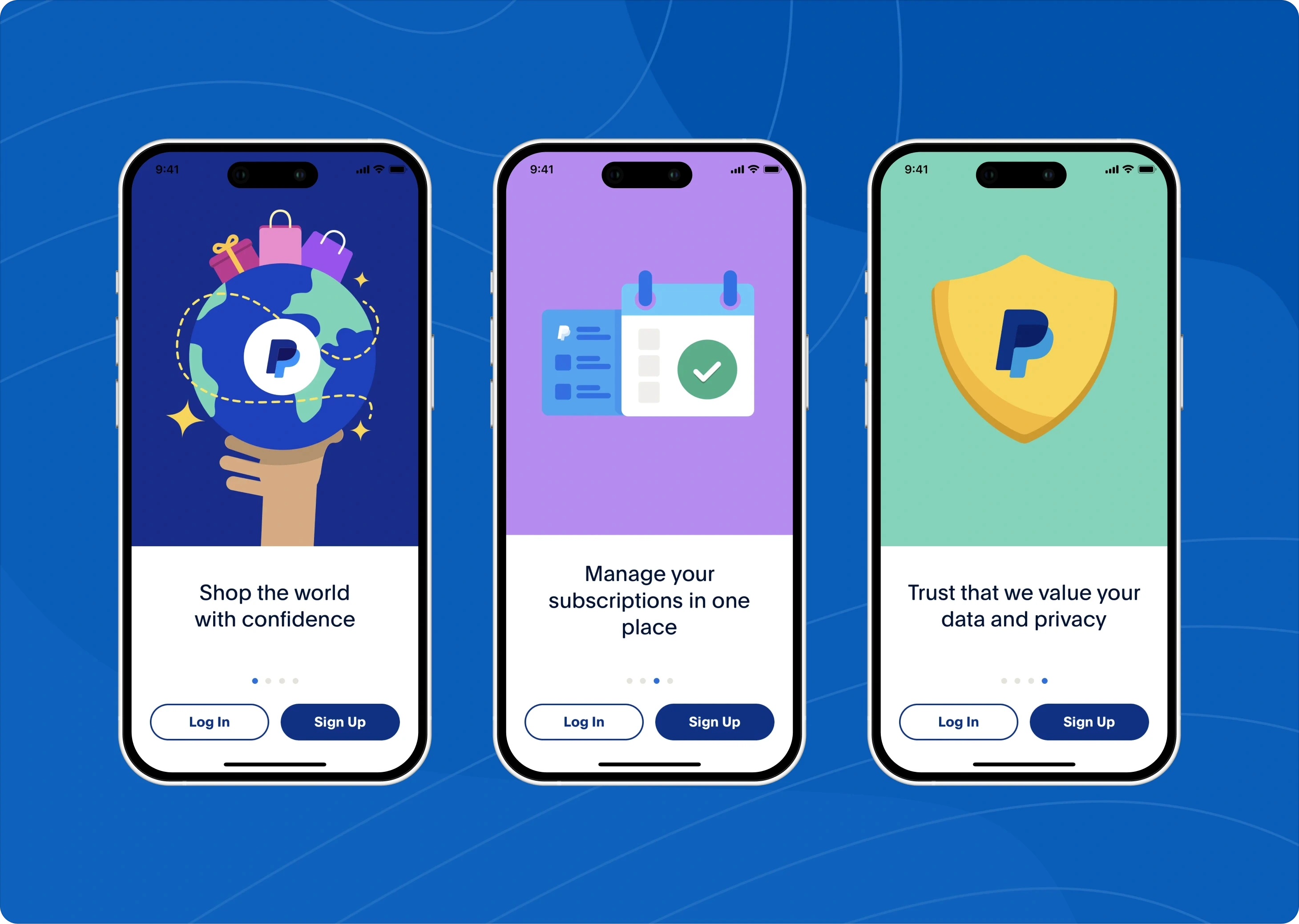
• 15 moderated user interviews with drop-off users revealed that people wanted to experience PayPal's value before committing to full verification

• Heatmap analysis showed significant hesitation at identity verification steps, with average dwell time of 47 seconds before abandonment

• Support ticket analysis confirmed that 34% of new user inquiries stemmed from confusion during account setup

• Mobile analytics revealed that 68% of signups started on mobile, but completion rate was only 31% compared to 54% on desktop

One participant captured the core issue perfectly:

One participant captured the core issue perfectly:

"I just wanted to send twenty dollars to my friend. Why do I need to upload my driver's license before I can do that?"

"I just wanted to send twenty dollars to my friend. Why do I need to upload my driver's license before I can do that?"

Our Approach

Value-First onborading

Value-First onborading

Our solution centered on progressive disclosure. Instead of asking users to trust PayPal before experiencing it, we let them experience it as a way to build trust. The new onboarding asked for just three pieces of information initially: an email address, a password, and a payment method. Within ninety seconds, a new user could complete their first transaction. The experience of successfully moving money became the foundation of trust, not a reward for completing bureaucratic steps.

Our solution centered on progressive disclosure. Instead of asking users to trust PayPal before experiencing it, we let them experience it as a way to build trust. The new onboarding asked for just three pieces of information initially: an email address, a password, and a payment method. Within ninety seconds, a new user could complete their first transaction. The experience of successfully moving money became the foundation of trust, not a reward for completing bureaucratic steps.

Complex requirements didn't disappear they moved to contextually appropriate moments. When a user tried to send an amount exceeding basic limits, we explained that verifying their identity would unlock higher transaction capabilities. This progressive approach meant every request came with a clear, immediate benefit.

Complex requirements didn't disappear they moved to contextually appropriate moments. When a user tried to send an amount exceeding basic limits, we explained that verifying their identity would unlock higher transaction capabilities. This progressive approach meant every request came with a clear, immediate benefit.

We rebuilt the entire experience with mobile as the primary canvas, incorporating touch-optimized inputs, biometric authentication, and streamlined visual design. The progress indicator changed from an overwhelming list of eleven steps to a simple three-phase journey. Users who completed a transaction in their first session showed three times higher retention at thirty days compared to the previous flow, validating our core hypothesis that trust is built through successful experiences rather than upfront verification.

We rebuilt the entire experience with mobile as the primary canvas, incorporating touch-optimized inputs, biometric authentication, and streamlined visual design. The progress indicator changed from an overwhelming list of eleven steps to a simple three-phase journey. Users who completed a transaction in their first session showed three times higher retention at thirty days compared to the previous flow, validating our core hypothesis that trust is built through successful experiences rather than upfront verification.

Crypto Integration

Making Digital Assets Accessible

Making Digital Assets Accessible

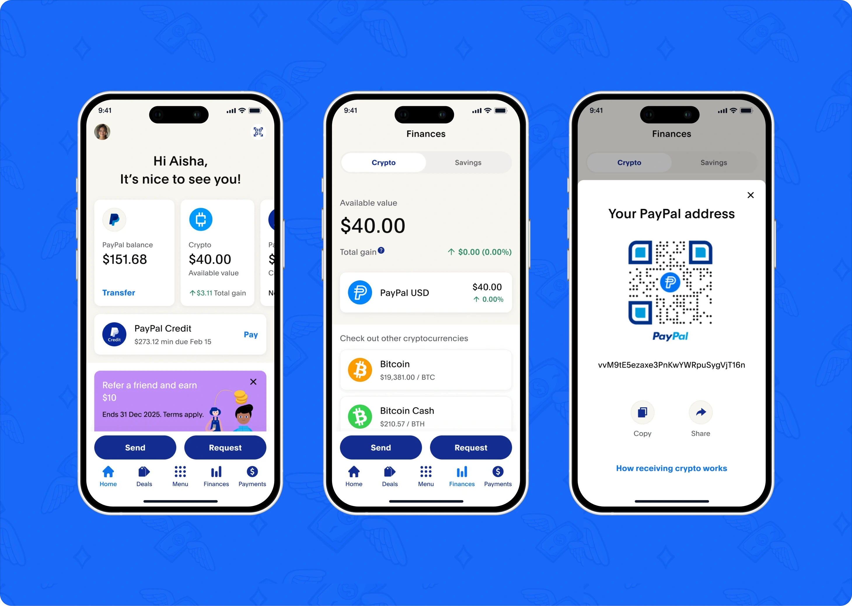
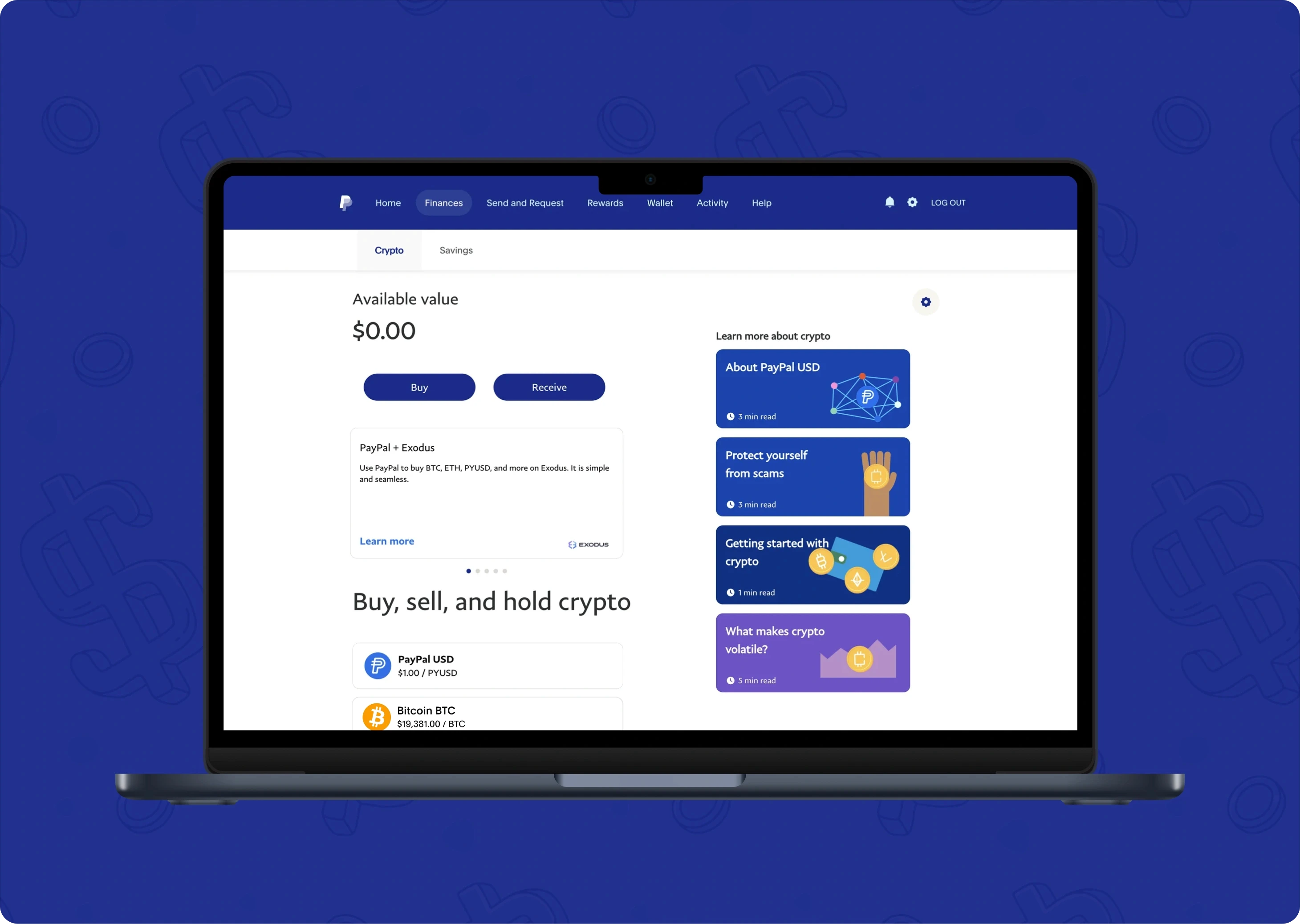
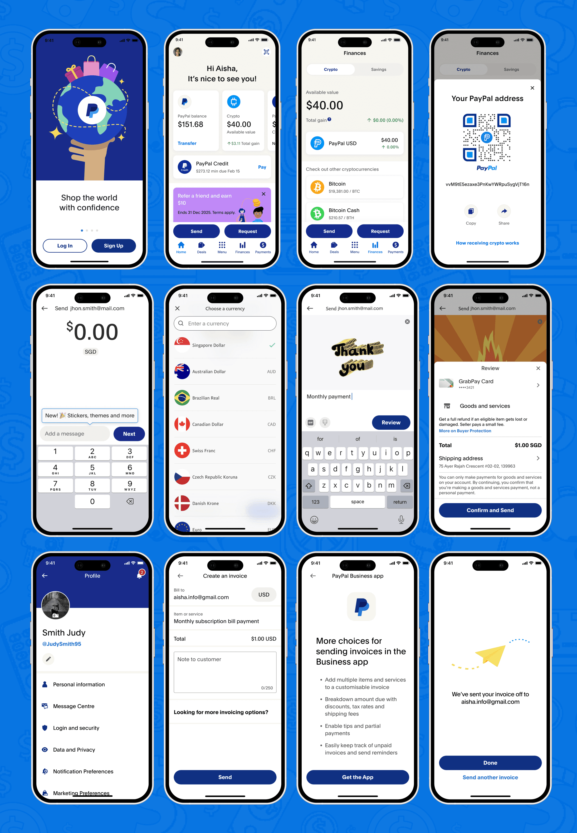
When PayPal entered the cryptocurrency market in 2020, they faced a significant UX challenge. Our research revealed that mainstream users were curious about crypto but felt overwhelmed by technical complexity. Terms like "blockchain," "wallet addresses," and "gas fees" created an immediate sense of being out of one's depth. Users who had tried crypto elsewhere reported anxiety about making costly mistakes.

Design approach

Design Philosophy: Translation Over Education

Design Philosophy: Translation Over Education

Our approach centered on translating crypto's complex reality through PayPal's familiar, trusted interface. We mapped every crypto concept to existing PayPal mental models. Buying crypto became as straightforward as adding money to a PayPal balance. Security features used PayPal's established protection language rather than intimidating technical jargon.

Our approach centered on translating crypto's complex reality through PayPal's familiar, trusted interface. We mapped every crypto concept to existing PayPal mental models. Buying crypto became as straightforward as adding money to a PayPal balance. Security features used PayPal's established protection language rather than intimidating technical jargon.

The interface treated cryptocurrency as just another currency in the PayPal ecosystem. Users saw Bitcoin and Ethereum presented with the same visual hierarchy as dollars or euros. Real-time price updates and simple percentage changes gave necessary context without overwhelming detail. A prominent "Learn" section provided bite-sized education exactly when users needed it.

The interface treated cryptocurrency as just another currency in the PayPal ecosystem. Users saw Bitcoin and Ethereum presented with the same visual hierarchy as dollars or euros. Real-time price updates and simple percentage changes gave necessary context without overwhelming detail. A prominent "Learn" section provided bite-sized education exactly when users needed it.

We designed the buying flow to feel identical to any other PayPal transaction. Users selected an amount in their local currency, reviewed the equivalent crypto they'd receive, and confirmed with biometric authentication. No wallet addresses to copy, no complex fees to calculate, no fear of sending funds to the wrong place.

We designed the buying flow to feel identical to any other PayPal transaction. Users selected an amount in their local currency, reviewed the equivalent crypto they'd receive, and confirmed with biometric authentication. No wallet addresses to copy, no complex fees to calculate, no fear of sending funds to the wrong place.

One of our most impactful decisions was treating education as a companion to action rather than a prerequisite. Users could make small, low-stakes transactions first, then deepen their understanding over time. Contextual learning moments appeared throughout the experience, with brief explainers answering "What is this?" in plain language and helpful guidance framed positively rather than as scary warnings.

One of our most impactful decisions was treating education as a companion to action rather than a prerequisite. Users could make small, low-stakes transactions first, then deepen their understanding over time. Contextual learning moments appeared throughout the experience, with brief explainers answering "What is this?" in plain language and helpful guidance framed positively rather than as scary warnings.

Profile Optimization

Understanding Merchant Pain Points

Understanding Merchant Pain Points

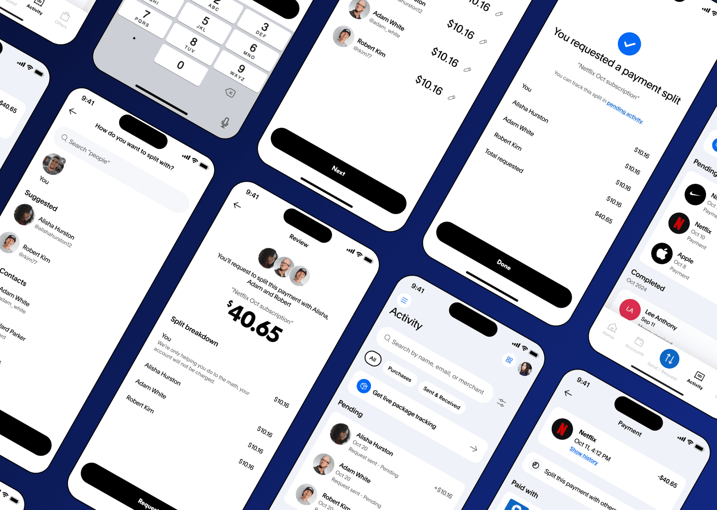
PayPal serves over thirty million merchant accounts ranging from solo entrepreneurs to large e-commerce operations. Our research with forty-seven merchants revealed that as PayPal's capabilities had grown, the merchant dashboard had become a maze of features without clear hierarchy. Small business owners felt overwhelmed by data they didn't understand. Growing businesses struggled to access critical functions quickly. Everyone spent too much time searching and not enough time understanding their business performance.

● Morning check-ins

Focused on overnight orders and customer messages

● Midday management

dealt with customer inquiries and fulfillment

● Evening reviews

analyzed performance and planned for growth

Crypto Integration

Making Digital Assets Feel Familiar

Making Digital Assets Feel Familiar

Crypto introduced fear, jargon, and complexity. Users felt overwhelmed by terms like wallet addresses and gas fees. We reframed crypto through PayPal’s familiar mental models:

Buying Crypto Worked like adding money to a PayPal balance

Price charts were simplified with clean % changes

A “Learn” hub delivered guidance at the moment of action

Flows used biometric confirmation, with no wallet addresses or technical barriers

The experience made crypto feel accessible, safe, and aligned with PayPal’s trusted ecosystem.

ai integration

GenAI Powered UX Enhancements

GenAI Powered UX Enhancements

PayPal’s UX design improvements fueled by GenAI directly responded to user frustrations around technical clarity, navigation, and workflow support. The core design changes focused on: Centralizing resources and making documentation easily discoverable - Embedding GenAI-powered agentic chatbots and contextual prompts for instant answers and tailored guidance as developers work - Integrating dynamic video tutorials and best practices precisely where users need them. These UX enhancements minimize friction, reduce confusion, and enable developers to complete payment integrations more efficiently, resulting in higher success rates and lower support burdens. The GenAI-driven UX delivers more adaptive, intelligent, and personalized experiences throughout PayPal’s technical environment, ensuring both developer and merchant needs are met seamlessly.

Brand refresh

2024 Brand Refresh Implementation

2024 Brand Refresh Implementation

In 2024, Pentagram rebranded PayPal with a new logo and typeface, representing the company's evolution and modern positioning. Our challenge was implementing this new visual language across hundreds of product screens and marketing touchpoints while ensuring consistency and maintaining or enhancing usability.

Strategic Implementation

Strategic Implementation

We worked closely with Pentagram and PayPal's product teams to translate brand guidelines into practical design systems. This wasn't simply swapping logos and fonts. We needed to ensure the new typography hierarchy improved readability, that color updates maintained accessibility standards, and that the refreshed visual language felt cohesive across vastly different experiences—from the consumer app to merchant tools to crypto interfaces.

We created comprehensive component libraries that encoded the new brand while preserving functional patterns users knew. Every button, form field, and modal received careful attention to ensure the refresh enhanced rather than disrupted familiar workflows. We conducted testing to verify that the new visual language improved rather than hindered task completion, particularly for accessibility considerations around contrast ratios and text legibility.

The rollout happened in carefully orchestrated phases, allowing us to gather feedback and make refinements. We prioritized high-traffic touchpoints first, ensuring the most visible parts of PayPal's ecosystem reflected the new brand identity while giving us data to optimize the approach for subsequent releases.

Lorem

Gift Cards & Offer Userflow Optimization

Gift Cards & Offer Userflow Optimization

PayPal's gift card and promotional offers represented significant revenue opportunities, but the user experience had accumulated friction over time. Users struggled to discover available offers, the redemption process felt disconnected from natural shopping flows, and merchants found it complex to create and manage promotional campaigns.

PayPal's gift card and promotional offers represented significant revenue opportunities, but the user experience had accumulated friction over time. Users struggled to discover available offers, the redemption process felt disconnected from natural shopping flows, and merchants found it complex to create and manage promotional campaigns.

Research Discovery

Research Discovery

Our analysis revealed several critical issues:

Our analysis revealed several critical issues:

Discovery problem:

Discovery problem:

67% of users were unaware that PayPal offered gift cards and merchant-specific deals

67% of users were unaware that PayPal offered gift cards and merchant-specific deals

Redemption friction:

Redemption friction:

The gift card application process required users to exit their checkout flow, leading to 41% abandonment

The gift card application process required users to exit their checkout flow, leading to 41% abandonment

Merchant complexity:

Merchant complexity:

Creating promotional offers required navigating seven different screens with unclear validation rules

Creating promotional offers required navigating seven different screens with unclear validation rules

Visibility gap:

Visibility gap:

Personalized offers based on shopping history and preferences weren't being surfaced effectively

Personalized offers based on shopping history and preferences weren't being surfaced effectively

User interviews uncovered that people loved the idea of PayPal offers but found them either invisible or too cumbersome to use. As one participant noted:

User interviews uncovered that people loved the idea of PayPal offers but found them either invisible or too cumbersome to use. As one participant noted:

"I know I probably have deals available, but I'm not going to stop my checkout to go hunt for them."

"I know I probably have deals available, but I'm not going to stop my checkout to go hunt for them."

Conclusion

Make financial Technology simple, human, & easy to trust

Make financial Technology simple, human, & easy to trust

Across two years, we helped PayPal rethink its consumer, merchant, developer, and brand experiences. From onboarding to crypto, merchant workflows to brand refresh, our work reduced friction, increased confidence, and improved long-term user engagement. As digital finance continues to evolve, these experience principles position PayPal to serve the next generation of global users with clarity, consistency, and trust.

Related Case Studies

Related Case Studies

see all

UX DesignDesign SystemProduct OptimizationInformation Architecture
Product DesignUX StrategyInformation ArchitectureUI DesignInteractionMobile App Design