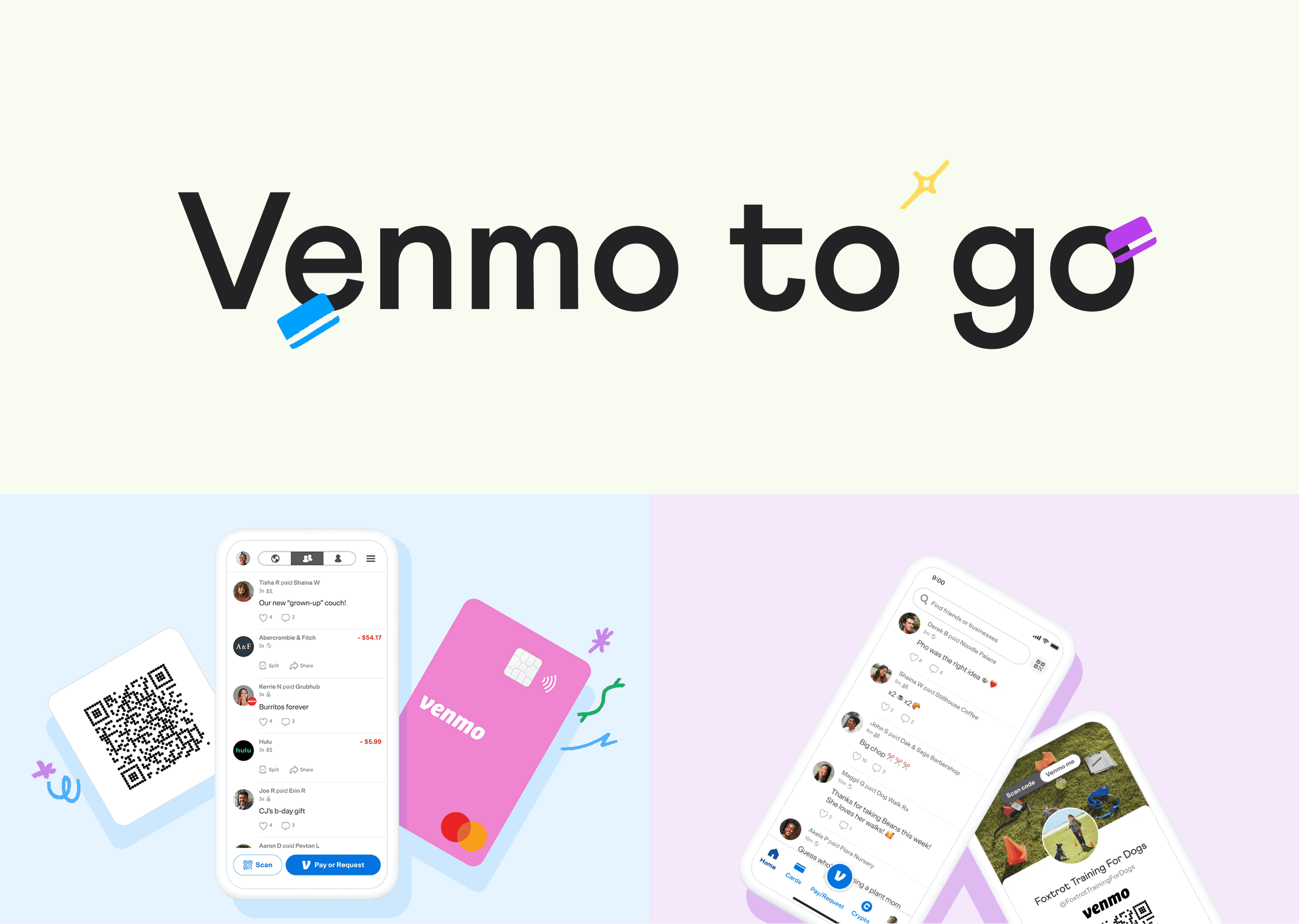
Client

Industry
Fintech
year
2022 - 2024
Scope of work
share
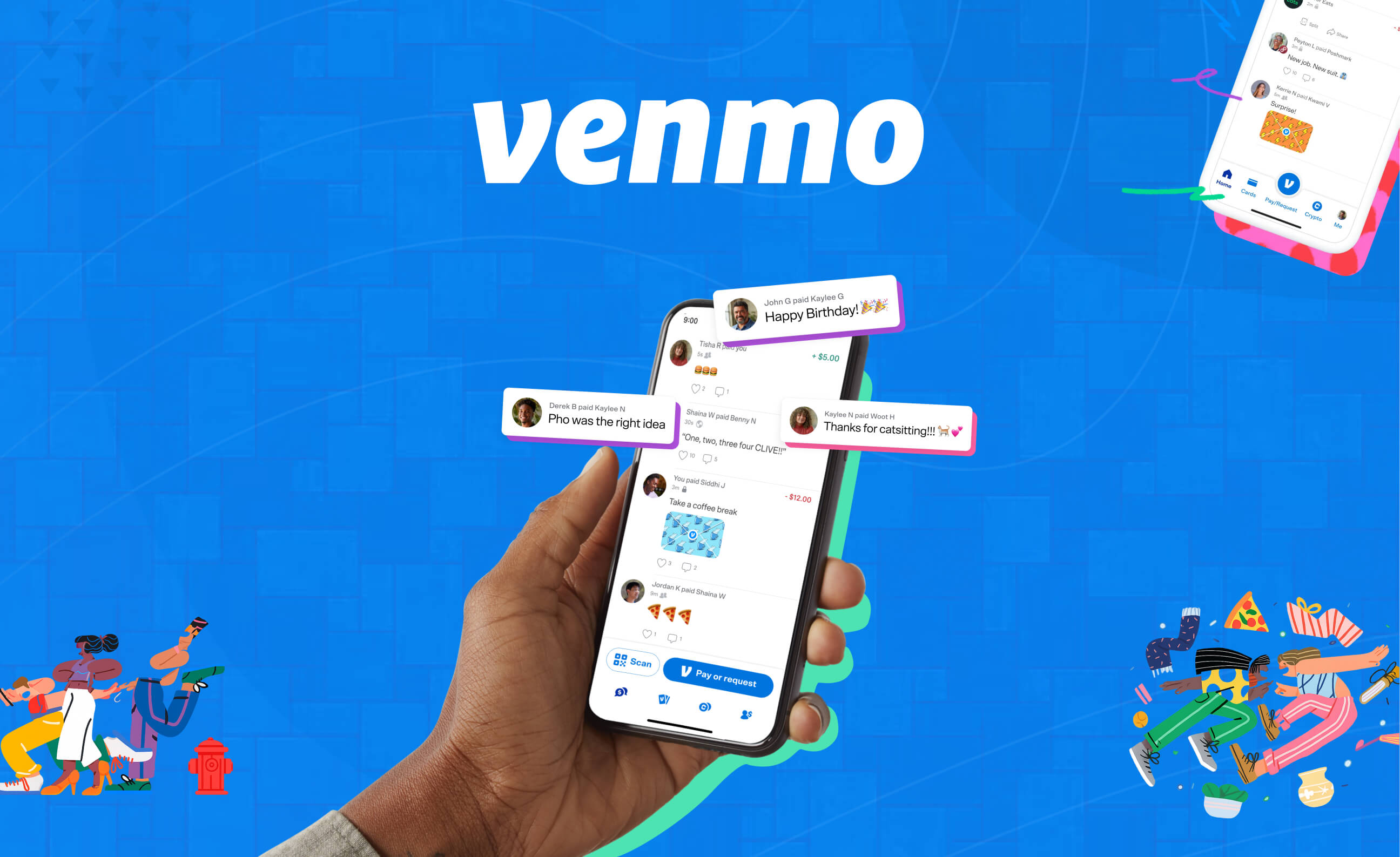
The Story
Understanding the Challenge
Research and Discovery
Strategic Approach
With research insights in hand, we developed our design strategy around three core principles.
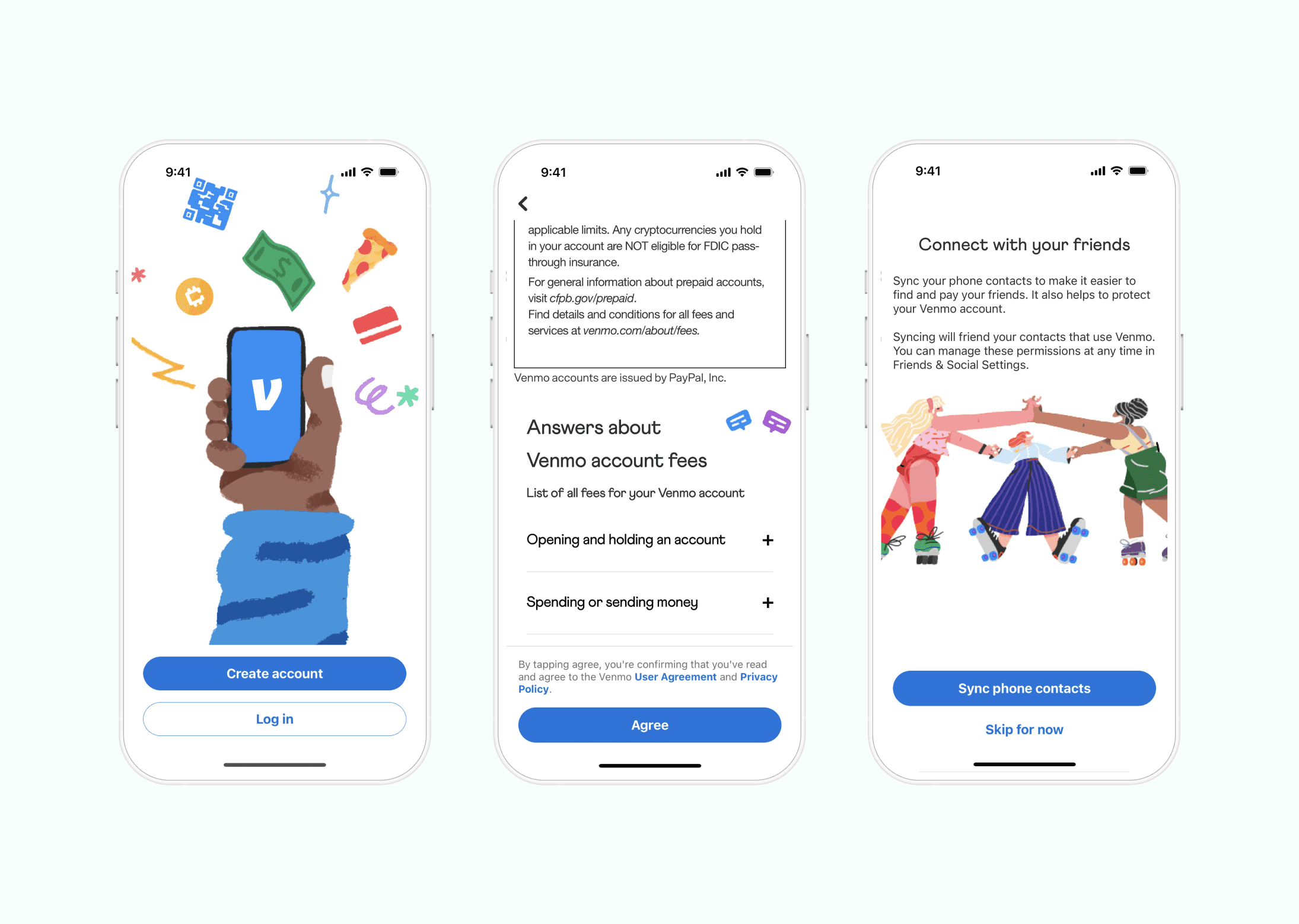
The team decided Venmo's playful personality was its "secret weapon" to make sophisticated features accessible. Using friendly illustrations and conversational language actively works to reduce the anxiety that surrounds financial decisions.
Every screen should answer three questions: "Where am I right now?", "What can I do here?", and "What will happen next?". Each moment of uncertainty adds to cognitive load, leading users to choose the safest option often, doing nothing.
The team needed to create a comprehensive design system with reusable, tested building blocks. This system would document not just what things look like, but why they work that way, empowering Venmo's teams to maintain quality as they built new features.

Design Implementation
Color and Visual Language:
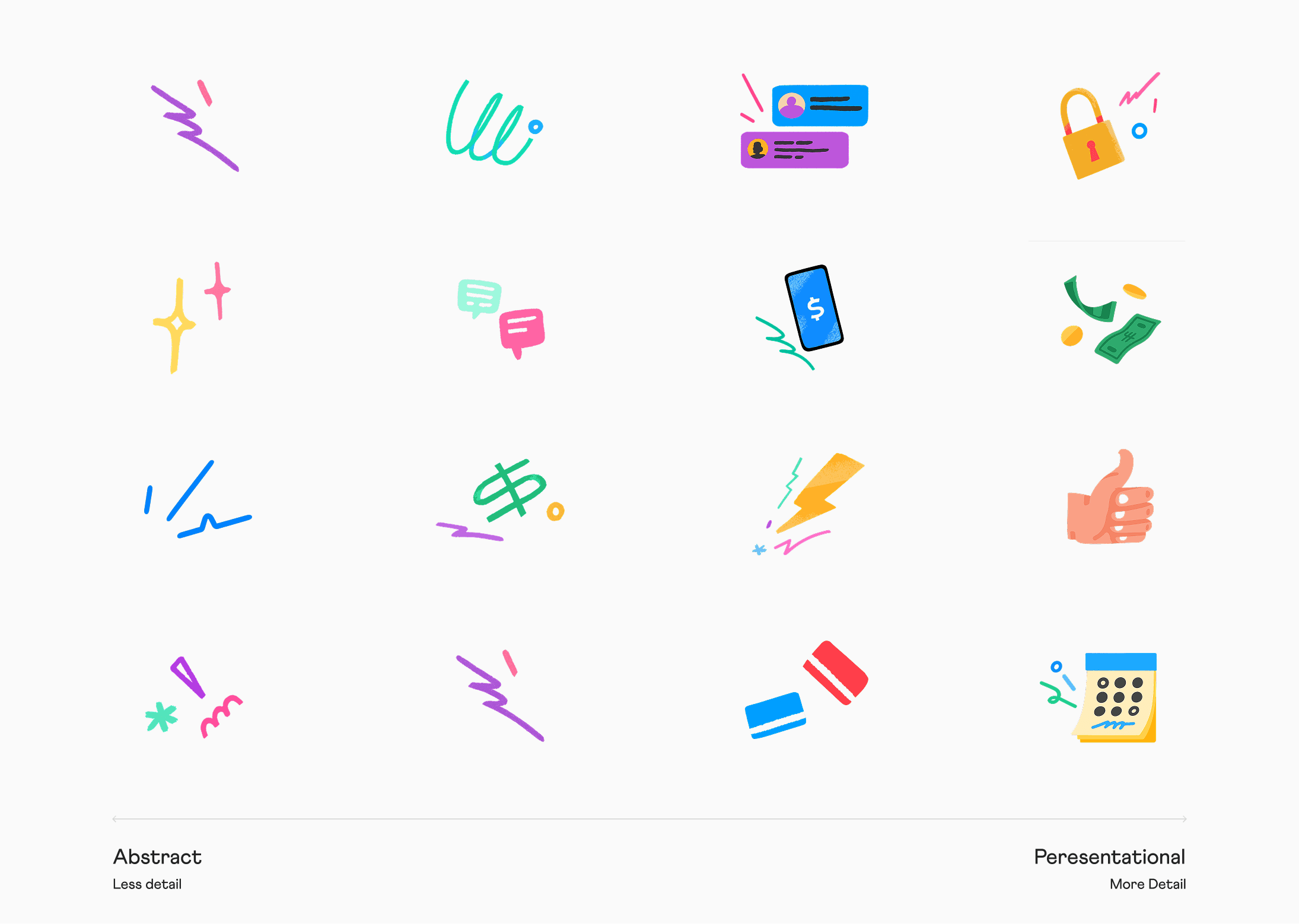
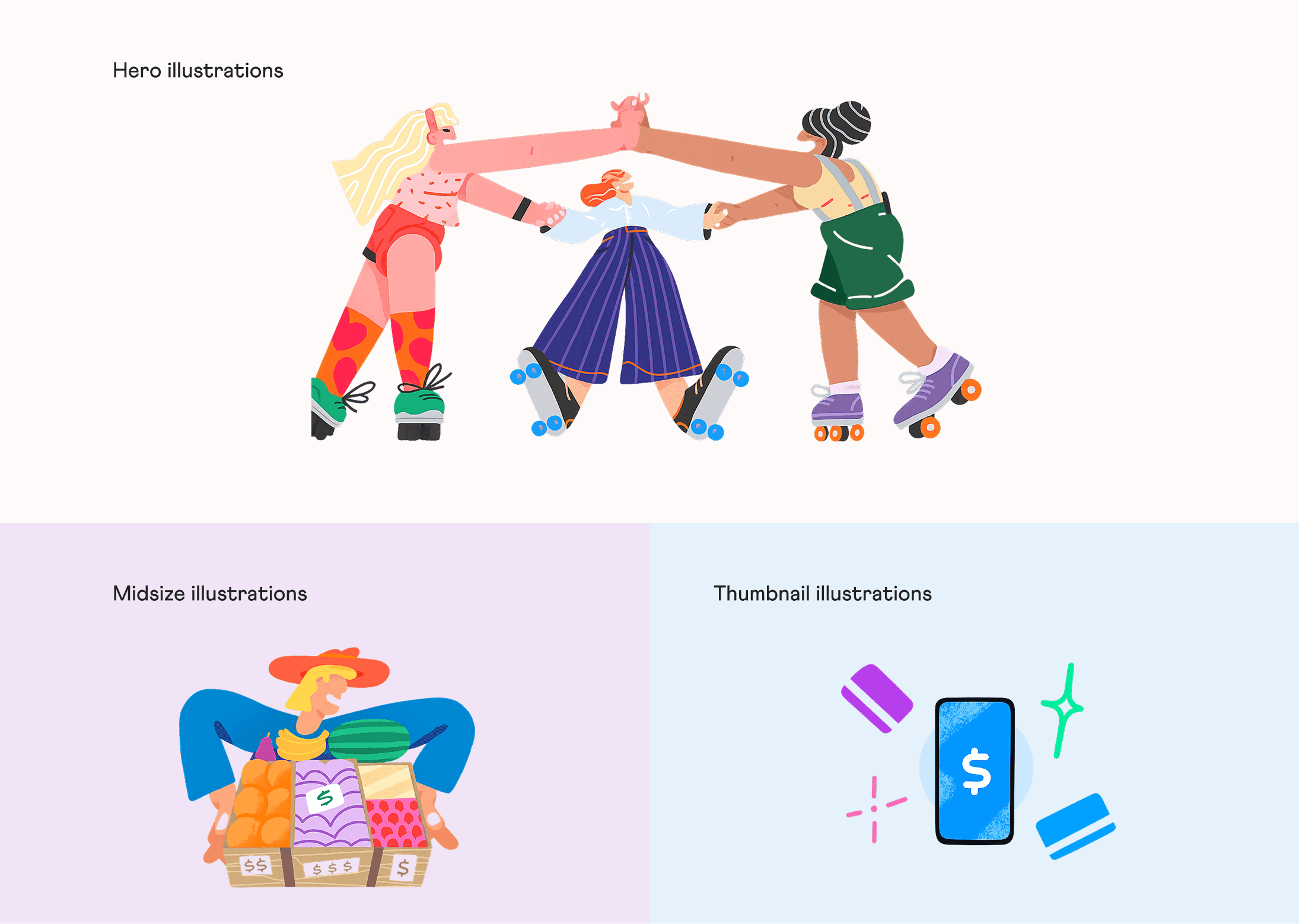
Illustration as Functional Design:
Progressive Onboarding:
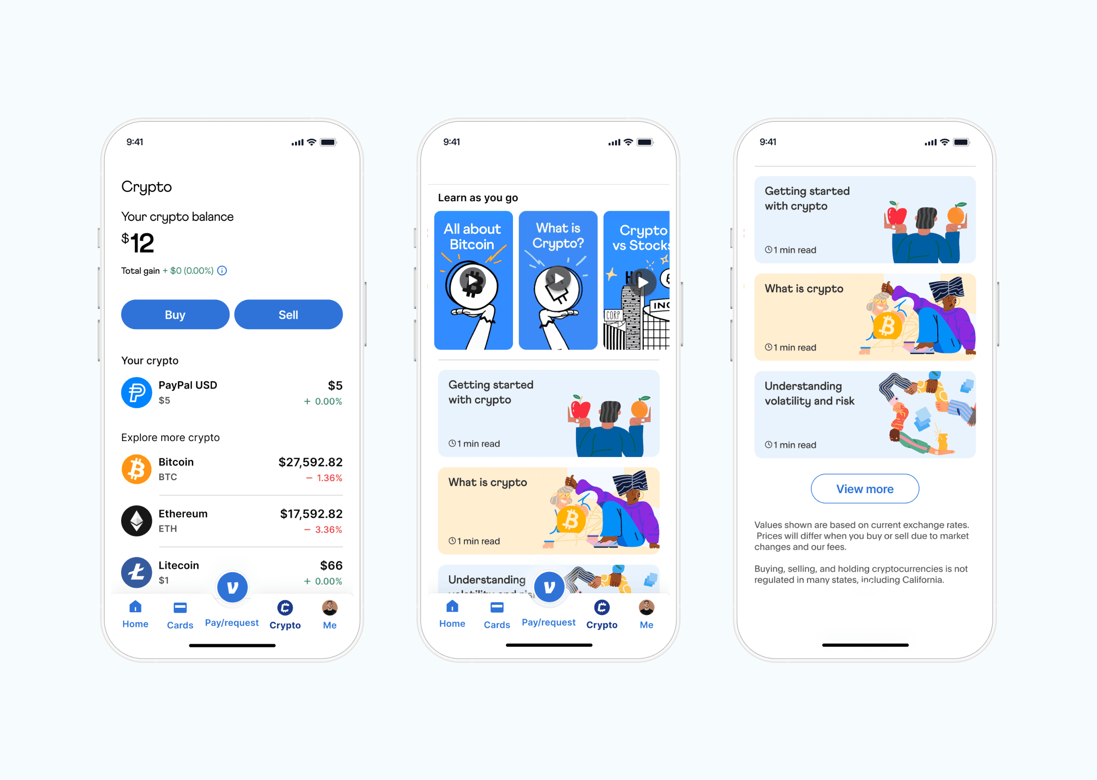
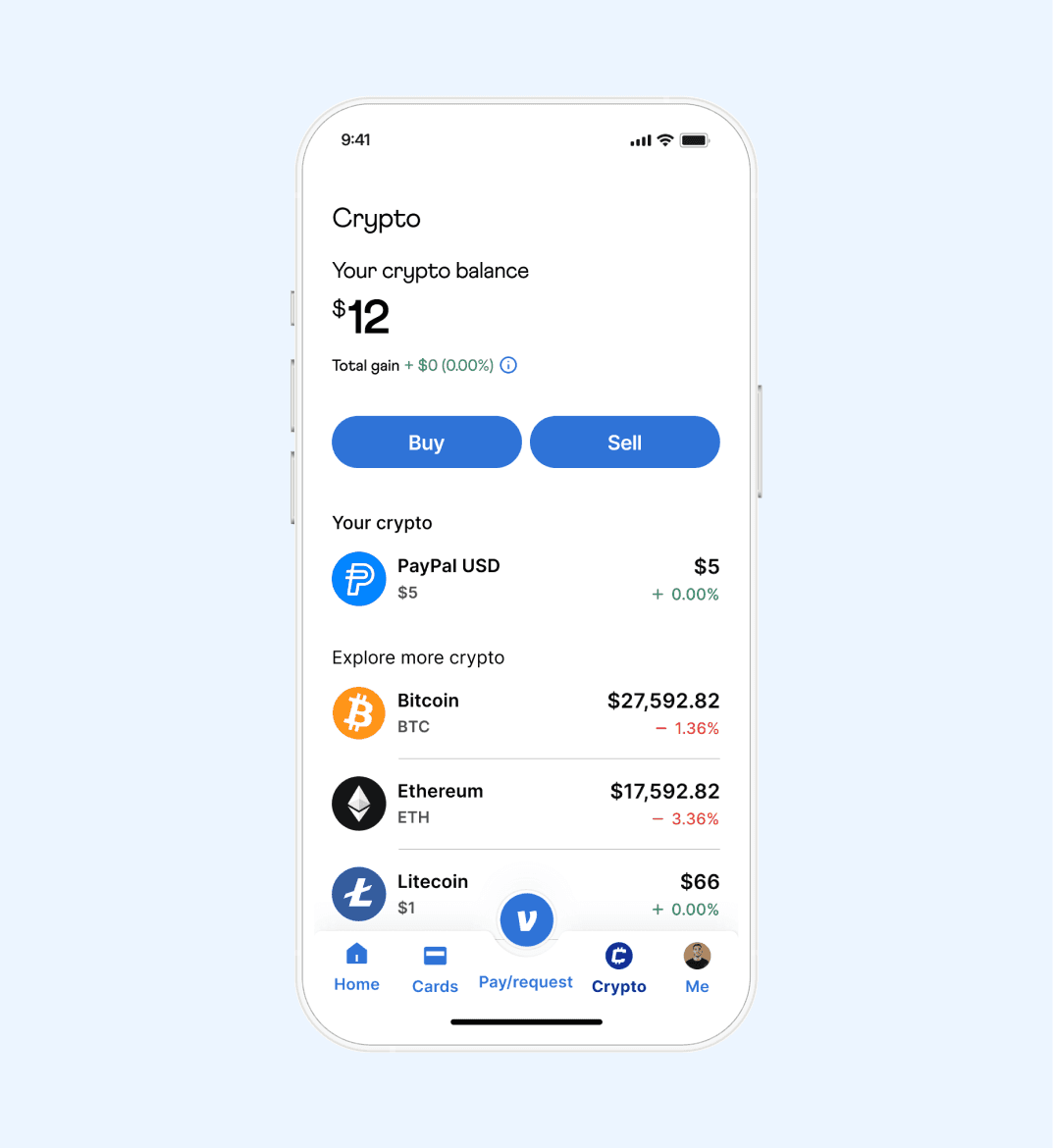
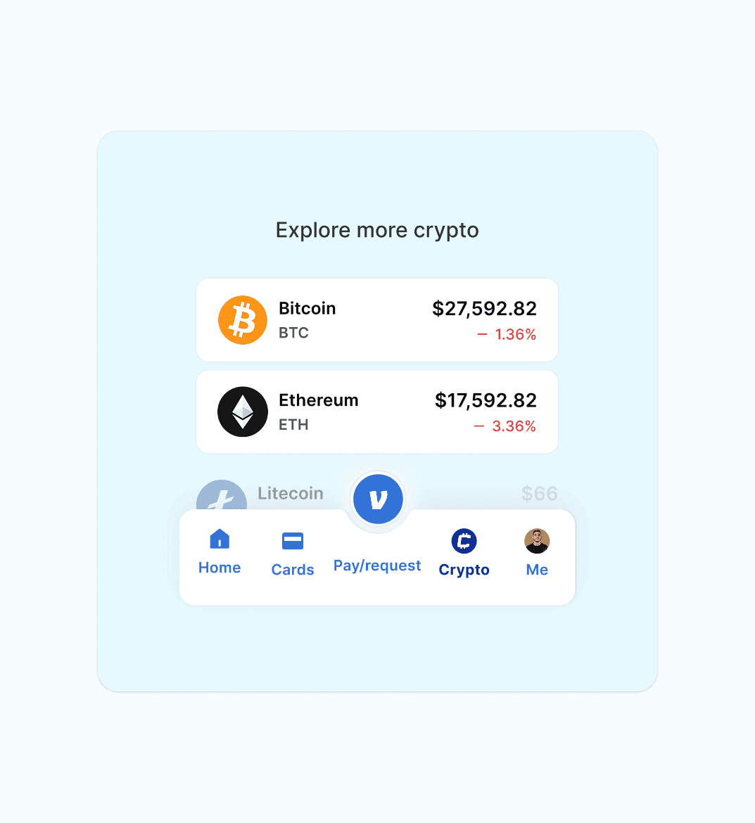
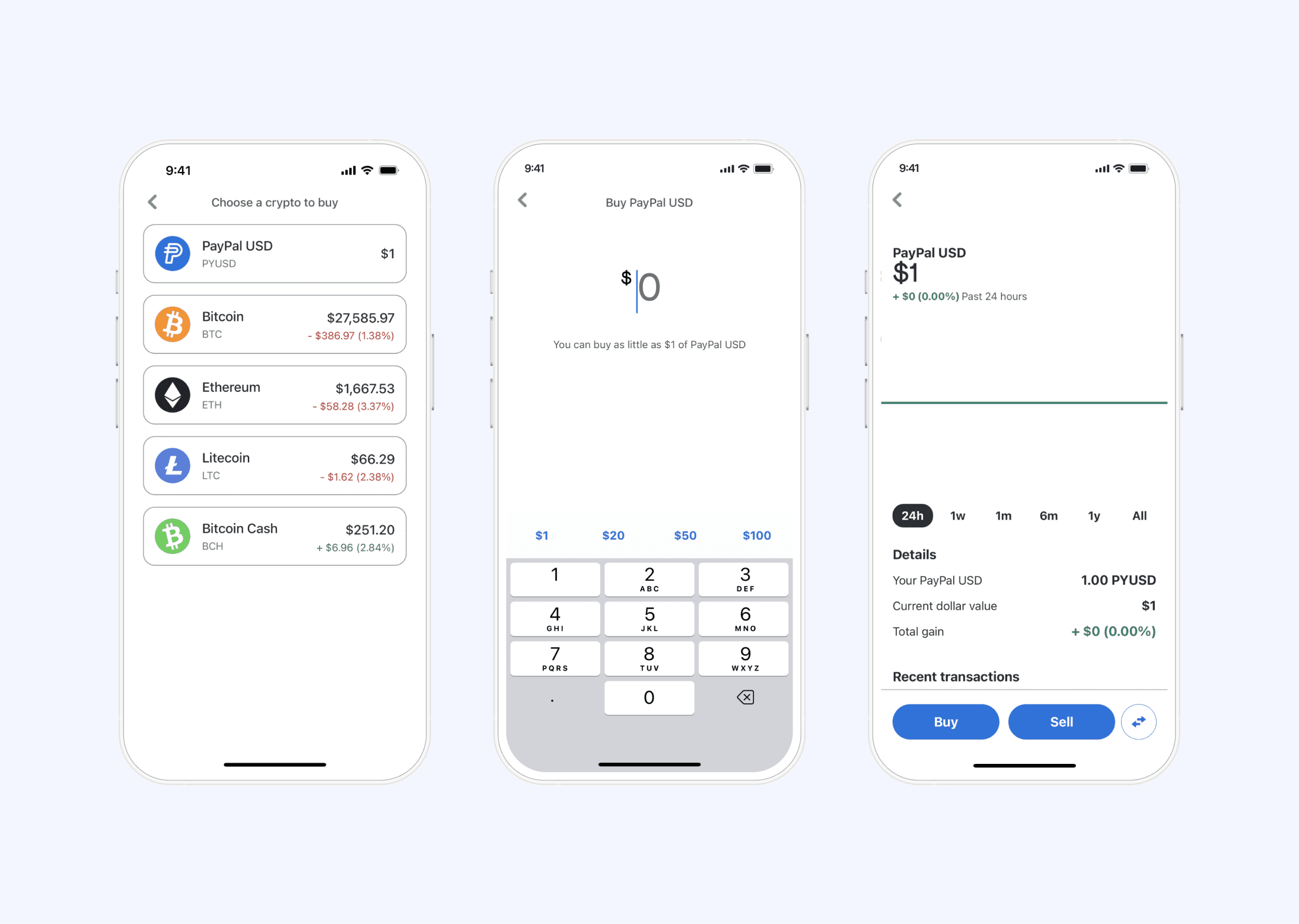
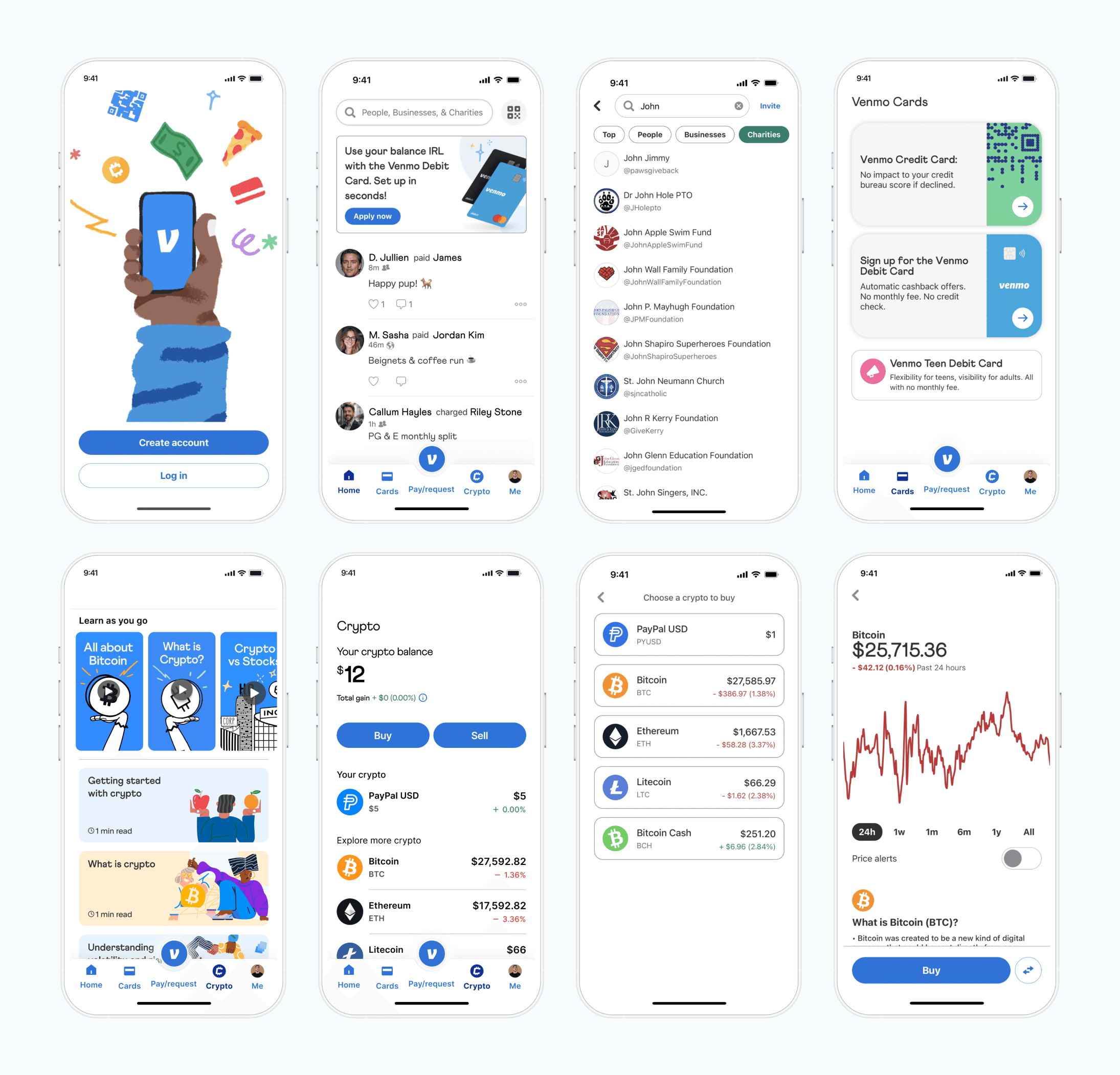
Crypto Integration
Social features remained central because they were core to Venmo's value proposition. Transaction feeds incorporated emoji, custom stickers, and playful interactions. Research shows that adding social elements to utility driven tasks creates habit forming patterns. When sending money triggers positive social feedback, users associate payment with connection rather than obligation.
The cryptocurrency integration showed how thoughtful design makes advanced features accessible. We used familiar metaphors and progressive disclosure. Initial screens presented crypto as another way to use Venmo, with complexity revealed gradually. Clear visual hierarchy, simple flows, and reassuring microcopy at decision points built confidence without overwhelming users.
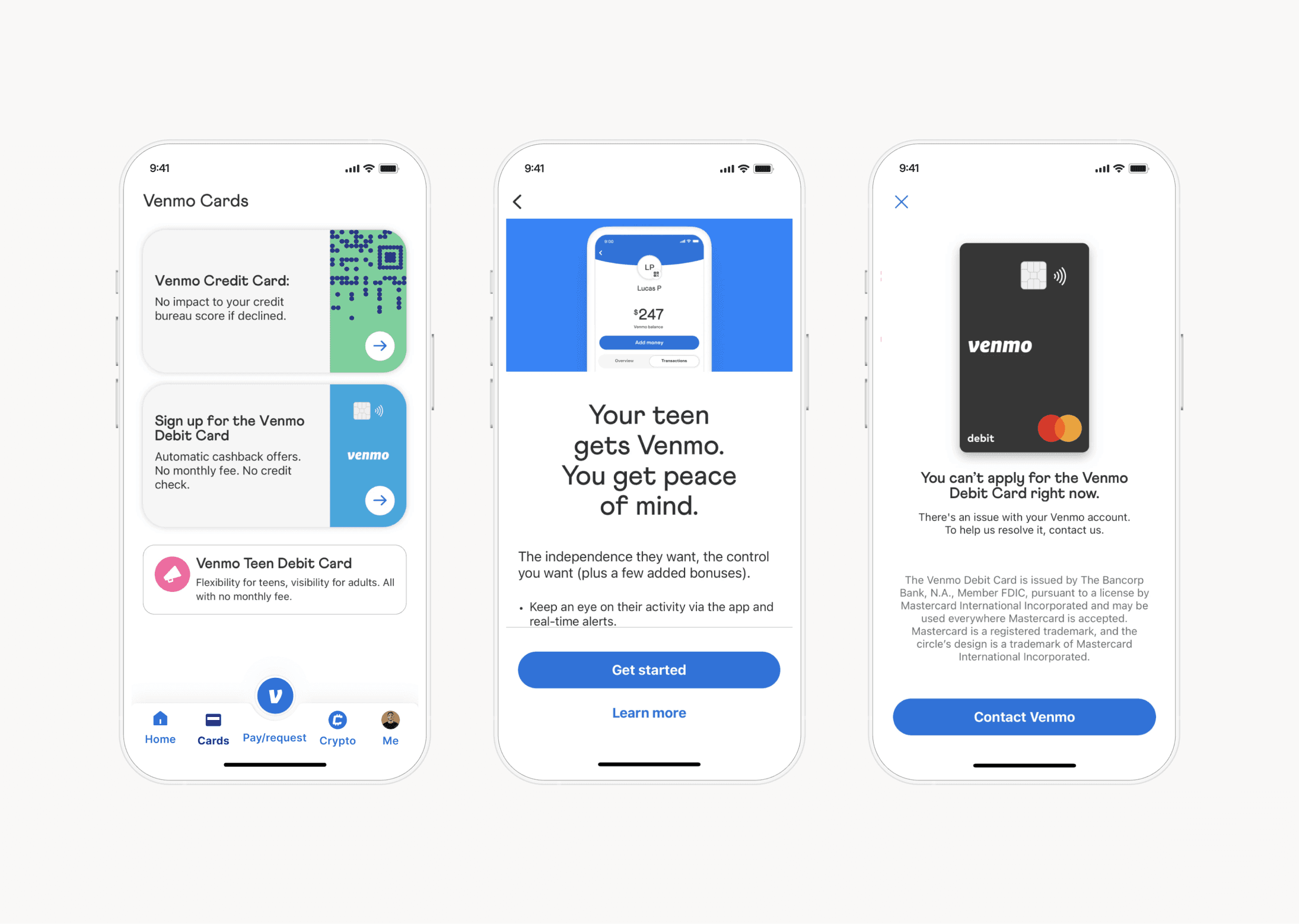
Venmo Card Portfolio
The Venmo Cards project involved expanding the app from a single-payment tool into a multi-product ecosystem. The design challenge was to introduce multiple, distinct financial products (Credit, Debit, and Teen Debit) without creating user confusion or "feature anxiety". The solution focused on applying the core principles of clarity and approachability. A central hub screen was designed to clearly segment the card offerings, helping users understand the distinct value of each. For high-anxiety products like the Teen Debit Card, the design used empathetic, benefit-driven language to reduce fear and build parental confidence, turning a complex financial decision into an approachable process.
The Impact
Onboarding completion rates increased significantly, and users spent less time completing their first transaction, which correlates strongly with long-term retention.
Cryptocurrency adoption "exceeded projections meaningfully". Surveys showed users had decreased anxiety, and many reported trying crypto on Venmo specifically because it "felt less intimidating" than other platforms.
Brand recognition improved, and users reported a stronger emotional connection. The new design system also accelerated feature development and reduced errors because teams used pre-tested, established patterns.
Key Learnings
Successful fintech experiences recognize that making things feel "lighter and more human" can actively reduce user anxiety, creating the emotional space for them to learn with confidence.
Revealing complexity gradually is an essential strategy for managing cognitive load and drives higher engagement with advanced features.
Color, illustration, and typography "profoundly shape how people feel and behave". In fintech, where trust is foundational, this combination is essential for growth.
Conclusion
We left this project with renewed appreciation for how design decisions at every scale contribute to the total user experience. Each choice either builds confidence or creates friction, clarifies understanding or adds confusion, strengthens brand connection or dilutes it. The accumulation of these choices determines whether users feel empowered to explore new capabilities or stick cautiously to what they already know. Our job as designers is to make every choice with intention, always asking how it serves the human being trying to accomplish something meaningful with our product.


