Last Update:
Dec 26, 2025

Share
Empty states are high-risk moments
Blank screens trigger anxiety, confusion, and early abandonment.Most churn happens before activation
80% of users drop within the first week if they fail to activate quickly.Every empty state must answer three questions
What is this? Why does it matter? What should I do next?Clear next steps reduce cognitive load
Strong CTAs and small actions dramatically increase follow-through.Good empty states boost activation by ~60%
Moving from 25–30% to 40%+ activation creates massive ARR impact.Personalization and demo content accelerate value
Showing examples beats asking users to start from scratch.Activation compounds into revenue
Early-activated users have 30–40% higher lifetime value.Empty states are low-effort, high-ROI UX wins
Few changes deliver clearer guidance, lower churn, and faster growth.
Introduction: The Blank Screen That Kills Products
Every SaaS product has them—those moments when a user first opens your dashboard, creates a new project, or searches for something that doesn't exist. The screen is empty. There's nothing to display. No data, no content, no clear path forward.
For most products, this is a missed opportunity. For the best products, it's a strategic goldmine.
The Critical First Impression Window
Most users decide within the first 3-5 seconds whether your product is worth keeping. According to the Nielsen Norman Group, users form judgments about digital interfaces almost instantaneously—often before conscious evaluation begins.
If they land on a blank screen with no guidance, they leave. The numbers tell a stark story: Approximately 80% of app users abandon products within their first week of use, and 90% will quit within the month if they fail to activate in the first three days.
Dr. Susan Weinschenk, behavioral psychologist, notes:
"The brain perceives blank spaces as incomplete tasks or missing information, triggering mild anxiety and uncertainty."
Empty states—those seemingly insignificant blank screens—are emotional checkpoints that either build trust and momentum, or silently push users toward the exit. This guide explores how to transform them from abandonment traps into activation goldmines using the What? Why? Next? framework.
Understanding Empty States and Why They Matter
What Are Empty States?
An empty state occurs when a product screen designed to contain user-generated content, data, or search results shows nothing instead. These moments represent interaction cost—the mental and physical effort users must expend to accomplish their goals.
Empty states manifest in several contexts:
First-use empty states: A new account with no data populated yet—these carry the highest activation friction.
User-cleared states: When someone completes all tasks or deletes content—these can be celebratory moments if designed correctly.
Search result states: When a search returns zero matches—high cognitive load scenarios requiring immediate guidance.
Error states: When a system fails to load or process a request—these damage user trust if poorly handled.
Feature-specific states: When users haven't accessed a particular feature yet—common in freemium models.
The Psychology Behind Empty States
When users encounter a blank screen, their brains don't stay neutral. Research shows that blank form fields and empty spaces trigger the same stress response as public speaking—a phenomenon known as "Blank Field Anxiety".
The research is revealing: About 71% of users hesitate for 2.7+ seconds before typing in a blank field, and form abandonment rates spike by 340% when fields contain no visual cues.
Jared Spool, founder of User Interface Engineering, observes: "Empty states are where users decide whether to invest time learning your product or move on to alternatives."
Users instinctively interpret blank screens through three lenses: technical failure ("Is something broken?"), confusing product ("Am I using this correctly?"), or unappealing value proposition ("Is this worth my time?").
Micro-Summary: Empty states aren't neutral—they're high-stakes moments where users evaluate product value, functionality, and trustworthiness. Poor design triggers anxiety and increases cognitive load, directly impacting activation rates.
The Business Cost of Poorly Designed Empty States
Revenue Impact and Churn
The financial consequences of poor empty state design are direct and measurable. Users who land on empty dashboards become confused and directionless, increasing early churn risk.
Bain & Company research demonstrates that acquiring a new customer can cost 5-25 times more than retaining an existing one. Consider these numbers: 75% of users abandon a product within the first week if they struggle getting started.
If a SaaS company has 1,000 signups monthly and loses 750 users due to poor onboarding (including confusing empty states), that's:
750 customers × $100 monthly ARPU = $900,000 in potential ARR lost annually from just one month's cohort.
User Confusion and Decision Paralysis
Empty states that fail to guide users create cognitive overload and decision paralysis. When users encounter blank screens, they face simultaneous uncertainties about what the space is for, what to do next, how it benefits them, and whether something's broken.
Don Norman explains: "When users can't form accurate mental models, they blame themselves rather than the design—but they still abandon the product."
Before Slack redesigned its onboarding empty states, new workspaces opened to minimal hints, creating immediate confusion that translated into early abandonment.
Lower Feature Adoption
McKinsey research shows only 20-30% of product features get regular use in most SaaS applications. When empty states in secondary features aren't thoughtfully designed, users develop avoidance patterns—a phenomenon called "feature blindness".
Users churn not because your product is bad, but because they didn't discover what makes it good.
Psychological Impact
From a psychological perspective, empty states activate loss aversion. Daniel Kahneman's research demonstrates that losses are psychologically twice as powerful as gains. Users interpret blank screens as "I'm missing something" rather than "Here's an opportunity."
Repeated encounters with unhelpful empty states trigger learned helplessness—users stop trying and assume the product isn't designed for them.
Micro-Summary: Poorly designed empty states create measurable revenue loss through increased churn, lower activation rates, and reduced feature adoption. The psychological impact compounds over time, turning temporary confusion into permanent abandonment.
The What-Why-Next Framework for Empty State Design
The Strategic Opportunity
Well-designed empty states are one of the highest-leverage, lowest-effort improvements you can make to SaaS retention. Companies that treat empty states strategically report significant improvements in activation rates, engagement, and churn reduction.
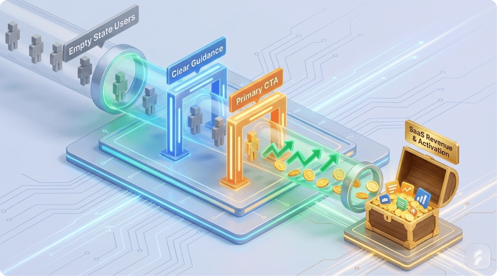
The framework is simple: What? Why? Next?
Every effective empty state answers three questions in clear, hierarchical order:
What? - Clearly explain what this space is and why it's empty
Why? - Provide context about the value or purpose of this area
Next? - Offer a clear, actionable next step to move forward
Component 1: "What?" - Context and Clarity
The first job of an empty state is to reassure users that the blank screen is intentional and normal, not a technical failure.
Example from Notion: "You haven't added any pages yet. Create your first page to get started."
This answers the implicit question: "Why is this blank? Is something wrong?"
❌ Poor version: Just an icon or "No data found" (too vague, creates anxiety)
✅ Better version: "You haven't created any projects yet. Projects are where you organize your work, set deadlines, and collaborate with teammates."
Giles Colborne notes: "Users need confirmation that nothing is broken before they'll invest energy in learning."
MIT's HCI Lab research shows users form opinions within 3-5 seconds—mostly emotional rather than logical. Your empty state's tone, language, and visuals determine whether users feel welcomed or confused.
Component 2: "Why?" - Value and Motivation
After explaining what the space is, explain why it matters. Connect the empty state to user benefits, not just product features.
Example from Duolingo: "Great job! You're on a 47-day streak. Come back tomorrow for new lessons, or try today's challenge to keep the momentum going."
This is brilliant because it:
Celebrates progress
Explains why the space is empty (positive reason)
Motivates continued engagement (streak mechanics)
Provides immediate alternatives
Nir Eyal explains: "Variable rewards combined with progress indicators create habit-forming experiences. Duolingo's empty states leverage both."
Salesforce research shows personalized onboarding can cut churn by up to 25%. Empty states are one of the most direct ways to personalize—by acknowledging the user's specific situation and goals.
Component 3: "Next?" - Clear Call-to-Action
The final and most critical component: make the next action obvious. This isn't subtle—it's an explicit button or clearly described action that reduces cognitive load.
Example from Slack: When you create a new workspace, Slack shows three specific prompts:
"Invite teammates"
"Create your first channel"
"Set your profile"
Each is a small, achievable action that builds momentum.
Teresa Torres observes: "Continuous small wins create commitment. Users who take one action are 3-4 times more likely to take a second."
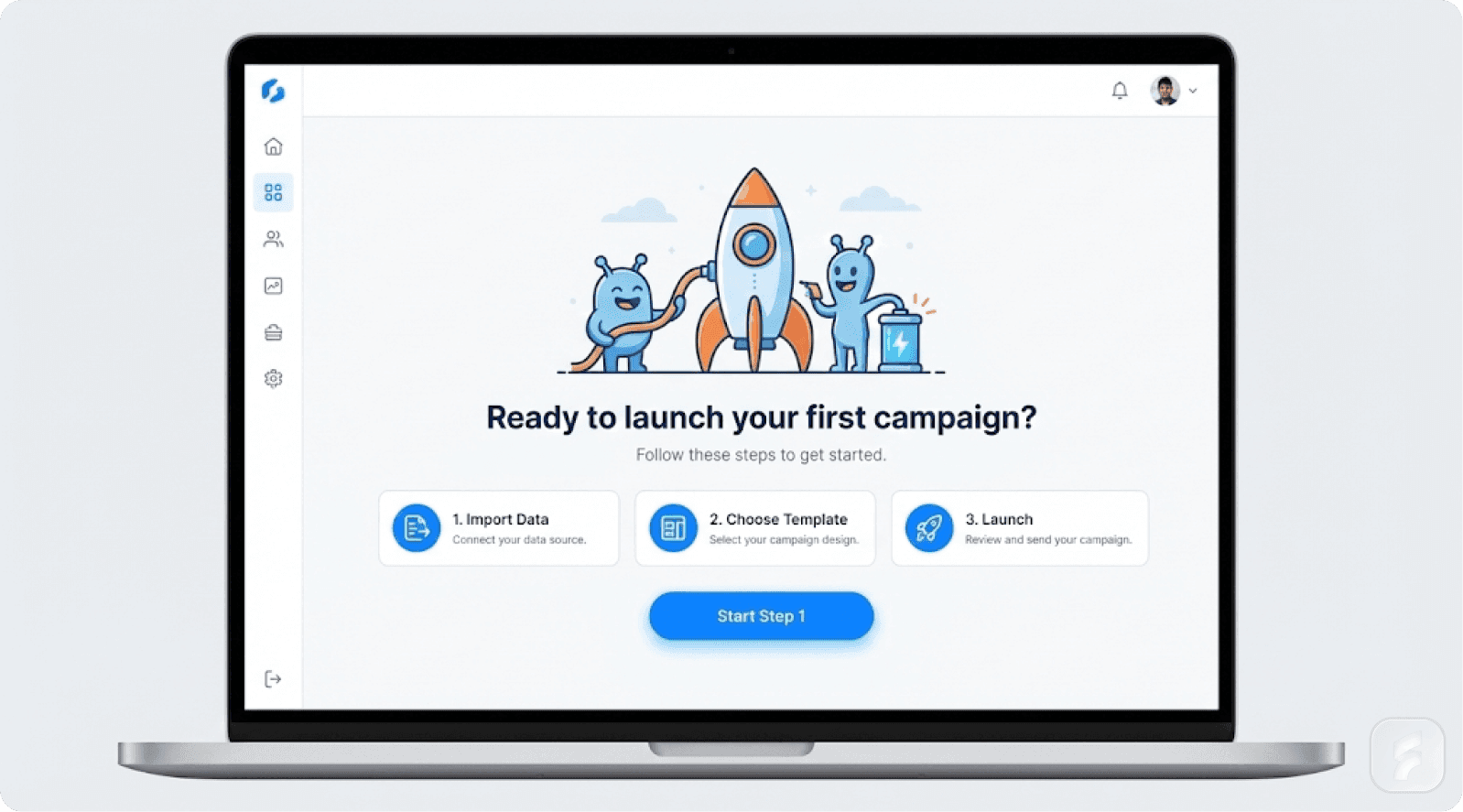
Example from Notion: Notion's empty state includes an interactive checklist with items users can check off as they go, building a sense of progress and direction.
BJ Fogg's Behavior Model demonstrates that motivation increases when users perceive progress toward a goal. Companies using onboarding checklists see activation rates of 40%+, far above the industry norm of 25-30%—a 60% improvement from a simple design pattern.
Micro-Summary: The What-Why-Next framework systematically eliminates activation friction by providing context, motivation, and direction—all critical factors in reducing early-stage churn.
Real-World SaaS Examples
Slack: The Playful Powerhouse
Slack's empty workspace redesign is often cited as one of the best examples of empty state design. When you create a new workspace, you see:
Friendly copy ("Welcome to your workspace!")
Cute illustrations that humanize the experience
Clear next steps
Helpful tips scattered throughout empty spaces
By filling empty states with guidance and personality, Slack transformed potential drop-off points into deeper engagement moments. UX designer Mahmuda Akter reported a 47% increase in signup-to-setup conversion after applying similar principles to a wellness SaaS app.
Notion: Demo Content as Onboarding
Instead of showing a blank page, Notion fills empty states with:
Pre-populated templates
Interactive checklists
Demo databases users can explore
Educational content that doubles as starter content
This approach:
Demonstrates value immediately
Provides interactive onboarding
Reduces anxiety
Accelerates time-to-value
Alistair Croll notes: "Demo content eliminates the 'cold start' problem. Users see possibilities before they create their first item."
Pinterest: Personalization Eliminates Emptiness
Pinterest solved the empty state problem by eliminating it through personalization. They:
Ask about interests during signup
Auto-populate boards with relevant pins
Suggest relevant boards to follow
Instead of facing an empty canvas, users instantly see a personalized space that feels like "their Pinterest." Segment's research shows personalized experiences can increase engagement by 60% or more.
Duolingo: Gamification Drives Engagement
Duolingo transformed empty states into engagement moments by applying gamification. When users reach the end of lessons, Duolingo shows:
Progress celebrations
Streak counters
Motivational quotes
Bonus opportunities
Yu-kai Chou explains:
"Empty states are perfect opportunities for positive reinforcement. They're natural pause points where motivation needs replenishment."
Research shows Duolingo's gamified design elements significantly increase user persistence.
Micro-Summary: Leading SaaS companies treat empty states as strategic activation opportunities through personality (Slack), demo content (Notion), personalization (Pinterest), and gamification (Duolingo).
Empty State Design Templates
Template 1: First-Use Empty State
Visual Element: Relevant illustration or icon
Headline: "You haven't [specific action] yet"
Subheading: "[Action] helps you [specific benefit]. It's a great way to [secondary benefit]."
Primary CTA: "Create your [item]" or "Get Started"
Secondary Option: "Learn more about this feature" or "See examples"
Applied Example - Project Management:
Illustration of person with clipboard
Headline: "Your first project starts here"
Subheading: "Projects help you organize tasks, set deadlines, and collaborate with your team in one place"
CTA: "Create your first project"
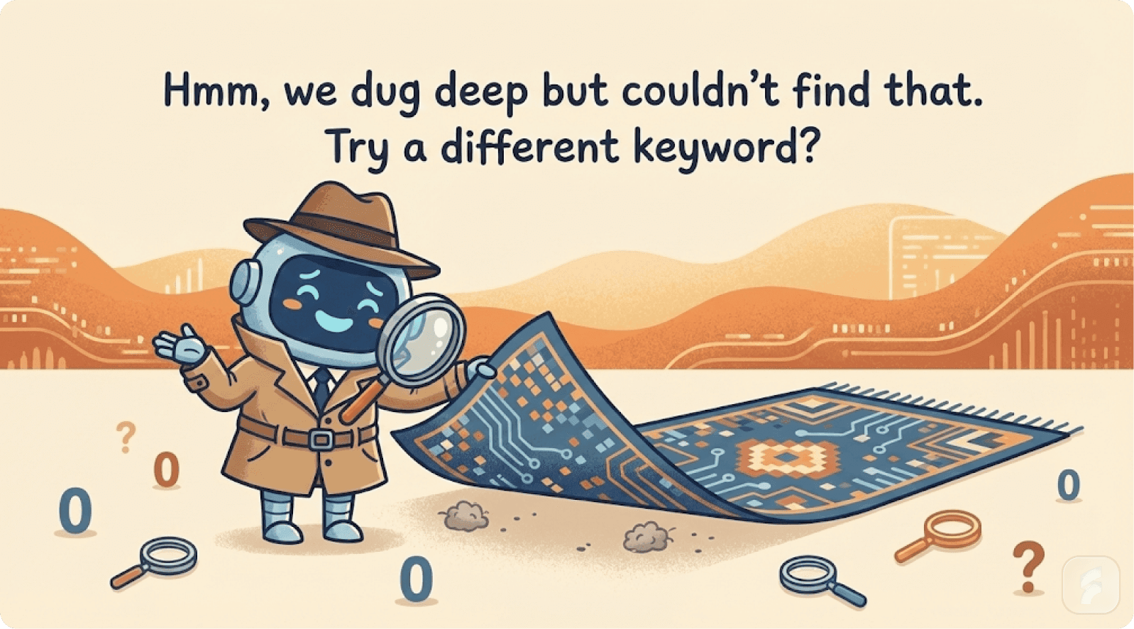
Template 2: No Search Results Empty State
Visual Element: Empty magnifying glass or search icon
Headline: "No results for '[search term]'"
Suggestion: "Try adjusting your [filters/search terms/date range]"
Alternatives: "Popular searches: [suggestions]" or "Explore [categories]"
Secondary Action: "Create a new [item] with this name"
The Baymard Institute's research shows 67% of users who encounter zero search results will immediately leave unless provided clear alternatives.
Template 3: Completed Action Empty State
Visual Element: Celebration illustration or icon
Headline: "You're all caught up!"
Acknowledgment: "You've [specific achievement]. Here's what you could do next:"
Next Actions: Multiple enticing options like:
"Try [related feature]"
"Invite [collaborators]"
Gamification elements
Peak-end rule research shows experiences are judged by their peak moments and endings—making completion empty states critical for overall satisfaction.
Template 4: Feature-Specific Empty State
Visual Element: Educative or demo content
Title: "Here's what [feature] looks like when it's in use"
Demo Content: Interactive examples like sample databases or templates to try
Checklist: List of actions to try
Explanation: "Interact with these examples to see how [feature] works. You can modify them or delete them anytime."
Primary CTA: "Create your own [feature]"
Micro-Summary: These templates provide actionable frameworks for common empty state scenarios, each implementing the What-Why-Next framework while adapting to specific user contexts.
Implementation Best Practices
Design Principles
1. Clarity Over Cleverness
While personality is valuable, clarity must come first. Users should understand why the screen is empty and what to do next in under 10 seconds. Steve Krug's principle "Don't Make Me Think" applies perfectly.
2. Match Tone to Moment
First-use states should feel welcoming and educational. Completion states should feel celebratory. Error states should feel helpful and solution-oriented.
3. Provide Graduated Clarity
Use information hierarchy—primary message (why empty), secondary message (what it's for), tertiary option (how to proceed). Don't overwhelm users with text walls.
4. Avoid Jargon
"You haven't created any projects yet" beats "No project instantiation detected." Plain language reduces cognitive load and builds trust.
5. Make CTAs Obvious
Use action verbs describing the outcome. "Create a project" is clear; "Initialize" is jargon; "Get started" is vague.
Testing and Iteration
Key metrics to track:
Activation rate: 40%+ of new users completing suggested action (UXCam benchmark)
Time-to-value: Under 5 minutes from signup to first "aha moment" (Exec research)
Feature discovery: 60%+ exploration rates indicate effective guidance
Session duration: Longer sessions suggest successful activation
A/B test systematically:
Different CTA text
With/without illustrations
Varying tone
Different next actions
Teams running consistent tests see 15-20% improvement in activation over 6 months.
Common Pitfalls to Avoid
❌ Leaving empty states completely blank - Creates anxiety and abandonment ✅ Always provide context, value explanation, and next steps
❌ Overloading with information - Users scan, they don't read ✅ Use 1-2 sentences maximum for main message
❌ Using generic messaging - "No data found" is unhelpful ✅ Personalize based on user segment or action
❌ Making next action unclear - Subtle links get ignored ✅ Use prominent buttons with clear, action-oriented text
❌ Ignoring emotional dimension - Empty states trigger emotions ✅ Design for welcoming, celebratory, or helpful tones based on context
Micro-Summary: Effective implementation requires clarity over cleverness, tone matching, graduated information hierarchy, plain language, and obvious CTAs. Test systematically and avoid common pitfalls.
Revenue Impact—The Numbers
Activation and Retention Metrics
Let's quantify what good empty state design means for your business.
Scenario: SaaS company with 1,000 monthly signups
Industry baseline: 25-30% activation rate
250-300 activated users per month
700-750 users churned due to poor onboarding
After empty state optimization: 40% activation rate
400 activated users per month
150 additional users retained
The Revenue Calculation
Revenue impact at $100/month ARPU:
150 additional activated users × $100 × 12 months = $180,000 annual recurring revenue
This represents pure incremental revenue from empty state design improvements alone.
Over a full year across 12 cohorts: 1,800 additional activated users = $2.16 million in incremental ARR
Jason Lemkin notes: "Small improvements in activation rates have exponential revenue impact because they compound monthly with new cohorts."
Churn Reduction Impact
Research shows personalized onboarding and clear empty states can reduce churn by up to 25%.
Scenario: 100-user cohort with 5% monthly churn
Baseline: 5 users churned per month
After improvement: 3.75 users churned (25% reduction)
Result: 1.25 additional users retained per month per cohort
Across 12 cohorts annually: 180+ additional retained users per year
Long-term LTV Impact
Early-activated users have 30-40% higher lifetime value than disengaged users (Stripe research) because they:
Adopt more features
Renew at higher rates
Generate referral revenue
Provide better feedback
At $1,200 annual contract value, a 35% LTV improvement = $420 additional value per activated user
150 additional activated users × $420 = $63,000 in additional lifetime value per monthly cohort
Better activation also improves CAC payback from 12-18 months to 8-12 months (33% improvement), enabling faster growth. SaaS Capital research shows companies with sub-12-month payback periods grow 30-50% faster.
The Bottom Line: Empty state optimization delivers measurable financial returns—60% improvement in activation, 25% churn reduction, hundreds of thousands to millions in incremental ARR, and 30-40% higher customer lifetime value.
Micro-Summary: Empty state optimization delivers measurable returns through improved activation (60% increase), reduced churn (25% decrease), and higher LTV (30-40% increase)—translating to substantial incremental ARR.
Next Steps for Implementation
For Product Managers and Designers
1. Audit your empty states:
Map where they occur
Identify which have highest traffic
Determine what percentage of new users encounter each
If you need professional help with this process, consider our UX audit services to identify optimization opportunities.
2. Prioritize high-impact moments:
Focus first on first-use empty states (highest churn risk)
Address top 3 features (highest volume)
Optimize search result pages
3. Apply the What-Why-Next framework:
For each priority empty state, write clear explanations (What)
Define benefits (Why)
Create actionable next steps (Next)
4. Design with personality:
Add illustrations
Use friendly copy
Apply appropriate tone that makes users feel welcomed
Julie Zhuo advises: "Personality in empty states transforms technical moments into human conversations."
5. Test and iterate:
A/B test changes
Measure activation rates, session duration, and feature adoption
Run tests for 2-4 weeks minimum
6. Scale across the product:
Once proven successful, systematize the approach
Create design system components
Document standards
Our product design team can help you implement these frameworks systematically across your entire product.
For Leadership and Growth Teams
1. Recognize empty states as retention levers:
Reframe in financial terms—each poorly designed empty state represents X% churn increase = $Y in lost ARR.
2. Invest in onboarding metrics:
Track activation rate, time-to-value, and early churn. Insight Partners shows SaaS companies with strong onboarding metrics grow 3-5x faster.
3. Prioritize in roadmap:
If struggling with activation or early churn, make empty state optimization a Q1 or Q2 priority with dedicated resources.
4. Build a culture of "first impressions matter":
Incorporate empty state reviews into product development processes.
For Individual Designers
1. Study the examples:
Learn from Slack, Notion, Duolingo, and Dropbox. Reverse-engineer their patterns.
2. Apply the templates:
Adapt the frameworks to your specific use cases while maintaining structural elements.
3. Advocate with data:
Show business impact using the numbers in this guide. Create one-page briefs showing:
Current activation
Projected improvement
Revenue impact
Timeline
4. Measure your impact:
Track before and after metrics. Document wins and present results to leadership.
Jared Spool emphasizes: "UX designers who quantify impact in business metrics gain 10x more influence in product decisions."
Micro-Summary: Successful implementation requires systematic audit, strategic prioritization, framework application, testing, and scaling. Different roles have different focuses—metrics for PMs, revenue recognition for leaders, and data advocacy for individual practitioners.
Conclusion: From Blank Spaces to Engagement Goldmines
Empty states are critical decision points where users form opinions about your product, decide whether to explore further, or exit to a competitor.
The research is clear: most apps lose 80% of users within the first week, with poor onboarding and confusing empty states as key culprits. But companies that invest in thoughtful empty state design see measurable improvements in activation, retention, and revenue.
Paul Graham writes: "The best startups obsess over every detail of the user experience, especially the moments others ignore."
Empty states are those ignored moments.
The Framework is Simple
What? Why? Next?
What? Explain why the space is empty and what it's for
Why? Connect it to user value and benefits
Next? Provide a clear, actionable next step
When you apply this framework—borrowing playful personality from Slack, educative content from Notion, personalization from Pinterest, and gamification from Duolingo—empty states transform from abandonment traps into activation opportunities.
The Competitive Advantage
The businesses that win in 2025 and beyond won't be the ones with the flashiest dashboards or most features. They'll be the ones that obsess over every moment a user encounters their product, including the moments that seem empty.
Because empty states aren't empty. They're where retention quietly begins. They're where first impressions crystallize. They're where users decide whether your product is worth their time.
Your Action Plan
Start today:
Audit one empty state in your product
Apply the What-Why-Next framework
Measure the impact on activation and retention
Scale to other empty states based on results
The revenue is waiting. The users are deciding. The empty states are either working for you or against you.
Make them work for you.
Ready to transform your product's empty states into activation opportunities? Explore our UX services or read more insights on our blog.
Glossary: Key Terms in Empty State Design
Activation Friction: The resistance users experience when attempting to complete initial product actions. Higher friction correlates with lower activation rates.
Activation Rate: The percentage of new users who complete core product actions within a defined timeframe (typically 7 days). Industry average is 25-30%; best-in-class is 40%+.
Cognitive Load: The mental effort required to process information and make decisions. Effective empty states minimize cognitive load through clarity and simplicity.
Decision Paralysis: A state where too many options or unclear choices prevent users from taking action. Also known as "analysis paralysis" or "choice overload."
Empty State: A screen or section of an interface that contains no user-generated content, search results, or data. Critical moments for user activation and retention.
Feature Blindness: When users avoid or overlook product features due to initial confusion or unclear value proposition, even if those features would be valuable.
Information Hierarchy: The arrangement of content elements to reflect their importance and guide user attention. Effective empty states use clear visual hierarchy.
Interaction Cost: The sum of mental and physical effort required to accomplish a goal. Lower interaction cost improves user experience and activation.
Learned Helplessness: A psychological state where repeated failure to find clear paths forward causes users to stop trying and assume the product isn't for them.
Mental Model: A user's understanding of how a system works based on prior experience and current interface cues. Empty states help shape accurate mental models.
Onboarding: The process of guiding new users to their first meaningful product interaction. Empty states are critical onboarding touchpoints.
Progressive Disclosure: A design technique that reveals information gradually, reducing initial cognitive load. Often used in complex empty state scenarios.
Time-to-Value: The duration from signup to first meaningful product benefit. Reducing time-to-value improves activation and retention significantly.
User Activation: The moment when a user completes core actions that indicate product understanding and commitment. Key milestone in user journey.
Usability Debt: The accumulated cost of poor UX decisions that create friction and confusion over time. Poorly designed empty states contribute significantly to usability debt.
References and Authoritative Sources
This guide draws on research and frameworks from:
Research Institutions:
Nielsen Norman Group - Usability research and UX heuristics
Baymard Institute - E-commerce and UX research
MIT Human-Computer Interaction Lab - Interface design research
Business Research:
Bain & Company - Customer retention and loyalty research
McKinsey & Company - Product adoption and feature utilization
Salesforce Research - Personalization and customer experience
Insight Partners - SaaS metrics and growth research
SaaS Capital - SaaS financial metrics and benchmarks
Product Analytics:
UXCam - Product analytics and onboarding research
LogRocket - UX design and empty state analysis
Userpilot - SaaS onboarding and activation patterns
UserGuiding - User onboarding teardowns and analysis
Amplitude - Product analytics and activation metrics
Segment - Personalization and user engagement
SaaS Resources:
Stripe Research - SaaS churn and retention research
Y Combinator - Startup growth and user experience
ProductLed Institute - Product-led growth frameworks
Procreator Design - UX strategy and retention optimization
Smashing Magazine - Web design and user onboarding
UX Planet - User experience design patterns