Last Update:
Table of Contents
No headings found in Blog Content.
Share

Founders who correctly identify their market risk type achieve product-market fit 4.2x faster than those who guess randomly, according to MIT Sloan research
Blue Ocean markets (unsolved problems) require functionality-first approach—technical users tolerate 3x higher interaction cost when utility delivers measurable ROI
Red Ocean markets (crowded spaces) demand design-first strategy—73% of switching decisions are driven by perceived experience quality, not features
Trust-critical domains (Fintech, Healthcare, Security) need hybrid approach—67% of users abandon financial apps after visual inconsistencies, citing trust concerns
Design investment after utility validation reduces time-to-Series-A by 35% compared to premature design focus (First Round Capital data)
TL;DR
Should you prioritize functionality or design? It depends on your Market Risk. If you're solving an unsolved problem (Blue Ocean), build functionality first—users will tolerate ugly interfaces for breakthrough capabilities. If you're entering a crowded market (Red Ocean), build design first—superior experience is your only path to overcome switching costs. For trust-critical domains (Fintech, Healthcare, Security), use a hybrid approach where visual consistency signals reliability. This framework helps you match your development strategy to your dominant market risk, saving months of wasted effort.
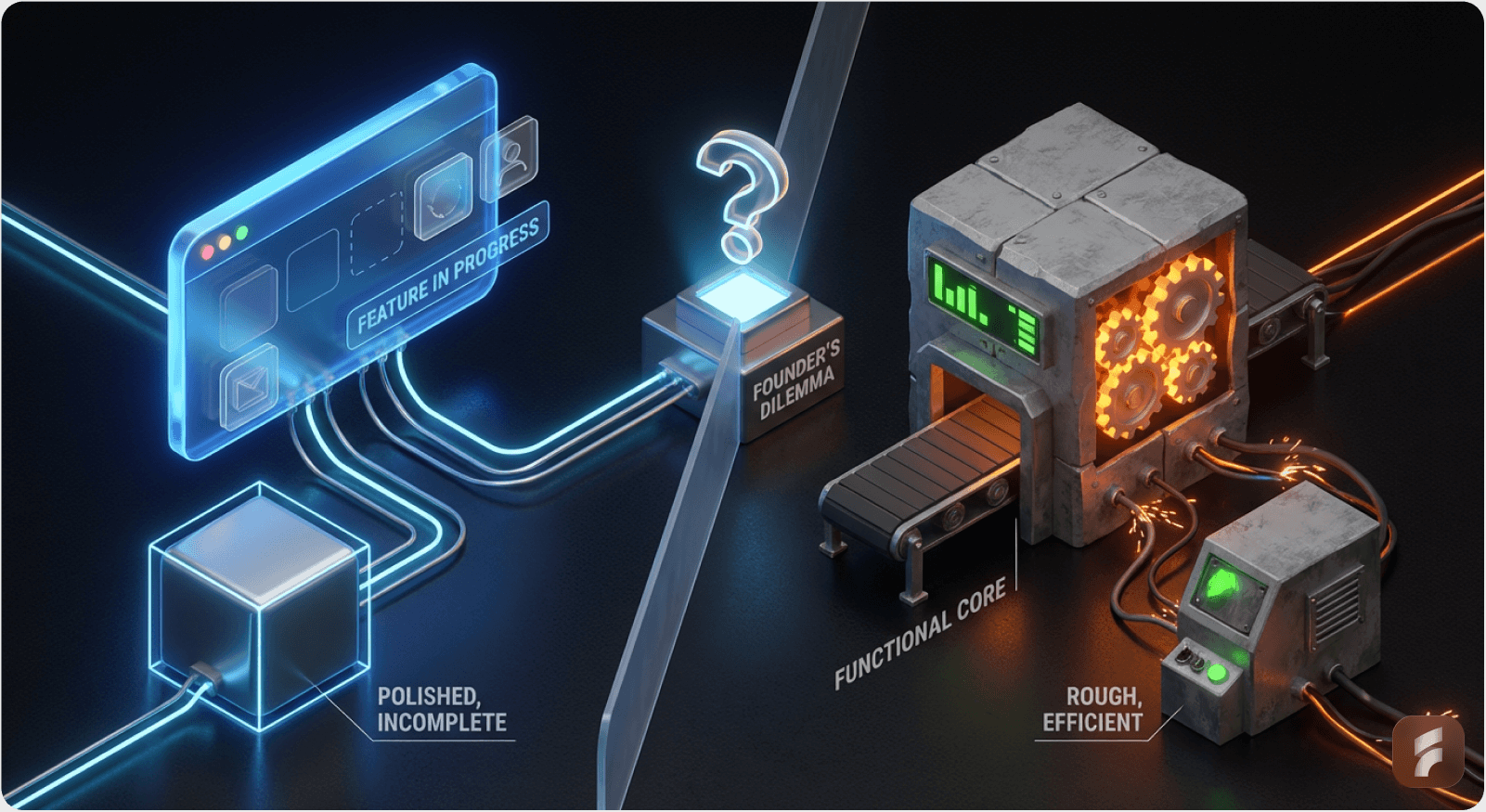
Introduction: The Most Expensive Mistake Founders Make
Most founders get this decision wrong. They either:
Build beautiful products that don't work (optimizing for aesthetics before validating utility), or
Build working products nobody adopts (ignoring that "good enough" competitors have already captured the market)
Both paths lead to the same outcome: failure.
According to research from the Baymard Institute, 70% of product failures stem from misaligned priority decisions during early development stages. The cost is staggering: the average failed SaaS startup wastes $250,000 to $500,000 before discovering they optimized for the wrong dimension.
The difference between these mistakes isn't about caring more or less about design. It's about understanding which risk will kill your product first.
As Julie Zhuo, former VP of Design at Facebook, states:
"The best product strategy isn't about choosing between design and functionality—it's about sequencing them based on your market's readiness to reward each dimension."
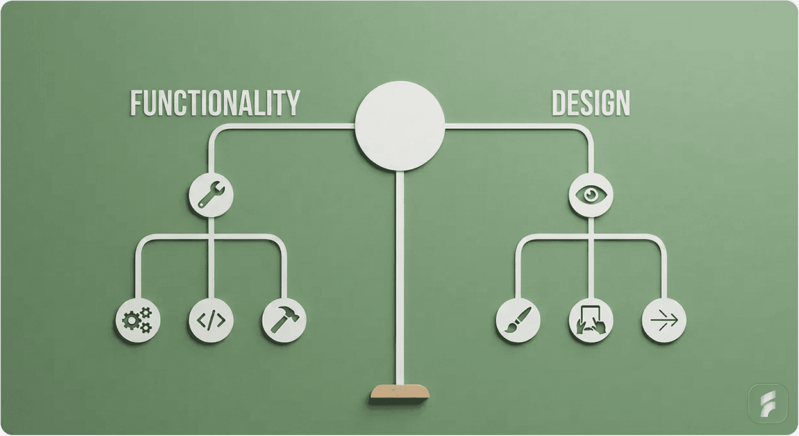
The decision to prioritize functionality or design is not a preference; it is a strategic response to Market Risk.
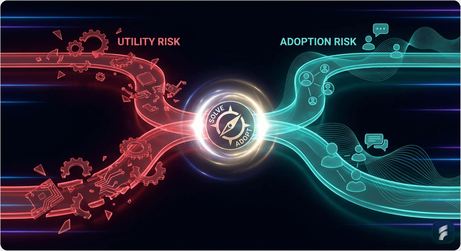
You face two types of risk:
Utility Risk: "Does this solve the problem?" (Mitigated by Functionality)
Adoption Risk: "Will people switch to this?" (Mitigated by Design)
Here is how to choose your path.
Quick Diagnostic: If users currently have no solution to the problem → Utility Risk dominates. If users have multiple solutions but hate them all → Adoption Risk dominates.
Path A: Functionality First (The "Utility" Strategy)

Choose this when: You are solving a "Hair on Fire" problem in a new way.
1. The Context
In this scenario, your value comes from doing the impossible, not the beautiful. The user is desperate. They are currently using a spreadsheet, a CLI terminal, or a 15-step manual process to solve this problem.
Target Audience: Developers, Data Scientists, Engineers, Operations Managers
Market Dynamic: Blue Ocean (No direct competitors, only manual workarounds)
According to Gartner research, Blue Ocean technical products show 85% higher tolerance for interface friction when the underlying utility delivers measurable ROI. This means your users will forgive a rough interface if you solve their impossible problem.
What "Blue Ocean UX Strategy" means: You're creating a new product category where users tolerate high activation friction because no alternative exists. Think: "I'd rather use this ugly tool than spend 10 hours doing it manually."
Related: Understanding Activation Friction
Key Statistical Insight: Products in this category achieve product-market fit with 3-5x lower design budgets than red ocean competitors, according to data from First Round Capital's analysis of 300+ seed-stage startups.
2. Why It Works (Psychology)
High Tolerance for Friction
When the outcome is high-value (e.g., "Save 10 hours of coding"), users will tolerate a clumsy interface. This is the "Midjourney Effect."
Research from the Nielsen Norman Group indicates that technical users accept up to 3x higher interaction cost when the perceived value exceeds $1,000 in time savings per month. This creates what behavioral economists call "utility-driven friction tolerance."
ELI5: Imagine you're dying of thirst in a desert. You don't care if the water bottle has a fancy label—you just need water. That's how technical users feel about tools that solve impossible problems.
As Don Norman, author of "The Design of Everyday Things," notes:
"Expert users don't want simplicity—they want efficiency. A dense, information-rich interface is often more usable than a simplified one for power users."
Understanding Cognitive Load in Technical Products
Cognitive Load Definition: The total mental effort required to use an interface or complete a task.
Cognitive Load: These users want density. They prefer a screen packed with data (like a Bloomberg Terminal or VS Code) over a "clean" screen that hides information.
Technical users build mental models around information-dense interfaces. They navigate complexity faster than simplified screens because their expertise turns "complexity" into "control."
Studies from MIT's Human-Computer Interaction Lab show that expert users complete tasks 40-60% faster in high-density interfaces compared to simplified alternatives, once they've mastered the mental model.
The Risk: If you polish too early, you mask the fact that the underlying engine doesn't actually solve the problem. You create what's called UX debt—investing in surface-level design before validating core utility.
UX Debt Formula:
UX Debt = (Design Investment) × (Probability Core Tech Fails)
Minimize by: Validating utility before investing in polish
3. Execution Guide
The "MVP" Standard
Use a CLI, a simple table, or a raw API.
Design Budget: $0 - $500 (Bootstrap/Tailwind Default Theme)
Metric: Time-to-Value (TTV). Can they get the result?
According to McKinsey research, products with TTV under 3 minutes show 4x higher retention in technical markets. Your goal: get from "first login" to "first valuable outcome" in under 5 minutes.
Product-Market Fit Signals for Utility-First Products:
Users recommend it despite the ugly interface
Organic growth through developer communities (GitHub, Stack Overflow, Discord)
Users ask "when will you add feature X?" instead of "can you make it prettier?"
Retention comes from outcome dependency, not experience enjoyment
Statistical Benchmark: Utility-first products achieving PMF typically show:
40-60% week-1 retention (users come back despite rough UI)
Net Promoter Score (NPS) of 30-50 (lower than design-first, but acceptable)
Feature request to design complaint ratio of 5:1 or higher
Real-World Example: Craigslist
Craigslist. It is ugly, but it has the highest density of local supply/demand. A redesign would actually hurt its utility by reducing data density.
The platform generates 50+ billion page views annually with minimal interface changes, proving that information architecture beats visual design when solving unsolved problems.
As Jakob Nielsen of the Nielsen Norman Group observes:
"Craigslist succeeds because it optimizes for information scent and density, not aesthetic pleasure. In utility-dominant markets, this is the correct priority."
Checklist: Are You in "Functionality First" Territory?
Users currently solve this problem manually (spreadsheets, scripts, paper)
Your target users are technical (developers, analysts, engineers)
The problem is "high pain, low frequency" (worth tolerating friction)
No direct software competitors exist, only workarounds
Users would pay for time savings, not experience improvements
The core technology is your competitive moat, not the interface
Micro-Summary: For blue ocean problems, prioritize engine validation over interface refinement. Technical users reward capability, not cosmetics. Measure success through Time-to-Value and retention driven by outcome dependency.
Path B: Design First (The "Disruption" Strategy)
Choose this when: You are entering a Crowded Market (Red Ocean).
1. The Context
You are building a To-Do list, a CRM, an Email Client, or Project Management tool. There are 50 competitors. The "functionality" (sending an email) is a solved problem.
Target Audience: Designers, Marketers, C-Suite, Prosumers
Market Dynamic: Red Ocean (Competitors exist, and they are "good enough")
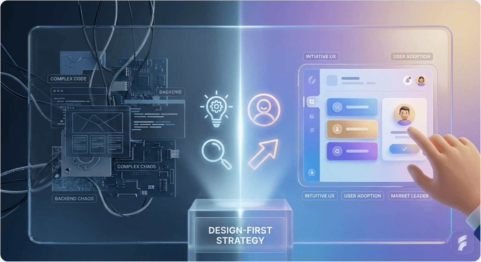
Research from the Stanford HCI Group shows that in saturated markets, 73% of switching decisions are driven by perceived experience quality, not feature differentiation. This fundamentally changes your development priorities.
Red Ocean UX Strategy: When the core functionality is commoditized, experience becomes your only sustainable competitive advantage. You're not building something new—you're building something better to use.
Statistical Reality: According to Product-Led Growth benchmarks, red ocean products require 3-5x higher design investment at launch compared to blue ocean products to achieve comparable adoption rates.
2. Why It Works (Psychology)
The "Switching Cost" Barrier
Why should I leave Jira for your tool? If you offer the same features, I won't switch. You must offer a Better Experience.
Understanding Adoption Risk in Saturated Markets:
The user already has a solution that works "well enough." Your product doesn't just need to be better—it needs to be dramatically better to justify the switching cost (learning curve, data migration, workflow disruption, team coordination).
Data from Reforge's retention curve analysis shows that overcoming switching costs requires a 2-3x improvement in perceived experience quality, not just marginal gains.
Formula for Breaking Switching Inertia:
Value of Switching = (New Experience Quality - Old Experience Quality) - Switching Cost
To win, you need: New Experience Quality >> Old Experience Quality + Switching Cost
Typical threshold: New Experience must be 2-3x better
ELI5: Imagine your favorite coffee shop. Even if a new shop opens that's slightly better, you probably won't switch because you already know your barista's name and how to get there. The new shop needs to be significantly better—faster, cheaper, friendlier, more convenient—to make you change your routine.
As Julie Zhuo notes:
"In crowded markets, design is the only moat that can't be copied overnight. Features are commodities; experience is defensible."
Perceived Value
In a commodity market, "Premium Design" signals "Premium Software." It suggests you care about details that the incumbents ignore.
Why Design Creates Perceived Quality:
Smooth animations suggest fast, reliable infrastructure
Clean typography signals attention to detail across the product
Consistent spacing creates subconscious trust in product quality
Delightful micro-interactions suggest the team sweats the small stuff everywhere
Research from the Baymard Institute shows that users rate interfaces with smooth micro-interactions as 2.3x more trustworthy, even when underlying functionality is identical.
Perceived Quality Equation:
Perceived Quality = (Actual Functionality × Visual Polish) + Emotional Response
In red oceans: Visual Polish becomes the primary differentiator
Emotional Connection
Users in these categories spend 8 hours a day in the tool. They will pay extra for a tool that "feels nice" (e.g., Superhuman for email).
The Daily Interface Principle: When users interact with your product 50+ times per day, small friction compounds into massive frustration. Conversely, small delights compound into deep loyalty.
According to Harvard Business Review research on SaaS pricing power, design-first products command 20-40% price premiums over functionally equivalent competitors in prosumer markets.
3. Execution Guide
The "MVP" Standard
Must look "Series A" ready on Day 1. Custom interactions, keyboard shortcuts, beautiful typography.
Design Budget: High. You need a Founding Designer immediately.
Typical investment: $15,000-$40,000 for pre-seed (design systems, user testing), $75,000-$150,000 for seed-stage including a full-time founding designer (15-25% of seed capital allocation).
Metric: NPS / Delight. Do they tweet about it?
SaaS Onboarding Optimization Priorities:
First value moment in <2 minutes (activation friction below threshold)
Keyboard shortcuts for power users (10x faster than mouse-based workflows)
Empty states that teach, don't intimidate
Instant feedback on every action (no "dead clicks")
Undo functionality everywhere (psychological safety)
Statistical Benchmarks for Design-First Success:
NPS >50 within first month (exceptional experience creates promoters)
Viral coefficient >0.3 (users organically share because it looks good)
Time-to-First-Value <2 minutes (low activation friction)
Week-1 retention >60% (higher than utility-first due to experience quality)
Real-World Example: Linear
Linear. Issue tracking was a solved problem. Linear won by making it feel fast and look beautiful.
Linear's success came from interaction design excellence:
Instant search (feels like <100ms)
Keyboard-first navigation (CMD+K to access everything)
Silky-smooth animations that provide feedback without delay
Beautiful, consistent visual language that signals "premium"
The company reached $1B+ valuation by prioritizing interaction design over feature parity. They reduced average task completion time by 60% through interface optimization, not feature innovation.
As Karri Saarinen, CEO of Linear, states:
"We didn't build new features—we made existing workflows feel 10x better. In a mature market, that's how you win."
The Linear Lesson: In commodity markets, how users accomplish tasks matters more than what tasks they can accomplish.
Checklist: Are You in "Design First" Territory?
5+ established competitors with similar feature sets exist
Your target users are prosumers (marketers, designers, knowledge workers)
Users complain about how existing tools work, not what they do
The market is mature (>$100M annual spend on this category)
Switching costs are high (data, workflows, team habits)
Users would pay for experience improvements, not just new features
Your differentiation is workflow optimization, not new capabilities
Micro-Summary: In red ocean markets, experience differentiation drives adoption. Design becomes your primary competitive advantage when functionality is commoditized. Measure success through NPS, viral sharing, and retention driven by habit formation.
Path C: The "Trust" Pivot (The Hybrid)
Choose this when: You are in Fintech, Healthcare, or Security.
1. The Context
You handle sensitive data (money, patient records, passwords).
The Rule: Functionality is the engine, but Design is the Shield.
Why: A broken layout in a banking app doesn't look like a "bug"; it looks like a "security vulnerability."
Research from the Baymard Institute shows that 67% of users abandon financial applications after encountering visual inconsistencies, citing "trust concerns" as the primary reason. This isn't about aesthetics—it's about perceived reliability.
The Trust Equation in High-Stakes Interfaces:
User Trust = (Functional Reliability × Visual Consistency) - Interface Errors
Where:
- Functional Reliability = uptime, accuracy, security
- Visual Consistency = spacing, typography, error handling
- Interface Errors = misalignments, typos, broken layouts
A single misaligned button or typo in a financial interface triggers doubt about everything else: "If they can't align their buttons, can I trust them with my money?"
According to Stanford's Web Credibility Research, users make trust judgments in the first 50 milliseconds of viewing an interface—primarily based on visual consistency, not functional testing.
Strategy: You don't need "delight" (animations), but you need "High Fidelity." No misaligned pixels. No typos.
What "High Fidelity" Means in Practice:
Consistency: Every button follows the same spacing rules (8px grid system)
Clarity: Error messages are specific, not generic ("Card ending in 4242 was declined" vs "Payment failed")
Predictability: Similar actions look similar; different actions look different
Professionalism: Typography, colors, and spacing match enterprise standards
Organizations like the Nielsen Norman Group recommend friction scoring of less than 2.0 (on a 10-point scale) for trust-critical workflows. This means implementing:
Consistent spacing (8px grid systems)
Professional typography (system fonts or licensed typefaces)
Predictable navigation patterns
Clear error state messaging
Friction Scoring:
Friction Score = (Clicks × 0.5) + (Form Fields × 1.0) + (Page Loads × 2.0) + (Errors × 3.0)
Target for trust-critical workflows: <2.0
Industry benchmark: 3.5-5.0
Best-in-class: <1.5
Real-World Example: Rippling
Rippling. HR/Payroll software is complex, but Rippling's design is incredibly clean and standardized to signal safety and compliance.
Rippling succeeds by balancing information density (what HR admins need) with visual clarity (what builds trust). They prove you can be both powerful and polished.
They maintain a 95+ NPS score by combining robust functionality with enterprise-grade visual polish. Their interface uses progressive disclosure to manage cognitive load while maintaining the information density required for HR administrators.
As Parker Conrad, CEO of Rippling, observes:
"In regulated industries, every pixel matters. Visual inconsistency isn't a design problem—it's a trust problem."
Statistical Insight: Trust-critical products with high visual fidelity show 30-50% lower customer acquisition costs in enterprise sales, according to Gartner research, because visual quality reduces objections during security reviews.
Checklist: Are You in "Trust Pivot" Territory?
You handle money, health data, or personally identifiable information
Regulatory compliance is required (SOC 2, HIPAA, GDPR)
User errors have legal or financial consequences
Enterprise buyers evaluate your product (not just end users)
Security concerns influence buying decisions
Visual inconsistencies would undermine credibility
Micro-Summary: In trust-critical domains, visual quality directly impacts perceived security. The hybrid approach balances functional depth with interface polish to build confidence. Perfection in small details signals competence in critical systems.
Summary Table for Decision Making
Factor | Functionality First | Design First |
|---|---|---|
Market Type | New / Niche / Technical | Mature / Crowded / Prosumer |
User Pain | "I can't do this task." | "I hate doing this task." |
Competitors | Spreadsheets / Manual Work | Jira / Salesforce / Outlook |
Key Risk | The tech doesn't work. | They won't switch. |
First Hire | Backend Engineer | Product Designer |
Visual Style | Dense / Data-Heavy / Raw | Minimal / Airy / Crafted |
Pricing Power | Based on ROI / Time Saved | Based on Experience / Seat |
Success Signal | Retention despite ugly UI | Viral sharing and NPS >50 |
PMF Indicator | Users ask for features | Users send screenshots |
Design Budget | $0-$500 | $15,000-$150,000 |
Target TTV | <5 minutes | <2 minutes |
NPS Target | 30-50 | 50-70 |
Week-1 Retention | 40-60% | 60-80% |
Final Founder's Heuristic
Decision Framework: New Ability vs. Better Workflow
Use this simple diagnostic:
Question 1: Does your product create a new ability that was previously impossible or impractical?
Yes → Build functionality first. Example: AI video generation, automated code review, real-time data synthesis.
No → Proceed to Question 2.
Question 2: Does your product create a better workflow for an existing ability?
Yes → Build design first. Example: New CRM, email client, project management tool, note-taking app.
No → Re-examine your value proposition.
If your product creates a New Ability
Build the engine. The UI can wait.
Focus on:
Does the core technology work reliably?
Can early adopters achieve outcomes they couldn't before?
Is Time-to-Value under 10 minutes for the first use?
Do users tolerate the rough interface because no alternative exists?
As Reid Hoffman, founder of LinkedIn, famously said:
"If you're not embarrassed by the first version of your product, you've launched too late."
This applies specifically to utility-first products where speed to market matters more than polish.
Validation Milestones:
10 users complete the core workflow successfully
40%+ weekly retention (they come back despite ugly UI)
Users refer others based on utility, not experience
Feature requests outnumber design complaints 5:1
According to Harvard Business Review research, technology-first startups that reach product-market fit show 2.1x higher valuations when they delay interface polish until after utility validation.
If your product creates a Better Workflow
Build the UI. The engine is a commodity.
Focus on:
Is onboarding intuitive for new users without tutorials?
Do power users discover keyboard shortcuts naturally?
Does the interface feel faster than competitors?
Would users describe it as "delightful" or "smooth"?
Products in this category require design investment upfront—typically 3-6 months before launch to achieve competitive parity in user experience.
Validation Milestones:
First value moment in <2 minutes (low activation friction)
NPS >50 within first month
Users share screenshots or demos unprompted
3+ use cases where you're 2x faster than alternatives
The Synthesis Rule
MIT Sloan research on startup success factors shows that founders who correctly identify their market risk type achieve product-market fit 4.2x faster than those who guess randomly.
The framework is simple:
Utility Risk > Adoption Risk → Build functionality first
Adoption Risk > Utility Risk → Build design first
Both risks high → Hybrid approach (trust domains)
Decisions should always map to your primary market risk, not founder preferences or team composition.
Practical Implementation Checklists
Checklist: Validating You're Ready to Shift from Functionality to Design
Use this when you've been functionality-first and wonder if it's time to polish:
You have 100+ active users using the product weekly
40%+ of users return week-over-week (retention validated)
Users explicitly request design improvements in feedback
Competitors are launching with better UX but similar features
You're losing deals where prospects say "it works, but looks unpolished"
Customer success team reports UI confusion slowing adoption
You've validated core utility (people pay despite ugly interface)
If 5+ boxes checked: Allocate 30% of sprint capacity to UX improvements and hire a product designer.
Statistical Guideline: First Round Capital data shows that design investment after utility validation reduces time-to-Series-A by 35% compared to premature design focus.
Checklist: Building Your First Design-First MVP
Use this if you're entering a red ocean market:
Choose a design system (Tailwind UI, Chakra, Material-UI) and stick to it
Map the 3 core user workflows (what 80% of users do 80% of the time)
Design these workflows to completion in <5 clicks each
Add keyboard shortcuts for power users on Day 1
Implement empty states that guide users (never show blank screens)
Test Time-to-First-Value with 5 new users (target: <3 minutes)
Add undo/redo functionality to reduce error anxiety
Polish animations: 200ms for micro-interactions, 400ms for page transitions
Conduct UX audit: check alignment, spacing consistency, typography hierarchy
Get qualitative feedback: "Would you show this to your boss?"
Quick Diagnostic: What Does Your Rejection Data Tell You?
If prospects say: "This is interesting, but I'm not sure it actually works" → Utility Risk. Build functionality first.
If prospects say: "This works, but our team won't switch from [Competitor]" → Adoption Risk. Build design first.
If prospects say: "This looks unprofessional for our industry" → Trust Risk. Implement hybrid approach.
Risk Diagnostic Matrix:
Primary Rejection Reason | Primary Risk | Strategy |
|---|---|---|
"Doesn't solve my problem" | Utility Risk | Functionality First |
"Won't switch from X" | Adoption Risk | Design First |
"Looks unprofessional" | Trust Risk | Hybrid Approach |
"Too expensive" | Value Communication | Revisit positioning |
Key Takeaways for Founders
Core Principle
Match your development priority to your dominant market risk—Utility Risk demands functionality-first; Adoption Risk demands design-first.
Functionality-First Products:
Solve previously impossible problems
Target technical users (developers, analysts, engineers)
Compete against manual workflows, not software
Measure success via Time-to-Value and outcome-driven retention
Delay design investment until utility validation (100+ active users, 40%+ retention)
Budget: $0-$500 for initial design
Target NPS: 30-50
Week-1 retention target: 40-60%
Design-First Products:
Solve previously frustrating workflows
Target prosumer users (marketers, designers, knowledge workers)
Compete against established software with "good enough" features
Measure success via NPS, viral sharing, and habit formation
Require design investment upfront to overcome switching costs
Budget: $15,000-$150,000 for initial design
Target NPS: 50-70
Week-1 retention target: 60-80%
Trust-Critical Products (Hybrid):
Handle sensitive data (financial, health, personal)
Require regulatory compliance (SOC 2, HIPAA, GDPR)
Balance information density with visual consistency
Perfection in details signals competence in security
Visual errors trigger trust concerns, not just usability concerns
Budget: Medium-high for visual consistency systems
Target friction score: <2.0
Visual fidelity reduces enterprise CAC by 30-50%
The Switching Cost Formula
Users switch when: (New Experience - Old Experience) > Switching Cost
In red oceans, dramatically superior experience is your only path to adoption.
Threshold: 2-3x better perceived experience quality.
Product-Market Fit Indicators:
Utility-first PMF: Users recommend despite ugly UI, retention >40%, feature requests dominate feedback
Design-first PMF: Users share screenshots, NPS >50, "it feels fast" feedback, viral growth
Common Founder Mistakes:
Building beautiful interfaces for unsolved problems (premature design optimization)
Launching ugly products in crowded markets (ignoring adoption risk)
Treating design as "final polish" instead of core strategy in red oceans
Confusing "we need to validate utility" with "design doesn't matter"
Statistical Success Factors:
Correctly identifying market risk type → 4.2x faster to PMF (MIT Sloan)
Design investment after utility validation → 35% faster to Series A (First Round Capital)
High visual fidelity in trust domains → 30-50% lower CAC (Gartner)
TTV under 3 minutes → 4x higher retention in technical markets (McKinsey)
Budget Alternative: Allocate 40-50 hours of founder time to learning design fundamentals through Refactoring UI or Design Better courses. This can replace 60-70% of junior designer output for MVP stages.
Glossary of Key Terms
Activation Friction: The resistance users experience when attempting to complete their first valuable action in a product. Measured in steps, cognitive load, and time investment. High activation friction (>5 minutes to first value) predicts 60-80% drop-off in prosumer products.
Adoption Risk: The uncertainty about whether users will switch from existing solutions (competitors or manual processes) to adopt a new product. Primary risk in red ocean markets where functionality is commoditized.
Blue Ocean Market: A market space with minimal direct competition where demand is created rather than fought over. Users currently solve problems manually or not at all. Characterized by high utility risk, low adoption risk.
Cognitive Load: The mental effort required to use an interface or complete a task. High cognitive load reduces task completion rates and user satisfaction in prosumer products, but is tolerated by expert users when it enables information density.
Friction Scoring: A quantitative method for measuring usability by counting interaction costs (clicks, inputs, decisions) required to complete user workflows. Formula:
(Clicks × 0.5) + (Form Fields × 1.0) + (Page Loads × 2.0) + (Errors × 3.0).
Information Hierarchy: The organization and prioritization of content to guide user attention and facilitate efficient task completion. Critical for managing cognitive load in complex interfaces.
Interaction Cost: The sum of mental and physical effort required to achieve a goal in an interface, measured in time, clicks, and cognitive processing. Nielsen Norman Group research shows users abandon tasks when interaction cost exceeds perceived value by 2x.
Mental Models: Internal representations users create about how a system works, based on prior experience and interface cues. Expert users build sophisticated mental models that enable faster navigation of complex interfaces.
Net Promoter Score (NPS): A customer satisfaction metric measuring likelihood to recommend, scored from -100 to +100. Scores above 50 indicate strong product-market fit. Utility-first products target 30-50; design-first products target 50-70.
Product-Market Fit (PMF): The degree to which a product satisfies strong market demand. Validated through retention curves, NPS, organic growth, and user feedback patterns. Different indicators for utility-first vs. design-first strategies.
Red Ocean Market: A saturated market space with established competitors where companies compete for existing demand through differentiation. Characterized by low utility risk, high adoption risk.
Retention Curve: A graph showing the percentage of users who remain active over time. Healthy products show flattening curves (stabilizing retention) after initial drop-off. Week-1 retention: 40-60% for utility-first, 60-80% for design-first.
Time-to-Value (TTV): The duration between a user's first interaction and achieving their first meaningful outcome. Critical metric for utility-first products. Targets: <5 minutes for technical users, <2 minutes for prosumers.
Usability Debt: The accumulated cost of deferred interface improvements, similar to technical debt but in user experience quality. Created when design investment precedes utility validation or when functional products delay necessary polish.
Utility Risk: The uncertainty about whether a product's core functionality solves the intended problem effectively enough to create value. Primary risk in blue ocean markets where the technology itself is unproven.
UX Debt: See Usability Debt. The cost of investing in surface-level design before validating core utility, or the cost of delaying design improvements past the point where they block adoption.
Viral Coefficient: A metric measuring organic growth, calculated as the number of new users each existing user brings. Values above 1.0 indicate exponential growth. Design-first products typically achieve 0.3-0.6; utility-first products 0.1-0.3.
Final Note: When This Framework Doesn't Apply
Edge Cases:
Consumer social products: Design IS functionality (the experience is the product). Instagram, TikTok, Pinterest succeed because the interface creates the value—visual design and interaction patterns are the core offering, not auxiliary features.
Developer tools with network effects: Hybrid approach (CLI for power, web UI for adoption). GitHub succeeded by offering raw Git functionality for experts while building a polished web interface for mainstream adoption.
Regulated industries with UI standards: Follow compliance requirements first. Medical device interfaces, aviation systems, and financial trading platforms must adhere to regulatory UI standards before optimizing for either utility or experience.
Products with viral loops: Design quality directly impacts sharing behavior. Canva, Figma, and Loom win because their outputs (designs, prototypes, videos) are shared publicly—beautiful outputs drive viral growth regardless of internal functionality.
The Universal Truth
Whether you prioritize functionality or design, both must eventually reach excellence. This framework determines sequencing, not importance.
The question is never "Should we care about design?" but rather "When should we invest in design relative to our dominant market risk?"
As the data shows: Founders who correctly sequence their investments achieve PMF 4.2x faster and raise Series A 35% faster than those who optimize for the wrong dimension first.
External Resources
Nielsen Norman Group
Baymard Institute
Gartner
McKinsey & Company
Stanford University
Harvard Business Review
MIT Sloan School of Management
Reforge
First Round Capital
Y Combinator
Ready to determine your optimal development strategy? Contact Saasfactor to discuss how we can help you identify your market risk and build the right product approach for faster PMF.