Last Update:
Table of Contents
No headings found in Blog Content.
Share

Poor interface design in healthcare is a direct patient safety risk. Medical errors linked to EHR usability failures contribute to hundreds of thousands of preventable deaths every year in the United States.
• Healthcare UI must follow a clear priority order: safety first, workflow efficiency second, and aesthetic appeal third. Getting this sequence wrong has measurable clinical consequences.
• UI (what the user sees and touches) and UX (the full journey through the product) are distinct but interdependent disciplines. Both must be designed well for a healthcare application to work safely.
• Regulatory compliance is a design problem, not just a legal one. HIPAA, WCAG 2.1 AA, FDA 21 CFR Part 11, HL7 FHIR, and ISO 62366 all have direct implications for interface decisions.
• Reducing cognitive load is the single most impactful design principle in clinical settings. Alert fatigue, deep navigation hierarchies, and dense data layouts each contribute to avoidable errors.
• Only 11% of patient-facing health apps currently meet WCAG 2.1 AA accessibility criteria, leaving the majority of the patient population underserved by the tools meant to help them.
• Contextual inquiry in real clinical environments is the most reliable form of user research for healthcare applications. Consumer research methods do not transfer directly into clinical settings.
• AI-powered interfaces, voice documentation tools, wearable dashboards, and adaptive layouts are the four main forces changing how clinical software is designed right now.
• Biometric authentication cuts login time by 67% versus password systems, making security and clinical workflow efficiency compatible rather than competing goals.
• Investing in user research before design work starts yields a 3:1 return on investment through lower support costs, fewer errors, and faster staff adoption.
Healthcare technology is advancing at an extraordinary pace, yet the quality of software interfaces within this space continues to lag dangerously behind. A confusing EHR screen, a cluttered patient portal, or a poorly labelled medication entry field can mean the difference between a smooth clinical encounter and a life-threatening error. This guide covers everything clinicians, product teams, and designers need to know about user interface design for healthcare applications, from foundational principles to the trends currently changing the industry.
Few industries carry higher stakes than healthcare. When a user misreads a dashboard element or struggles to locate the correct data entry field under pressure, the consequences extend far beyond inconvenience. The U.S. Department of Health and Human Services estimates that medical errors cause more than 250,000 deaths annually in the United States, placing them as the third leading cause of death. A meaningful share of these errors trace directly back to poor interface design.
"Poor EHR usability is one of the leading contributors to clinician burnout and preventable errors. We cannot afford to treat interface design as an afterthought." Dr. Christine Sinsky, Vice President of Professional Satisfaction, American Medical Association |
The ECRI Institute has repeatedly flagged health IT usability failures as a top patient safety concern. A 2020 analysis in the Journal of the American Medical Informatics Association (JAMIA) found that 33% of reported health IT safety events were directly attributable to usability problems, including confusing alert designs, unclear labelling, and poor workflow integration. These figures translate into wrong-patient medication orders, missed critical alerts, and delayed diagnoses.
The global digital health market is projected to reach USD 836.75 billion by 2031, growing at a CAGR of 18.6% from 2024 (Allied Market Research, 2024). |
70% of physicians report that EHR systems reduce their efficiency, with interface friction cited as the primary cause (American Medical Association, 2023). |
Poorly designed healthcare software costs U.S. hospitals roughly USD 8.3 billion per year in wasted clinician time (Arch Collaborative / KLAS Research, 2022). |
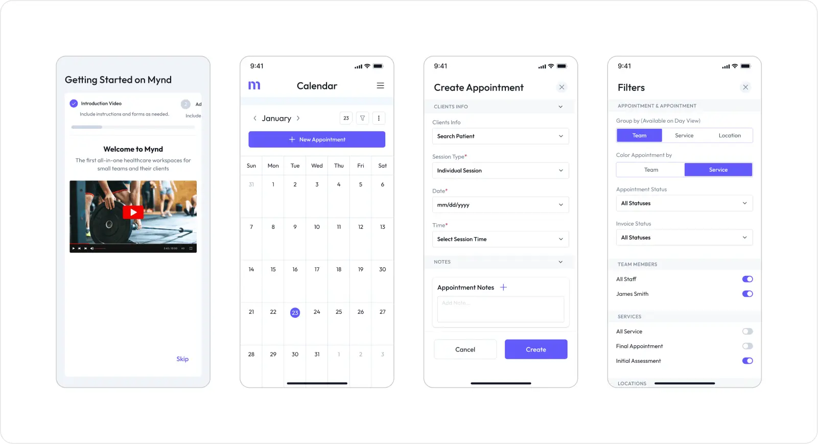
Electronic Health Record systems, telemedicine platforms, remote patient monitoring apps, and consumer-facing mobile health tools have fundamentally changed how care is delivered and recorded. The COVID-19 pandemic accelerated telehealth adoption by close to a decade. McKinsey & Company reported a 38-fold increase in telehealth use between 2019 and 2021. That kind of rapid expansion puts urgent pressure on interface quality across every digital health category.
This guide moves from foundational definitions through to the design trends gaining traction right now. Whether you are a c entering healthcare for the first time, a product manager overseeing a clinical application, or a developer working through compliance requirements, the guidance here is practical and grounded in published evidence.
What Is User Interface Design in Healthcare?
User interface design in healthcare is the deliberate, research-informed process of designing every visual and interactive element that a user encounters when working with a digital health product. That user might be a clinician, an administrator, or a patient. Unlike consumer applications where aesthetic appeal drives engagement, healthcare UI design is governed first by safety, then by workflow efficiency, and then by usability. Getting this order wrong has measurable clinical consequences.
KEY INSIGHT Healthcare UI is not just about how something looks. It is about how safely and efficiently a clinical decision can be made within it. Every design choice is a potential patient safety decision. |
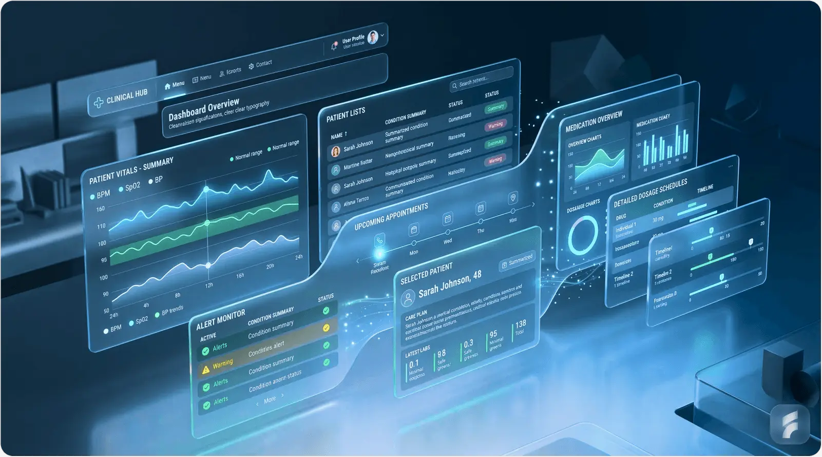
In medical contexts, user interface design covers far more than colour palettes or button placement. It governs how critical patient data is displayed, how alerts are prioritised and communicated, how clinical workflows are sequenced across screens, and how errors are blocked at the point of data entry. The scope spans Electronic Health Records, diagnostic imaging software, pharmacy dispensing systems, patient-facing portals, wearable device dashboards, and AI-powered clinical decision support tools.
Difference Between UI and UX in Healthcare Applications
UI design focuses on the specific visual components a user sees and touches: buttons, forms, typography, iconography, and layout grids. UX design & optimization covers the entire journey a user takes through a product, including their emotional state, cognitive load, and whether the product actually supports their goals. In healthcare, this distinction is clinically significant. A well-rendered UI sitting on top of a poorly designed UX will still produce dangerous workflows. Apple's design principle, that design is not just what it looks like but how it works, applies with particular force in medical software.
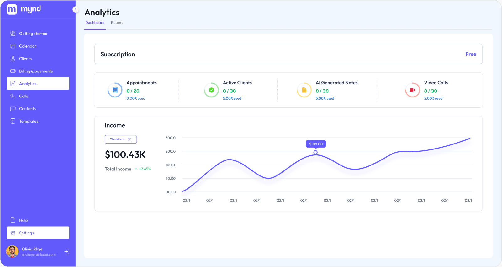
Types of Healthcare Applications
Healthcare applications cover an enormous range of use cases, each with distinct interface requirements and user populations. Understanding these categories is the first step before any design work starts.
Application Type | Primary User and Interface Challenge |
Electronic Health Records (EHR) | Clinicians who must handle dense data with minimal errors |
Telemedicine Platforms | Patients and providers working across variable levels of tech familiarity |
Remote Patient Monitoring Apps | Patients at home who need simple, alert-driven, accessible interfaces |
Patient Portals | General public who need data richness balanced with readability |
Medical Device Interfaces | Clinical specialists who need speed and strong error prevention |
Healthcare Mobile Apps | Mixed user base that must meet WCAG 2.1 and platform standards |
Each category calls for a different approach. An emergency department monitoring interface prioritises at-a-glance data interpretation and one-click alerts. A chronic disease management app used by elderly patients at home prioritises large typography, shallow navigation, and plain-language explanations of clinical data.
Why UI Design Matters in Healthcare Applications?
The consequences of healthcare UI design decisions fall across three interconnected areas: patient safety, regulatory compliance, and institutional efficiency. Treating these as separate problems is a mistake. A design that fails in one area will create failures in the others too.
Patient Safety and Error Reduction
The relationship between interface design and patient safety is well-documented. A landmark study in Applied Ergonomics found that cognitive overload caused by dense, poorly structured EHR screens was directly linked to medication dosing errors among prescribing nurses. When a user must process multiple alert notifications at once, work through deep menu hierarchies, and cross-reference data from separate screens, working memory fills up and errors become almost inevitable.
"Every unnecessary click, every ambiguous label, every overlapping alert is a latent error waiting to happen. The interface is the last line of defence before a clinical mistake reaches the patient." Dr. Ross Koppel, Sociologist and Health IT Safety Researcher, University of Pennsylvania |
Alert fatigue is estimated to contribute to 33-96% of drug-drug interaction alerts being dismissed without review (JAMIA, 2019). |
EHR-related adverse drug events affect approximately 700,000 patients per year in the US, many of which could be prevented through better interface design (Agency for Healthcare Research and Quality, 2021). |
Good healthcare UI addresses these risks through clear information hierarchy, intelligent alert prioritisation, smart defaults that cut manual input, and confirmation dialogs at high-risk decision points.
Regulatory Compliance and Standards
Healthcare applications must conform to a complex set of regulatory requirements that have direct implications for interface design. In the United States, HIPAA governs how protected health information is displayed, accessed, and secured within software. At the interface level, this shapes decisions around session timeout behaviour, role-based data visibility, and audit trail presentation.
Accessibility carries equal weight. The Web Content Accessibility Guidelines (WCAG) 2.1 at Level AA set the international benchmark for accessible digital products. For healthcare, where users include elderly patients with reduced visual acuity, clinicians working under pressure, and individuals with motor impairments, AA compliance is a starting point, not a finish line.
COMPLIANCE CHECKPOINT Key standards every healthcare UI must address: HIPAA (data display and access controls), WCAG 2.1 AA (accessibility), FDA 21 CFR Part 11 (electronic records and signatures), HL7 FHIR (interoperability-driven UI data structures), and ISO 62366 (usability engineering for medical devices). |
Improving Clinical Efficiency
In a busy hospital ward, a physician may interact with an EHR system hundreds of times per shift. Each interaction that requires unnecessary navigation, produces confusing feedback, or fails to surface the right data at the right moment represents a direct cost in clinician time and mental energy. Research by Stanford Medicine found that physicians spend roughly 4.5 hours per day on EHR documentation, time that comes directly out of patient contact and feeds burnout rates now above 50% in many specialties.
Optimised UI design in EHR systems has been shown to cut documentation time by up to 40% in prospective studies (Journal of General Internal Medicine, 2022). |
Clinician burnout costs the US healthcare system an estimated USD 4.6 billion per year in turnover and reduced productivity (Mayo Clinic Proceedings, 2019). |
Workflow optimisation through better interface design, surfacing the right data at the right stage, reducing click depth, and enabling keyboard shortcuts for experienced users, delivers measurable gains in both clinician satisfaction and patient throughput.
Enhancing Patient Engagement
Patient engagement through digital health tools connects directly to clinical outcomes. A meta-analysis in the British Medical Journal found that patients who actively used digital engagement tools showed 15% better adherence to chronic disease management plans versus those receiving standard care alone. Engagement only happens when the interface is genuinely accessible to the people using it, many of whom are elderly, have low health literacy, or pick up a phone or tablet infrequently.
A Nielsen Norman Group study found that patients judge the credibility of a healthcare organisation partly through the quality and clarity of its digital interfaces. A cluttered, confusing patient portal erodes confidence in the care provider. Clean, accessible UI design is a reputational asset as much as a clinical one.
Core Principles of User Interface Design for Healthcare Applications
Good healthcare UI design is not built on aesthetic instinct. It rests on a foundation of well-established principles, each with a clear clinical rationale. These principles should inform every design decision, from initial wireframes through to production.
Simplicity and Clarity

Reducing cognitive load matters more in healthcare than in almost any other software domain. Jakob Nielsen's research on information foraging theory shows that users under time pressure, which describes nearly every clinical encounter, abandon complex information structures and look for the shortest path to their goal. Healthcare interfaces that add complexity without a clear purpose are not sophisticated. They are dangerous.
Simplicity means minimalist layouts that surface only the data relevant to the current task, clear and consistent typography (a minimum 16px body text size is recommended for clinical displays), and information hierarchies that follow established clinical reasoning: assessment before diagnosis, diagnosis before management, management before follow-up.
"Perfection is achieved, not when there is nothing more to add, but when there is nothing left to take away." Antoine de Saint-Exupery, a principle that applies directly to healthcare interface design |
Accessibility and Inclusivity
Healthcare serves the entire population, which means healthcare interfaces must serve every segment of it. The target user group for a patient-facing health application includes people aged 65 and older (16.5% of the US population and growing), people with low digital literacy, users with visual impairments, users with motor disabilities, and speakers of minority languages.
Designing for elderly users: minimum touch target sizes of 44x44px (per Apple HIG and Google Material Design guidelines), larger default font sizes (16-18px body), and less reliance on gesture-based navigation.
Colour contrast and readability: WCAG 2.1 Level AA requires a minimum contrast ratio of 4.5:1 for normal text and 3:1 for large text. Critical health status indicators should never rely on colour alone. Always pair colour with text labels or iconography.
Multilingual support: Over 25 million people in the United States have limited English proficiency. Healthcare UI that offers no language alternatives creates a direct health equity gap.
Screen reader compatibility: ARIA landmarks, semantic HTML structure, and descriptive alt text are required for any patient-facing health application.
Only 11% of patient-facing health apps currently meet all WCAG 2.1 AA accessibility criteria (Deque Systems Accessibility Benchmark Report, 2023). |
Consistency Across Platforms
A clinical user who finds a different interaction pattern on the mobile version of a medication management tool than on its desktop version must spend cognitive resources relearning. Those resources should go toward patient care. Design systems, documented libraries of standardised components, tokens, and interaction patterns, are the most reliable way to keep cross-platform experiences consistent.
Organisations including Epic, Cerner (now Oracle Health), and NHS England have invested heavily in proprietary design systems that enforce consistency across their product lines. The NHS Design System is worth studying as a public-access reference for how standardised, accessible health UI components should be documented and built.
Data Visualisation Best Practices
Healthcare data is complex by nature. Lab result trends, vital sign trajectories, medication histories, and imaging findings each need different visualisation approaches. Trying to display all available data at once is one of the most common failure modes in EHR interface design. Effective data visualisation in healthcare is selective, contextual, and always tied to a specific clinical decision.
DATA VISUALISATION PRINCIPLES FOR HEALTHCARE Display only the data relevant to the current clinical task. Use trend lines rather than raw data tables for time-series measurements. Pair numerical values with clear reference ranges, flagging abnormals and normals, but always with text labels alongside colour. Reserve charts with more than three variables for specialist analytical views, not primary clinical workflows. |
Florence Nightingale's use of the polar area diagram to visualise Crimean War mortality data in 1858 remains a landmark example of how thoughtful health data visualisation can drive life-saving decisions. The principle has not changed, only the tools have.
Error Prevention and Feedback
In healthcare software, designing to prevent errors matters far more than designing to recover from them. Once a wrong medication order has been signed, the window for prevention has closed. Donald Norman's concept of forcing functions, design elements that make incorrect actions physically or procedurally impossible, applies directly to healthcare UI: mandatory weight entry before weight-based dosing calculations, allergy verification before prescribing cross-reactive medications, patient identity confirmation before accessing or amending records.
When errors do occur, system feedback must be immediate, clear, and actionable. Vague error messages like 'An error occurred' are particularly dangerous in clinical settings where users cannot afford to troubleshoot software. Error messages should state exactly what went wrong, why it matters clinically, and what the user must do next.
Healthcare-Specific UI Challenges
Beyond general good design practice, healthcare applications face a set of challenges that are largely unique to the clinical environment. Product teams entering healthcare for the first time regularly underestimate the complexity these domain-specific constraints introduce.
Complex Medical Workflows
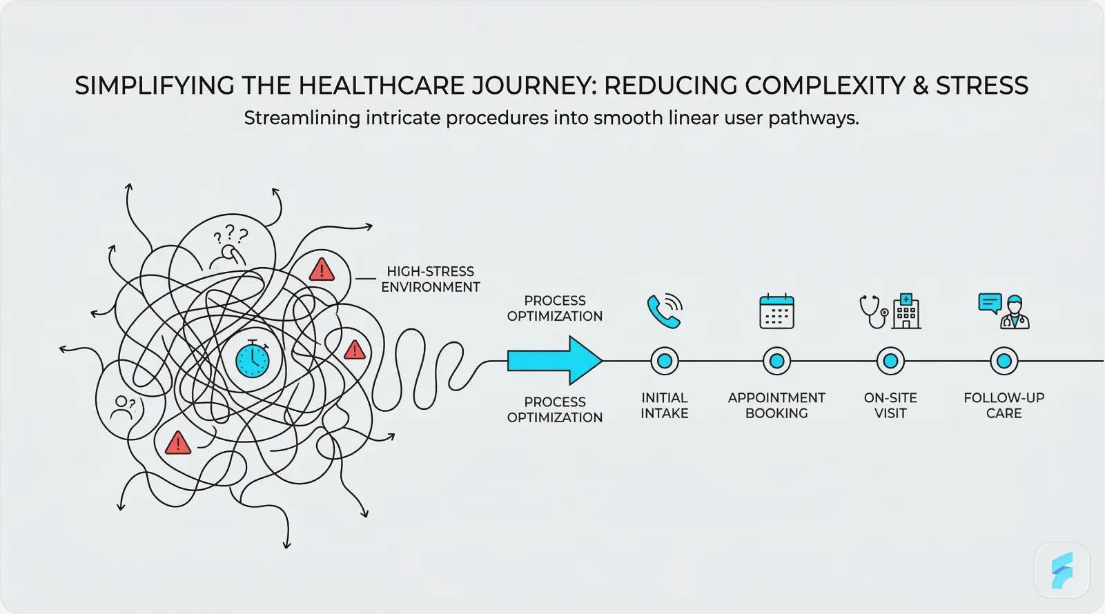
A single clinical encounter, say a GP consultation with a patient presenting with type 2 diabetes and hypertension, may involve reviewing past medication history, ordering blood tests, updating a problem list, generating a referral, and issuing a prescription, all within a 10-minute appointment window. Each of those tasks may require working through different modules within an EHR system, each with its own interface logic.
Multi-step documentation workflows need interfaces that preserve context across steps, surface relevant information at each stage without pulling users away from their primary task, and allow flexible completion so a clinician can start a referral, be interrupted by an urgent call, and pick up exactly where they left off. Progressive disclosure, showing only what is relevant to the current step while keeping additional context available, is one of the most practical tools for managing this complexity.
"The EHR was designed by engineers for billing, not by clinicians for care. Every workaround a nurse creates to get their job done is a design failure that hospital leadership should be ashamed of." Dr. Robert Wachter, Chair of Medicine, UCSF, The Digital Doctor (2015) |
High-Stress Environments
Emergency department interfaces operate under conditions that bear no resemblance to office-based clinical software. Clinicians in emergency settings make rapid, high-stakes decisions with incomplete information, frequent interruptions, and physical fatigue. Every design decision, from the size of actionable buttons to the sound characteristics of critical alerts, must be optimised for that environment.
A study in the Annals of Emergency Medicine found that ED physicians are interrupted or switch tasks an average of once every three minutes during a shift. Interface design must explicitly account for this (Annals of Emergency Medicine). |
Fast-decision interfaces for emergency settings should use high-contrast, large-target designs; apply colour coding conservatively but consistently for urgency levels; remove or minimise mandatory field completion at point-of-entry; and ensure that the most time-critical actions, such as ordering emergency medications or activating code alerts, can be reached within two taps or clicks from any screen state.
Security Without Friction
Healthcare data security requirements are among the most stringent in any industry. HIPAA requires that protected health information be secured against unauthorised access, which at the interface level means strong authentication, automatic session timeouts, and audit-logged access to patient records. The design challenge is delivering this without creating the kind of friction that interrupts clinical workflows at the worst possible moments.
Biometric authentication, fingerprint or facial recognition, is gaining ground as the preferred solution for clinical workstations. It enables fast, secure re-authentication after session timeouts without requiring clinicians to type passwords while managing a patient. A 2022 study in Applied Clinical Informatics found that biometric login cut authentication time by 67% compared to password-based systems, with clinician satisfaction scores rising by 41%.
SECURITY UX BALANCE Session timeout length is a genuine design tradeoff. Set it too short (under 5 minutes) and you create dangerous workflow interruptions in busy clinical settings. Set it too long (over 30 minutes) and you create HIPAA exposure. Best practice: implement activity-based timeouts that reset on user interaction, with biometric re-entry for locked sessions rather than a full logout cycle. |
User Interface Design Process for Healthcare Applications
Designing healthcare interfaces without a rigorous, evidence-based process is one of the most common reasons health technology products fail. A 2019 report by American EHR Partners found that 89% of physicians rated their EHR system as difficult to use, a figure that points squarely at products built without adequate user research and iterative testing. The following process framework draws from industry best practices and ISO 62366 usability engineering standards.
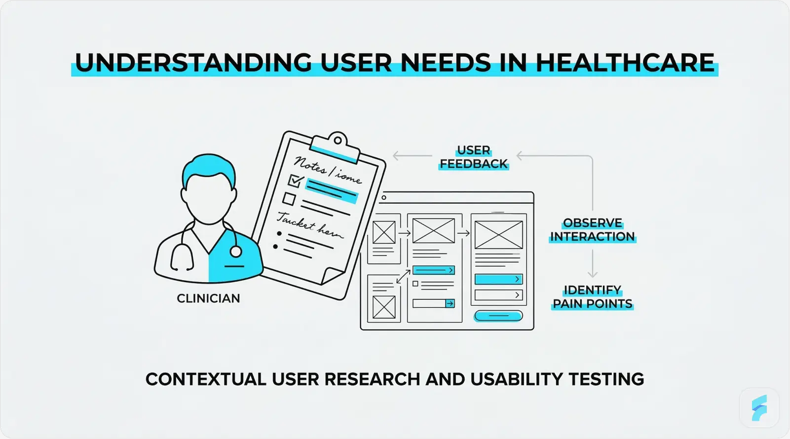
User Research in Clinical Settings
Clinical user research is fundamentally different from consumer research. Clinicians cannot step away from patient care for extended research sessions. Ethical governance applies to any research involving patient data or clinical environments. The workflow context itself, a busy ward, a dimly lit radiology reading room, a loud emergency department, is integral to understanding how the interface will actually be used.
Contextual inquiry, where the designer observes users in their actual work environment as they perform real tasks, is especially well-suited to healthcare UI research. Interviews with physicians, nurses, pharmacists, and administrative staff should aim to uncover: the most common failure points in current workflows; the data most frequently needed and hardest to access; the workarounds users have built around poor interface design; and the mental models users hold about how data is and should be organised.
Healthcare organisations that invest in formal user research before starting UI design see a 3:1 return on investment through lower support costs, fewer errors, and faster user adoption (Nielsen Norman Group, 2020). |
Wireframing and Prototyping
Low-fidelity wireframes serve a specific purpose in healthcare design: they allow clinical stakeholders to evaluate workflow logic and information architecture without the distraction of visual design choices. A wireframe review with a group of nurses will surface workflow problems far more efficiently than a polished mockup, because low fidelity invites honest critique in a way that high fidelity inhibits.
Interactive prototyping using tools such as Figma, Axure, or InVision enables task-based testing before a single line of production code is written. For healthcare applications where iterating on production software is costly and carries clinical risk, this front-loaded investment pays off. Stakeholder validation at the prototype stage should include clinical end users, IT security reviewers, and compliance officers, not only product managers and designers.
Usability Testing and Iteration
ISO 62366-1, the international standard for usability engineering in medical devices, requires documented summative usability testing as a condition of regulatory approval for many categories of medical device software. Beyond compliance, usability testing is simply the most reliable method for finding interface problems that research and design review will not catch.
Task-based usability testing scenarios in healthcare should come from real clinical workflows, not hypothetical tasks. A medication ordering test, for example, should include scenarios with weight-based dosing calculations, allergy alerts, and multi-drug combinations, the situations most likely to produce errors in actual use. A/B testing between interface variants should be used wherever sufficient usage volume exists to generate statistically meaningful results. Continuous improvement cycles embedded in the product development process ensure that post-launch findings are acted on rather than filed away.
"The best investment a health technology company can make is a usability testing lab. It will prevent patient harm, cut regulatory risk, and save millions in rework. And it costs far less than any of those alternatives." Janice (Ginny) Redish, UX Research Pioneer and Author of Letting Go of the Words |
New Developments in Healthcare Interface Design
Healthcare UI design is not a fixed field. Artificial intelligence, voice technology, connected devices, and adaptive design systems are changing what is technically possible, and what clinicians and patients will expect from digital health products over the next five years.
AI-Powered Interfaces
Artificial intelligence is moving from backend analytics into the interface layer of healthcare applications. Clinical Decision Support tools powered by machine learning are appearing within EHR interfaces as contextual recommendations, surfacing evidence-based treatment suggestions, flagging potential drug interactions, and predicting deterioration risk scores directly within the clinician's working screen.
The interface design challenge with AI-powered CDS is trust calibration. An alert from an AI system that fires too often, or that cannot explain its reasoning in plain language, will be dismissed through the same fatigue mechanisms that plague traditional rule-based alerts. IBM Watson Health's experience, where AI diagnostic recommendations failed to gain clinical adoption partly because the interface could not communicate the reasoning behind them, stands as a well-documented cautionary example.
The global AI in healthcare market is projected to reach USD 188 billion by 2030, growing at a CAGR of 37% (Grand View Research, 2023). |
AI-assisted diagnostic tools that present recommendations through explainable, well-designed interfaces show adoption rates up to 3.4 times higher than those presenting raw probability scores (NPJ Digital Medicine, 2023). |
Voice User Interfaces (VUI)
Voice-driven interfaces address one of clinical documentation's most persistent problems: the disconnect between the clinician's attention and their keyboard. Ambient clinical documentation tools, such as those built on the Nuance DAX platform, allow physicians to conduct a natural patient consultation while the system automatically generates a structured clinical note from the spoken dialogue.
The implications of voice in healthcare extend beyond documentation. Hands-free medication lookup, voice-activated equipment control in operating theatres, and patient-facing voice assistants for post-discharge care management are all active development areas. Interface design for VUI in healthcare must account for the clinical acoustic environment (background noise in ICUs can exceed 70 dB), the need for clear confirmation feedback when voice commands execute, and privacy constraints around voice data storage.
"Voice is not replacing the screen in healthcare. It is liberating the clinician from it. The doctor's eyes and hands can stay with the patient while the documentation happens around them." Dr. Lee Schwamm, Chief Digital Health Officer, Yale New Haven Health |
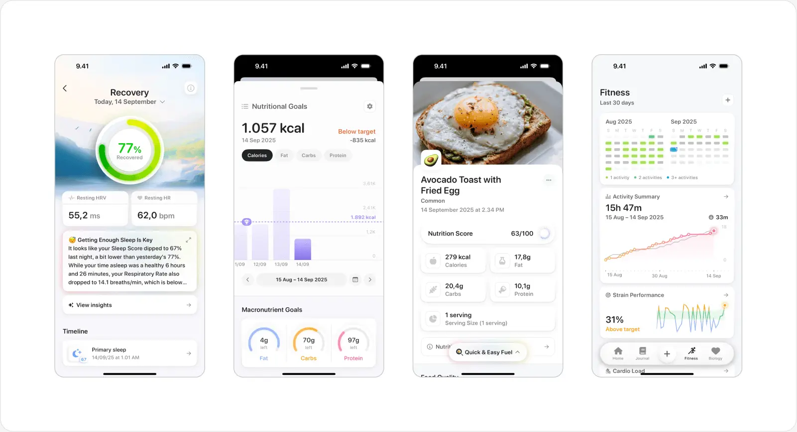
Wearable and IoT Interfaces
The spread of wearable health monitoring devices, smartwatches, continuous glucose monitors, cardiac event monitors, and remote vital sign patches, has created a new category of healthcare interface design: the real-time physiological data dashboard. These interfaces must communicate complex, continuously updating health data to users who range from highly trained clinical specialists to patients with no medical background at all.
The global wearable medical device market was valued at USD 27.2 billion in 2023 and is projected to reach USD 81.5 billion by 2031 (Fortune Business Insights, 2024). |
Smartwatch health dashboard design faces a core tension: displaying meaningful clinical information within an extremely small screen. The most effective approaches apply progressive disclosure aggressively, showing summary-level health status by default and making detailed trend data available on demand. Alert thresholds for wearable data must be set carefully to avoid false positive fatigue, and interfaces should give users clear guidance on when to seek clinical attention versus when an anomaly is within expected variation.
Dark Mode and Adaptive Interfaces
Dark mode has moved from a consumer preference to a clinical requirement in certain settings. Radiologists reading diagnostic images on high-resolution displays, intensivists monitoring patients in darkened ICUs, and emergency physicians using mobile devices in variable lighting conditions all benefit from interfaces that reduce screen brightness and the eye strain that comes with extended high-luminance use. Research methods such as eye tracking UX help designers understand how clinicians visually interact with medical interfaces in low-light environments, revealing where attention is focused and how screen brightness affects visual fatigue. A 2021 study published in Ergonomics found that dark-mode interfaces reduced eye strain symptoms by 41% among clinicians working extended shifts in low-light environments.
Context-aware adaptive interfaces take this further. An interface that automatically adjusts its layout, font sizes, and notification intensity based on the clinical environment, a quiet outpatient clinic versus a busy emergency department, a day shift versus a night shift, represents one of the more promising directions in personalised healthcare UI. Emerging standards such as the HL7 SMART on FHIR framework are making the contextual integration required for this kind of adaptability technically feasible at wider scale.
Best Practices Checklist for Healthcare UI Designers
The following checklist pulls together the core guidance from this guide into actionable design criteria. Use it as a review tool at each major stage: initial concept, wireframe completion, prototype review, and pre-launch sign-off.
Information Architecture and Layout
Information hierarchy reflects clinical reasoning sequences (assessment, diagnosis, management, follow-up)
Most-used clinical actions are reachable within 2 clicks or taps from any screen
Progressive disclosure is used to manage data density: detail on demand, not by default
Consistent navigation patterns are maintained across all modules and platform variants
Patient identity is persistently and clearly visible throughout all clinical workflow screens
Accessibility and Compliance
WCAG 2.1 Level AA contrast ratios met for all text and interactive elements
All critical health status indicators use both colour and text or icon labels
Minimum touch target size of 44x44px for all interactive elements
Screen reader compatibility tested with NVDA (Windows) and VoiceOver (macOS/iOS)
HIPAA-compliant session timeout implemented with biometric re-authentication option
Multilingual support available for patient-facing interfaces
Error Prevention and Data Safety
Forcing functions in place at all high-risk clinical decision points
Weight entry required before any weight-based dosing calculation
Patient identity confirmation required before record access or amendment
Error messages are specific, clinically meaningful, and actionable
Undo or cancel is available for all non-irreversible actions
Alert priority tiers clearly differentiated (critical, warning, informational)
Performance and Technical
Interface loads within 2 seconds on standard clinical network infrastructure
Offline functionality available for critical clinical tasks
Cross-browser and cross-device compatibility tested and documented
Design system documented and version-controlled for consistency across teams
Conclusion
User interface design for healthcare applications is not a peripheral product concern. It is a clinical discipline with direct implications for patient safety, care quality, and the long-term sustainability of healthcare systems under growing pressure. Well-designed healthcare interfaces reduce errors, reduce clinician burnout, improve patient engagement, and deliver measurable returns on investment. The data supporting each of these claims is solid and continues to grow.
The principles covered in this guide, simplicity, accessibility, consistency, thoughtful data visualisation, and rigorous error prevention, are not aspirational ideals. They are established, evidence-based standards that every healthcare product team should be accountable to. Regulatory frameworks such as ISO 62366 and FDA guidance on human factors engineering in medical devices are making this accountability increasingly formal.
The technologies changing healthcare UI right now, AI-powered decision support, voice interfaces, wearable data dashboards, and adaptive design systems, offer real opportunities to deliver care that is more precise, more personal, and more humane. Those opportunities will only be realised if the human factors work keeps pace with the technical ambition.
"The interface between a clinician and a patient's data is where technology either serves the relationship or disrupts it. Great design serves it. Poor design disrupts it. The choice is ours." Don Berwick, Former Administrator of the Centers for Medicare and Medicaid Services |
Whether you are building a patient portal for a regional health system, a clinical decision support tool for an academic medical centre, or a consumer wellness app, the principles in this guide apply. Design with the user in mind. Test with real users in real environments. Iterate without ego. And keep in mind that in healthcare, the user is not just a customer. They are a patient, a caregiver, or a clinician keeping someone alive.
References and Further Reading
American Medical Association (2023). AMA Digital Health Research: Physician's Motivations and Requirements for Clinical Decision Support.
Agency for Healthcare Research and Quality (2021). EHR-Related Adverse Drug Events. AHRQ Patient Safety Network.
Allied Market Research (2024). Digital Health Market Size, Share and Trends Analysis Report, 2024-2031.
Deque Systems (2023). Accessibility Benchmark Report: Healthcare Sector.
Grand View Research (2023). Artificial Intelligence in Healthcare Market Size, Share and Trends Analysis.
Journal of the American Medical Informatics Association (2019). Alert Fatigue and Its Impact on Clinical Decision Making.
KLAS Research / Arch Collaborative (2022). EHR Usability and its Impact on Clinician Efficiency.
Mayo Clinic Proceedings (2019). Tait D. Shanafelt et al. Burnout and Satisfaction With Work-Life Integration Among Physicians.
McKinsey and Company (2021). Telehealth: A quarter-trillion-dollar post-COVID-19 reality.
NHS England (2022). NHS Digital Design System: User Research and Outcomes Report.
Nielsen Norman Group (2020). ROI of User Research in Healthcare Applications.
NPJ Digital Medicine (2023). Explainability in AI clinical decision support and its effect on clinician adoption.
Norman, D. (2013). The Design of Everyday Things (Revised Edition). Basic Books.
Redish, J. (2012). Letting Go of the Words: Writing Web Content that Works. Morgan Kaufmann.
Wachter, R. (2015). The Digital Doctor: Hope, Hype, and Harm at the Dawn of Medicine's Computer Age. McGraw-Hill Education.