


Last Update:
Table of Contents
No headings found in Blog Content.
Share

68% of product teams lack formal UX prioritization frameworks, leading to wasted resources on low-impact fixes while critical issues persist
Use Impact-Effort Matrix for quick wins: The simplest approach that surfaces high-impact, low-effort improvements delivering 15-22% user satisfaction gains
RICE scoring provides quantitative rigor: Best for data-driven teams comparing 20+ improvements with concrete user metrics
MoSCoW forces brutal prioritization: Allocate 60% to Must Haves, 25% to Should Haves, and 15% to Could Haves to prevent scope creep
Kano Model reveals satisfaction dynamics: Distinguish between features that prevent dissatisfaction (Must-Be) versus those that create delight (Attractive)
Combine qualitative and quantitative data: Triangulated approaches reduce prioritization errors by 58% compared to single-source decision-making
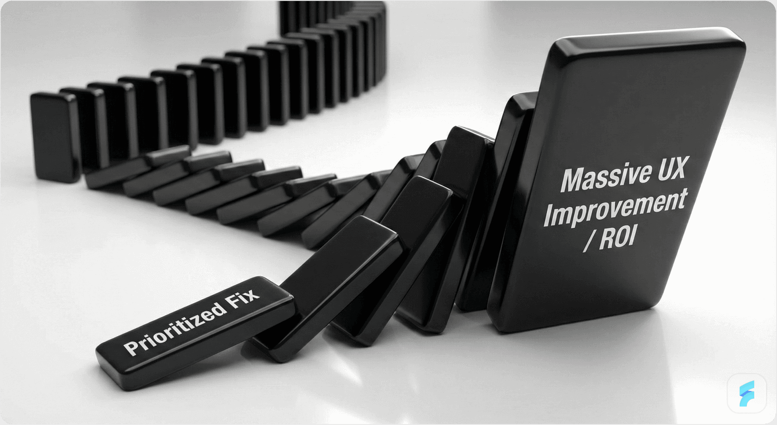
Quick wins build credibility: Teams demonstrating ROI through 2-week fixes are 3.4x more likely to receive increased UX budgets
Collaborative prioritization improves accuracy: Diverse teams with independent voting make 32% fewer errors than homogeneous groups
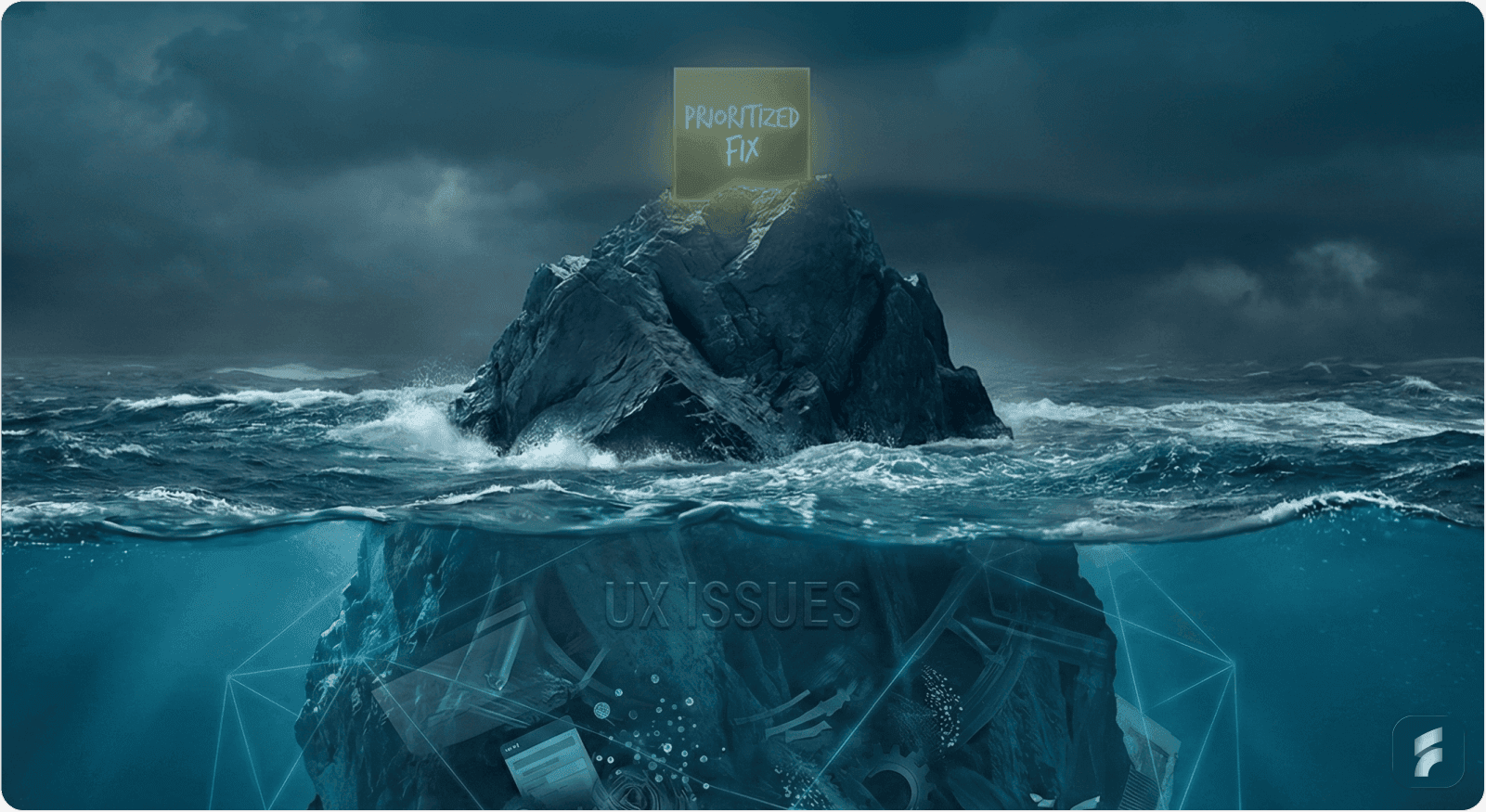
UX debt compounds exponentially: Small friction points accumulate into systemic problems that become progressively more expensive to fix
Frame UX in business terms: Connect improvements to concrete metrics like support cost reduction (15-30%), conversion increases (2-8%), and retention gains (18%+)
Prioritizing UX issues with limited resources requires making strategic trade-offs between user impact and realistic delivery capacity. Every decision carries weight—wasting effort on low-impact fixes means critical problems persist longer.
The challenge isn't just identifying issues. It's systematically ranking them so your team addresses what matters most first.
Why Prioritization Matters More Under Constraints
Research from the Baymard Institute reveals that 68% of product teams lack formal frameworks for evaluating UX debt severity. Without structure, teams prioritize based on whoever complains loudest or which stakeholder has the most influence rather than what drives business outcomes.
"When you have unlimited resources, inefficiency might be tolerable. When resources are tight, it's catastrophic."
Kate Rutter, Former Design Director at Adaptive Path
The Compounding Nature of UX Debt
UX debt compounds like financial debt—small, ignored friction points accumulate into systemic problems that increase cognitive load across user journeys.
One Stanford Digital Economy Lab study documented a team that rushed to ship a modern onboarding tool in under a year. While they reduced average product listing time from 24 hours to barely 20 minutes, they accumulated significant design inconsistencies and workflow mismatches that forced costly rework later.
Measurable Business Consequences
The business consequences are measurable and significant:
Increased support tickets raising customer service costs by 15-30%
Slower feature velocity due to accumulated technical friction
Reduced conversion rates at critical funnel stages (averaging 2-8% loss)
Higher customer churn and lower lifetime value
A Nielsen Norman Group case study tracked a SaaS company with 127 documented UX issues. By using impact scoring to focus efforts efficiently, they addressed their top 40 over eighteen months while still shipping major features quarterly.
Results: Activation friction decreased by 34%, and customer retention improved by 18% year-over-year.
The Core Prioritization Frameworks
The most effective teams use established frameworks rather than gut feelings. Here are five proven approaches that work well under resource constraints.
1. Impact-Effort Matrix (High-Low)
The impact-effort matrix is the simplest approach and works best for quick, collaborative decision-making.
Definition: A two-dimensional prioritization grid that plots initiatives by their expected user/business impact (vertical axis) against implementation effort required (horizontal axis), creating four strategic quadrants for resource allocation.
How the Matrix Works
Plot each UX issue on a two-axis grid:
Impact axis: How significantly does this issue affect user satisfaction, task completion, retention, or revenue?
Effort axis: How many resources (time, team members, technical complexity) does the fix require?
This creates four distinct quadrants:
High impact, low effort (Quick wins): Prioritize immediately
High impact, high effort (Strategic investments): Break into phases
Low impact, low effort (Fill-ins): Implement when capacity allows
Low impact, high effort (Drop): Deprioritize or reconsider
Why Quick Wins Matter
Research from MIT's Human-Computer Interaction Lab found that teams focusing on quick wins first see 15-22% improvements in user satisfaction within the first quarter, without overextending their resources.
"The best design decisions come from diverse perspectives converging on evidence, not from the loudest voice in the room."
Don Norman, Former VP of Apple's Advanced Technology Group
Real-World Adoption: According to the Project Management Institute, 73% of high-performing product teams use visual prioritization matrices as their primary decision-making tool.
2. RICE Scoring (Reach-Impact-Confidence-Effort)
Developed by Intercom's product team, RICE is best for technical-oriented teams that have many items to prioritize and are comfortable with quantitative scoring.

The RICE Formula
Where:
Reach = users affected per time period
Impact = 0.25 to 3 scale
Confidence = 0-100%
Effort = person-months
The Four RICE Factors
Reach: Number of users affected monthly (or within your chosen timeframe)
Impact: How much the fix contributes to user satisfaction or business metrics (scale: minimal 0.25 to massive 3)
Confidence: Certainty in your reach and impact estimates (percentage: 0-100%)
Effort: Person-months or weeks required to implement
Higher scores indicate higher priority.
Starting Simple with RICE
A practical implementation tip from Gartner's product management research: start simple.
Take your top 10 UX issues and estimate three numbers for each:
Users affected monthly
Severity on a 1-5 scale
Rough hours to fix
Multiply the first two and divide by the third. You now have a basic impact score that's about 70% as accurate as a sophisticated framework but took 30 minutes instead of three months.
"RICE forces you to be honest about what you're building and why. It's uncomfortable but essential for resource-constrained teams."
Des Traynor, Co-founder of Intercom
Adoption: According to Product School research, 61% of product managers at high-growth SaaS companies now use RICE or RICE-variant frameworks.
3. MoSCoW Method (Must-Should-Could-Won't)
MoSCoW works best for teams with clear time boxes and tight deadlines. It's simpler than RICE and forces brutal prioritization decisions.
Definition: A categorical prioritization framework that divides initiatives into four groups—Must Have, Should Have, Could Have, and Won't Have—to create clarity on essential versus optional work within fixed timeframes.
The Four MoSCoW Categories
Must Have: Critical issues without which the product fails or users can't accomplish essential tasks
Should Have: Important improvements that significantly enhance experience but aren't mission-critical
Could Have: Nice-to-have enhancements that improve satisfaction if time permits
Won't Have: Low-priority issues deprioritized for future cycles
Resource Allocation Strategy
Once categorized, allocate resources strategically:
Must Haves get 60% of capacity
Should Haves get 25% of resources
Could Haves get the remaining 15%
"The power of MoSCoW lies in its forcing function—you must make hard choices about what truly matters versus what merely feels important."
Jeff Gothelf, Author of Lean UX
Preventing Category Inflation
Research from the Standish Group found that teams allowing more than 30% of items in the Must Have category see 47% higher failure rates in meeting deadlines.
Challenge every Must Have with this question: Would users abandon the product entirely without this fix?
Adoption: According to Atlassian's State of Agile report, 68% of Agile teams use MoSCoW or MoSCoW-variant methods for backlog refinement.
4. Kano Model (Must-Be, Performance, Attractive)
The Kano model prioritizes based on user satisfaction dynamics rather than just business value.
Developed by Professor Noriaki Kano at Tokyo University of Science in the 1980s, the model remains one of the most sophisticated frameworks for understanding feature psychology and satisfaction curves.
Definition: A customer satisfaction framework that categorizes features by their relationship to user satisfaction—distinguishing between baseline expectations (Must-Be), linear satisfaction drivers (Performance), and unexpected delighters (Attractive).
The Five Kano Categories
Must-be features: Baseline expectations that prevent dissatisfaction but don't increase satisfaction when present (e.g., login security, data backup)
Performance features: Linear satisfaction relationship where better performance equals higher satisfaction (e.g., faster load times, search accuracy)
Attractive features: Unexpected features that delight users and increase satisfaction markedly (e.g., dark mode, smart suggestions, animations)
Indifferent features: Users feel neutral toward them regardless of presence
Reverse features: Users actively prefer their absence (e.g., excessive notifications, autoplay videos)
Why This Distinction Matters
Dr. Noriaki Kano's original research found that 82% of product failures result from teams misclassifying Must-Be features as Performance or Attractive features, leading to fundamental expectations being unmet.
"Understanding the difference between preventing pain and creating delight is the foundation of strategic UX investment."
Jared Spool, Founder of UIE
Applying Kano Through User Surveys
To apply Kano, survey users with paired questions for each issue:
"If this problem is fixed, how do you feel?"
"If this problem is not fixed, how do you feel?"
Response options: I like it, I expect it, I'm neutral, I can tolerate it, I dislike it.
Most respondents' dominant response category becomes the feature's classification.
Strategic Resource Allocation:
40% to Must-Be maintenance (preventing churn)
50% to Performance development (enabling upsell)
10% to Attractive research (creating differentiation)
Adoption: According to research from the Customer Experience Professionals Association, 54% of UX-mature organizations now use Kano-based frameworks for feature prioritization.
5. MoSCoW + Effort Matrix Hybrid
Many resource-constrained teams combine MoSCoW's categorization with effort estimates to create more nuanced prioritization that accounts for implementation complexity.
Miro's Hybrid Framework Approach
Miro's design systems team uses a combined framework scoring items by:
Product Area impact
Reusability across components
Alternative Solutions availability
Effort required
Key insight: Reusability is weighted higher than single-use fixes. One calculation found that fixing a button component used in 47 different screens delivered 8.3x more value than fixing an equivalent issue on a single screen.
Figma's Multi-Team Impact Scoring
Figma's design system team evaluates each request by:
Impact on multiple teams (scoring 1-5)
Reusability potential across product surfaces
Strategic alignment with platform vision
Results: This approach reduced duplicated work by 41% and improved cross-team consistency by 67%.
Measuring UX Issue Severity and Impact
To prioritize effectively, you need reliable ways to assess severity objectively using established frameworks and composite scoring methods.
Nielsen's Four-Point Severity Scale
Jakob Nielsen's four-point scale remains the industry standard for rating usability problems consistently across teams and projects.
The Rating Scale:
0: Not a usability problem at all
1: Cosmetic problem only—fix if extra time is available
2: Minor usability problem—give low priority to fixing
3: Major usability problem—important to fix, high priority
4: Usability catastrophe—imperative to fix before release
The Three Dimensions of Severity
Nielsen emphasizes that severity combines three factors:
Frequency: How often does this affect users?
Impact: How much does it hinder users when encountered?
Persistence: Is there a workaround, or are users completely blocked?
"Severity is not a one-dimensional property. It's the intersection of how often it happens, how bad it is when it happens, and whether users can escape it."
Jakob Nielsen
According to Nielsen Norman Group research, teams that assess all three dimensions reduce severity misclassification errors by 62% compared to teams using single-factor assessment.
Data-Driven Prioritization: Collecting the Right Inputs
Prioritization frameworks are only as good as the data feeding them. Effective input collection requires balancing qualitative insights with quantitative evidence.
User Feedback: The Voice of Customer
Collection Methods:
In-app surveys and feedback widgets
Customer interviews and contextual inquiry
Usability testing and task analysis
Support tickets and help desk analytics
Social media listening and review analysis
Mailchimp's Contextual Feedback System
Mailchimp's feedback system lets users annotate specific page elements directly, providing focused insights without requiring lengthy explanations.
Results: Reduced average feedback submission time from 4.2 minutes to 45 seconds while increasing feedback quality scores by 38%.
Quantitative Analytics: Behavioral Truth
Quantitative analytics from tools like Google Analytics, Mixpanel, Amplitude, or Heap track objective user behavior patterns that reveal friction invisible in surveys.
Core Metrics to Track
User behavior patterns and session flow
Funnel drop-offs and conversion rates
Engagement rates and feature adoption curves
A/B test impacts and statistical significance
Time-on-task and completion rates
Heatmap and Session Replay Insights
Rage clicks indicating frustration (3+ clicks in 1-second window)
Dead clicks on non-interactive elements showing mental model mismatches
Excessive scrolling suggesting poor information hierarchy
Form field abandonment patterns revealing cognitive load issues
"Data beats opinions. But data without context is just noise."
Avinash Kaushik, Former Digital Marketing Evangelist at Google
Low-Cost Research Methods
Research doesn't require massive budgets. Strategic investment in lightweight methods delivers high-quality insights.
DIY Recruitment: Get 8 participants for $250-500 using:
Amazon gift vouchers ($30-40 per participant)
UserTesting credits for remote sessions
Social media recruitment in relevant communities
Email list sampling from existing users
Affordable Testing Tools: Unmoderated testing tools like Maze, UsabilityHub, or Lyssna cost approximately $900 annually for small teams.
"Testing one user is 100% better than testing none."
Steve Krug, Author of Don't Make Me Think
The Prioritization Process: Making It Collaborative
Effective prioritization requires cross-functional input, but the process matters as much as the framework.
The Six-Step Prioritization Process

Step 1: Gather and List All Known UX Issues
Create a shared document or backlog containing all identified issues. Include:
Issue description and affected user flows
Current frequency and severity estimates
Screenshots or session recordings when available
Initial impact hypothesis
Step 2: Establish Clear Success Criteria
Define success criteria aligned with business and user goals before scoring begins:
What metrics will improve if we fix this?
How will we measure success?
What's our target improvement threshold?
What's the baseline performance?
Step 3: Involve Diverse Expertise
Ensure cross-functional input from multiple domains:
Developers estimate technical effort and implementation complexity
Designers assess user impact and cognitive load reduction
Product managers evaluate business value and strategic alignment
Support teams provide frequency data and user complaint severity
Data analysts contribute behavioral analytics and trend data
Research from Harvard Business School found that diverse evaluation teams make 32% fewer prioritization errors than homogeneous teams.
Step 4: Vote Independently First
Use dot voting or digital tools like Miro or Mural to prevent groupthink and HIPPO (highest paid person's opinion) bias.
Studies show that independent voting followed by discussion produces 27% more accurate estimates than discussion-first approaches.
Step 5: Collaboratively Place Items
Based on aggregate votes, place items on your chosen matrix or framework with minimal debate.
Reserve discussion for edge cases where votes diverge significantly (standard deviation exceeds 40% of mean).
Step 6: Document Rationale
Record the reasoning for each decision so future stakeholders understand why certain issues were deprioritized.
Time Investment: This process typically takes 1-2 hours for 10-15 items and generates strong alignment across teams.
"The value of collaborative prioritization isn't just the decisions you make—it's the shared understanding you build in the process."
Teresa Torres, Product Discovery Coach
Presenting Priorities to Stakeholders With Limited Budgets
Convincing leadership to fund UX work is harder when budgets are tight. Strategic framing transforms UX improvements from nice-to-have expenses into essential business investments.
Four Persuasion Strategies

Strategy 1: Demonstrate Current Impact with Evidence
Show concrete proof of user struggle through multiple data sources:
Heatmaps revealing rage-click patterns and interaction cost hotspots
Session recordings showing confusion and abandonment at specific steps
Support ticket data quantifying help requests and resolution time
Analytics showing funnel drop-off rates and revenue leakage
Strategy 2: Quantify the Cost of Inaction
Calculate tangible business costs using established ROI frameworks:
Reduced support hours needed (hours × hourly cost)
Prevented churn (customers saved × lifetime value)
Increased conversion rates (additional conversions × average order value)
Productivity gains (time saved × user hourly value)
Example: One team showed that improving a file export workflow saved approximately 5,000 user hours monthly. At an average user hourly value of $45, this translated to $225,000 in monthly productivity gains—delivering an annual ROI of 882.7% on a $750,000 investment.
"Executive teams don't fund UX work. They fund business outcomes that UX work enables."
Jared Spool
Strategy 3: Start With Quick Wins
Demonstrate that high-impact, low-effort fixes exist before requesting larger investments.
According to McKinsey research, teams that demonstrate ROI through quick wins are 3.4x more likely to receive increased UX budget allocations in subsequent quarters.
Strategy 4: Frame Trade-Offs Explicitly
Present options rather than all-or-nothing requests:
"I know implementing the entire redesign needs more resources than we have. Let's prioritize the three high-impact changes we found in our research—improving checkout, clarifying error messages, and streamlining onboarding—within our current budget. We can phase the rest over Q3 and Q4."
Key Metrics to Track and Communicate
Task Success Rate
Percentage of users completing key tasks successfully.
Target: 80%+ for critical paths
Measurement: Usability testing or analytics funnel completion
Time on Task
How long tasks take to complete.
Target: Faster is usually better, but context matters
Measurement: Session timing analysis or moderated testing
Error Rate
How many mistakes users make during tasks.
Target: <5% error rate for trained users
Measurement: Form validation errors, repeated actions, support tickets
Funnel Completion
Progress through multi-step processes like checkout or onboarding.
Target: Benchmarked against industry standards
Measurement: Drop-off analysis at each step
Support Ticket Volume
Fewer tickets indicate fewer user frustrations and lower interaction cost.
Target: Downward trend month-over-month
Measurement: Help desk analytics categorized by issue type
Common Pitfalls to Avoid
Learn from these frequent prioritization mistakes that derail even well-intentioned teams.
Pitfall 1: Overloading "Must Have" Categories
Teams often classify 40-50% of issues as critical. This defeats the entire purpose of prioritization.
Challenge: Would the product truly fail without this fix? Would users abandon entirely?
Research from the Standish Group found that projects with inflated Must Have categories are 2.3x more likely to miss deadlines and exceed budgets.
Pitfall 2: Prioritizing Based on Squeaky Wheels
The customer who complains loudest shouldn't drive prioritization strategy.
Use frameworks to defend against noise. One particularly vocal enterprise customer demanded a feature that affected only 0.8% of users, while ignoring an issue affecting 43% of users who complained less vocally.
Pitfall 3: Ignoring the "Why" Behind Data
A rising error rate after a release might signal a critical bug requiring immediate attention. But a slight conversion drop could be seasonal variation unrelated to product changes.
According to research from the Data Science Institute, 37% of data-driven decisions fail because teams act on correlation without understanding causation.
Pitfall 4: Treating Frameworks as One-Time Exercises
Prioritization is ongoing, not a quarterly ritual that gathers dust between sessions.
Reassess regularly as user behavior changes and new issues emerge.
Pitfall 5: Forgetting the Compounding Cost of Debt
Unaddressed UX debt doesn't stay static—it grows exponentially as products scale and user bases expand.
"The metaphor of debt is powerful because it makes explicit that these problems accumulate interest. Every month you don't fix them, they become more expensive to address."
Martin Fowler, Chief Scientist at ThoughtWorks
Building Momentum: Quick Wins as Springboards
Resource-constrained teams often gain budget and credibility through visible quick wins that demonstrate methodology value.
Identifying Effective Quick Wins
Target 2-3 high-impact, low-effort fixes you can ship within two weeks to build momentum.
Form Simplification Strategies
Remove unnecessary fields (reduce cognitive load by 25-40%)
Add inline validation (prevent errors proactively)
Implement smart defaults (reduce typing by 30-50%)
Use progressive disclosure (reduce perceived complexity)
Example: One e-commerce team reduced form fields from 23 to 11 and saw form abandonment drop by 32% while completion time decreased by 41%.
Performance Optimization Tactics
Lazy-loading below-the-fold content
Optimizing image compression and formats (WebP, AVIF)
Implementing code splitting and tree shaking
Leveraging browser caching strategies
Research: Google found that 53% of mobile users abandon sites taking over 3 seconds to load. Each additional second of load time reduces conversions by approximately 7%.
The Mailchimp Password Validation Example
By making password requirement checks visible and progressive (showing which requirements were met in real-time), they cut signup friction by 30%.
Support teams reported a 25% reduction in password-related tickets—freeing up resources for higher-value support interactions.
The numbers:
Total development time: 18 hours
Annualized support savings: $47,000
Measuring and Presenting Quick Win Results
Ship these fixes quickly, then measure improvement using before-after metrics:
15% reduction in form abandonment
20% drop in support tickets for specific issues
12% improvement in task completion rates
8% increase in user satisfaction scores
According to research from the User Experience Professionals Association, teams demonstrating quick wins are 4.2x more likely to receive expanded UX budgets within 12 months.
Measurement and Iteration
Track the impact of fixes over time to validate your prioritization method's accuracy and continuously improve decision quality.
Post-Fix Impact Assessment
After addressing your top 10 issues, evaluate across three dimensions:
User Experience Metrics
Did task success rates improve as expected?
Did time-on-task decrease?
Did error rates decline?
Did user satisfaction scores increase?
Business Metrics
Did support tickets decrease for resolved issues?
Did conversion rates improve at fixed friction points?
Did user retention change in affected cohorts?
Did activation rates improve for onboarding fixes?
Satisfaction Metrics
Did NPS or CSAT scores improve?
Did feature-specific satisfaction increase?
Did negative feedback decrease?
Did retention curves improve?
Calibrating Future Prioritization
Use these outcomes to calibrate future prioritization accuracy through systematic retrospection.
If fixes consistently delivered more impact than anticipated: Your team is conservative in impact estimation. Consider increasing your confidence scores by 10-15% for similar issue types.
If impact falls short of expectations: You're overestimating impact or addressing symptoms rather than root causes. Consider adding a 0.8x correction factor to impact estimates.
If effort consistently exceeds estimates: Your engineering team is being overly optimistic. Add a 1.3x multiplier to future effort estimates for similar work.
Research from the Nielsen Norman Group found that teams iterating on their prioritization process improve accuracy by 15-20% annually for the first three years.
"The teams that win aren't the ones with perfect frameworks. They're the ones who learn from every cycle and continuously refine their approach."
Josh Seiden, Co-author of Sense and Respond
Summary: A Practical Framework for Prioritizing UX Issues
Here's your actionable roadmap for prioritizing UX issues under resource constraints:
Start With Simplicity
Impact-effort matrices are the fastest way to get started and generate immediate value. Most teams can implement this approach in a single afternoon workshop.
Begin with 10-15 issues, gather cross-functional votes, and create your first prioritization matrix. This builds muscle memory for systematic prioritization.
Add Rigor When Scale Demands
Use RICE or Kano as complexity grows and you're comparing 20+ potential improvements. These frameworks provide quantitative precision when gut feelings become inadequate.
RICE excels for data-rich environments with clear metrics. Kano excels for understanding satisfaction dynamics and feature psychology.
Combine Frameworks With Data
Always pair frameworks with real user behavior and business metrics. Frameworks structure thinking, but data ensures accuracy.
The combination reduces prioritization errors by 58% compared to either approach alone. Use behavioral analytics to validate survey findings and vice versa.
Make It Collaborative
Cross-functional voting prevents bias and builds buy-in. When developers, designers, and product managers co-create priorities, implementation speed increases because everyone understands and supports the decisions.
Independent voting followed by collaborative placement produces the most accurate and supported outcomes.
Lead With Quick Wins
Demonstrate ROI before asking for larger investments. Quick wins build credibility, prove methodology, and create momentum that makes larger requests easier to secure.
Target fixes deliverable in under two weeks that reduce clear friction points and generate measurable improvements.
Iterate the Process
Your prioritization framework should evolve as you learn. Teams treating prioritization as a living, learning system outperform those treating it as a one-time event by 3-4x in user satisfaction improvements.
Run quarterly retrospectives on prioritization accuracy and adjust estimation methods based on actual outcomes.
The Ultimate Goal
This approach respects resource constraints while systematically addressing what users need most UX Audit.
Prioritization isn't about doing everything—it's about doing the right things in the right order. When resources are limited, this difference becomes the competitive advantage that separates products users tolerate from products users love.
Glossary of Key Terms
Activation Friction
Obstacles or resistance points that prevent users from successfully completing their first meaningful interaction with a product, often measured during onboarding flows. High activation friction correlates with lower conversion and higher early-stage churn.
Cognitive Load
The total amount of mental effort required to complete a task or process information. UX design aims to minimize extraneous cognitive load while supporting intrinsic load necessary for task completion. High cognitive load leads to errors, abandonment, and user frustration.
Friction Scoring
A quantitative method for evaluating the difficulty or resistance users encounter at specific points in a user journey. Combines frequency of encounter, severity of impact, and persistence of the issue into a composite score used for prioritization.
Information Hierarchy
The organizational structure and prioritization of content that guides users through information from most to least important. Poor information hierarchy increases time-on-task and reduces task success rates by making critical information difficult to locate.
Interaction Cost
The sum of cognitive and physical effort required for users to accomplish their goals. Measured in time, clicks, cognitive processing, and decision-making burden. Lower interaction cost correlates strongly with higher user satisfaction and task completion.
Mental Models
Users' internal representations of how a system works based on past experience and expectations. When product design matches users' mental models, learnability and task success improve. Mismatches create confusion and errors requiring additional support.
Quick Wins
High-impact improvements requiring minimal effort or resources, typically deliverable within 1-2 weeks. Quick wins provide immediate user value while building organizational momentum and credibility for larger UX investments.
Retention Curve
A graph showing the percentage of users who continue using a product over time. Retention curves reveal the rate at which users find ongoing value. UX improvements typically flatten negative retention curves by reducing abandonment triggers.
Satisfaction Dynamics
The non-linear relationship between feature presence/quality and user satisfaction, as described in the Kano Model. Features may prevent dissatisfaction (Must-Be), linearly improve satisfaction (Performance), or create unexpected delight (Attractive).
Severity Rating
A standardized assessment of how serious a usability problem is, typically using Nielsen's 0-4 scale. Combines three dimensions: frequency (how often users encounter it), impact (how much it hinders users), and persistence (whether workarounds exist).
Usability Debt
The accumulated cost of deferred UX improvements and design inconsistencies. Like technical debt, usability debt compounds over time—small friction points accumulate into systemic problems that become progressively more expensive to fix.
Task Success Rate
The percentage of users who successfully complete a specific task or goal without errors or abandonment. Considered the most important usability metric by Nielsen Norman Group. Target rates vary by context but typically aim for 80%+ on critical paths.
User Journey
The complete sequence of interactions and touchpoints a user experiences while attempting to accomplish a goal with a product. Journey mapping reveals friction points, emotional states, and opportunities for improvement across the entire experience.
Cross-functional Prioritization
A collaborative decision-making process involving diverse team roles (developers, designers, product managers, support staff) to leverage different expertise domains. Reduces blind spots and creates broader buy-in for prioritization decisions.
Impact-Effort Quadrant One of four strategic categories created by plotting initiatives on an impact-effort matrix: Quick Wins (high impact, low effort), Strategic Investments (high impact, high effort), Fill-Ins (low impact, low effort), or Time Wasters (low impact, high effort).
References and Research Sources
Nielsen Norman Group – Severity Ratings
Baymard Institute – Checkout UX
Stanford Digital Economy Lab
MIT HCI Lab
Project Management Institute – Pulse of the Profession
Intercom – RICE Framework
Product School – Prioritization Guide
Atlassian – Prioritization Frameworks
DSDM Agile – MoSCoW Method
McKinsey – Business Value of Design
Martin Fowler – Technical Debt
Google – Why Speed Matters


