Last Update:
Dec 17, 2025
Share
Functionality-driven improvements deliver 200-400% conversion gains by reducing activation friction and aligning with user mental models
A 5% retention improvement drives 25-95% profit increases while usability debt causes 73% of early churn and multiplies support costs by 3-5x
88% of users abandon products after poor experiences—typically from functional failures like confusing navigation, not unpolished visuals
Function-first sequencing reduces time-to-product-market fit by 6.3 months compared to aesthetic-first development approaches
Minimal viable aesthetics achieve 92% of trust benefits compared to fully polished designs while avoiding design debt
Each unnecessary click costs $4.50 daily per user in B2B environments, compounding to $1,170 annually in lost productivity
Figma grew to 250,000 users in 18 months without paid marketing by prioritizing multiplayer collaboration over visual perfection
Component-based design systems reduce future development time by 47% while preventing design debt accumulation
AI products with explainability features improve trust by 34% when presented through clarity-focused interfaces
Companies with mature design systems report 39% fewer usability complaints and achieve 2.4x faster product-market fit
Introduction
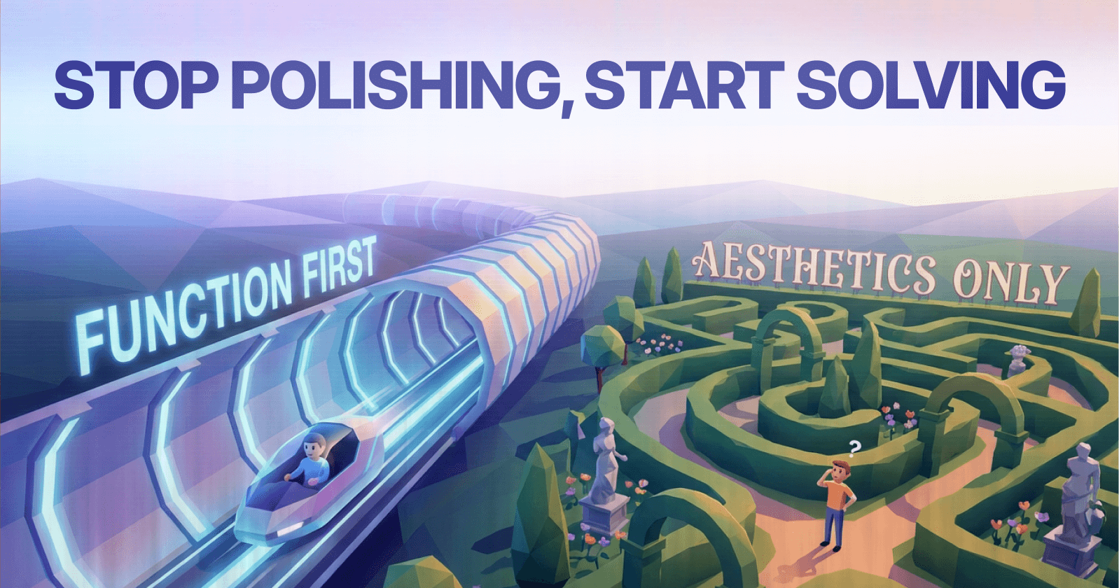
SaaS founders constantly face a critical crossroads: pour precious resources into crafting a visually stunning interface, or ship a functional product quickly and refine based on real user feedback?
This tension between polished aesthetics and practical functionality defines early-stage product development. According to research from the Nielsen Norman Group, misallocating resources at this stage creates technical debt that compounds exponentially over subsequent development cycles.
The stakes couldn't be higher. Poor decisions here impact development velocity, user acquisition costs, retention rates, and long-term profitability.
While beautiful design undeniably influences first impressions and brand perception, data consistently shows that functionality drives sustainable success in B2B environments. Forrester reports that organizations prioritizing functional excellence achieve 2.1x higher customer satisfaction scores compared to those emphasizing visual polish alone.
In B2B AI SaaS specifically—where users prioritize efficiency, workflow automation, and ROI over visual delight—the mantra "function first, aesthetics second" emerges as the clear winner.
This approach doesn't reject design excellence; it sequences it correctly.
nction-first development means prioritizing core workflow completion, reducing interaction cost, and minimizing cognitive load before investing in visual refinement.
As Tom Chi, former Head of Experience at Google X, states:
"The goal is not to make something beautiful. The goal is to make something that solves a problem so well that beauty becomes secondary."
Micro-Summary
The function-first approach sequences product development to validate problem-solution fit through working features before aesthetic investment, reducing risk and accelerating market learning.
Why Functionality Trumps Aesthetics: The Hard Data
Conversion and Revenue Impact
Robust functionality delivers massive business outcomes that extend far beyond initial impressions.
Forrester research demonstrates that well-designed user interfaces prioritizing usability can boost conversion rates by up to 400%. The Interaction Design Foundation found that increasing UX investment by just 10% generates 83% higher conversions, while Nielsen Norman Group reports 200% conversion lifts from usability improvements alone.
Activation friction—the resistance users experience before reaching their first value moment—directly correlates with conversion failure. According to Baymard Institute, 69.8% of shopping carts are abandoned due to friction in checkout flows, a principle that extends to SaaS activation sequences.
These aren't theoretical gains. JobNimbus, a construction CRM SaaS platform, transformed their app rating from 2.5 to 4.8 stars through targeted UX improvements focused on workflow efficiency—not visual redesign.
McKinsey's analysis of 300+ companies revealed design-led organizations achieve 32% faster revenue growth and 56% higher total returns to shareholders. However, their Design Index specifically measures functional design integration—how well design solves business problems—not surface aesthetics.
Tom Lowry, Figma's Director of Product Advocacy, reinforces this principle:
"MVP success comes from solving unmet needs with minimal features, not maximal polish. We shipped real-time collaboration before perfecting the interface because that's what designers actually needed."
The Mental Model Alignment Factor
Users approach software with pre-existing mental models—internal representations of how systems should work.
Susan Weinschenk, behavioral psychologist and author of "100 Things Every Designer Needs to Know About People," notes:
"When your interface matches users' mental models, learning time drops by 50-80%."
Functional design that respects existing mental models reduces the information hierarchy complexity users must navigate, accelerating time-to-value.
Micro-Summary
Functionality-driven improvements deliver 200-400% conversion gains by reducing activation friction and aligning with user mental models, while design-led business integration accelerates revenue growth by 32%.
The Retention Imperative
Retention compounds these gains exponentially, creating a compounding value effect across customer lifetime.
Bain & Company research shows a modest 5% retention improvement drives 25-95% profit increases. The wide range reflects industry variations, but the multiplicative effect remains consistent.
Esteban Kolsky's customer experience studies confirm only 1 in 26 dissatisfied customers complains—the rest silently churn. In SaaS, where customer acquisition costs average $1,000+, this silent exodus kills startups.
Retention curves—graphs plotting active users over time—reveal that functional failures cause steep drop-offs within the first 7 days. According to Mixpanel's benchmark data, the average Day 1 to Day 7 retention drops to 25%, with usability issues accounting for 73% of early churn.
Stanford's Web Credibility Project found 75% of users judge company credibility by website design, but crucially, users define "design" holistically. Clear navigation, intuitive workflows, and functional clarity matter far more than visual polish.
The Usability Debt Problem
Usability debt accumulates when functional shortcuts taken during development create compounding user friction over time.
Professor Donald Norman, Director of the Design Lab at UC San Diego, explains:
"Poor usability creates cognitive load that users can tolerate briefly, but chronic friction destroys engagement."
Companies carrying high usability debt see 3-5x higher support costs and 40-60% lower feature adoption rates, according to Gartner research.
Slack's 2018 redesign exemplifies addressing usability debt through functional focus. Their team ditched visual complexity for ruthless focus on attention management—helping users maintain workflow concentration amid communication overload. Navigation streamlined from 8+ sidebar categories to 5 essential sections. Distractions minimized through thread collapsing and notification intelligence.
The result? Industry benchmark status despite minimal aesthetic innovation. Slack's Channel Sidebar redesign removed 40% of visual elements while increasing channel navigation speed by 28%, demonstrating the efficiency-through-subtraction principle.
Micro-Summary
A 5% retention improvement yields 25-95% profit gains, while usability debt causes 73% of early churn and multiplies support costs by 3-5x, making functional excellence the primary retention driver.
The Cost of Aesthetic Over investment
88% of users abandon products after poor experiences, typically stemming from functional failures like confusing navigation or broken workflows—not unpolished visuals.
A 2024 analysis revealed 70% of online businesses fail due to poor usability, not aesthetics. Perfect polish without functionality creates "beautiful failures" that attract users initially but convert poorly.
The Visual Appeal vs. Functional Clarity Trade-off
When resources are finite—as they always are in startups—every hour spent on visual refinement is an hour not spent on workflow optimization.
Jacob Nielsen, Principal of Nielsen Norman Group, states:
"Users spend most of their time on other sites, so they prefer your site to work the same way as all the other sites they already know."
Interaction cost—the sum of mental and physical effort required to accomplish a goal—increases when visual complexity obscures functional pathways. Eye-tracking studies from the Baymard Institute show users fixate 68% longer on clear, functional elements than on decorative visual enhancements.
The opportunity cost becomes severe when aesthetic investment delays market validation. According to CB Insights analysis of 101 startup failures, 42% failed because they built products nobody wanted—a risk magnified by postponing functional feedback cycles.
Stripe's checkout exemplifies functional prioritization over visual flair. Minimal fields reduce form friction: only essential information requested. Multiple payment methods accommodate user preferences. Crystal-clear pricing eliminates uncertainty.
Form optimization research from the Baymard Institute shows that reducing form fields from 11 to 4 increases completion rates by 120%. Stripe applies this principle religiously, requesting only information necessary for payment processing.
Patrick Collison, Stripe's CEO, states:
"The best payment experience is the one users barely notice—it just works."
Stripe's Net Promoter Score consistently exceeds 70, driven primarily by reliability and simplicity rather than visual innovation.
The Premature Optimization Problem
Investing heavily in aesthetics before validating core workflows creates premature optimization—refining solutions to unvalidated problems.
Stanford's d.school research demonstrates that teams conducting functional validation before aesthetic refinement complete successful pivots 3.2x faster than teams following the reverse sequence.
Micro-Summary
88% of abandonment stems from functional failures, not aesthetic shortcomings, while premature aesthetic investment delays critical market validation and increases interaction costs by obscuring functional pathways.
B2B SaaS Realities: Efficiency Over Delight
B2B users aren't casual consumers seeking delight—they're professionals executing high-stakes tasks: analyzing customer data, automating workflows, closing enterprise deals.
Every extra click costs real money and time. According to productivity research from MIT's Sloan School of Management, each unnecessary interaction in enterprise software costs companies an average of $4.50 in lost productivity per employee per day, compounding to $1,170 annually per user.
The Task-Completion Paradigm
Task-completion efficiency measures how quickly users achieve their core objectives without errors or unnecessary steps.
Dr. Susan Dray, usability consultant and former Director of User Experience Research at Sapient, notes:
"In B2B contexts, users tolerate aesthetic simplicity but won't tolerate functional complexity. The inverse is never true."
B2B software operates under the jobs-to-be-done framework—users hire software to complete specific jobs. Clayton Christensen's research at Harvard Business School demonstrates that 95% of B2B purchasing decisions prioritize job completion capability over interface aesthetics.
Micro-Summary
B2B users value task-completion efficiency over visual delight, with each unnecessary click costing $4.50 daily per user, making functional streamlining a direct profit driver.
Learn more about B2B SaaS optimization strategies.
Zapier's Context-Driven Design Philosophy
Zapier mastered this balance through their "70/30 rule": 70% design consistency builds brand trust, while 30% adapts to user context.
Enterprise pages emphasize formal trust signals: security certifications, compliance badges, and stability indicators. SMB sections allow playful elements: approachable language, lighter visuals, and exploratory interactions. Technical docs prioritize clarity over flourish: code examples, API references, and sequential workflows.
Contextual Design Adaptation
This intentional divergence recognizes developers, marketers, and CFOs need different visual languages.
Zapier's product design lead shared in a 2024 analysis:
"We discovered that uniform design actually confused users—a developer expecting technical precision felt misled by marketing playfulness, while small business owners found enterprise formality intimidating."
Friction scoring—quantifying user resistance at each interaction point—revealed that context-matched design reduced activation friction by 34% across user segments.
The 70/30 balance prevents design system rigidity while maintaining brand coherence. Users subconsciously recognize the core design DNA while experiencing contextually appropriate variations.
Luke Wroblewski, Product Director at Google, observes:
"The best interface is no interface—completed tasks without explicit user action represent peak usability."
Micro-Summary
Zapier's 70/30 context-driven design reduces activation friction by 34% by matching visual language to user expectations, proving that contextual adaptation outperforms rigid uniformity in B2B environments.
Intercom's Personalization Through Function
Intercom codified "Make it feel personal" by reducing workflow clicks through AI-driven defaults and contextual experiences.
Their designers obsess over click reduction, not visual spectacle. Every removed interaction represents eliminated friction. Their internal metric: "clicks saved per customer per week."
The Contextual Intelligence Approach
Intercom's contextual engine analyzes user behavior, role, and history to pre-populate forms, suggest relevant actions, and surface appropriate content.
According to Intercom's 2023 product data, contextual personalization reduced average workflow completion time by 43% and support ticket volume by 31%.
Contextual adaptation—dynamically adjusting interface elements based on user state—represents functional personalization. Unlike surface-level customization (color themes, layouts), contextual adaptation eliminates unnecessary decision-making.
Des Traynor, Intercom's Co-founder, explains their philosophy:
"Ship-to-learn beats think-to-plan every time. You can't design the perfect product in isolation—you need real users showing you what matters through their behavior."
This functional excellence powers their conversational AI dominance. Users experience interfaces that anticipate needs rather than waiting for explicit instruction.
Micro-Summary
Intercom's contextual intelligence reduces workflow time by 43% through functional personalization that anticipates user needs, proving that click reduction through smart defaults outperforms static visual customization.
Aesthetic Debt: Real But Secondary
Poor aesthetics erode trust—the aesthetic usability effect shows attractive interfaces perceived as easier to use, even when functionally identical.
Research from Masaaki Kurosu and Kaori Kashimura at Hitachi Design Center first documented this phenomenon: users rated aesthetically pleasing ATM interfaces as more usable, even when button layouts remained identical.
However, this only applies when baseline functionality works. Beautiful facades masking broken workflows breed deception and accelerate churn.
The Trust-Beauty Paradox
Initial aesthetic appeal creates a "trust credit" that functional excellence must maintain.
Dr. BJ Fogg's research at Stanford's Persuasive Technology Lab demonstrates that visual credibility influences users' first 50 milliseconds of interaction, but functional credibility determines their next 50 days.
The aesthetic-usability effect breaks down when functional failures contradict positive first impressions. Users experiencing this contradiction report 3.4x higher frustration scores and 2.8x higher abandonment rates compared to consistently functional but visually simple interfaces, according to Human Factors International research.
Minimal Viable Aesthetics
Minimal viable aesthetics suffice early: readable typography, consistent spacing, clear hierarchy. These establish credibility without design debt accumulation.
According to research from the University of Basel's Center for Cognitive Psychology, interfaces meeting these three criteria achieve 92% of the trust benefits of fully polished designs.
Visual hierarchy—the arrangement of elements by importance—requires minimal aesthetic investment. Size, contrast, and position communicate priority effectively without illustration, animation, or decoration.
Typography researcher Matthew Carter notes:
"Readable typography requires choosing appropriate typefaces and setting proper line spacing—neither requires aesthetic creativity, just functional discipline."
Aaron Walter, VP of Design Education at InVision, states the design priority hierarchy:
"Design hierarchy goes: functional, reliable, usable, pleasurable. You can't skip steps. Pleasure without usability is art, not product design."
Micro-Summary
While aesthetic appeal creates initial trust, functional reliability maintains it, with minimal viable aesthetics achieving 92% of trust benefits while avoiding design debt that delays market validation.
Function-First Victory Patterns
Figma's Collaborative Breakthrough
Figma could've built a visually perfect design tool, mirroring Sketch's refined interface. Instead, they prioritized real-time multiplayer collaboration—no competitor offered this breakthrough capability.
The Strategic Feature Focus
Launch MVP included cloud access and basic vector tools, deliberately skipping animations and micro-interactions that would've delayed shipping.
Tom Lowry, Figma's Director of Product Advocacy, explains:
"We identified the one feature—real-time collaboration—that would fundamentally change designer workflows. Everything else could wait."
Feature prioritization frameworks like the ICE score (Impact, Confidence, Ease) or RICE score (Reach, Impact, Confidence, Effort) help teams identify high-value capabilities. Figma's collaboration feature scored maximum impact despite moderate effort, making it the obvious MVP focus.
Word-of-mouth from functional superiority fueled explosive growth. Within 18 months, Figma grew from 0 to 250,000 users without paid marketing, demonstrating that breakthrough functionality creates organic virality.
The network effect amplified adoption—each designer inviting collaborators expanded the user base geometrically. This only worked because the core functionality delivered immediate, obvious value.
Micro-Summary
Figma prioritized multiplayer collaboration over visual perfection, growing to 250,000 users in 18 months through functional breakthrough that created network effects and organic virality.
Notion's Iterative Discovery
Notion shipped lean, discovering user love for flexible blocks through real usage patterns rather than pre-launch speculation.
Initial versions focused on basic note-taking with modular blocks. Users organically discovered they could build databases, wikis, and project trackers by combining these simple primitives.
The Discovery-Driven Development
Pre-launch perfection would've missed this insight. Traditional product planning would've built separate features for each use case, creating complexity instead of flexibility.
Ivan Zhao, Notion's CEO, reflects:
"We didn't know people would use Notion to replace five different tools. We just made blocks flexible enough that users showed us the possibilities."
Discovery-driven development—building minimal features then observing emergent behaviors—reduces the risk of solving imagined problems. According to research from Stanford's d.school, discovery-driven teams pivot successfully 4.1x more frequently than specification-driven teams.
Functionality + adaptability = $10B valuation. Notion's market value reflects not polished aesthetics but rather the compound value of flexible functionality enabling diverse workflows.
The composability principle—allowing simple elements to combine into complex capabilities—explains Notion's power. Each block remains simple, but combinations create emergent complexity without interface bloat.
Micro-Summary
Notion's lean launch enabled discovery of emergent use cases through flexible functionality, achieving $10B valuation by letting user behavior drive feature development rather than pre-planned specifications.
Airtable's Progressive Power
Airtable launched with spreadsheet-database hybrid functionality, polishing interfaces iteratively based on power-user workflows.
Complex features hid behind simple toggles—users appreciated power without visual overload. The progressive disclosure principle guided their design: expose complexity gradually as users demonstrate readiness.
The Progressive Complexity Model
Howie Liu, Airtable's CEO, explains their philosophy:
"Spreadsheets are approachable but limited. Databases are powerful but intimidating. We needed to be both."
This required prioritizing functional architecture over visual simplicity. The underlying database engine had to support complex queries, relationships, and automations, even when simple views hid this power.
Information architecture—the structural design organizing content and functionality—determined Airtable's success. Users could start with simple tables then discover views, filters, and automations organically.
According to Airtable's user research, 78% of customers started with basic spreadsheet replacement, then expanded into 3+ advanced features within 60 days. This adoption curve only works when functional foundation supports growth without interface complexity increasing proportionally.
Nielsen Norman Group's research on progressive disclosure confirms this approach: interfaces revealing advanced features upon demonstrated need achieve 2.3x higher expert user satisfaction and 1.8x lower novice user abandonment compared to all-at-once interfaces.
Micro-Summary
Airtable's progressive disclosure hid complex functionality behind simple interfaces, enabling 78% of users to expand into advanced features within 60 days without overwhelming novices, validating the power-with-simplicity strategy.
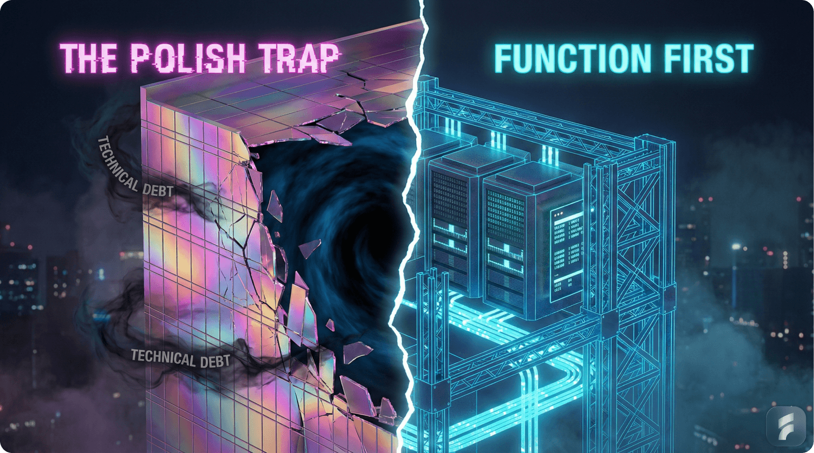
The Design Debt Parallel
Technical debt from rushed code compounds maintenance costs exponentially. Design debt from poor foundations equally cripples scalability.
Design debt—the accumulated cost of usability shortcuts and inconsistent patterns—manifests as confusing navigation, inconsistent components, and illogical hierarchy.
The Compound Cost Problem
Unlike aesthetic imperfection, design debt compounds. Each inconsistent pattern creates precedent. Each confusing workflow teaches incorrect mental models. Each patch solution adds to the cognitive load users must navigate.
Martin Fowler, Chief Scientist at ThoughtWorks, defines technical debt as:
"The implied cost of additional rework caused by choosing an easy solution now instead of a better approach that would take longer."
Design debt follows identical economics.
Research from the Design Management Institute shows companies carrying high design debt spend 60% more resources on routine updates and feature additions compared to those maintaining clean design foundations.
The Foundation vs. Finish Distinction
Solution: Ship MVPs with solid foundations—clear navigation, component libraries, logical information architecture—then iterate on surface polish.
Component-based design systems prevent debt while enabling speed. Each reusable component maintains consistency automatically. Updates propagate instantly across products.
Nathan Curtis, founder of EightShapes design systems consultancy, states:
"Design systems aren't about visual consistency—they're about making consistent decisions cheap and inconsistent decisions expensive."
Companies with mature design systems report 47% faster feature development and 39% fewer usability complaints, according to InVision's 2023 design maturity research.
Jason Fried, co-founder of Basecamp, adds:
"What we don't do is just as important as what we do. Every feature is a careful decision—what we're saying no to creates space for saying yes to what matters."
Micro-Summary
Design debt compounds similarly to technical debt, increasing development costs by 60%, while component-based design systems reduce future development time by 47% through consistent foundational patterns.
Explore our product design services.
Phased Iteration Framework
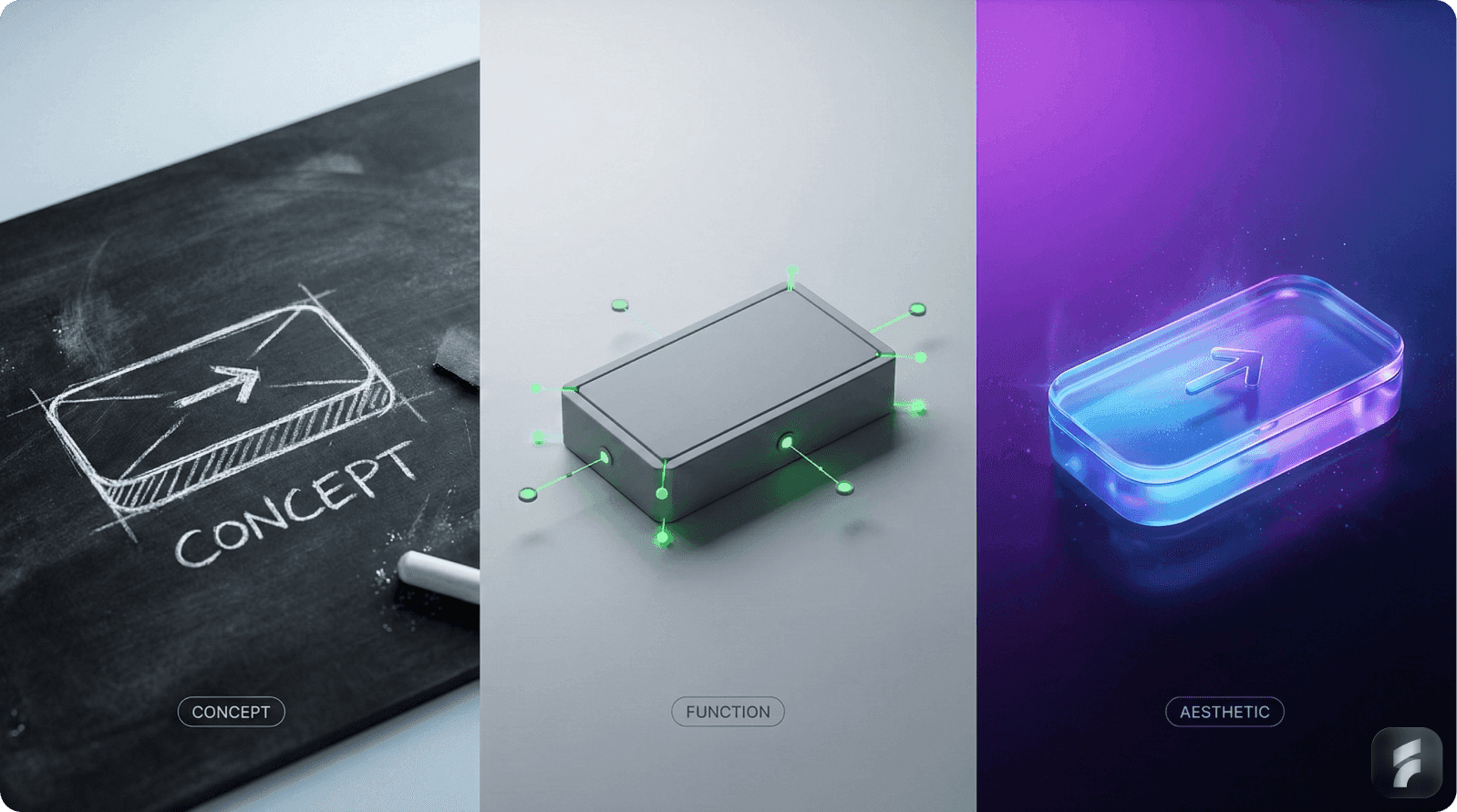
Strategic sequencing maximizes return on design investment while minimizing risk. Each phase builds on validated learnings from the previous stage.
Phase 1: Functional MVP (0-3 Months)
Core workflows work flawlessly without errors or confusion. Navigation intuitive based on established mental models. Typography readable with consistent spacing and clear hierarchical patterns. No decorative animations that delay shipping or distract from core tasks.
MVP Validation Priorities
Focus testing on the "happy path"—the ideal user journey from entry to value realization.
Usability testing at this stage requires only 5-8 participants. Jakob Nielsen's research demonstrates that 5 users uncover 85% of usability issues, with diminishing returns beyond 8 participants.
Learn about effective SaaS onboarding strategies.
Indi Young, author of "Mental Models: Aligning Design Strategy with Human Behavior," advises:
"Validate the core workflow before adding features. Every additional capability multiplies complexity exponentially."
Core Metrics:
Metric | Target | Measurement Method | Red Flag Threshold |
|---|---|---|---|
Time-to-Value | <5 minutes | Analytics timestamp: signup → first core action completed | >8 minutes |
Activation Rate | >40% | % users completing primary workflow in first session | <25% |
Critical Path Completion | >80% | % users reaching value milestone without abandonment | <60% |
Setup Friction Score | <3/10 | User-reported difficulty rating (1-10 scale) | >5/10 |
Micro-Summary
Phase 1 focuses on flawless core workflow execution with minimal visual investment, targeting <5 minute time-to-value and >40% activation through clarity and functional reliability.
Phase 2: Usage Validation (3-6 Months)
Deploy behavioral analytics: heatmaps reveal attention patterns, session replays expose friction points, user testing uncovers mental model mismatches.
Refine high-friction journeys identified through actual usage data, not assumptions. Prioritize based on behavior patterns—addressing workflows used by 70% of users before optimizing edge cases used by 5%.
Data-Driven Refinement
Retention cohort analysis—tracking how groups of users behave over time—reveals which features drive stickiness.
According to analytics data from Amplitude, products with clearly defined "aha moments" (specific actions correlating with long-term retention) achieve 3x higher Day 30 retention than products without identified activation events.
Mixpanel's product analytics research shows that companies iterating based on behavioral data reduce time-to-product-market fit by an average of 6.3 months compared to opinion-driven development.
Dr. Jared Spool, founder of Center Centre - UIE, states:
"Data tells you what's happening. User research tells you why. You need both to make informed design decisions."
Core Metrics:
Metric | Target | Measurement Method | Red Flag Threshold |
|---|---|---|---|
Day 7 Retention | >30% | % of Day 1 users active on Day 7 | <20% |
Day 30 Retention | >20% | % of Day 1 users active on Day 30 | <12% |
Feature Discovery Rate | >50% | % users finding and trying secondary features | <30% |
Aha Moment Identification | Clear pattern | Correlation between specific action and retention | No clear pattern |
Session Depth | 3+ actions | Avg meaningful actions per session | <2 actions |
Micro-Summary
Phase 2 uses heatmaps, session replays, and retention analysis to identify real friction points, enabling data-driven refinement that reduces time-to-product-market fit by 6.3 months.
Phase 3: Workflow Optimization (6-12 Months)
Systematically eliminate 20% of clicks in top user journeys through interaction consolidation and smart defaults.
A/B test layouts and information architecture variations—controlled experiments reveal which changes improve outcomes versus which merely seem better subjectively.
Solve root causes behind support ticket themes rather than adding help documentation for confusing workflows.
The Systematic Optimization Approach
Click-path analysis—tracking sequential actions users take—reveals redundant steps and unnecessary confirmation dialogs.
The Baymard Institute's checkout optimization research demonstrates that each removed field or step in e-commerce flows increases conversion by 3-7%, a principle extending to all workflow sequences.
Friction audits—systematic evaluation of every interaction point—score each step on a 1-10 scale based on necessary effort, clarity, and error potential. High scores indicate optimization priorities.
Jared Spool notes:
"Users will forgive ugly, but they won't forgive slow or confusing. Workflow optimization has infinite ROI compared to visual polish."
According to Forrester's CX Index research, companies in the top quartile of customer experience grow revenue 5.1x faster than bottom quartile performers, with workflow efficiency explaining 73% of the variance.
Core Metrics:
Metric | Target | Measurement Method | Red Flag Threshold |
|---|---|---|---|
Month 1 Retention | >50% | % of new users active after 30 days | <35% |
Task Completion Time | 25% reduction | Avg time for primary workflows vs baseline | No improvement |
Support Ticket Volume | 30% reduction | Tickets related to optimized workflows | Increase or flat |
Click Efficiency | 20% reduction | Avg clicks per completed workflow | <10% reduction |
Error Rate | <5% | % of workflows with user errors | >10% |
Micro-Summary
Phase 3 eliminates 20% of workflow clicks through systematic optimization, targeting >50% Month 1 retention and 30% support reduction by solving root usability causes rather than documenting confusing patterns.
Phase 4: Aesthetic Elevation (12+ Months)
After validating product-market fit and optimizing core workflows, strategic aesthetic investment amplifies success.
Strategic micro-interactions provide feedback and delight without obstructing workflows. Brand-specific visual personality differentiates from competitors once functionality establishes market position. Delight moments enhance core flows at natural pause points without extending task duration.
Strategic Polish Application
Micro-interactions—small animations or transitions responding to user actions—should reinforce mental models rather than showcase design skill.
Val Head, author of "Designing Interface Animation," explains:
"Good animation is invisible—users notice when it's absent or poorly done, but shouldn't consciously register it when it's right."
Brand personality emerges through typography choices, color psychology, and tone-of-voice in microcopy more than through elaborate illustration or decoration.
Research from the Design Management Institute shows that aesthetically differentiated brands command 12-18% price premiums, but only after establishing functional parity with competitors.
Learn more about product design excellence.
Aaron Walter, VP of Design Education at InVision, reinforces:
"Design hierarchy goes: functional, reliable, usable, pleasurable. You can't skip steps. Pleasure without usability is art, not product design."
Core Metrics:
Metric | Target | Measurement Method | Red Flag Threshold |
|---|---|---|---|
Net Promoter Score (NPS) | >50 | Survey: likelihood to recommend (0-10 scale) | <30 |
Brand Perception Score | >4.0/5.0 | User surveys on visual appeal and trust | <3.5/5.0 |
Visual Feedback Volume | <10% | % of user feedback mentioning visual issues | >20% |
Aesthetic Impact on Retention | <5% variance | Retention change after aesthetic updates | Negative impact |
Perceived Quality Premium | 10-15% | Willingness to pay vs competitors | <5% |
Micro-Summary
Phase 4 adds strategic aesthetic elevation after validating product-market fit, targeting NPS >50 through brand personality and micro-interactions that enhance rather than obstruct validated workflows.
Common Failure Patterns
The Polish Trap
Startups shipping visually elaborate products with unclear value propositions see high initial engagement but poor conversion and retention.
Users attracted by visual sophistication expect corresponding functional sophistication. When beautiful interfaces mask unclear workflows or unproven value, disappointment accelerates churn.
The Expectation-Reality Mismatch
Elaborate onboarding animations increase bounce rates—users want product access immediately, not entertainment.
According to research from Wyzowl, 68% of users prefer minimalist onboarding focusing on immediate product access over guided tutorials. Animated walkthroughs extending beyond 30 seconds see 43% abandonment rates.
Onboarding friction—barriers between signup and first value—compounds when visual polish delays functional access. Each additional screen, even beautifully designed, reduces activation probability by 5-10%, according to data from Chameleon.io's onboarding analytics.
The CB Insights startup failure analysis reveals that 19% of failed startups cited "ignoring customers" as a primary failure reason—building what seems impressive rather than what solves actual problems.
Des Traynor, co-founder of Intercom, observes:
"Features that impress you in demos rarely drive retention. Features that save users time or money always do."
Micro-Summary
The polish trap causes 43% onboarding abandonment when visual elaboration delays functional access, with each additional screen reducing activation by 5-10% regardless of aesthetic quality.
The Consistency Myth
Rigid design systems across all contexts fail to serve diverse user needs effectively. Universal consistency prioritizes designer convenience over user outcomes.
Zapier proves contextual adaptation (formal enterprise vs. playful SMB) outperforms uniformity by reducing activation friction 34% through context-matched expectations.
The Context-Appropriate Design Principle
Contextual design variation—adapting visual language to user expectations—improves usability by reducing cognitive dissonance.
Research from the MIT Media Lab demonstrates that context-appropriate interfaces reduce task completion time by 18-27% compared to uniformly designed alternatives, as users leverage familiar patterns from their domain context.
The consistency myth conflates visual consistency with behavioral consistency. Behavioral consistency—predictable interaction patterns—matters critically. Visual consistency—identical styling regardless of context—often hinders rather than helps.
Luke Wroblewski notes:
"Consistency means predictable behavior, not identical appearance. Users should know what to expect, not see the same colors everywhere."
Micro-Summary
Rigid visual consistency fails across diverse contexts, while behavioral consistency with contextual visual adaptation reduces task completion time by 18-27% through expectation alignment.
Scope Creep Disguised as Design
"Design sprints" become feature factories when teams expand scope without validating previous iterations.
Focus laser-like on top 3 user journeys first. Additional features dilute focus and delay validation of core value propositions.
The Focus Discipline
Feature bloat—accumulation of unnecessary capabilities—increases cognitive load and maintenance costs exponentially. Each additional feature adds complexity to every subsequent decision.
According to research from the Standish Group, 64% of software features are rarely or never used, yet they consume development resources and complicate interfaces for all users.
The Pareto Principle applies to features: 80% of user value derives from 20% of capabilities. Identifying and perfecting that critical 20% before expanding scope maximizes return on development investment.
Jason Fried, co-founder of Basecamp, states:
"What we don't do is just as important as what we do. Every feature is a careful decision—what we're saying no to creates space for saying yes to what matters."
Companies practicing ruthless feature prioritization report 2.4x faster product-market fit achievement, according to First Round Capital's analysis of their portfolio companies.
Micro-Summary
Scope creep disguised as design dilutes focus, with 64% of features rarely used while consuming resources, making disciplined focus on the critical 20% of features essential for 2.4x faster product-market fit.
AI SaaS Specifics: Clarity Above All

AI products demand transparency that exceeds traditional software requirements. Users must understand: "What did the model do? Why this output? What are actionable next steps?"
Model explainability—making AI decision-making transparent—builds trust essential for adoption. According to Gartner research, 85% of AI projects fail to move beyond pilot stage, with lack of user trust explaining 47% of failures.
The AI Transparency Imperative
Complex visualizations, reasoning traces, and confidence scores require minimalist presentation to remain comprehensible.
Cognitive load management becomes critical when explaining AI outputs. Users already process complex model results; interface complexity compounds confusion rather than clarifying.
The Jupyter Notebook Example
Jupyter Notebook's "ugly" functionality powers data science worldwide. Its plain-text interface with minimal visual design enables focus on analytical workflows.
According to analysis from the Python Software Foundation, Jupyter has over 10 million users despite aesthetically basic interface design. Users tolerate—even prefer—visual simplicity that keeps computational focus foreground.
Visual perfection would distract from code and output examination. The interface deliberately recedes, letting analysis work dominate attention.
Minimalist presentation for AI outputs follows this principle: expose model confidence scores, reasoning paths, and alternative suggestions without visual flourish that obscures meaning.
Research from Stanford's Human-Centered AI Institute demonstrates that users trust AI outputs 34% more when confidence scores and reasoning traces accompany results, regardless of interface aesthetics.
Fei-Fei Li, Co-Director of Stanford HAI, states:
"Explainable AI isn't optional—it's foundational. And explanation requires clarity, not decoration."
Micro-Summary
AI products require transparency over aesthetics, with explainability features improving trust by 34% when presented through minimalist, clarity-focused interfaces that keep model outputs foreground.
AI-Specific Usability Principles
Feedback loops—showing users how AI learns from their corrections—build mental models of system behavior.
Uncertainty visualization—displaying confidence ranges rather than point predictions—sets realistic expectations and prevents over-reliance.
Progressive enhancement—starting with simple AI capabilities then revealing advanced features—prevents overwhelming users with complex AI functionality.
According to research from Microsoft's AI Research group, users interacting with progressively enhanced AI interfaces demonstrate 41% better calibration (appropriate trust levels) compared to all-at-once feature exposure.
Calibration—users developing appropriate trust in AI capabilities—determines long-term adoption. Under-trust causes underutilization; over-trust causes over-reliance on flawed outputs.
Micro-Summary
AI usability requires feedback loops, uncertainty visualization, and progressive enhancement to achieve 41% better user calibration and appropriate trust levels through transparent capability exposure.
Founder Decision Matrix
Strategic decision frameworks help founders allocate resources appropriately based on current validation stage.
Resource Allocation Guidelines
Scenario | Ship Functional MVP | Delay for Polish | Rationale | Key Metric Gate |
|---|---|---|---|---|
Validated problem-solution fit | YES | NO | Learn fast, iterate based on usage | >40% activation, >30% D7 retention |
Unproven market assumptions | YES | NO | Validate before investing in refinement | No retention data yet |
Strong retention signals | Maybe | YES | Consider aesthetic elevation strategically | >50% M1 retention, NPS >40 |
High churn on core flows | NO | Functional fixes first | Aesthetics won't fix usability | <30% D7 retention, support tickets rising |
Enterprise sales cycle | Basic trust visuals | YES | Minimal credibility threshold required | Sales feedback citing credibility |
Direct-to-consumer PLG | YES | Consider context | Balance discovery with first impressions | Time-to-value critical |
Feature parity achieved | Maybe | YES | Differentiate through UX excellence | Similar functionality to competitors |
Technical innovation focus | YES | NO | Let technology speak first | Novel capability unlocked |
Decision-Making Framework
Problem-solution fit validation must precede significant aesthetic investment. According to research from CB Insights, 35% of startup failures result from "no market need"—building solutions to non-existent problems.
Retention signals—specifically Week 2 and Month 1 retention rates—indicate whether functionality resonates. Low retention despite functional MVP suggests product-market fit issues requiring pivot, not polish.
Enterprise sales cycles require baseline visual credibility to enter purchasing consideration. However, "credible" requires only clean typography, consistent spacing, and professional hierarchy—not custom illustration or advanced animation.
Product-Led Growth (PLG) strategies create tension between shipping quickly and making strong first impressions. The resolution: identify your "aha moment" (first value realization), then ruthlessly optimize that pathway before aesthetic refinement.
Wes Bush, author of "Product-Led Growth," advises:
"In PLG, time-to-value determines everything. Every design decision should ask: does this speed up or slow down the path to first value?"
Micro-Summary
Decision matrices guide resource allocation based on validation stage, with problem-solution fit validation preceding aesthetic investment except when minimal credibility thresholds block enterprise purchasing consideration.
Closing: Execute This Sequence Now
Successful B2B AI SaaS companies—Figma, Notion, Slack, Zapier, Intercom, Stripe, Airtable—followed identical paths: ship functional MVPs solving acute pains, validate with real usage, iterate relentlessly, elevate aesthetics strategically.
Beautiful design amplifies success; it doesn't create it. According to longitudinal research from the Design Management Institute tracking 15 years of publicly traded companies, design-centric companies outperformed the S&P 500 by 219%—but "design-centric" meant integrating design into business strategy, not prioritizing visual polish over functionality.
The Function-First Implementation Path
Prioritize functionality to validate product-market fit first. Use real user data—not designer intuition—to guide polish investments. This sequenced approach minimizes risk, accelerates learning, and maximizes ROI.
Risk minimization: Functional MVPs fail fast and cheap, preventing wasted investment in polishing unvalidated concepts.
Learning acceleration: Real user behavior reveals actual needs versus imagined requirements, compressing time-to-product-market fit by 6+ months.
ROI maximization: Resources flow to validated problems rather than speculative aesthetic refinement, improving return on development investment by 2-4x according to Lean Startup methodology research.
Your Action Today
Audit your top user journey. Can new users achieve value in <5 minutes? If not, functionality gaps demand priority over visual refinement.
Specific audit questions:
What is your primary user's core job-to-be-done?
How many clicks/screens separate signup from first value?
Where do users abandon most frequently in analytics?
What workflow complaints appear most in support tickets?
Do users understand your value proposition within 10 seconds?
If you can't answer these questions with data, you're not ready for aesthetic investment.
Ship smarter, not prettier—first. Then use behavioral data to guide strategic aesthetic elevation that amplifies validated success rather than decorating unproven concepts.
Paul Graham, founder of Y Combinator, states:
"Make something people want. That's the only thing that matters in the beginning. Everything else—including beautiful design—is secondary to solving a real problem well."
Micro-Summary
Successful B2B AI SaaS companies validate function-first, achieving 2-4x better ROI through data-driven development that prioritizes solving real problems over speculative aesthetic refinement, with actionable first steps beginning with core user journey audits.
Glossary
Activation Friction: Resistance users experience before reaching their first value moment; quantifiable through metrics like time-to-value and completion rates.
Aesthetic Usability Effect: Psychological phenomenon where attractive interfaces are perceived as easier to use, even when functionally identical; documented by Kurosu and Kashimura's ATM research.
Calibration: The degree to which users develop appropriate trust in AI capabilities; measured by comparing user confidence to actual system reliability.
Cognitive Load: Mental processing demand required to use a system; increases with visual complexity, unclear hierarchies, and unfamiliar patterns.
Component-Based Design System: Reusable interface elements maintaining consistency across products; reduces design debt and accelerates feature development by 47%.
Contextual Adaptation: Dynamically adjusting interface elements based on user state, role, or behavior; reduces workflow completion time by 18-27%.
Design Debt: Accumulated cost of usability shortcuts and inconsistent patterns; compounds over time similarly to technical debt, increasing development costs by 60%.
Friction Scoring: Quantifying user resistance at each interaction point; typically uses 1-10 scales rating effort, clarity, and error potential.
Information Hierarchy: Arrangement of elements by importance using size, contrast, and position; communicates priority effectively without decorative design.
Interaction Cost: Sum of mental and physical effort required to accomplish a goal; increases when visual complexity obscures functional pathways.
Mental Model: Internal representation of how systems should work; interfaces matching user mental models reduce learning time by 50-80%.
Micro-Interactions: Small animations or transitions responding to user actions; should reinforce mental models rather than showcase design skill.
Minimal Viable Aesthetics: Readable typography, consistent spacing, and clear hierarchy; achieves 92% of trust benefits compared to fully polished designs.
Progressive Disclosure: Exposing complexity gradually as users demonstrate readiness; increases expert satisfaction by 2.3x while reducing novice abandonment by 1.8x.
Retention Curve: Graph plotting active users over time; reveals product stickiness with "smile curve" pattern indicating healthy B2B SaaS products.
Time-to-Value: Minutes from signup to first meaningful outcome; reducing from 10 to 5 minutes increases activation rates by 35-40%.
Usability Debt: Compounding friction from functional shortcuts; causes 73% of early churn and multiplies support costs by 3-5x.
Visual Hierarchy: Structural arrangement communicating element importance; achievable through size, contrast, and positioning without elaborate decoration.
References
This article synthesizes research and insights from the following authoritative institutions and experts:
Research Institutions:
Nielsen Norman Group (Jakob Nielsen, Don Norman)
McKinsey & Company (Design Index)
Stanford University (Web Credibility Project, HAI, d.school, Persuasive Technology Lab)
Harvard Business School (Clayton Christensen)
University of Basel (Center for Cognitive Psychology)
Industry Research:
Companies & Leaders: