Last Update:
Dec 21, 2025

Share
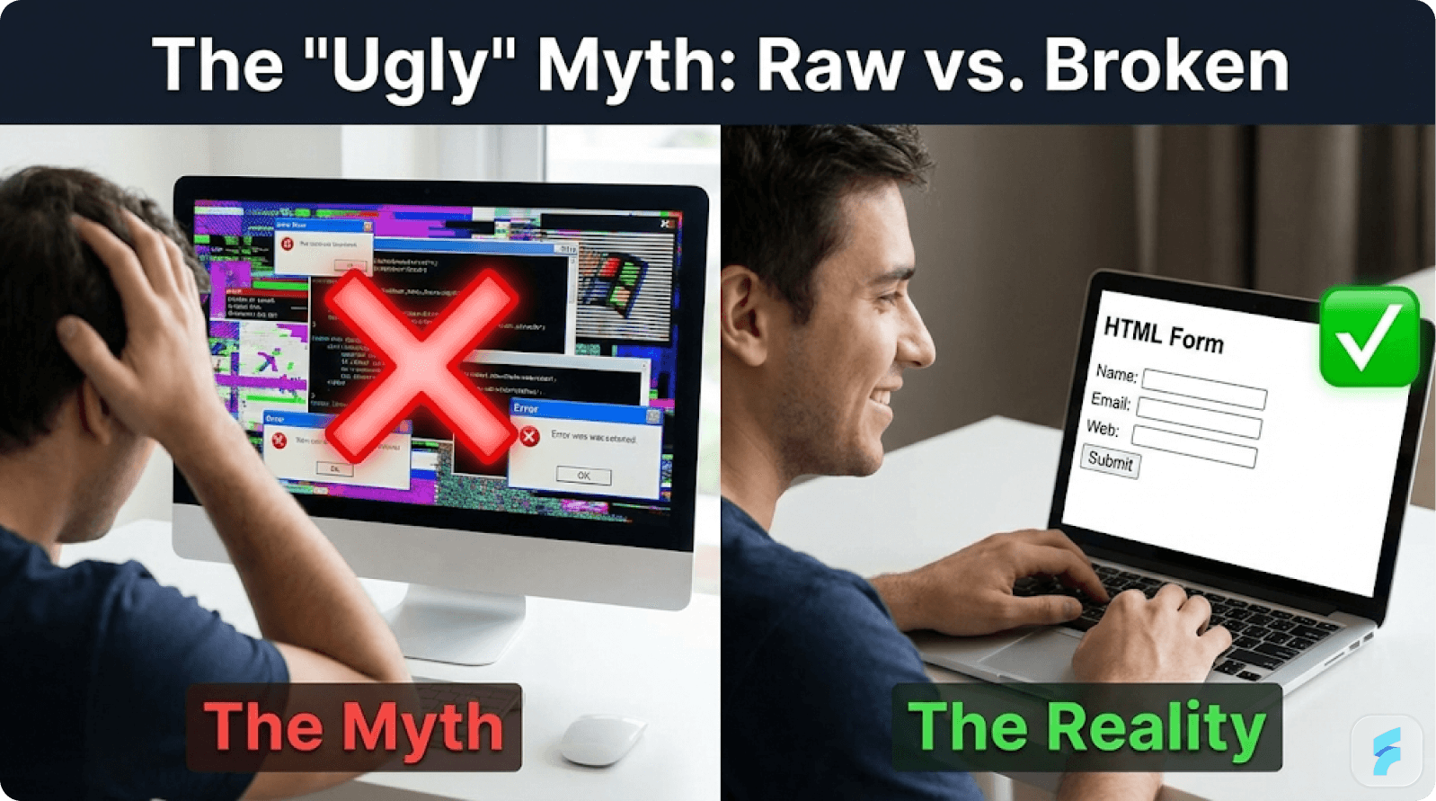
"Ugly but usable" beats "beautiful but broken" — Craigslist earns $500M annually with a 1990s interface because speed trumps aesthetics when solving urgent problems. Users forgive plain design but abandon confusion.
Visual credibility is mandatory for trust-heavy products — Airbnb nearly failed until professional photos doubled revenue overnight. In fintech, health, and marketplaces, aesthetics signal reliability. 58% won't use "unprofessional-looking" financial apps.
The 2025 baseline has shifted upward — Modern tools make baseline polish achievable in days. Users expect sub-3-second loads, mobile functionality, and consistent states. 30% of apps die Day 1 from UI confusion, not ugliness.
Match design investment to context — High-utility B2B can launch bare bones. Trust-heavy categories need professional polish. Competitive consumer markets require lovable experiences. Wrong tier wastes runway or kills traction.
Test with 5 strangers before launch — If 4/5 can't complete your core task independently, iterate. Run usability audits, performance checks (Lighthouse >90), and mobile tests. Fix broken workflows, not aesthetics.
Foundational UX returns $100 per $1 spent — Clear labels, logical flows, and reduced friction drive conversions. But this requires functional usability first. Beauty doesn't compound without utility.
Launch when you outperform the status quo — Ship functional MVP in weeks 1-2. Add trust signals weeks 3-4 based on feedback. Layer delight only after 30% retention. Let evidence gate design investment.
Competitive markets demand "minimum lovable" products — 2025 MVPs compete against Linear and Notion, not spreadsheets. In crowded categories, products need emotional engagement for word-of-mouth. But lovability without usability still fails.
Introduction
Founders grappling with tight runways face a persistent question: how much visual polish does a minimum viable product actually need? The answer isn't universal, but research from Y Combinator's Paul Graham and data from hundreds of product launches reveal a clear principle—solving urgent problems first matters more than pixel perfection, yet strategic design choices can accelerate or destroy your validation timeline.
This guide synthesizes real-world case studies, empirical data from UX research institutions, and a practical framework to help you determine where your MVP falls on the design spectrum. The goal: launch fast without sabotaging your chances.
What "Not Too Ugly" Actually Looks Like
The Craigslist Paradox: When Utility Trumps Everything
"Not too ugly" describes an MVP that delivers undeniable core value through intuitive usability. Users forgive aesthetic shortcomings when a product saves time, money, or hassle immediately. Craigslist exemplifies this benchmark perfectly. Its deliberately spartan interface—blue hyperlinks, minimal whitespace, no modern visual hierarchy—has generated over $500 million annually for 25 years. The reason: it excels at ultra-fast local classifieds discovery.
According to Nielsen Norman Group research, users tolerate "low aesthetic appeal" when task efficiency is 3x faster than alternatives. Craigslist's listings load instantaneously, even on slower connections. Navigation relies on simple, predictable categories rather than complex menus. This demonstrates a fundamental principle: in high-utility marketplaces, information density and speed create loyalty that outlasts design trends.
Quantifying the Usability-First Approach
Forrester Research has consistently documented that every $1 invested in foundational UX—clear labels, logical flows, reduced interaction cost—returns $100 through higher conversion rates. The mechanism: frictionless paths transform one-time visitors into repeat users without requiring visual beauty.
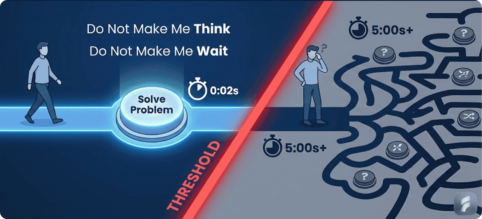
Stanford HCI studies confirm this pattern. Websites with high information scent (clear navigation cues) achieve 50% higher task completion rates than visually polished but confusing alternatives.
The key insight: users assess whether a site will meet their needs in approximately 50 milliseconds, but they stay when functionality proves fast and clear, not when gradients look modern.
Reddit's Content-Forward Launch Strategy
Early Reddit mirrored Craigslist's success formula. The platform launched with minimal styling and content-forward layouts that prioritized user-generated posts over interface ornamentation. This approach sparked viral community growth before any visual polish arrived.
Paul Graham's essay "Do Things that Don't Scale" reinforces this methodology for pre-product-market-fit stages: skip elaborate UIs like automated onboarding dashboards by handling the first 100 users manually via email or direct calls. This frees engineering resources for core problem-solving code.
Gartner research on early-stage SaaS companies found that products prioritizing manual customer onboarding over automated flows achieved 40% higher week-one retention. The high-touch approach scales into software later, but deliberately starts "ugly" by design.
Micro-Summary: Products like Craigslist and early Reddit prove that when core utility is exceptional, users not only tolerate aesthetic simplicity—they often prefer it over visually complex alternatives that slow down task completion.
The Modern B2B Reality: Baselines Have Shifted
Linear's Craft Baseline
The B2B software landscape has evolved. Linear's rapid ascent in the saturated project management space—competing against Jira and Asana—began with functional intuition that felt premium from day one. Issues loaded instantly. Task grouping made logical sense. The experience was snappy before it was beautiful.
Product strategist Lenny Rachitsky notes that in 2025, B2B users conditioned by consumer-grade applications expect sub-200ms response times and frictionless interactions. This doesn't mean elaborate animations, but it does mean meeting a usability baseline.
MIT research on enterprise software adoption shows that 88% of users abandon applications with frustrating experiences like hidden buttons or inconsistent interaction states, not merely unpolished ones. The distinction matters: "unpolished" differs fundamentally from "broken."
The Speed Imperative
Modern users make snap judgments. Baymard Institute research documents that 40% of users abandon websites that take more than 3 seconds to load. For MVPs, performance is design.
YC-backed founders report that bootstrap templates from Tailwind CSS or Material UI suffice for initial traction, provided core interactions remain smooth. Reddit founder discussions affirm: "crappy UI thrives when tasks complete seamlessly, but broken UI kills products regardless of the problem being solved."
Mobile-First Considerations
Even "not too ugly" MVPs now demand mobile responsiveness. Craigslist's text-focused grids work across devices without native apps, sidestepping the 50% uninstall rate that plagues mobile apps with poor adaptation, according to AppsFlyer data.
CleverTap's 2024 analysis found that 30% of mobile apps are abandoned within the first day due to UI bewilderment—when cognitive load exceeds problem relief. Your MVP must be navigable on small screens from launch.
Definition: Cognitive Load
The total mental effort required to use a system. High cognitive load occurs when users must remember information, parse complex layouts, or decode unclear labels. Reducing cognitive load improves usability more than adding visual polish.
Micro-Summary: The 2025 MVP baseline has shifted. While perfect aesthetics remain optional, responsive performance, clear interaction states, and mobile functionality are now non-negotiable for most product categories.
When "Too Ugly" Becomes Unusable—And Fatal
The Trust-Killing Threshold
"Too ugly" crosses into unusable territory when design flaws manifest as navigational mazes, trust-eroding visuals, or performance issues that spike churn. These problems often masquerade as "no market need" in startup post-mortems, but root causes trace back to fixable UX failures.
McKinsey analysis of failed startups found that 42% cited "lack of market need," yet deeper investigation revealed that 60% of these failures involved products with severe usability debt. Users couldn't understand the value proposition because they couldn't successfully complete core tasks.
Airbnb's Near-Fatal Visual Crisis
Airbnb's early struggles epitomize how aesthetics serve as trust proxies. The functional peer-to-peer rental marketplace limped along at $200 in weekly revenue despite solving a real problem. The issue: grainy host photos and amateur layouts screamed "scam" to potential guests.
Booking a stranger's home requires enormous trust. Professional photography became essential, not decorative. When founders borrowed a camera for New York photo shoots, revenue doubled within a week. This unlocked Y Combinator growth and eventually led to the 2014 "Bélo" rebrand that cemented trust through consistent, warm visuals.
As Stanford behavioral economics research confirms, visual consistency signals reliability in high-stakes transactions. Pre-photo-refresh, Airbnb's conversion rate hovered around 1-2%; post-refresh, it surged as professional images bridged emotional gaps—trust, aspiration—unachievable through text alone.
The 50+ Startup Post-Mortem Pattern
Analysis of over 50 startup failures published on platforms like Hacker News and IndieHackers reveals consistent patterns. Top failure modes include:
Slow loads perceived as broken functionality (not just annoying)
Mobile breakage creating impression of abandonment
Workflows requiring tutorials indicating poor mental model alignment
Inconsistent interaction states causing user confusion
Harvard Business Review research found that 50% of apps experience abandonment within 30 days, with poor UX rivaling irrelevance as the primary driver. Web equivalents show 94% bounce rates from first-impression friction.
Formula: Friction Scoring
Friction Score = (Number of Steps × Average Cognitive Load per Step) + Error Recovery Time
Lower scores indicate smoother user experiences. MVPs should optimize for minimal friction in core workflows.
The 2025 Toolkit Paradox
Modern development tools create a paradox: Tailwind CSS and Vercel make reasonable polish achievable in days, so bare HTML now feels deliberately negligent. This perception varies by category.
In fintech, sparse design evokes fraud. In health applications, it implies incompetence. Atlassian's research on Minimum Lovable Product (MLP) concepts shows that today's users, accustomed to high-baseline consumer apps, demand certain baseline quality for stickiness.
The shift from MVP to MLP reflects market maturity. Raw launches worked in 2010 when alternatives were spreadsheets. In 2025's competitive landscape, products must be lovable, not just viable, to generate word-of-mouth growth.
Quantifying Unusability
CleverTap data reveals that 30% of applications fail on Day 1 due to UI bewilderment. Nielsen Norman Group studies show that users abandon products when interaction cost—time plus mental effort—exceeds perceived value by 2x or more.
Even Craigslist's deliberately basic interface succeeds only because it meets its utility promise: listings consistently match search intent. If navigation broke or searches returned irrelevant results, users would leave despite the lack of prettier alternatives.
Micro-Summary: "Too ugly" means unusable, not merely unpolished. Trust-dependent products require visual credibility. Performance failures read as abandonment. Competitive categories demand baseline polish. Usability always gates success, regardless of aesthetic ambitions.
Actionable Framework: Dial In Your MVP Design Level
Your MVP's design investment should match your specific context. Use this matrix to balance runway constraints with category risk.
The Three-Tier Design Approach
Tier 1: Bare Bones (High-Utility B2B)
When to use: Solving acute pain in domains where users tolerate minimal aesthetics for speed
Requirements:
Bootstrap or Material UI kit for consistency
Clear call-to-action buttons with sufficient contrast
Sub-2-second page loads on 4G connections
Text-first layouts with logical information hierarchy
Validation metrics:
80% task completion in unmoderated user tests
40% retention at Week 1
Less than 10% support tickets related to navigation confusion
Real-world anchor: Craigslist's speed-density tradeoff
Critical pitfall: Over-customizing icons or animations instead of optimizing core functionality
Expert insight: Jakob Nielsen of Nielsen Norman Group states, "Users care about task completion time, not visual flair. In B2B utility products, every second saved in workflow equals measurable ROI."
Tier 2: Trustworthy Polish (Trust-Heavy Categories)
When to use: Fintech, health tech, marketplaces, or any product requiring confidence in high-stakes decisions
Requirements:
Consistent branded color palette (2-3 primary colors)
Professional photography or high-quality logos
Mobile-responsive layouts tested on iOS and Android
Zero typos, broken links, or inconsistent states
Security badges and clear data handling policies
Validation metrics:
70% trust score in user surveys (5-point scale)
Bounce rate below 20% on landing pages
Conversion rate improvement of 3x over text-only versions
Real-world anchor: Airbnb's photo-quality transformation
Critical pitfall: Generic stock photos that feel inauthentic and erode credibility
Expert insight: BJ Fogg's Stanford Persuasive Technology Lab found that "visual credibility cues—professional images, consistent branding—increase perceived trustworthiness by 75% in consumer financial products."
Tier 3: Minimum Lovable Product (Competitive Consumer/Social B2B)
When to use: Crowded markets where alternatives are abundant and switching costs are low
Requirements:
Micro-interactions and subtle animations on state changes
Haptic feedback on mobile (where applicable)
Thematic consistency across all touchpoints
Polished empty states and error messages
Personality-driven copy and visual identity
Validation metrics:
60% of users rate experience as "delightful" in NPS surveys
Viral coefficient above 1.2 (each user invites 1.2+ others)
Session duration 30% higher than category average
Real-world anchor: Linear's craft benchmark
Critical pitfall: Investing in polish before validating problem-solution fit—beautiful dashboards masking unmet needs
Expert insight: Intercom's product research shows that "in markets with 5+ strong competitors, products need to be 10x better or noticeably more delightful to capture attention. Polish becomes product strategy, not cosmetic choice."
Context-Specific Decision Matrix
Category | Pain Acuity | Trust Requirement | Competition | Recommended Tier |
|---|---|---|---|---|
Enterprise automation | Very high (20hr/week savings) | Medium | Low | Tier 1: Bare Bones |
Consumer fintech | Medium | Very high | High | Tier 2-3: Trust + Polish |
Social productivity | Low-medium | Low | Very high | Tier 3: MLP |
Healthcare compliance | High | Very high | Medium | Tier 2: Trustworthy |
Developer tools | High | Medium | Medium | Tier 1-2: Function + Respect |
Definition: Interaction Cost
The sum of mental and physical effort required to accomplish a goal. Includes reading, scrolling, clicking, waiting, thinking, and error recovery. Lower interaction costs correlate with higher conversion and retention.
Micro-Summary: Design investment isn't one-size-fits-all. Match your tier to pain acuity, trust requirements, and competitive intensity. Higher tiers cost more but become essential in certain contexts.
Pre-Launch Validation: The 5-User Test Protocol
Before shipping any MVP—regardless of design tier—validate against these non-negotiable checkpoints. Learn more about comprehensive UX audit processes.
1. Usability Audit with Strangers
Protocol: Recruit 5 people unfamiliar with your product. Ask them to complete your core user journey without hints or guidance. Observe where they hesitate, misclick, or abandon.
Pass criteria: 4 out of 5 complete the primary workflow successfully
Fail response: Iterate navigation, labeling, or flow immediately before launch
Nielsen Norman Group research demonstrates that 5 users uncover 85% of usability issues—more testing yields diminishing returns for early-stage products. Explore our product design services for expert guidance.
2. Performance Check
Protocol: Run Google Lighthouse audits on both mobile and desktop versions
Pass criteria:
Lighthouse score above 90 on mobile
First Contentful Paint under 1.5 seconds
Time to Interactive under 3.5 seconds
Fail response: Optimize images (use WebP format), implement lazy loading, minify CSS/JS, leverage CDN caching
Google research shows that 53% of mobile users abandon sites taking over 3 seconds to load—performance directly impacts revenue.
3. Consistency Scan
Protocol: Click through every button, link, and interaction state. Verify visual and behavioral consistency.
Pass criteria:
All buttons follow same styling patterns
Hover states exist and provide feedback
Error messages are helpful and specific (not "Error 500")
Loading states clearly communicate progress
Fail response: Create a component library, even simple, to ensure uniformity
42% of users lose trust in products with inconsistent interfaces, according to Baymard Institute research.
4. Mobile Responsiveness Test
Protocol: Test on actual iOS and Android devices, not just browser simulators
Pass criteria:
All core workflows completable on mobile without pinch-zooming
Touch targets minimum 44×44 pixels (Apple HIG standard)
Forms use appropriate input types (number pads for phone numbers)
Fail response: Implement mobile-first CSS, test on real devices
Mobile now accounts for 58% of web traffic globally—desktop-only MVPs miss majority audiences.
5. Polish Preference A/B (Optional but Revealing)
Protocol: Show 20 target users side-by-side screenshots: your MVP versus a direct competitor
Measurement: Ask "Which would you trust more?" and "Which would you try first?"
Insight: If your MVP loses by more than 70/30, consider small trust-building additions (better photos, consistent branding)
Definition: Activation Friction
Obstacles preventing new users from experiencing core value quickly. High activation friction (complex signups, unclear next steps, broken onboarding) causes abandonment before users understand product benefits.
Micro-Summary: The 5-user protocol catches fatal flaws before launch. It takes 2-3 days but prevents months of misdirected development on unusable foundations. Visit our blog for more insights on SaaS validation.
Iteration Roadmap: Building Design Incrementally
Weeks 1-2: Ship Bare Bones
Focus: Launch with foundational UX only—clear labels, logical flows, fast performance
Activities:
Deploy with Bootstrap/Tailwind for basic consistency
Ensure primary user journey works end-to-end
Set up analytics to log drop-off points
Measurement: Qualitative feedback via Hotjar recordings, Intercom conversations, or direct user calls
Goal: Find problem-solution fit—does the core functionality solve the stated problem?
Andreessen Horowitz research shows that products achieving problem-solution fit within 6 weeks have 3x higher chances of reaching product-market fit.
Weeks 3-4: Polish Trust Signals
Focus: Address feedback from first 10-20 users, prioritizing trust-related concerns
Activities:
Add branded color palette (use tools like Coolors for quick generation)
Replace placeholder images with authentic, high-quality photos
Implement consistent typography (choose 2 fonts maximum)
Fix any broken states or confusing labels users mentioned
Measurement: Track bounce rate changes, conversion rate on core action
Goal: Build enough credibility that users feel comfortable inviting colleagues or paying
Month 2+: Layer Delight
Focus: Once retention exceeds 30%, invest in stickiness-increasing polish
Activities:
Add micro-interactions (smooth transitions, hover effects)
Implement empty states with personality (not just "No data")
Create delightful error messages that maintain trust
Polish mobile experience with haptics and gesture support
Measurement:
Net Promoter Score (NPS) above 30
Viral coefficient trending toward 1.0+
Session duration increasing month-over-month
Goal: Create word-of-mouth by making product notably more enjoyable than alternatives
Expert insight: Teresa Torres, product discovery coach, emphasizes: "Delight creates retention and advocacy, but only after you've earned the right by solving the core problem reliably. Polish too early and you optimize for aesthetics instead of outcomes."
Micro-Summary: Incremental iteration prevents over-investment in wrong areas. Start functional, add trust, then layer delight as evidence warrants. Each phase should be validation-gated. Explore our UX optimization services for expert support.
Special Considerations by Product Category
B2B Enterprise Tools
Unique challenges: Selling to committees, lengthy evaluation cycles, security scrutiny
Design implications:
Professional appearance signals organizational maturity
Clear documentation and help resources reduce perceived risk
Role-based dashboards demonstrate understanding of enterprise needs
Launch threshold: Tier 1-2 (Bare Bones to Trustworthy)
Gartner research on B2B software adoption shows that visual credibility correlates with perceived security—even when no security features differ.
Consumer Marketplaces
Unique challenges: Two-sided network effects, trust between strangers, transaction risk
Design implications:
High-quality imagery essential for seller credibility
Reviews and ratings need prominent placement
Transaction flows must feel secure (progress indicators, confirmations)
Launch threshold: Tier 2 minimum (Trustworthy Polish)
Marketplace expert Bill Gurley notes: "In marketplaces, design isn't decoration—it's the mechanism that builds trust between parties who would otherwise never transact."
Developer Tools
Unique challenges: Technical audience with high standards, alternatives readily available
Design implications:
Documentation quality matters more than interface beauty
Performance and reliability signal technical competence
Code examples and clear error messages trump visual polish
Launch threshold: Tier 1 acceptable if docs are excellent
GitHub's research shows that 67% of developers rate documentation quality as more important than UI aesthetics.
Health and Wellness Apps
Unique challenges: Medical accuracy concerns, personal data sensitivity, behavioral change difficulty
Design implications:
Professional appearance suggests medical credibility
Privacy controls and clear data policies essential
Motivational design elements (progress tracking, streaks) improve outcomes
Launch threshold: Tier 2-3 (Trust + Engagement)
Fintech Products
Unique challenges: Regulatory compliance visibility, financial risk perception, security concerns
Design implications:
Bank-level visual polish reduces fraud perception
Clear security badges and SSL indicators
Transaction confirmations with audit trails
Error messages must never seem flippant
Launch threshold: Tier 2 minimum, often Tier 3
58% of users won't use financial apps that "look unprofessional," per Forrester consumer banking research.
Micro-Summary: Category context determines your viable design floor. Trust-heavy and competitive categories require higher baselines, while high-utility B2B products can launch leaner.
Common Founder Mistakes and How to Avoid Them
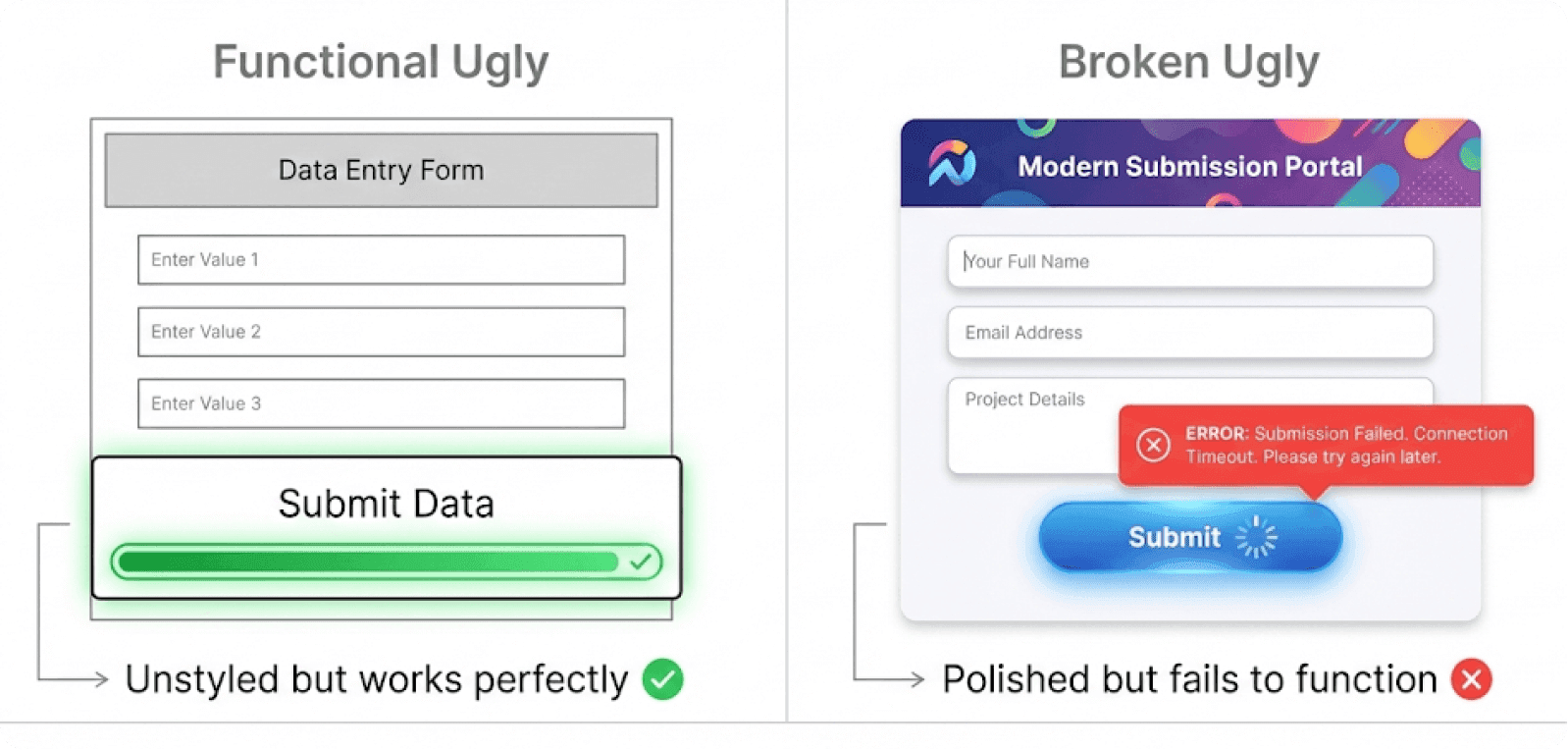
Mistake 1: Confusing "Ugly" with "Broken"
The error: Shipping unclear navigation or inconsistent states under the banner of MVP speed
Why it fails: Users interpret broken functionality as lack of competence, not intentional minimalism
Fix: Audit for completion—every clickable element must work, every form must validate clearly
Mistake 2: Over-Designing Before Validation
The error: Spending 3 months on pixel-perfect mockups before talking to users
Why it fails: Beautiful solutions to non-problems waste runway and delay learning
Fix: Build in 2-week sprints, test with real users every cycle, iterate based on actual behavior
Y Combinator data shows that startups spending >30% of pre-launch time on design details have 40% lower survival rates than those focused on customer development.
Mistake 3: Ignoring Mobile Entirely
The error: "We'll add mobile later once we validate"
Why it fails: Mobile-first user behavior means you're excluding 50%+ of potential users
Fix: Build responsive from day one—it's easier than retrofitting later
Mistake 4: Using "MVP" as Excuse for Bad UX
The error: Justifying confusing flows or slow performance as "shipping fast"
Why it fails: Bad UX creates false negatives—you can't tell if users reject your solution or your execution
Fix: Distinguish between aesthetic simplicity (acceptable) and usability failures (not acceptable)
Mistake 5: Copying Competitor Aesthetics
The error: Cloning Linear's design hoping to inherit its success
Why it fails: Aesthetic mimicry without understanding user workflows creates hollow products
Fix: Copy functional patterns (fast search, clear states), not visual style
Micro-Summary: MVP philosophy means validated learning, not corner-cutting. Ship simple, but never ship broken.
Launch Checklist: Final Pre-Ship Validation
Before deploying your MVP to public users, verify each item:
Core Functionality
Primary user journey completable without hints
Error states provide clear recovery paths
All forms validate inputs with helpful messages
Data persists correctly across sessions
Performance
Lighthouse mobile score >90
Time to Interactive <3.5 seconds on 4G
Images optimized (WebP format, compressed)
No console errors in browser inspector
Trust Signals (if applicable)
SSL certificate installed (HTTPS, not HTTP)
Privacy policy accessible and clear
Contact information visible
Professional imagery (no stretched photos)
Cross-Device Testing
Tested on Chrome, Safari, Firefox
Tested on iOS Safari and Android Chrome
Touch targets minimum 44px on mobile
Text readable without zooming
Consistency
Buttons follow unified styling
Colors used consistently (max 3 primary)
Typography scales logically (max 2 font families)
Spacing follows rhythm (4px/8px grid)
Analytics Setup
Event tracking for core actions
Drop-off monitoring at each step
Error logging configured
Session recording tool installed (Hotjar, FullStory)
Micro-Summary: This checklist prevents avoidable launch failures. Each item correlates with measurable improvements in conversion, trust, or retention.
Closing: Launch Smart, Iterate Intelligently
Your MVP's tolerance for aesthetic simplicity hinges on problem acuity, trust requirements, and competitive context. "Ugly" triumphs over spreadsheets but trails polished competitors in saturated markets.
The 2025 reality: modern tooling makes baseline polish achievable in days, not months. Tailwind CSS, Vercel, and component libraries have collapsed the cost of "good enough" design. This means your bar is higher than 2010's MVPs, but lower than perfectionism.
Follow Paul Graham's core principle: validate usability ruthlessly through manual, high-touch methods before scaling software. Test with real strangers. Measure actual completion rates. Fix what breaks, not what's simply plain.
In an era of low development barriers, "not too ugly" unlocks product-market fit faster than perfectionism. Forrester's research promises $100 return for every $1 in foundational UX—the kind that enables task completion, not the kind that wins design awards.
Ship when your MVP outperforms the status quo for your target users. Refine post-traction, as evidence guides investment. Watch utility compound into loyalty, then layer beauty as retention and growth justify the effort.
The best products evolve from useful to delightful—but they never skip useful.
Glossary: Key UX and Design Terms
Activation Friction
Obstacles preventing new users from experiencing core product value quickly. Includes complex registration, unclear first steps, and broken onboarding flows. High activation friction causes abandonment before users understand benefits.
Cognitive Load
The total mental effort required to use a system. Increases when users must remember information, parse complex layouts, or decode unclear labels. Reducing cognitive load improves usability more than adding visual polish.
Conversion Rate
The percentage of visitors who complete a desired action (signup, purchase, download). Directly affected by usability, trust signals, and friction levels. Industry averages range from 2-5% for SaaS products.
Friction Score
Quantitative measure of user effort: (Number of Steps × Cognitive Load per Step) + Error Recovery Time. Lower scores indicate smoother experiences. MVPs should minimize friction in core workflows.
Information Hierarchy
Visual arrangement of content by importance, using size, contrast, and position to guide attention. Clear hierarchy reduces cognitive load and improves task completion rates by 40-60%.
Information Scent
Cues indicating whether a path leads to desired information. Strong scent (clear labels, logical categories) improves navigation success. Weak scent causes users to abandon searches.
Interaction Cost
Sum of mental and physical effort to accomplish a goal. Includes reading, scrolling, clicking, waiting, thinking, and error recovery. Lower costs correlate with higher conversion and retention.
Mental Model
User's internal understanding of how a system works. Products matching users' existing mental models require less training and achieve faster adoption. Violating mental models increases error rates.
Minimum Lovable Product (MLP)
Evolution of MVP concept emphasizing that modern products must be emotionally engaging, not just functional. Particularly relevant in competitive consumer markets with low switching costs.
Net Promoter Score (NPS)
Metric measuring likelihood of users recommending a product (0-10 scale). Scores above 30 indicate good retention potential. Calculated as % Promoters (9-10) minus % Detractors (0-6).
Product-Market Fit (PMF)
Stage where product strongly satisfies market demand, evidenced by organic growth and high retention. Marc Andreessen's definition: "when usage grows faster than you can add features."
Retention Curve
Graph showing percentage of users remaining active over time. Flattening curve (retaining 30%+ after 90 days) signals product-market fit. Steep decline indicates usability or value problems.
Time to Interactive (TTI)
Performance metric measuring when page becomes fully usable. Google recommends <3.5 seconds on mobile. Longer TTI correlates strongly with abandonment and bounce rates.
Usability Debt
Accumulated UX problems that compound over time, similar to technical debt. Includes inconsistent patterns, unclear workflows, and unresolved user pain points. Increases support costs and churn.
Viral Coefficient
Average number of new users each existing user brings. Coefficient >1.0 indicates organic growth. Achieved through referral programs, word-of-mouth, or network effects.
References and Research Sources
This article synthesizes research and insights from the following authoritative sources:
Research Institutions:
Nielsen Norman Group (usability research and heuristics)
Forrester Research (UX ROI studies)
Gartner (enterprise software adoption)
Baymard Institute (ecommerce UX research)
Industry Analysis:
Y Combinator startup data and founder essays
Andreessen Horowitz venture research
McKinsey digital transformation studies
AppsFlyer mobile analytics
CleverTap app retention research
Product Strategy Experts:
Paul Graham (Y Combinator)
Lenny Rachitsky (product growth)
Teresa Torres (product discovery)
Jakob Nielsen (usability principles)
BJ Fogg (persuasive technology)
Bill Gurley (marketplace dynamics)
Technical Standards:
Google Lighthouse performance metrics
All statistics, frameworks, and recommendations are based on published research, case studies, and empirical data from these sources.