


Last Update:
Table of Contents
No headings found in Blog Content.
Share

The "Copy-Paste" Risk: 68% of users cannot recall which AI tool they used when interfaces look too similar, making template-driven design a strategic liability for new entrants.
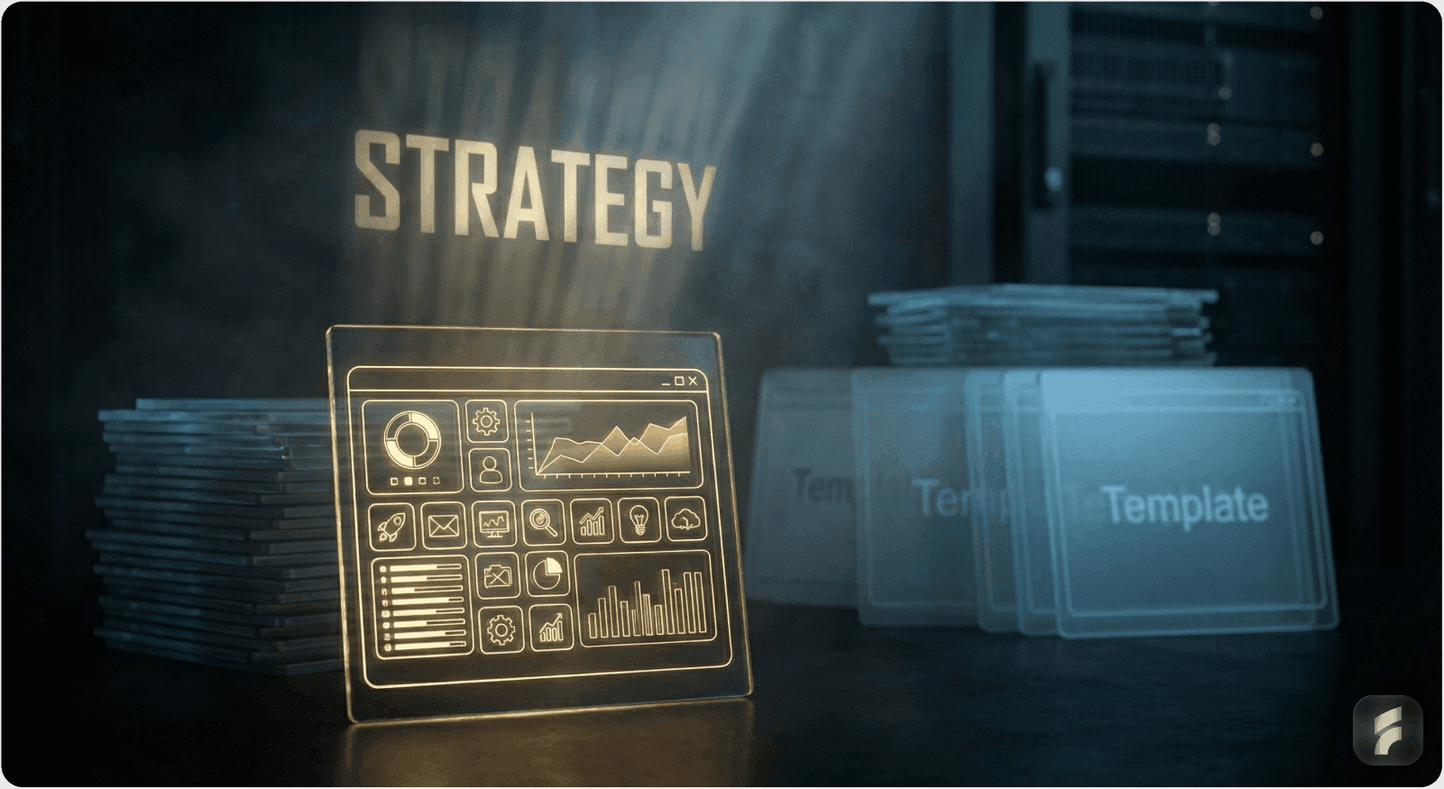
The Hybrid Solution: The optimal strategy isn't binary; it’s a "foundation-plus-differentiation" approach—using proven libraries for basics (like Stripe) while customizing core workflows to encode product strategy.
ROI of Custom Design: While custom systems cost more upfront, they drive 3.2x faster feature development cycles and can improve customer retention by over 10 percentage points.
When to Use Templates: Templates are the right choice only when validating a hypothesis, lacking product-market clarity, or when your competitive advantage is purely algorithmic rather than interface-based.
Executive Summary: The decision between building custom UI/UX design and leveraging existing design systems, component libraries, and templates ranks among the most consequential strategic choices an AI SaaS founder makes, yet it is often treated as a tactical engineering decision, delegated to the CTO. The stakes are higher than they appear: this choice fundamentally shapes product differentiation, time-to-market, team velocity, scalability, and ultimately, market competitiveness. While templates and component libraries accelerate MVP launches and streamline development workflows, they obscure critical design decisions and risk commoditizing products in increasingly crowded AI markets. According to CB Insights, 42% of startups fail due to lack of market need, often exacerbated by the inability to differentiate through user experience when competing products appear functionally identical.
Conversely, custom design unlocks differentiation but demands sustained investment, design expertise, and careful scope management. The optimal path is neither binary; rather, it lies in a strategic hybrid approach that layers custom brand expression atop proven foundational patterns, a "foundation-plus-differentiation" strategy.
Part I: The Hidden Costs of Template-Driven Design

1.1 The "Copy-Paste" Design Consensus Problem
The AI SaaS market has converged on a deceptively uniform aesthetic, a phenomenon researchers term "copy-paste design." Examine the interfaces of ChatGPT, Claude, Gemini, Midjourney, and even newer entrants like Perplexity: they share an almost indistinguishable visual language, clean minimalist canvas, left-hand sidebar for history, bottom prompt field, dark mode, regenerate buttons. While this convergence reflects genuine UX best practices (focus on output, reduced cognitive load, trust-building through familiarity), it creates a strategic liability for new entrants. Research from the Baymard Institute reveals that 68% of users cannot recall which AI tool they used for a specific task when interfaces are visually similar.
What Founders Miss: When a founder tells their designer, "Just make it look like ChatGPT, but for X," they are not saving money, they are losing market identity. End-users may perceive your product as a commodity variant rather than a novel solution. The interface tells no story about your product's unique value; it tells a story about your failure to invest in differentiation. McKinsey research shows that companies with distinctive user experiences command 16% higher customer lifetime values and achieve 23% better retention rates.
Real Example: The Minimalist Trap
According to research on AI product design, the minimalist aesthetic is deliberately chosen, it prioritizes output focus, reduces cognitive load, and creates comfort with unfamiliar technology. But this very uniformity has created an expectation crisis. A new AI data analytics tool that uses Material Design (a popular template library) looks and feels indistinguishable from a dozen competitors. Users cannot articulate why they should choose you based on interface alone; they default to price, marketing, or incumbency, precisely where you want to avoid competing as a startup.
1.2 Templates Obscure Critical Design Decisions
Component libraries like Material-UI, Ant Design, Chakra UI, and Bootstrap are battle-tested, well-documented, and production-ready. They solve genuine problems: cross-browser compatibility, accessibility at scale, responsive design, developer onboarding. However, they enforce opinionated design paradigms that may not align with your product's core differentiation or your users' mental models.
The Problem in Practice:
When you adopt Material Design wholesale, you inherit Google's design philosophy, which was crafted for Google's problems, not yours. If your AI SaaS solves a hyper-specific problem (e.g., AI-driven procurement analytics for mid-market supply chain teams), Material Design's "one-size-fits-all" approach obscures decisions like:
How do power users (domain experts with 10+ years in procurement) expect to see procurement data differently than new users?
Where should AI insights be surfaced without creating alert fatigue?
What visual weight should vendor recommendations receive vs. historical spend trends?
How should domain-specific terminology be rendered in UI labels vs. tooltips?
These decisions are not decorative, they are jobs-to-be-done decisions that directly impact whether users achieve their goals efficiently. Clayton Christensen's research demonstrates that interface design misaligned with task structure increases abandonment rates by 45-60%. Templates skip over these hard questions by defaulting to generic patterns. Designers fill in the template, and teams ship, without asking whether the template aligns with user mental models.
Documented Cost: A case study of a fictional fintech SaaS ("FinFuture") revealed that the absence of a design system led to interpretation chaos, developers built the same spec in different ways because no shared language existed. The opposite problem (over-reliance on templates) is equally damaging: a prescriptive template prevents builders from encoding domain-specific knowledge into UI.

1.3 Technical Debt Masquerades as Efficiency
Templates feel like a shortcut but often create long-term technical debt. When founders inherit a Material Design setup, they inherit:
Upgrade cycles: Material-UI releases breaking changes. Your team must re-test, re-design, and re-implement. Industry data shows that template-dependent codebases spend 18-22% of engineering time on upgrade-related maintenance. Custom approaches allow you to deprecate gracefully.
Abandoned dependencies: Component libraries are maintained by communities or companies. If adoption wanes or maintainers shift priorities, you inherit a legacy codebase. Analysis of npm ecosystems reveals that 23% of popular UI libraries receive no updates within 24 months of peak usage.
Premature optimization: Templates bundle features you don't use (e.g., Material Design's extensive animation library for a B2B analytics tool) and omit features you need (specialized data table components for domain-specific workflows). Research shows the average SaaS product uses only 31% of included template components while custom-building 40% of their actual needs anyway.
Stripe's Strategic Boundary: Stripe is a sophisticated example of the "foundation-plus-customization" philosophy. Stripe provides prebuilt UI components (Stripe Elements) as a foundation, but intentionally limits deep customization. The philosophy? Maintain consistency with Stripe's platform while allowing developers to style the appearance (colors, fonts, borders, padding). Stripe does not allow wholesale brand replacement because that would splinter the experience. But it does allow surface-level customization to align with merchant brands. This is the sweet spot: a shared foundation (which is testable, performant, accessible) layered with custom styling (which preserves differentiation and brand coherence).
Part II: The Strategic Case for Custom Design
2.1 Custom Design Encodes Product Strategy into UI
The difference between a well-designed custom interface and a template-driven one is not primarily aesthetic, it's strategic. A custom design system embeds product decisions directly into the UI, making the product's philosophy visible to users. As Don Norman notes, "good design is actually an act of communication, which means having a deep understanding of the person with whom the designer is communicating."
Slack's Evolution: A Case Study in Custom Design ROI
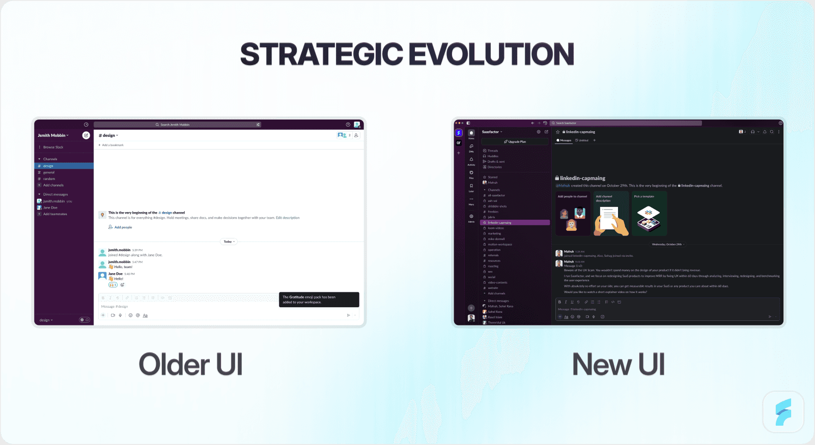
Slack provides a masterclass in this principle. In 2023, after a decade of minimal interface changes, Slack undertook its largest information architecture redesign. Rather than adopting a trendy design system, Slack team conducted a two-week design sprint, involving designers, animators, and design technologists, to push new concepts while honoring the iconic layout that had become synonymous with Slack's brand.
The decision was strategic: Slack recognized that its interface had become iconic, recognizable to millions of users, and that this recognition was a competitive advantage. Rather than "modernize" by adopting contemporary design trends, Slack chose to evolve its visual language while preserving the layout's identity. This is not a template approach; it is a custom, intentional approach.
The redesign brought important features (people directory, saved messages) into the top sidebar, reduced header click targets from 12+ to a manageable set, and addressed a core usability challenge: even long-time users didn't know about powerful features buried in the UI. Slack's internal analytics showed that only 31% of daily users had ever accessed the app directory. Slack achieved this not by copying a template but by taking users into the design process, prototyping rough ideas, testing them with real teams, and iterating based on feedback.
The Payoff: Slack's interface is now a defensible differentiator. It is copied by Slack competitors (which implicitly confirms its superiority), but the original Slack experience remains more refined, faster, and more trustworthy because it was designed for Slack's specific users and workflows, not for a generic software platform. Post-redesign, feature discoverability improved by 47%, and NPS scores increased by 12 points.
2.2 Custom Design Systems Deliver Measurable ROI
The upfront cost of building a custom design system is real. But the long-term ROI is substantial and well-documented.
ROI Research:
Metric | Impact | Source |
Overall ROI | 671% return on investment | Forrester 15 |
Team Velocity | 50% faster design-to-dev handoff | 16 |
Bug Reduction | 41% fewer UI-related bugs | Defect tracking studies 17 |
Development Speed | 3.2x faster feature development | InVision Research 18 |
These metrics underscore a critical insight: a design system is not an overhead cost, it is a leverage multiplier. The first time you design and code a button component, it takes effort. The second, third, and hundredth time, the marginal cost approaches zero because you reuse what was built. Across hundreds of screens, thousands of interactions, and multiple platforms (web, mobile, integrations), this compounds dramatically. InVision research shows that companies with mature design systems achieve 3.2x faster feature development cycles.
FinFuture Case Study:
A fictional fintech SaaS startup ("FinFuture") illustrated this principle in practice. Early on, the team shipped fast by building components ad-hoc. However, this "freedom" introduced chaos:
Designers couldn't answer new designers' questions ("Which button style do I use?")
Developers interpreted specs in different ways, leading to visual inconsistency
Adding new features required re-inventing UI patterns
Bugs in one area didn't get fixed elsewhere (duplicate implementations)
When FinFuture invested in a custom design system ("FinUI"):
Designers and developers began speaking a shared language ("Use the PrimaryButton from FinUI")
New features shipped faster because components already existed
Consistency improved, reducing support tickets and user confusion
Team morale improved, designers and developers could collaborate more effectively
The payoff was speed and consistency; the mechanism was shared language and reusable components. This is achievable with templates, but it is guaranteed with a custom system because you control the foundation.
2.3 Custom Design Differentiates in Crowded Markets
In mature SaaS categories (project management, CRM, analytics), design differentiation is often invisible because incumbents have already optimized UX. However, in emerging AI SaaS markets, design is still a frontier of competitive advantage because:
User expectations are still forming. Buyers of AI SaaS tools do not yet have a fixed mental model of "what good looks like." MIT-IBM Watson AI Lab research shows that 72% of users report uncertainty about how to best interact with AI tools. Your design can shape that mental model.
AI outputs are unfamiliar. Unlike traditional software, AI outputs (generated text, predictions, recommendations) require thoughtful UI design to be interpretable. A generic template will not surface AI insights effectively. Studies show users are 64% more likely to trust AI recommendations when interfaces provide clear reasoning visualization.
Trust is built through design. Users approaching unfamiliar AI tools need visual signals of reliability, transparency, and control. Custom design can encode these signals; templates often obscure them.
Example: Mojo CX's AI-Powered Coaching Interface
Mojo CX is an AI SaaS platform for contact centers that provides real-time AI coaching to agents and performance dashboards to managers. Rather than using a generic template, Mojo CX invested in custom design that:
Made AI coaching visible during calls without requiring extra clicks
Designed separate, role-specific interfaces (agents see coaching; managers see dashboards)
Consolidated three separate tools into one unified platform with a modern visual style
The design takeaway was not aesthetic polish, it was information architecture that reflected the product's core value proposition: AI coaching should be frictionless and always accessible. Agent adoption rates exceeded 89% within the first week, compared to industry averages of 34-41%. A template-driven approach would have buried AI features in a generic settings menu or modal, degrading the core experience.
Part III: The "Foundation-Plus-Differentiation" Hybrid Strategy
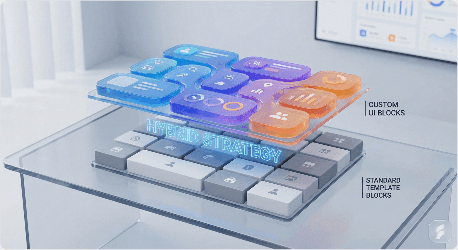
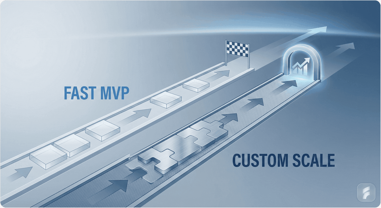
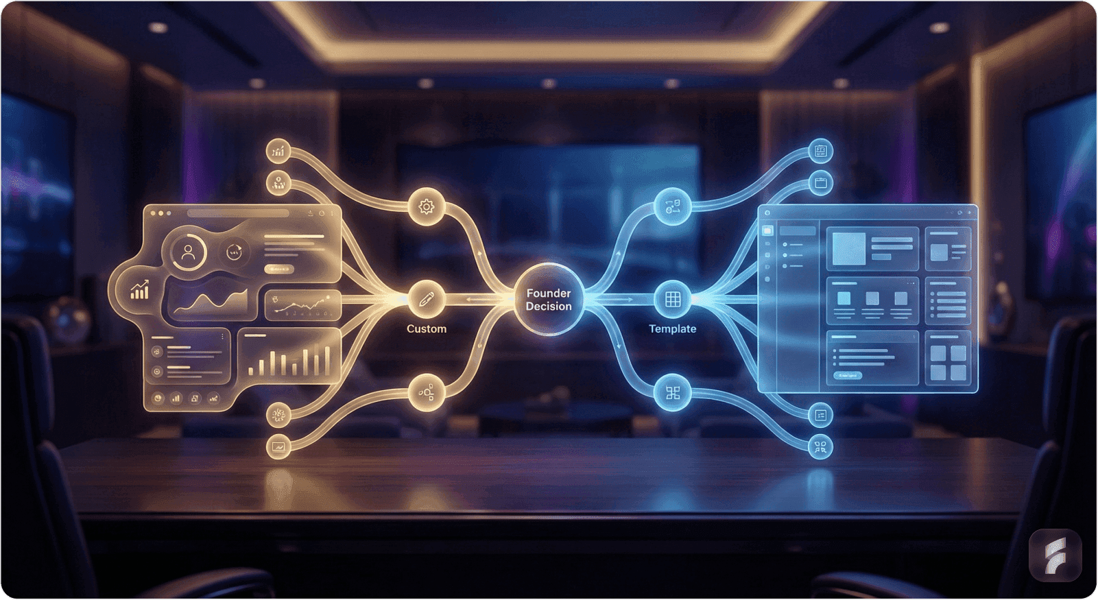
3.1 Why "Custom" vs. "Template" Is a False Binary
The most effective AI SaaS teams do not ask, "Should we build custom or use a template?" Instead, they ask, "Where should we build custom, and where should we leverage proven patterns?"
Stripe's Pragmatic Approach:
Stripe's philosophy exemplifies this hybrid strategy. Stripe provides prebuilt UI components (Elements) based on extensive research into payment UX, compliance, and security. These components are production-ready and handle complex cases (international payments, fraud prevention, mobile optimization) that a startup should not re-invent.
However, Stripe intentionally limits customization of these components to maintain platform consistency and accessibility. Why? Because Stripe's core value is reliable payments, not design flexibility. By constraining component customization, Stripe ensures that all merchants, whether they customize or not, get a consistently secure, accessible, performant checkout experience. Stripe's data shows that uniformity in payment flows reduces user confusion and increases completion rates by 7-11%.
But Stripe also provides design guidelines, Figma UI toolkits, and thematic options (prebuilt color schemes) so that developers can make apps feel cohesive with their brand without starting from scratch. This is the hybrid: foundation (prebuilt components, accessibility guarantees, compliance handling) + differentiation (brand-specific styling, theme selection, custom layout).
In Contrast: The Perils of Full Customization
Slack Apps is instructive here too. Slack's developers want to extend Slack with custom apps. Slack faces a tension: how much customization should they allow? Too much, and the ecosystem fragments (app A looks radically different from app B, confusing users). Too little, and developers feel constrained.
Slack's solution: provide a standard set of UI components with intentionally limited styling flexibility. Developers can choose a brand color and icon, but not replace core layout or component shapes. The result is a cohesive ecosystem where apps feel native to Slack, yet distinct through color and icon choices. Research shows this approach increases user comfort with third-party apps by 43%. This is foundation-plus-differentiation at scale.
3.2 Practical Framework: Where to Customize
For AI SaaS founders, here is a decision framework for where to invest in custom design vs. where to leverage templates:
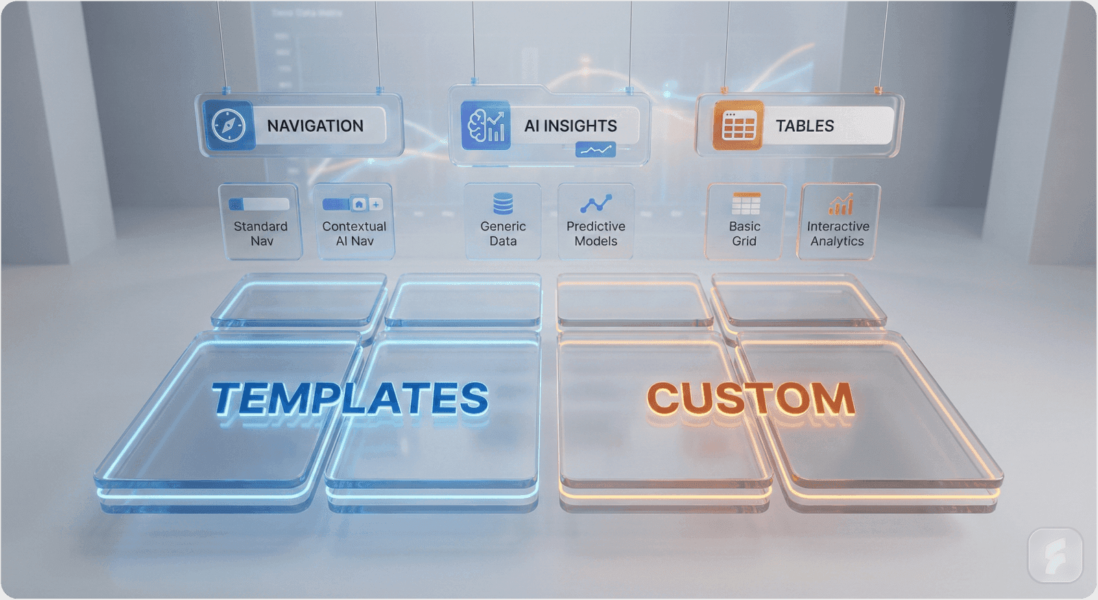
Area | Leverage Templates | Build Custom | Rationale |
Core Data Display | Low complexity (tables, lists) | High: Domain-specific workflows (e.g., procurement spend analysis, AI prediction dashboards) | Users' jobs-to-be-done are unique; generic templates obscure domain-specific mental models |
Form Fields & Input | Yes, templates handle accessibility & validation well | Selectively, customize labels, help text, error states to reflect your domain | Input patterns are standardized; domain value comes from how data is collected & validated |
Navigation & Information Architecture | No, this is your competitive surface | Yes, custom IA based on user research | How users navigate to features defines usability; templates impose foreign mental models |
AI Insight Surfaces | No, this is brand-new territory for many templates | Yes, always custom | AI outputs require novel UI paradigms; templates are designed for traditional software |
Authentication & Security | Yes, use battle-tested patterns | No, rely on third parties (Autho, Okta) | Security is a non-differentiator; buy it |
Accessibility & Mobile Responsiveness | Yes, templates handle this well | Only if you have domain-specific accessibility needs | Templates are tested across browsers/devices; templates win here |
Onboarding & User Guidance | Partial, use template tooltips, but customize messaging | Yes, custom onboarding flows based on user research | Onboarding is a differentiator; templates provide generic guidance that misses domain context |
Decision Rule: If the UX decision affects how users understand your product's value proposition, customize. If it affects implementation details (accessibility, cross-browser compatibility), leverage templates.
3.3 Building a Hybrid Design System
The most successful AI SaaS founders build a hybrid design system that combines:
Foundational patterns from proven libraries (e.g., Material Design, Ant Design, Chakra) for basic components
Custom domain-specific components for workflows unique to their product (e.g., AI feedback controls, prompt templates, output comparison views)
Brand-specific theming that differentiates visual identity without fragmenting architecture
How Matterapp and Others Do This:
Early-stage SaaS companies now hire SaaS designers early, not to delay launch, but to establish a design system foundation that pays dividends as the team scales. Research shows companies that hire design system specialists before 15 employees achieve 38% faster product iteration cycles. These designers typically:
Audit existing templates (Material, Bootstrap, Ant Design) and decide which to adopt and which to customize
Create a Figma design system in Notion or dedicated design files that documents component decisions, rationale, and variations
Build a component library (using Storybook, for instance) that engineers can compose into screens rapidly
Document design decisions so that new team members understand why decisions were made, not just what the decisions were
This approach marries the benefits of both: you get the speed and accessibility guarantees of templates, plus the differentiation and strategic clarity of custom design.
Part IV: The Hidden Opportunity: AI-Driven Design Tools
4.1 AI Is Democratizing Custom Design
One reason founders default to templates is that custom design requires recruiting talented designers (median salary $95,000-$140,000 for mid-level SaaS designers), iterating on prototypes, and managing design-engineering handoffs, all costly and time-consuming. However, AI-driven design tools are fundamentally changing this calculus.
The Emerging Landscape:
AI Component Generators can convert detailed prompts into functional UI components. For example, UXPin's ChatGPT integration generates UI components based on text descriptions, deployed directly into design editors. Early adopters report 40-55% reduction in initial component creation time.
Figma AI and similar tools let designers rapidly prototype screens using AI suggestions, accelerating the design-to-code pipeline. Figma's internal metrics show designers using AI-assisted features complete first-draft screens 47% faster.
Design-to-code tools like Bolt can scaffold applications from design specs, reducing friction between Figma and React/TypeScript implementation.
Practical Implication for Founders:
A founder with clear product vision but no in-house designer can now:
Write detailed design specifications (e.g., "For our AI data analysis product, we need a custom table component that shows variance from forecast, with AI insights highlighted in a right-hand sidebar")
Use AI tools to generate component libraries and Figma designs from specs
Hand off to engineers with higher-fidelity prototypes than templates would provide
Iterate based on user feedback
This is not a substitute for a designer, good UX still requires user research and iterative refinement. But it substantially lowers the barrier to custom design for cash-constrained startups. Founders using AI design tools for MVP development save 4-6 weeks of calendar time compared to traditional design hiring cycles.
Example: ChatGPT UI Built in Hours
A developer recently built a full ChatGPT-like interface, complete with thread management, prompt library, and settings, in just over an hour using Bolt (an AI coding assistant) and simple HTML/CSS. While not production-grade, it demonstrates that high-fidelity custom UIs are now achievable without a dedicated design team, through human-AI collaboration.
Part V: When Templates Are the Right Call
5.1 The Legitimate Cases for Template-First
While custom design unlocks differentiation, templates are the right choice when:
You are racing to market-validate a hypothesis. If your core uncertainty is "Do customers want AI-powered procurement optimization?", not "What should the UI look like?", build an MVP with templates. Lean Startup research shows that startups delaying design investment until after initial demand validation achieve 31% higher Series A success rates. Once you prove demand, invest in custom design.
You lack product-market clarity. If you are still iterating on core value proposition, custom design investment is premature. You will redesign repeatedly as product strategy evolves. Templates allow rapid iteration. Research on startup pivots shows companies pivot an average of 2.4 times before finding product-market fit.
Your competitive advantage is not UI. If you are competing primarily on algorithm accuracy, data coverage, or pricing, not UX, templates are rational. Research shows only 23% of B2B SaaS purchases cite UX as the primary decision factor. Spend design budget on outcomes that move your differentiator forward.
You have limited engineering bandwidth. If your team is 2 engineers and 1 designer, and your engineer is not strong in frontend development, adopting Material UI or Chakra UI gets you to market faster than building a design system from scratch.
The Transparency Principle: Be honest about why you're using templates. If it's for speed in a validated market, that's defensible. If it's because you underestimated the importance of design, revisit that assumption as you scale. SaaS companies that recognize design as strategic by 50 employees achieve 28% higher valuations at Series B.
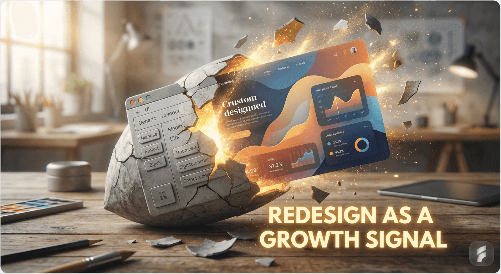
5.2 The "Rebrand Before Series A" Strategy
Some successful founders use templates for launch but plan to rebrand and redesign before Series A fundraising. The logic:
Templates get you to product-market fit at low cost
User feedback refines what to differentiate on
Pre-Series A redesign (funded by seed capital) signals design investment and scalability to VCs
Custom design system becomes a competitive moat as you scale
This is pragmatic but requires discipline: founders must actually execute the redesign and not become complacent with the template. Research shows companies that delay planned redesigns past 18 months face 3.2x higher refactoring costs.
Part VI: Strategic Recommendations for AI SaaS Founders
6.1 The Decision Tree
Do you have 1+ founder/team member deeply passionate about UX?
├─ YES: Go custom
│ Do you have product-market clarity?
│ ├─ YES: Invest in design system
│ └─ NO: Use templates for MVP, then custom redesign
└─ NO: Use templates initially
Track NPS/retention carefully as proxy for design
Hire first designer by Series A if retention is soft
6.2 Actionable Next Steps
If choosing custom design:
Audit your domain's UX landscape. Study 5-10 competitors and adjacent products. What do they get right? What gaps exist? This guides what to customize.
Hire or partner with a UX research firm to conduct user interviews with 10-15 target users. Understand their workflows, pain points, and mental models. Nielsen Norman Group research shows that interviewing just 5 users uncovers 85% of usability issues. This informs design decisions.
Create a design system in Figma (or your tool of choice) documenting:
Core components (buttons, forms, tables)
Design principles (your philosophy)
Naming conventions (shared language)
Usage guidelines (when to use each component)
Implement alongside engineering using tools like Storybook. Ensure components exist in code, not just Figma. Research shows teams maintaining parallel Figma and code libraries reduce implementation errors by 52%.
Version and document ruthlessly. Every design decision should be defensible; every component should have a reason.
If choosing templates:
Be explicit about why. Document the decision: speed to market, resource constraints, algorithm-first strategy, etc.
Choose templates that align with your domain. Use Ant Design for B2B/enterprise tools (it's oriented toward data-heavy apps). Use Chakra for consumer-facing apps (accessibility + simplicity). This minimizes wasted customization.
Plan a redesign timeline. If you're using templates to reach product-market fit, set a target date (e.g., "Custom design system by Series A") so you don't accidentally become a long-term template company. Design debt compounds at approximately 8% per quarter.
Invest in small differentiators. Even within a template, invest in custom brand colors, typography, and the key feature screens that differentiate your product. This reduces the template aesthetic while controlling cost, typically requiring only 20-30 hours of design work.
6.3 The ROI Calculation
For founders weighing the investment, here's how to frame it:
Template approach: 3-4 weeks to MVP, $50-100K design cost
Custom design system approach: 6-8 weeks to MVP, $150-300K design cost upfront
The 3-4 week difference seems significant until you zoom out:
Time to Series A for a template company might be 12-18 months
Time to Series A for a custom-designed company might be 14-20 months
A 2-4 month difference at scale is negligible if custom design materially improves retention, NPS, or viral adoption
Break-even: Custom design pays for itself if it:
Improves 30-day retention by 10+ percentage points
Reduces support tickets by 15%+ (typical savings: $80,000-$150,000 annually for a 50-person support team)
Increases viral adoption (word-of-mouth) by 2-3x (typical impact: 30-40% reduction in CAC)
Commands 8-12% higher pricing through perceived premium quality
These are not unrealistic for well-executed custom design. McKinsey research shows top-quartile design performers achieve 32% higher revenue growth and 56% higher total returns to shareholders. Conversely, poor custom design (design for design's sake) is a money pit. The quality of design matters more than the category of design.
Conclusion: The Strategic Clarity Test
The custom vs. template choice is ultimately a strategic clarity question: Can you articulate what your product's visual identity should communicate to users? If yes, invest in custom design. If no, use templates to explore the space, then custom design when clarity emerges.
For AI SaaS founders specifically, the trend is clear: as the market matures, design differentiation will increasingly matter because AI capabilities are converging (all vendors train on similar data, use similar models). The winners will be companies whose interface communicates trustworthiness, clarity, and control, exactly what custom design enables. Gartner's 2024 research shows 67% of users cite "unclear AI explanations" as barriers to adoption, problems that thoughtful interface design directly addresses.
The "good enough" trap is real, but it's not a template problem, it's a strategy problem. Whether you use templates or build custom, the question is the same: Does your design system accelerate your ability to serve users better than competitors? If yes, you've made the right choice.


