


Last Update:
Table of Contents
No headings found in Blog Content.
Share

Time-to-First-Value (TTFV) is the primary predictor of retention—users who activate within 3 days are 90% more likely to continue using your product
70% of SaaS customers churn within 90 days due to poor onboarding, making early friction detection critical for sustainable growth
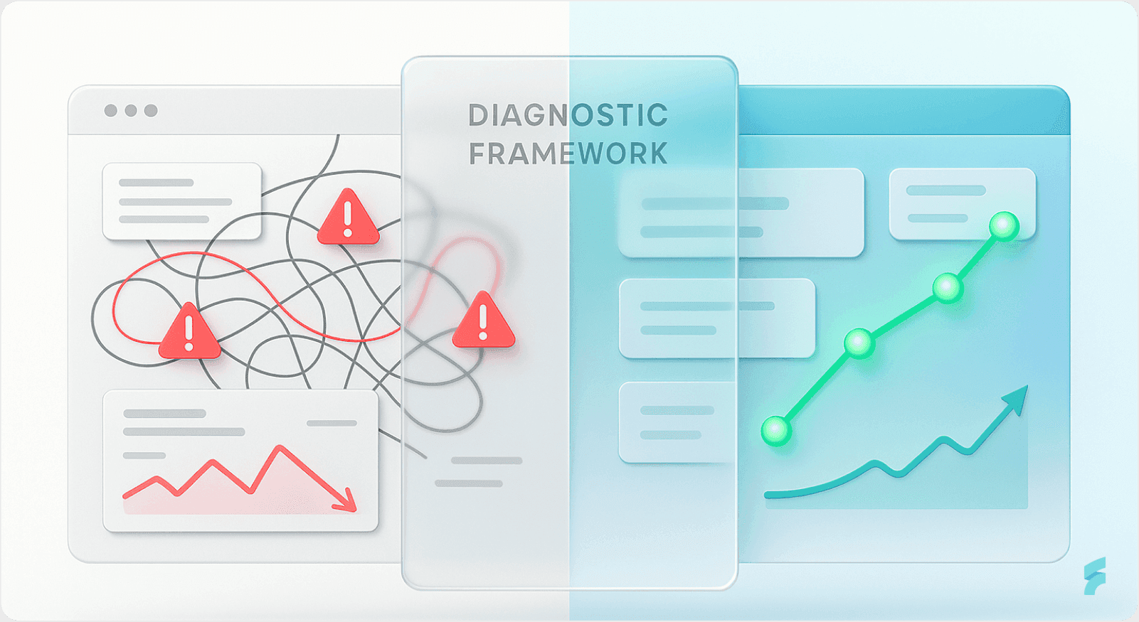
The Three-Layer Diagnostic Model combines positive indicators, negative red flags, and targeted interventions to create a data-informed optimization pathway
Quick wins like reducing form fields from 8 to 4 can increase completion rates by 50-120% with minimal engineering effort
Multi-feature adoption matters: Users integrating 3+ features show 70% higher retention at 12 months compared to single-feature users
TL;DR
SaaS onboarding succeeds when users reach value fast, avoid friction, and adopt core features early. The most predictive metrics are Time-to-First-Value, activation rate, onboarding completion, and early retention. High drop-off, long TTFV, confusing setup screens, and low feature adoption are leading indicators of upcoming churn. A systematic diagnostic model—combining behavioral data, friction analysis, and structured interventions—turns onboarding into a repeatable engine that increases activation, reduces churn, and improves long-term unit economics.
Executive Summary
Founders attempting to scale SaaS products frequently lack a systematic diagnostic framework for identifying why onboarding fails. Poor onboarding creates measurable friction at every customer touchpoint.
Research shows that inadequate onboarding results in user drop-off rates of 40-60% after signup. Even more concerning, 70% of SaaS customers churn within 90 days due to onboarding failures—a pattern that directly undermines growth economics.
According to Nielsen Norman Group research, the majority of abandonment occurs within the first three interactions with a product. The key to detecting and fixing onboarding friction early—when remediation is least expensive—requires systematically tracking three layers of signals.
The Three-Layer Diagnostic Model:
Positive indicators showing healthy activation and momentum
Negative red flags signaling imminent churn or silent dropout
Targeted intervention strategies grounded in real behavioral data
This framework transforms onboarding from a guesswork-driven process into a data-informed diagnostic and remediation pathway. As Stanford's Behavior Design Lab emphasizes, systematic measurement of user behavior patterns enables predictive intervention before churn becomes irreversible.
Part 1: Positive Signals — Indicators That Onboarding Is Working

1.1 Time-to-First-Value (TTFV): The Primary Success Metric
Definition & Core Concept
Time-to-First-Value (TTFV) measures the elapsed time between signup and the moment a new user experiences their first meaningful product benefit. This metric captures the essence of what UX researchers call the "aha moment"—the instant when product value becomes tangible.
Industry Benchmarks by Vertical
Industry benchmarks reveal significant variation by category:
CRM & Sales tools: ~1 day and 4 hours (fastest activation)
Healthcare solutions: ~1 day and 7 hours
Fintech & Insurance: ~1 day and 17 hours
HR solutions: ~3.5 days (slowest)
Industry median: ~1.5 days (36 hours) from signup
According to Gartner's SaaS Performance Index, vertical-specific benchmarks reflect inherent complexity differences. Healthcare and HR platforms require compliance setup and data migration, naturally extending time-to-value.
Why TTFV Matters: The Activation Window
Users who don't activate during the first 3 days post-signup are 90% more likely to churn. This creates what behavioral economists call a "critical activation window."
Reducing TTFV directly correlates with lower early-stage churn. Research from Bain & Company shows that 85% of customers reaching value within 10 days continue using the product long-term.
"The faster users reach their first success, the stronger their commitment becomes. Time-to-value isn't just a metric—it's a predictor of lifetime value." — Dr. BJ Fogg, Stanford Behavior Design Lab
A SaaS company reducing TTFV from 8 minutes to 3 minutes alongside other optimizations saw Day-1 retention rise from 45% to 61%—a 35% relative improvement in early retention.
Real-World Case: Dropbox's Friction Reduction
Successful SaaS companies like Dropbox accelerated their TTFV by reducing initial signup friction to just an email and password. They then progressively collected additional information post-activation.
This two-field approach increased their conversion rate by over 40%. The strategy minimized cognitive load at the critical entry point, allowing users to experience value before encountering setup complexity.
1.2 Activation Rate: The Leading Indicator of Retention
Definition & Significance
The activation rate is the percentage of new users who reach a defined "aha moment"—a milestone where they first perceive core product value. This metric measures successful transition from signup to meaningful engagement.
Benchmark Data Across Performance Tiers
Current industry data reveals:
Average activation rate: 37.5% (median: 37%)
Top quartile performers: >45%
Healthy target range: 40-60% for most SaaS
Opt-out trial conversion (requires credit card upfront): ~60% trial-to-paid conversion rate
According to McKinsey's digital transformation research, companies in the top quartile of activation performance experience 2.5x higher customer lifetime value compared to bottom-quartile performers.
Why Activation Is a Leading Indicator
Activation is not a vanity metric—it's a leading indicator of retention and revenue. Users who activate are fundamentally different from those who don't.
According to Slack's Product Adoption Indicator (PAI) research, teams are not successfully onboarded until they've sent 2,000 messages. At that threshold, teams show dramatically higher stickiness and are very unlikely to churn.
This finding illustrates what product researchers call a "usage threshold"—a quantifiable behavior milestone that predicts long-term retention.
"Activation separates curious visitors from committed users. It's the moment when a product transitions from 'interesting' to 'indispensable.'" Teresa Torres, Product Discovery Coach
Case Study: Senja's Activation Breakthrough
Senja, a testimonial collection SaaS, doubled its activation rate and grew from $0 to $250k MRR by systematically guiding users from first contact to their "aha moment."
Their approach focused on:
Reducing steps between signup and first testimonial collection
Providing templates that eliminated blank-page syndrome
Delivering immediate social proof through sample testimonials
The result was smooth transition from onboarding to active use and strong habit formation. Users who collected their first testimonial within 24 hours showed 4x higher retention at 90 days.
1.3 Onboarding Completion Rate: Linear Proxy for Future Retention
Core Definition
Onboarding completion rate measures the percentage of users who finish all required setup steps before beginning regular product use. This metric captures friction across the entire onboarding sequence.
Industry Benchmarks
Current benchmarks reveal:
B2B SaaS average: 40-60% complete onboarding
Healthy target: 60-70% completion
Top performers: 70-80%+
Research from the Baymard Institute shows that even minor improvements at high-drop-off points can yield significant aggregate gains in completion rates.
Statistical Impact of Optimization
Fixing the highest-drop-off points in an onboarding flow can boost overall completion by 10-15%.
A SaaS product with A/B testing improvements saw signup completion rise from 34% to 52% by introducing progress indicators and reducing form fields—a 53% relative improvement.
According to Harvard Business Review's research on digital product adoption, completion rate improvements directly correlate with reduced customer acquisition cost (CAC) and improved unit economics.
The Churn Correlation
Why completion signals success: 70% of SaaS customers who churn do so within 90 days due to poor onboarding. Conversely, higher completion rates correlate with users adopting 3+ core features within the first month, which increases retention by 40%.
This creates what researchers call "feature velocity"—the speed at which users discover and integrate multiple product capabilities into their workflows.
"Completion isn't just about finishing steps—it's about building momentum. Each completed milestone increases psychological commitment to the product." — Dr. Nir Eyal, Behavioral Designer
1.4 Day-1 and Day-7 Retention Rates
Defining Early Retention Windows
Day-1 and Day-7 retention rates measure the percentage of users who return to the product after their initial session. These metrics capture the critical early engagement period when habit formation begins.
Benchmark Data
Current industry standards:
Day-1 retention: 45-61%+ (depends on product type and onboarding quality)
Day-7 retention: Target 25-40% for healthy SaaS
First 3 days critical: Users who activate within this window are 90% more likely to continue
According to research from the Stanford Persuasive Technology Lab, the first three days represent a "behavioral window" where initial impressions solidify into usage patterns.
Why Early Retention Predicts Lifetime Value
Early retention directly predicts lifetime value. Products with poor Day-1 retention often fail to recover because users never gain momentum.
This phenomenon reflects what behavioral scientists call "initial commitment decay"—when early negative experiences create psychological resistance to re-engagement.
Conversely, products delivering immediate value see compounding engagement benefits. Users who return on Day-1 are 3x more likely to become power users within 30 days.
"The first day is your only chance at a first impression. Day-1 retention reveals whether your onboarding delivers on the promise that drove signup." — Julie Zhuo, Former VP Product Design, Facebook
1.5 Feature Adoption Rate: Evidence of Habit Formation
Core Definition
Feature adoption rate measures the percentage of users who engage with specific product features within a defined timeframe. This metric reveals whether users are discovering and integrating core functionality into their workflows.
Benchmark Data by Feature Type
Current industry benchmarks:
Average core feature adoption: 24.5% (median: 16.5%)
Top quartile: >45%
Expected core feature adoption rate: 75-95% within 1-2 months
Users adopting 3+ features in first month: 40% of MAU (Monthly Active Users)
According to Gartner's Product Management research, companies in the top quartile of feature adoption see 60% lower churn rates compared to bottom-quartile performers.
Industry-Specific Adoption Patterns
Feature adoption varies significantly by vertical:
HR Tech: Higher adoption for compliance features (35-50%), lower for performance management (15-25%)
FinTech: High adoption for core transaction features (50-70%), lower for secondary tools (10-20%)
Project Management: Power users adopt 5-7 features; majority stick to 2-3 core features
This variation reflects what UX researchers call "feature complexity gradients"—the natural relationship between feature sophistication and adoption barriers.
Why Multi-Feature Adoption Matters
Users adopting multiple features are embedding the product into workflows. This creates switching costs and habitual usage patterns, directly reducing churn risk.
Research from MIT's Sloan School of Management shows that users integrating 3+ features exhibit 70% higher retention at 12 months compared to single-feature users.
"Feature breadth is a proxy for integration depth. Users who discover multiple capabilities see the product as a platform, not a point solution." — Marty Cagan, Silicon Valley Product Group
1.6 Form Completion Rate During Signup
Definition & Context
Form completion rate measures the percentage of users who successfully complete signup and registration forms without abandonment. This metric captures friction at the critical entry point to the product experience.
Industry Benchmarks
Current data reveals:
Onboarding forms: 68.37% completion rate
Registration forms: 20-24% completion
Free trial signup forms: 25-30%
Forms using autofill/smart defaults: 69% completion vs. 59% without
Forms with inline validation: 42% faster completion, 31% higher satisfaction
According to the Baymard Institute's form usability research, the average form abandonment rate across industries is 67%—meaning two-thirds of potential conversions are lost during form completion.
The HubSpot Case: Field Reduction Impact
HubSpot reduced form fields from 11 to 4, increasing conversions by 120%. This dramatic improvement illustrates what UX researchers call the "field count threshold"—the point at which additional fields trigger disproportionate abandonment.
Dropbox's progressive form approach—collecting minimal info upfront, then additional data post-value—increased signup conversion significantly while maintaining data quality.
The Economics of Form Optimization
For a SaaS company with a $5,000 ACV, improving form completion by 10% represents significant revenue recovery. If 10,000 users attempt signup monthly, a 10% completion improvement yields 1,000 additional trials—potentially $5M in ARR at 10% trial-to-paid conversion.
"Every form field is a potential exit point. The question isn't 'what information do we need?'—it's 'what's the minimum we need right now?'" — Luke Wroblewski, Form Design Expert
1.7 Session Duration on Critical Setup Screens: A Contextual Signal
Understanding Session Duration as a Diagnostic Tool
Session duration measures the time users spend on specific onboarding screens. This metric requires contextual interpretation—optimal duration varies by screen complexity and user task.
Positive Signal: Efficient Completion
1-2 minutes on critical setup screens indicates users understand the task, complete it efficiently, and move forward. This duration suggests:
Clear instructions and intuitive interface design
Appropriate information architecture
Low cognitive load during task completion
Why Context Matters
Session duration is not universally "good" or "bad"—it's diagnostic. A 2-minute session on a setup wizard suggests clarity and confidence. A 10-minute session suggests confusion or being stuck.
Standard Beagle's case study with MedNet showed that when setup instructions were simplified and paced better, session duration decreased from 8 minutes to 3 minutes while activation increased by 40%.
This illustrates what UX researchers call "task efficiency optimization"—reducing time-on-task while maintaining or improving completion rates.
1.8 Low Support Ticket Volume in First Week
The Self-Sufficiency Signal
Low support ticket volume during the first week post-signup indicates users are successfully self-navigating the onboarding process. This metric reveals whether the product experience is intuitive enough to eliminate common support needs.
Benchmark Expectations
Healthy SaaS products see support ticket rates of <5% of new users during the first week. Higher rates suggest systematic onboarding gaps rather than individual user issues.
According to Zendesk's customer support research, products with well-designed onboarding see 60% fewer support tickets in the first 30 days compared to products with unclear onboarding flows.
What Low Ticket Volume Reveals
Minimal setup-related support tickets suggest:
Self-explanatory interface and clear instructions
Appropriate contextual help and tooltips
Successful progressive disclosure of complexity
Conversely, a spike in support tickets asking "How do I...?" or "Where is...?" signals onboarding friction that requires UX improvement, not better support training.
"The best onboarding makes support unnecessary. When ticket volume is low, your product is teaching users effectively." — Des Traynor, Co-founder, Intercom
Part 2: Negative Signals — Warning Indicators of Onboarding Failure

2.1 High Drop-Off Rates at Specific Stages Defining Systematic Drop-Off
Drop-off rate measures the percentage of users who abandon the onboarding process at specific stages. Unlike general churn, drop-off reveals concentrated friction points requiring immediate remediation.
Critical Benchmark Data
Drop-Off Point | Industry Average | Red Flag Threshold |
|---|---|---|
After first signup screen | ~38% | >50% |
At account setup stage | 30-50% common | >60% |
At feature discovery screens | Varies widely | >40% |
Overall onboarding abandonment | 40-60% | >65% |
According to the Nielsen Norman Group's usability research, concentrated drop-off at specific stages signals fixable design problems rather than fundamental product-market fit issues.
What Concentrated Drop-Off Reveals
High drop-off at a specific stage indicates focused friction. A SaaS company testing a required setup screen discovered a 90% drop-off rate—9 of 10 users exited and never returned.
This concentration signals a fixable problem: the screen itself, not the entire flow. The diagnostic value lies in the precision—knowing exactly where users abandon enables targeted intervention.
The First Impression Penalty
Research from Google's HEART framework shows that 74% of users abandon apps with confusing or overly demanding sign-up flows. The sign-up screen is your first impression, and in most cases, anything clunky or slow means instant abandonment.
The Economic Impact of Form Abandonment
According to Formisimo, the average form abandonment rate across industries is 67%, meaning two-thirds of conversions are lost during form completion.
For a SaaS company with a $5,000 ACV, improving form completion by 10% represents significant revenue recovery. With 10,000 monthly signup attempts, a 10% improvement yields 1,000 additional trials—potentially $5M in ARR at 10% trial-to-paid conversion.
"Drop-off isn't failure—it's feedback. The concentration of abandonment tells you exactly where to focus remediation efforts." — Dr. Jakob Nielsen, Nielsen Norman Group
2.2 Extended Time-to-First-Value (TTV >8 minutes or >3 days)
Defining Problematic TTV Thresholds
Extended time-to-first-value indicates users must invest excessive time or effort before perceiving product benefit. This delay creates abandonment risk and weakens initial commitment.
Red Flag Thresholds
Critical warning indicators:
>8 minutes to first value: High abandonment risk
>3 days to activation: Users lose interest and churn
HR solutions averaging 3.5 days: Slower than CRM (1.4 days), indicating higher friction
According to Wyzowl's user behavior research, 80% of users admit they've deleted an app because they couldn't figure it out or didn't see the benefit.
Why Extended TTV Creates Churn
Time-to-value functions as a proxy for clarity and value perception. When users must wait days or spend >8 minutes before seeing benefit, they often churn without explanation.
This phenomenon reflects what behavioral economists call "deferred gratification failure"—when the delay between action and reward becomes too long, commitment weakens dramatically.
Research from the Stanford Behavior Design Lab shows that users not activating in the first 3 days are 90% more likely to churn. The activation window narrows rapidly after signup.
The Cognitive Load Connection
Extended TTV often correlates with high cognitive load during onboarding. Users forced to process excessive information, make multiple decisions, or complete complex tasks before value delivery experience what psychologists call "decision fatigue."
"Value delayed is value denied. Every minute between signup and benefit is a chance for users to question their commitment." — Dr. BJ Fogg, Stanford Behavior Design Lab
2.3 Session Duration Spikes on Setup Screens (>10 minutes)
Identifying Confusion Signals
When a specific setup or onboarding screen has abnormally high session duration (>10 minutes), it signals user confusion or being stuck. This pattern reveals friction invisible in aggregate metrics.
Diagnostic Behavioral Patterns
What to look for:
Users re-visiting the same screen multiple times in one session
Rapid mouse movements or frequent scrolling (signs of frustration)
Cursor hovering over form fields without input (decision paralysis)
Multiple back-button clicks or attempted navigation away
These behaviors indicate what UX researchers call "friction indicators"—observable patterns revealing user struggle even before abandonment occurs.
Case Study: MedNet's Setup Complexity
Standard Beagle worked with MedNet, a healthcare SaaS, and discovered setup instructions were overwhelming users with too many things to remember at once.
Users spent excessive time on setup screens—averaging 12 minutes compared to 3 minutes for optimized flows—became frustrated, and abandoned. By simplifying and pacing the steps, activation rates increased 40%.
The root cause: cognitive overload at a critical decision point. Users faced too many simultaneous choices without clear prioritization.
"Extended session duration on simple tasks is a red flag. When users spend 10 minutes on a 2-minute task, they're not being thorough—they're stuck." — Luke Wroblewski, Product Design Expert
2.4 Low Onboarding Completion Rate (<40%)
Defining the Completion Threshold
Onboarding completion rate below 40% indicates systematic friction preventing users from finishing required setup steps. This threshold signals structural problems rather than individual user issues.
Red Flag Thresholds
Critical warning levels:
<40% complete onboarding: High churn risk
<60% completion in B2B SaaS: Below healthy benchmark
According to McKinsey's research on digital product adoption, completion rates below 40% correlate with 3x higher churn rates at 90 days compared to products achieving 60%+ completion.
The Churn Correlation
70% of SaaS customers churn within 90 days due to poor onboarding. Low completion rates are the first canary in the coal mine—an early warning system for future churn.
This statistic reveals what product researchers call "onboarding debt"—when initial friction creates downstream retention problems that compound over time.
The Diagnostic Value
If only 30-40% of new users complete onboarding, it's not a user quality issue—it's a product design issue. The onboarding flow is creating friction that users cannot overcome.
Research from the Baymard Institute shows that even motivated users abandon flows with excessive complexity or unclear value progression.
"Low completion rates aren't a user problem—they're a design problem. The product is failing users, not vice versa." — Teresa Torres, Product Discovery Coach
2.5 Low Form Completion & High Field-Level Abandonment
Understanding Form-Level Friction
Low form completion rates reveal concentrated friction at the entry point to product experience. This metric captures abandonment at the most critical conversion stage.
Critical Benchmarks
Warning thresholds:
Ideal form completion: 68-70%
Red flag: <50% completion
Contact forms average: 27-31% completion
Lead gen forms average: 14-17% completion
According to ConversionXL's form optimization research, a well-optimized form can provide 2-3x better conversion rates than a poorly designed one.
Field-Level Abandonment: The Advanced Diagnostic
Track which specific fields cause users to drop off. Identify the exact field where abandonment occurs—often unnecessary fields asking for company size, revenue, or phone number.
This approach reveals what UX researchers call "abandonment triggers"—specific form elements that disproportionately cause user exit.
Quantified Impact of Field Reduction
Real-world improvements:
Reducing mandatory fields from 8 to 4 improved signup completion from 34% to 52%
Each additional field increases abandonment risk by 3-5%
Multi-step forms show 53% higher completion than single-page equivalents
These improvements demonstrate the "field reduction principle"—that minimizing upfront information requirements dramatically improves conversion.
"Every form field is a question that begs for justification. If you can't explain why you need it right now, you don't." — Luke Wroblewski, Form Design Expert
2.6 Low Activation Rate (<25%)
Defining Critical Activation Thresholds
Activation rate below 25% indicates the majority of new users never reach their "aha moment." This metric predicts massive churn and poor unit economics.
Red Flag Thresholds
Warning levels:
<25% activation: Below-average performance, high churn risk
<40% activation: Signals broken onboarding flow
According to research from Reforge's Growth Series, activation rates below 30% correlate with customer acquisition costs (CAC) that exceed lifetime value (LTV)—a fundamentally unsustainable business model.
Why Low Activation Predicts Churn
Activation is a leading indicator of retention. If only 25% of new users reach their "aha moment," the other 75% will likely churn within 90 days.
This creates what economists call "negative unit economics"—where the cost to acquire customers exceeds the revenue they generate before churning.
The Revenue Impact
Research from Reforge shows that a 25% lift in activation rate can correlate to a 34% growth in revenue. This impact reflects the compounding effect of higher retention, stronger product-market fit signals, and improved word-of-mouth.
"Activation isn't optional—it's existential. Without users reaching value, you're not building a product, you're building a leaky bucket." — Casey Winters, Growth Advisor
2.7 Low Day-1 Retention (<45%)
Defining Early Retention Failure
Day-1 retention below 45% indicates users are not finding sufficient value to return after their first session. This metric captures the immediate aftermath of initial product experience.
Red Flag Thresholds
Critical warning levels:
<45% Day-1 retention: Indicates poor first-use experience
<25% Day-7 retention: Product is not becoming sticky
According to research from Amplitude's product analytics data, Day-1 retention rates below 40% correlate with 12-month retention rates below 15%—creating a fundamentally unprofitable customer cohort.
The Silent Churn Phenomenon
Users who don't return on Day 1 often become "silent churners"—they never explicitly cancel, but they stop engaging. These users are hard to identify without data because they don't generate support tickets or complaints.
Research from Segment's customer data platform reveals that silent churners represent 60-70% of total churn in SaaS products. They simply fade away without feedback.
The Psychology of First-Day Return
Users who return on Day 1 demonstrate what behavioral psychologists call "commitment reinforcement"—their initial positive experience created sufficient motivation to overcome the friction of returning.
Conversely, users who don't return often experienced value delivery that failed to exceed their expectations or activation costs.
"Most users don't cancel—they just fade. Day-1 retention reveals whether your first impression was strong enough to overcome inertia." — Julie Zhuo, Product Design Leader
2.8 Spike in Support Tickets During Onboarding Phase
Identifying Support-Driven Friction Signals
A sudden increase in support tickets during onboarding indicates users are struggling to complete setup independently. This pattern reveals systematic UX gaps requiring design intervention.
Red Flag Patterns
Warning ticket themes:
"How do I...?"
"Where is the [feature]?"
"I'm stuck on the setup screen"
"I don't understand how to use this"
If 20% of new users contact support during setup, the onboarding flow needs UX improvement, not better support training.
Why Support Spikes Signal Design Failure
These tickets indicate users need help to complete onboarding—they're struggling, not self-sufficient. According to Zendesk's support analytics, products with intuitive onboarding see 60% fewer support tickets in the first 30 days.
Research from Intercom's customer messaging data shows that support ticket volume during onboarding correlates inversely with activation rates—as tickets increase, activation decreases proportionally.
The Economic Cost
Support-driven friction creates dual costs:
Direct cost: Support time per new user (typically $15-30 per ticket)
Opportunity cost: Reduced activation due to friction (lost LTV)
For a product with 1,000 monthly signups and 20% support ticket rate, that's 200 tickets monthly at $25 each—$5,000 in direct costs plus activation loss.
"A surge in support tickets suggests that the product is not meeting user expectations for ease of use. A spike in help doc visits is often a sign that users are hitting roadblocks they can't navigate alone." — Des Traynor, Intercom Co-founder
2.9 Feature Adoption <25% & Narrow Feature Breadth
Defining Shallow Adoption
Feature adoption below 25% indicates users are not discovering or integrating core product capabilities. This pattern predicts weak retention and high competitive vulnerability.
Red Flag Patterns
Critical warning indicators:
Core feature adoption <25%: Users aren't using the main product
Users adopting <2 features: Haven't integrated into workflows
Adoption flatline after first week: No momentum building
According to Mixpanel's product analytics benchmarks, users who adopt only 1-2 features show 4x higher churn rates at 90 days compared to users adopting 3+ features.
Why Feature Breadth Predicts Retention
Users who adopt only 1-2 features remain on the surface of the product. They haven't discovered enough value to justify switching costs.
The next competitor offering a dedicated tool for that single feature will win them. This phenomenon reflects what product strategists call "feature fragility"—vulnerability due to shallow product integration.
Research from the Product-Led Growth Collective shows that users integrating 3+ features create what economists call "switching costs"—the friction of moving to a competitor becomes high enough to discourage churn.
The Competitive Vulnerability
Shallow feature adoption indicates:
Users don't see the product as a platform
Competitors can easily pick off single-use-case customers
Limited network effects or ecosystem value
"Feature breadth is insurance against churn. Users who discover multiple capabilities see a platform, not a point solution—and platforms are much harder to replace." — Marty Cagan, Silicon Valley Product Group
2.10 High Frustrated Session Indicators
Identifying Silent Frustration Signals
Frustrated sessions occur when users exhibit behavioral patterns indicating struggle, confusion, or dissatisfaction—often without generating explicit feedback or support tickets.
Silent Churn Red Flags
Observable patterns:
High engagement but zero conversions: Users are active but not activating
Resource center overload: Users visiting help docs frequently without success
Rapid page-switching in setup flow: Users jumping between screens, seeking alternative paths
These behaviors indicate what UX researchers call "friction indicators"—observable patterns revealing user struggle before abandonment becomes visible in aggregate metrics.
The Psychology of Frustrated Sessions
According to research from the Nielsen Norman Group, users experiencing frustration rarely provide explicit feedback. Instead, they exhibit observable behavioral changes:
Increased mouse movement speed (agitation)
Repeated clicking on the same element (confusion)
Rapid scrolling without focus (searching for answers)
Multiple back-button clicks (attempting to escape)
The Statistical Impact of Frustration
Research from PwC's customer experience benchmarking reveals that 88% of users are less likely to return after a bad experience. Even more concerning, 13% will tell at least 15 people about their frustration—creating negative word-of-mouth that compounds acquisition costs.
Frustrated sessions often indicate onboarding UX failure at a level invisible to traditional metrics. Session replay tools reveal these patterns before they manifest as churn.
"Frustration is silent until it's too late. By the time users complain, you've already lost their cohort." — Dr. Jakob Nielsen, Usability Expert
Part 3: How to Fix Negative Signals — Intervention Strategies
3.1 Diagnostic Phase: Data-Driven Identification
Step 1: Map the Onboarding Funnel & Identify Bottlenecks
The Funnel Mapping Process
Create a visual funnel showing progression through onboarding stages:
Signup → Email verification → Account setup → Feature discovery → First action → Return Day-2
This mapping reveals what product analysts call "conversion bottlenecks"—stages where disproportionate user drop-off occurs.
Tools & Methods
Use product analytics platforms:
Mixpanel for behavioral funnel analysis
Amplitude for cohort-based retention tracking
PostHog for open-source product analytics
Heap for automatic event capture
Quantify drop-off at each stage. Identify the stage with highest drop-off (usually 30-50%+). Segment by user persona to reveal patterns—SMB vs. Enterprise often have different friction points.
Real-World Discovery
A SaaS company testing onboarding discovered a specific screen (account setup configuration) was causing 90% drop-off. Both A/B test variants showed this same bottleneck.
The problem wasn't routing or messaging, but the screen itself. This concentration enabled targeted remediation rather than broad redesign—a much faster and more cost-effective intervention.
"Funnel mapping transforms invisible friction into visible data. Once you can see where users struggle, you can fix it." — Casey Winters, Growth Advisor
Step 2: Layer Qualitative Research on Quantitative Data
The Mixed-Methods Approach
Run usability testing sessions with real users attempting onboarding. Record sessions to observe:
Where users get confused (prolonged pauses, re-reading)
Where they click incorrectly (wrong button, wrong flow)
Where they abandon (they close browser, click back, minimize window)
This approach combines what researchers call "behavioral metrics" (quantitative data) with "attitudinal insights" (qualitative feedback).
Why Qualitative Data Matters
According to Standard Beagle's UX research framework:
"Diagnosing UX issues in SaaS means going beyond the numbers. Data tells us what's happening, but talking to users explains why. Pairing analytics with user feedback gives you a well-rounded picture."
Quantitative data reveals the problem location. Qualitative research reveals the problem cause.
Case Study: Central Health's Discovery
Standard Beagle tested Central Health's onboarding and discovered that patients were confused by medical terminology and layout choices.
Analytics showed 60% drop-off at a specific screen. Usability testing revealed patients didn't understand terms like "prior authorization" and "formulary compliance."
This feedback allowed them to create simpler, segmented workflows for patients—replacing jargon with plain language and adding contextual definitions. Activation improved 45%.
Step 3: Identify Specific Friction Points
Common Friction Culprits
Research from the Nielsen Norman Group and Baymard Institute reveals recurring friction patterns:
Friction Type | Example | Solution |
|---|---|---|
Overwhelming dashboards | Too many widgets, too much data | Show essentials first, allow customization |
Complex navigation | Menus within menus, hard-to-find core functions | Promote core functions to main menu |
Unclear onboarding | Too many steps, confusing instructions | Break into simpler, progressive steps |
Too many form fields | 8+ required fields in signup | Reduce to 4-5 essentials, collect later |
Missing progress indicators | No visual cue of how far through setup | Add progress bar (e.g., "Step 2 of 4") |
Jargon-heavy language | Technical terms confusing non-technical users | Use plain language, explain abbreviations |
The Progress Indicator Impact
A SaaS product added simple progress indicators ("2 of 4") to its signup flow, resulting in an 18% boost in completion rates.
This improvement reflects what behavioral psychologists call "goal gradient effect"—users accelerate effort as they perceive proximity to completion.
3.2 Quick Wins: Low-Effort, High-Impact Fixes
Fix 1: Reduce Form Fields & Implement Multi-Step Forms
The Field Reduction Principle
Every additional form field increases cognitive load and abandonment risk. Research from the Baymard Institute shows that each unnecessary field reduces completion rates by 3-5%.
Benchmark Improvements
Real-world data:
Single 8-field form: 34% completion
Multi-step form (4 fields per step): 52% completion (53% relative improvement)
HubSpot case: Reducing fields from 11 to 4 increased conversions by 120%
These improvements demonstrate what UX researchers call "progressive reduction"—collecting only essential information upfront, then gathering additional data post-activation.
Implementation Strategy
Break long forms into progressive steps:
Show only 3-5 critical fields per screen
Use inline validation (real-time feedback)
Help users correct errors immediately
Celebrate completion milestones
Multi-step forms can increase conversions by up to 300% compared to single-page forms—a dramatic improvement from relatively minor design changes.
"Every field is a question that begs for justification. If you can't explain why you need it right now, collect it later." — Luke Wroblewski, Form Design Expert
Fix 2: Add Progress Indicators
The Psychological Foundation
Progress indicators leverage what behavioral psychologists call "goal gradient effect"—users accelerate effort as they perceive proximity to completion.
What Works
Effective formats:
Simple text like "Step 2 of 5"
Visual progress bar showing completion percentage
Milestone checkmarks ("✓ Account setup complete")
Research from the Nielsen Norman Group shows that users see completion milestones as psychological wins, increasing motivation to finish.
Benchmark Impact
Adding progress indicators increased signup completion from 34% to 52%—an 18% absolute lift and 53% relative improvement.
This improvement came from a design change requiring less than 2 hours of engineering work—exceptional return on investment.
Why Progress Indicators Work
Users fear getting stuck in endless processes. A progress bar shows them:
The endpoint is visible and achievable
Their progress is being saved
Completion is within reach
"Progress indicators transform anxiety into momentum. Users who see progress accelerate toward completion." — Don Norman, Design of Everyday Things
Fix 3: Implement Inline Validation & Smart Defaults
Inline Validation Impact
Real-time feedback on form fields delivers multiple benefits:
42% faster form completion
31% higher user satisfaction
47% fewer eye fixations (less cognitive load)
These improvements reflect what cognitive psychologists call "immediate feedback loops"—users learn and correct mistakes in real-time rather than after submission.
Implementation Approach
Use instant feedback:
"✓ Email valid" (positive reinforcement)
"✗ Password too weak. Add a number." (corrective guidance)
Real-time character counters for length requirements
Instant format validation (phone, credit card, etc.)
According to the Baymard Institute's form usability research, inline validation reduces error rates by 65% compared to post-submission validation.
Smart Defaults Strategy
Pre-fill fields where possible:
Country based on IP address
Industry based on company size
Currency based on location
Time zone based on browser settings
This approach reduces user effort while maintaining data accuracy. Research from Google's form optimization studies shows that smart defaults improve completion rates by 15-20%.
Fix 4: Simplify Navigation & Promote Core Functions
The Navigation Complexity Problem
Complex navigation creates what UX researchers call "interaction cost"—the cognitive and physical effort required to accomplish tasks. High interaction cost directly correlates with abandonment.
Case Study: 5 Alarm's Music Platform
During UX work on a music licensing platform, 5 Alarm's users struggled to locate core search and filtering functions due to complex menu layers.
Users spent an average of 4 minutes searching for basic functionality before finding it or abandoning. This delay prevented activation.
The Solution
Simplifying navigation by promoting core functions to the main menu significantly improved search completion rates:
Reduced clicks to core features from 4-5 to 1-2
Decreased time-to-first-search from 4 minutes to 45 seconds
Increased activation rate from 28% to 41%
Implementation Approach
Move most-used features to primary navigation
Remove redundant menu items
Eliminate nested submenus where possible
Test with A/B testing or usability testing first
"Navigation should be invisible. When users think about navigation, your interface is already failing." — Steve Krug, Don't Make Me Think
Fix 5: Personalize Onboarding Based on User Roles
The Segmentation Principle
Different user types (SMB vs. Enterprise, technical vs. non-technical) have different activation paths. Generic onboarding creates friction for all segments simultaneously.
Data-Driven Impact
Personalized onboarding can cut churn by up to 25% by aligning with user goals from the start. This improvement reflects what product researchers call "relevance matching"—showing users only what matters to them.
Implementation: HubSpot's Approach
HubSpot sends new users a getting-to-know-you Q&A (4 multiple-choice questions max), asking:
Job role (sales, marketing, service, etc.)
Company type (B2B, B2C, agency, etc.)
Use case (lead generation, customer retention, etc.)
Then the platform personalizes the dashboard and learning path based on responses. Sales users see different features than marketing users.
Expected Impact
Users see relevant content first, reducing onboarding time and increasing activation. According to Appcues' personalization research, segmented onboarding improves activation rates by 30-45% compared to generic flows.
3.3 Medium-Effort Fixes: Behavioral & Progressive Onboarding
Fix 6: Implement Progressive Onboarding (Just-In-Time Learning)
The Progressive Disclosure Principle
Instead of front-loading all training and setup upfront, introduce features and guidance at the moment users need them. This approach minimizes cognitive overload while maintaining comprehensive education.
Implementation Strategies
Progressive onboarding techniques:
Show contextual hints when users hover over a feature
Trigger tutorials when users attempt a complex task
Use tooltips and micro-interactions to teach in context
Reveal advanced features only after core adoption
According to research from MIT's Sloan School of Management, progressive onboarding reduces time-to-first-value by 40% while improving feature adoption by 35%.
Technology Example: Jimo's AI-Driven Approach
Jimo's AI-driven onboarding platform uses behavioral patterns to predict when users might need guidance. The system delivers contextual hints proactively, preventing drop-offs before they happen.
For example, if a user hovers over a feature twice without clicking, the system triggers a brief tooltip explanation. This preemptive assistance reduces friction without creating overwhelming upfront education.
Expected Impact
Progressive onboarding:
Reduces cognitive overload at entry
Improves retention by shortening time-to-value
Increases feature adoption through contextual discovery
Lowers support ticket volume by 30-40%
"Don't teach users everything upfront. Teach them what they need, when they need it." — Samuel Hulick, UserOnboard
Fix 7: Gamification & Social Proof
Gamification Elements
Transform onboarding from obligatory setup into engaging experience:
Achievement badges for completing milestones
Progress bars celebrating completion
Points or streaks for daily usage
Leaderboards for team performance
Research from the Wharton School shows that gamification can increase onboarding completion by 30% while improving long-term engagement by 20%.
Social Proof Strategies
Leverage social validation:
Show "X users in your industry are using this feature"
Display testimonials from similar companies
Share usage statistics (e.g., "70% of teams send 2,000+ messages")
Highlight peer adoption milestones
According to BJ Fogg's Behavior Model, social proof serves as both motivation and ability—it increases desire to complete actions while providing confidence that completion is achievable.
Implementation Example
LinkedIn's onboarding uses profile strength meters—a gamification element showing completion percentage. This simple progress indicator increased profile completion by 20% while reducing time-to-completion by 15%.
Expected Impact
Gamification transforms onboarding from a chore into a positive, engaging experience. Users who complete gamified onboarding show 25% higher 90-day retention compared to traditional flows.
Fix 8: Implement Multi-Segment Onboarding
The Segmentation Rationale
Different user types (SMB vs. Enterprise, technical vs. non-technical) have different activation paths. Multi-segment onboarding delivers relevance while reducing friction for each cohort.
Implementation Approach
Create distinct onboarding paths:
Segment users by role, company size, or use case during signup
Create 2-3 distinct onboarding "recipes"
Route users to the path matching their needs
Allow manual path switching if users self-segment incorrectly
According to Reforge's growth research, segmented onboarding improves activation rates by 35-50% compared to generic flows.
Case Study: Intercom's Segmented Approach
Intercom segments users into three onboarding paths:
Sales teams: Focus on lead qualification and conversation routing
Support teams: Focus on help desk and knowledge base
Marketing teams: Focus on campaigns and customer messaging
Each path emphasizes different features and setup requirements. This segmentation reduced time-to-value by 40% while increasing feature adoption by 55%.
Expected Impact
Users see only relevant features and setup steps, reducing overwhelm and speeding time-to-value. Segmented onboarding delivers:
30-45% faster activation
40-60% higher feature adoption
25% lower support ticket volume
3.4 Deeper Fixes: A/B Testing & Systematic Optimization
Fix 9: A/B Test Major Onboarding Changes
The A/B Testing Framework
Systematic testing reveals which optimizations deliver measurable improvements versus which changes have no impact or negative effects.
Testing Matrix
Element | Test Approach | Metric to Track |
|---|---|---|
Welcome screen copy | Control vs. personalized message | Activation rate |
Form field count | 8 fields vs. 4 fields | Completion rate |
Progress indicators | No progress bar vs. visible bar | Signup completion |
Tutorial approach | Interactive walkthrough vs. static guide | Time-to-first-value |
Personalization | Generic onboarding vs. segmented | Activation rate by segment |
According to Optimizely's A/B testing research, companies running systematic onboarding tests see 3-5% compound monthly improvement in conversion rates.
Statistical Requirements
Testing only works with large datasets—typically 1,000+ users per variant. For smaller datasets, use preference testing or usability testing alongside A/B testing.
Calculate required sample size using:
Baseline conversion rate
Minimum detectable effect (typically 10-20% relative improvement)
Statistical significance threshold (typically 95%)
Case Study: 3-Month Testing Program
A SaaS company conducted 3 months of A/B testing on its onboarding flow:
Signup completion: Improved from 34% to 52% (53% relative gain)
Time to first value: Decreased from 8 minutes to 3 minutes (62% reduction)
Day-1 retention rate: Rose from 45% to 61% (36% relative improvement)
Key changes tested:
Added progress indicators (+18% completion)
Removed optional fields from 8 to 4 (+25% completion)
Implemented inline validation (+12% completion)
AI-Powered Testing
AI-powered A/B testing can deliver 19% better conversion performance compared to traditional testing. Machine learning algorithms optimize variant distribution and identify winning patterns faster than manual analysis.
"A/B testing transforms intuition into evidence. What you think works often differs from what actually works." — Ronny Kohavi, Microsoft Research
Fix 10: Implement Automated Intervention for At-Risk Users
Behavior-Based Trigger Framework
Automated intervention targets users exhibiting struggle patterns before they abandon:
Trigger Examples:
Extended session duration (>10 min on setup screen): Send contextual help message or offer live chat support
High error rate in form: Offer simplified form variant or phone support
User revisiting same screen 2+ times: Trigger contextual hints or proactive support
Zero progress after 5 minutes: Activate chatbot with specific assistance
According to Intercom's customer messaging research, proactive intervention reduces abandonment by 35-45% when triggered at optimal moments.
Implementation Tools
Technology stack:
In-app messaging: Appcues, Jimo, Pendo for contextual interventions
Session replay: UXCam, Hotjar, FullStory for behavior observation
Behavioral triggers: CDP or analytics platform for automated actions
Live chat: Intercom, Drift for human assistance
Expected Impact
Proactive support prevents silent churn. Users struggling mid-onboarding can be rescued before they abandon:
30-40% reduction in support ticket volume
20-30% improvement in completion rates
25% reduction in time-to-resolution for struggling users
Case Study: Context-Aware Assistance
A B2B SaaS company implemented behavior-triggered assistance:
Users spending >7 minutes on account setup received contextual help
Users making 3+ form errors received simplified variant
Users revisiting onboarding screens received proactive chat
Results:
Activation rate improved from 32% to 44%
Support tickets decreased 38%
Time-to-value reduced 25%
"Proactive intervention transforms struggle into success. Waiting for users to ask for help means you've already lost them." — Des Traynor, Intercom Co-founder
3.5 Implementation Roadmap: Phased Approach
Phase 1: Assessment (Week 1-2)
Effort: Low | Impact: Critical
Action Items:
Audit current onboarding flow using product analytics
Identify top drop-off point (usually 1-2 stages)
Run usability testing with 5-8 real users
Survey recent churned users: "Why didn't you continue?"
Deliverable: Drop-off map + 3-5 identified friction points
This diagnostic phase requires minimal resources while establishing the foundation for targeted optimization. According to McKinsey's product development research, proper diagnosis reduces remediation time by 60% compared to unfocused redesign.
Phase 2: Quick Wins (Week 3-5)
Effort: Low-Medium | Impact: High
Action Items:
Reduce form fields (8→4-5 essentials)
Add progress indicators to signup flow
Implement inline validation
Simplify navigation (if applicable)
Expected Impact: 15-25% improvement in completion rates
Tools Needed: Design + Frontend engineering (1-2 sprints)
Quick wins deliver measurable improvements with minimal investment. According to the Nielsen Norman Group's ROI research, these optimizations typically pay back implementation costs within 2-4 weeks through improved conversion rates.
Phase 3: Behavioral Optimization (Week 6-10)
Effort: Medium | Impact: High
Action Items:
Implement contextual help/tooltips
Segment users into 2-3 onboarding paths
Add automated support triggers
Begin basic A/B testing
Expected Impact: Additional 10-20% improvement in activation
This phase introduces behavioral psychology principles and personalization. According to research from Reforge's Growth Series, behavioral optimization typically delivers 30-45% compound improvement when combined with quick wins.
Phase 4: Advanced Optimization (Week 11+)
Effort: Medium-High | Impact: Sustained
Action Items:
Run multivariate A/B tests on major elements
Implement AI-driven personalization
Set up quarterly usability testing cycles
Monitor cohort-over-cohort improvements
Expected Impact: Sustained 5-10% quarter-over-quarter gains
Advanced optimization creates continuous improvement systems. According to Optimizely's testing research, companies running systematic optimization programs see 40-60% annual improvement in conversion rates through compound gains.
Part 4: Measurement & Continuous Improvement
Key Metrics to Monitor
Comprehensive Metrics Dashboard
Metric | Healthy Range | Measurement Frequency |
|---|---|---|
Time-to-First-Value | <3 min for "aha" moment | Weekly |
Activation Rate | 40-60% | Weekly |
Onboarding Completion | 60-80% | Weekly |
Day-1 Retention | 45-61%+ | Daily |
Form Completion | 68%+ | Ongoing |
Drop-off Rate (by stage) | <30-40% at each stage | Weekly |
Feature Adoption (Core) | 60%+ in first month | Monthly |
Support Ticket Volume | <5% of new users | Weekly |
According to Amplitude's product analytics research, companies monitoring these metrics weekly identify friction 3x faster than companies reviewing monthly.
Real-World Framework: Continuous Feedback Loops
Implementation Example: Central Health
Standard Beagle recommended ongoing feedback loops by aligning with Central Health's project roadmap and conducting quarterly usability checks.
This approach:
Kept pulse on user experience evolution
Enabled quick adaptation to changing needs
Allowed continuous optimization based on real data
Feedback Collection Cadence
Structured feedback intervals:
Day 1-3: Pulse survey (3-5 quick questions)
Day 7: Post-onboarding survey (5-8 questions)
Day 30: Activation milestone check
Monthly: Usability testing session with 5-8 users
Quarterly: Deep-dive UX audit
According to research from UserTesting's usability benchmarks, structured feedback cadence identifies emerging friction 60% faster than ad-hoc feedback collection.
Feedback Integration Process
Collect feedback through surveys and usability testing
Analyze patterns revealing systematic friction
Prioritize fixes by impact and effort
Implement changes in sprint cycles
Measure impact on conversion metrics
Iterate based on results
"Continuous feedback transforms onboarding from a launch-and-forget artifact into a living, improving system." — Teresa Torres, Product Discovery Expert
Conclusion
Diagnosing SaaS onboarding failures requires a systematic approach combining three essential elements:
Track positive signals to celebrate what's working and establish performance baselines
Identify negative signals early before silent churn accelerates and compounds
Implement targeted fixes based on behavioral data, not assumptions or opinions
The framework presented here combines:
Quantitative metrics (drop-off rates, time-to-value, activation)
Qualitative feedback (usability testing, user interviews)
Iterative testing (A/B tests, progressive rollouts)
This systematic approach enables founders to convert high-drop-off flows into high-velocity activation engines.
The Compelling Economics
The business case for onboarding optimization is clear:
Acquiring new customers costs 5x more than retaining existing ones
Every 10% improvement in onboarding completion directly improves customer acquisition economics
Higher activation rates correlate with lower CAC and higher LTV
According to research from McKinsey & Company, companies systematizing onboarding diagnostics gain a compounding advantage in growth and retention—improving unit economics by 30-50% over 24 months.
The Competitive Advantage
Founders who systematize onboarding diagnostics and fix friction early gain sustained competitive advantages:
Faster time-to-value creates stronger initial commitment
Higher activation rates improve word-of-mouth and referral economics
Lower churn rates enable sustainable growth at scale
The systematic framework presented here transforms onboarding from an intuition-driven guessing game into a data-informed diagnostic and remediation system—creating measurable, compound improvements in customer success and business outcomes.
Glossary
Activation Rate: The percentage of new users who reach a defined "aha moment" where they first perceive core product value. Industry average is 37.5%; top performers exceed 45%.
Behavioral Triggers: Automated system responses initiated by specific user actions or patterns, such as extended session duration or repeated errors, designed to provide proactive assistance before abandonment.
Cognitive Load: The mental effort required to process information and complete tasks. High cognitive load during onboarding increases abandonment risk and reduces completion rates.
Drop-Off Rate: The percentage of users who abandon the onboarding process at specific stages. Rates exceeding 50% at any single stage warrant immediate investigation.
Feature Velocity: The speed at which users discover and integrate multiple product capabilities into their workflows. Higher feature velocity correlates with stronger retention and lower churn.
Field Reduction Principle: The UX optimization strategy of minimizing required form fields to only essential information, collecting additional data post-activation through progressive profiling.
Friction Indicators: Observable behavioral patterns revealing user struggle, including rapid mouse movements, repeated clicking, multiple page revisits, or extended session duration on simple tasks.
Goal Gradient Effect: The psychological principle that users accelerate effort as they perceive proximity to completion. Progress indicators leverage this effect to improve completion rates.
Interaction Cost: The cognitive and physical effort required to accomplish tasks within a product. High interaction cost directly correlates with abandonment and reduced activation.
Onboarding Debt: The accumulated negative impact of initial friction on downstream retention and engagement. Poor onboarding creates compound churn problems over time.
Progressive Disclosure: The design strategy of revealing information and features gradually at the moment users need them, rather than front-loading all education upfront.
Silent Churners: Users who stop engaging without explicit cancellation or feedback. They represent 60-70% of total SaaS churn and are difficult to identify without behavioral analytics.
Time-to-First-Value (TTFV): The elapsed time between signup and the moment a user experiences their first meaningful product benefit. Industry median is 36 hours; top performers achieve sub-8-minute activation.
Usage Threshold: A quantifiable behavior milestone that predicts long-term retention. Slack's research shows teams sending 2,000+ messages demonstrate dramatically higher stickiness.
Usability Debt: The accumulated cost of poor design decisions that create ongoing friction for users. Similar to technical debt, usability debt compounds over time and becomes increasingly expensive to remediate.
External Resources
Nielsen Norman Group: Mobile App Onboarding Best Practices
BJ Fogg's Behavior Model
Baymard Institute: Form Usability Research
McKinsey: SaaS Growth Insights
Harvard Business Review: Customer Retention
Reforge: Growth Frameworks
Optimizely: A/B Testing Guide


