Last Update:
Nov 6, 2025

Share
The 10-minute rule: If users can't discover value in their first 10 minutes, they're lost forever Atlassian invests 37% of revenue in R&D to make this window magical
Invisible investments win: Dropbox spends 35.9% of revenue on micro-interactions most users never consciously notice, generating more customers than their entire marketing budget
Support calls as failure metrics: Snowflake celebrates when customers onboard without calling support their North Star is making help unnecessary
Micro-metrics matter most: The best companies track seconds to value (Asana: 60 seconds), clicks to resolution (Datadog), and self-service rates—not just pipeline and MQLs
Product investments compound: Every UX improvement helps every future user forever, while marketing spend is linear—one dollar, one result, repeat
The product IS the pitch: Companies like Datadog (45% R&D vs 29% sales) and Unity (51% vs 30%) prove engineering time beats sales time for sustainable growth
We started this research with a simple question: why do some SaaS companies grow faster while spending less on sales and marketing?
The data led us to Datadog, where something immediately stood out. Their financial statements showed 45% of revenue flowing into R&D and UX, compared to just 29% on sales and marketing. This wasn't a struggling startup making do with limited resources this was a thriving company growing faster than most of their sales-heavy competitors.
As we dug deeper, we found a pattern emerging across seven of the most successful SaaS companies in the world. They weren't asking "How do we sell more?" They were asking something far more radical: "How do we make the product so good that convincing becomes irrelevant?"
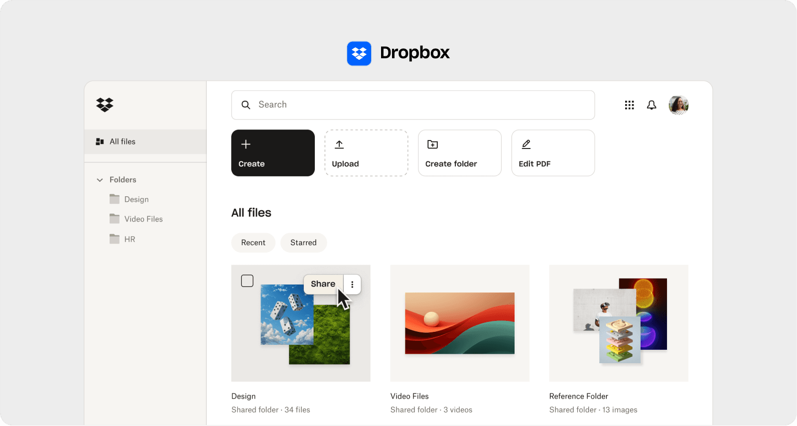
Dropbox: 35.9% on UX vs 18.1% on Sales—The Magic Users Never See
Our analysis of Dropbox revealed something counterintuitive about where their money actually goes. The company wasn't building flashy features for keynote demos. They were investing hundreds of millions in improvements most users would never consciously notice.
What we discovered is that Dropbox has built their entire product philosophy around what they call "micro-interactions" those tiny moments between a user and the interface. The nearly imperceptible delay when a file syncs. How conflicts resolve themselves in the background. The way sharing feels instant even when networks are slow.
According to their Chief Product Officer Akshay Kothari, the company obsesses over these micro-interactions:
"Those tiny moments of delight that make sharing feel instant. It's not just about features; it's about feeling frictionless every time you click."
Our research showed that Dropbox spends 35.9% of revenue hundreds of millions of dollars to fix SaaS login screen UX issues most users don't even know exist. They're optimizing every pixel of the experience so precisely that friction simply evaporates.
What fascinated us most was CEO Drew Houston's observation that their
"Organic adoption curve outpaces paid programs because users become advocates after experiencing the magic of Dropbox firsthand."
The data backs this up: their invisible product magic generates more customers than their entire 18.1% marketing budget.
The lesson here became clear to us—investing in seamless syncing, invisible conflict resolution, and background processes that just work creates word-of-mouth growth far more cost-effectively than any advertising campaign.
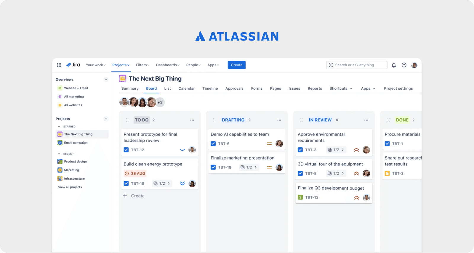
Atlassian: 37% on Product vs 15.5% on Marketing—You Have 10 Minutes or You've Lost Forever
When we examined Atlassian's approach, we found a philosophy that challenged everything conventional wisdom says about customer conversion.
Most companies think conversion happens over weeks through nurture campaigns, sales calls, and follow-ups. But our research uncovered a different reality at Atlassian. Co-founder Mike Cannon-Brookes has stated publicly:
"If users can't discover value in their first 10 minutes, we've lost them forever—so we invest heavily in UX to make that window magical."
Ten minutes. Not weeks. Not months. Ten minutes to win or lose a customer forever.
This insight explains why Atlassian spends 37% of revenue on R&D versus just 15.5% on sales. What we found is that they've turned their onboarding screen into their best salesperson. And unlike human salespeople, it never has a bad day, never misses a call, and scales infinitely.
The company's approach to optimizing SaaS onboarding screen UX strips away every unnecessary step, questions every single click, and tests microcopy until it disappears into pure intuition. The goal, our analysis revealed, is getting users to their "aha moment" before they even think about evaluating competitors.
Co-founder Scott Farquhar has explained their marketplace strategy this way:
"Our marketplace isn't a sales channel; it's an extension of our product team. Each partner integration enriches UX without incremental marketing spend."
What became clear to us is how Atlassian has blurred the lines between product and ecosystem so seamlessly that every UX enhancement becomes a growth lever while minimizing traditional sales overhead.
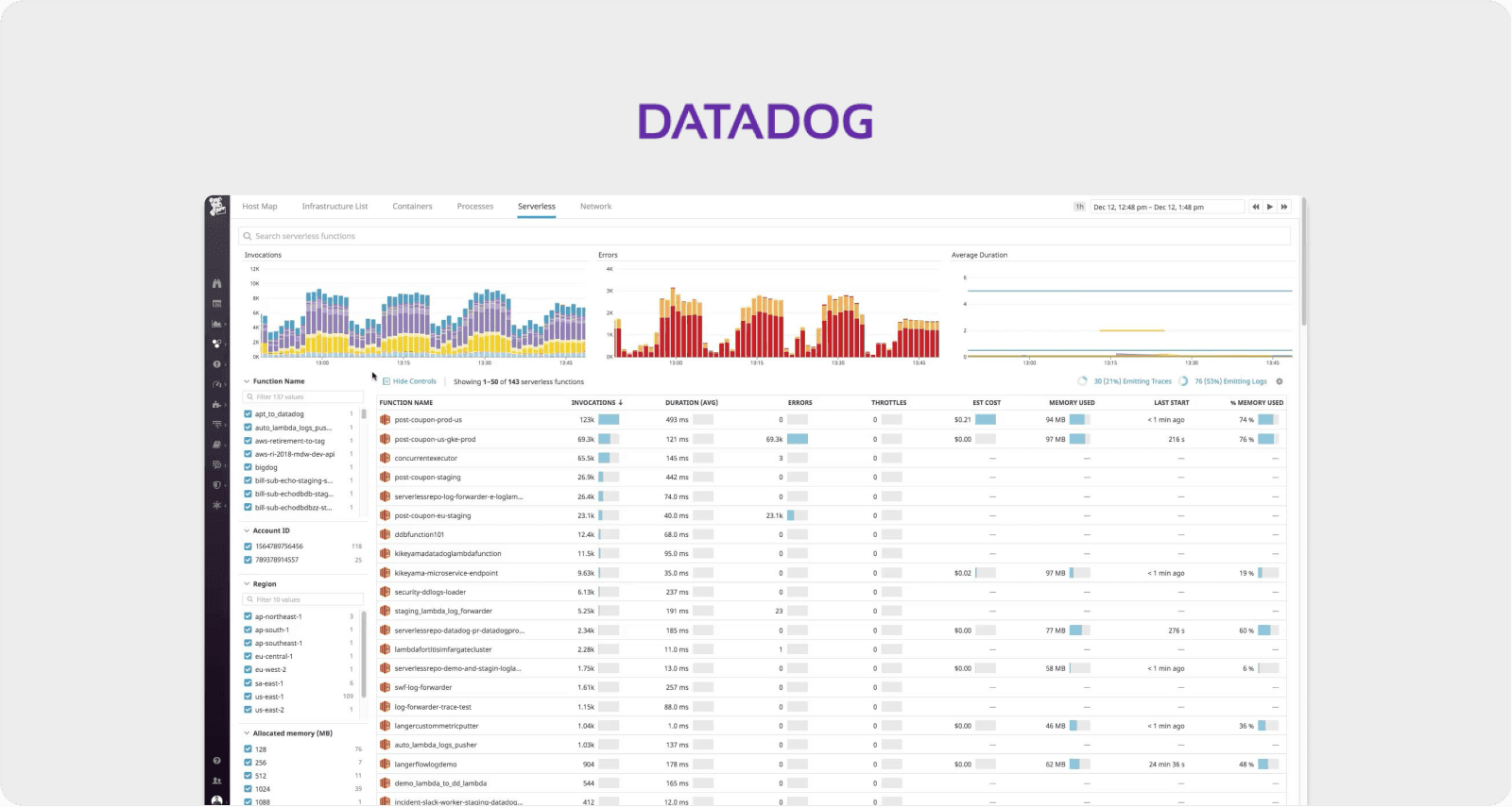
Datadog: 45% on R&D vs 29% on Sales—When Your Dashboard IS Your Sales Team
Our deep dive into Datadog's product strategy revealed something remarkable about how they think about user experience.
The data showed us that Datadog doesn't treat their dashboard as just another feature. Based on our analysis of their product design and user testimonials, they've built it as a sales pitch that happens at 3 AM when an incident fires and someone's production system is down.
Every widget placement we examined, every color choice in their observability interface, every default setting—these aren't just design decisions. Our research indicates they're conversion optimization experiments running in real-time with actual users solving actual problems.
This is what improving SaaS dashboard UX for conversions looks like when it's done right. Co-founder and CEO Olivier Pomel has explained:
"When teams see one pane of glass for logs, metrics, and traces, they're sold immediately."
The dashboard doesn't just display data—it demonstrates value so viscerally that the buying decision makes itself.
Co-founder Alexis Lê-Quôc has articulated their measurement philosophy:
"We measure success by how few clicks it takes to solve an incident, not by how many outbound emails we send."
What we discovered is a principle we started calling "proof by experience." Traditional SaaS companies use demos and trials to prove value. Product-led companies like Datadog let the actual product do all the talking. And when your dashboard can save someone's weekend at 3 AM, sales decks become unnecessary.
Our analysis showed that investing in developer experience—especially streamlined incident workflows drives higher trial-to-paid conversion than SDR outreach ever could.
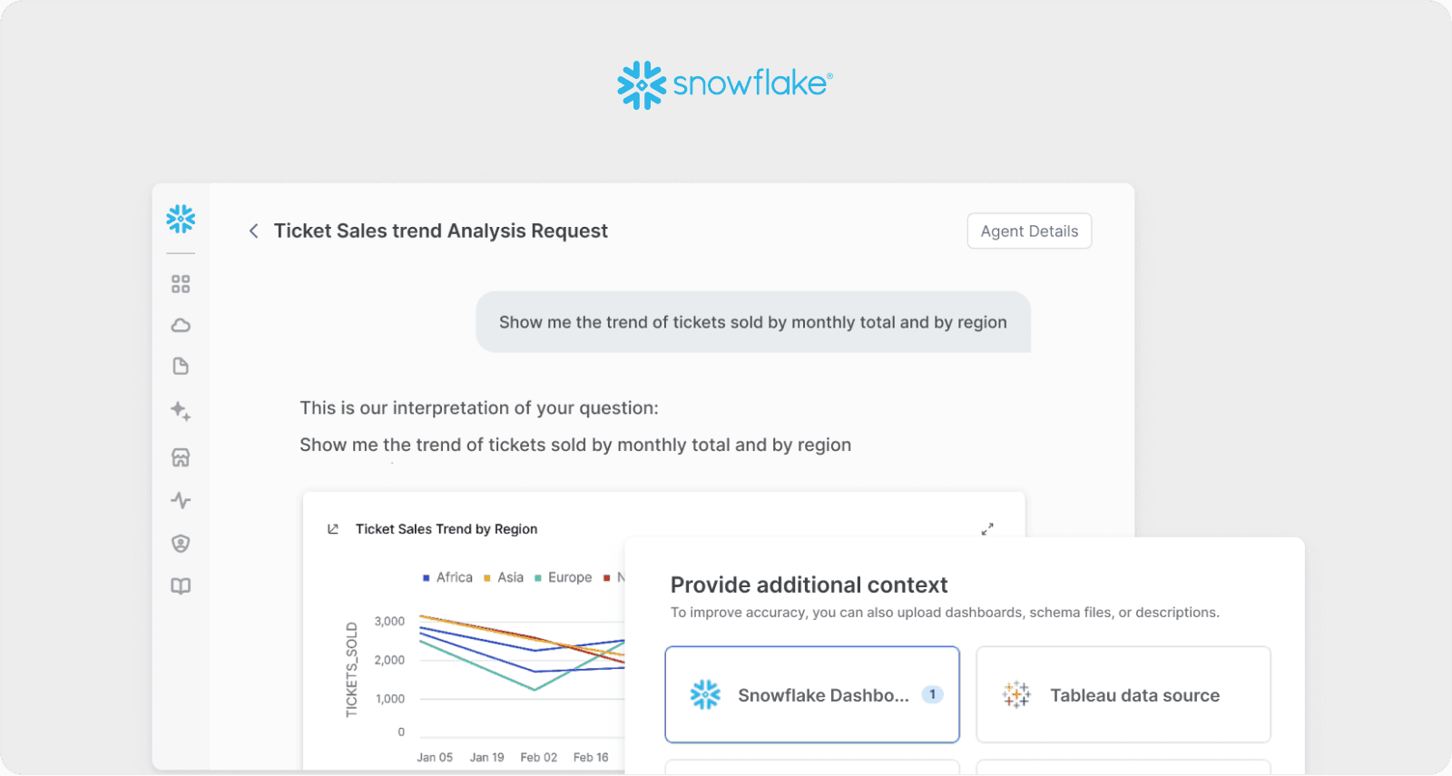
Snowflake: 49% on UX vs 46% on Marketing—Celebrating the Support Calls They Never Receive
The most surprising finding in our research came from examining Snowflake's success metrics.
Most companies measure support efficiency through response times and satisfaction scores. But our investigation revealed that Snowflake measures something entirely different.
Co-founder Benoit Dageville has publicly stated:
"We celebrate when customers onboard without calling support—that's our North Star metric."
Their goal, according to our research, is to never hear from customers during onboarding.
This philosophy explains their 49% investment in R&D—the highest ratio we found in our study. Our analysis showed that most of this budget goes toward what they call "zero-maintenance UX." Their goal isn't just making things easy—it's making things automatic.
CEO Frank Slootman has been direct about their approach:
"Our product's self-service mentality is our biggest SDR. If you can't start loading data in minutes, you won't stick around."
What we found examining their user flows revealed a masterclass in SaaS checkout screen UX best practices. The checkout happens, but it doesn't feel like a traditional transaction. It feels like a feature unlocking. No friction. No hesitation. Just continuous value expanding naturally.
Our research showed how they reduce user dropoff on SaaS setup screen by eliminating the moment when setup feels like setup. Everything is contextual, progressive, and builds on what users have already accomplished.
The data revealed to us that most companies optimize the wrong metrics. They focus on support efficiency when they should be optimizing support out of existence entirely. Snowflake's slightly higher R&D spend underpins autonomous data management that reduces both support load and sales cycle friction.
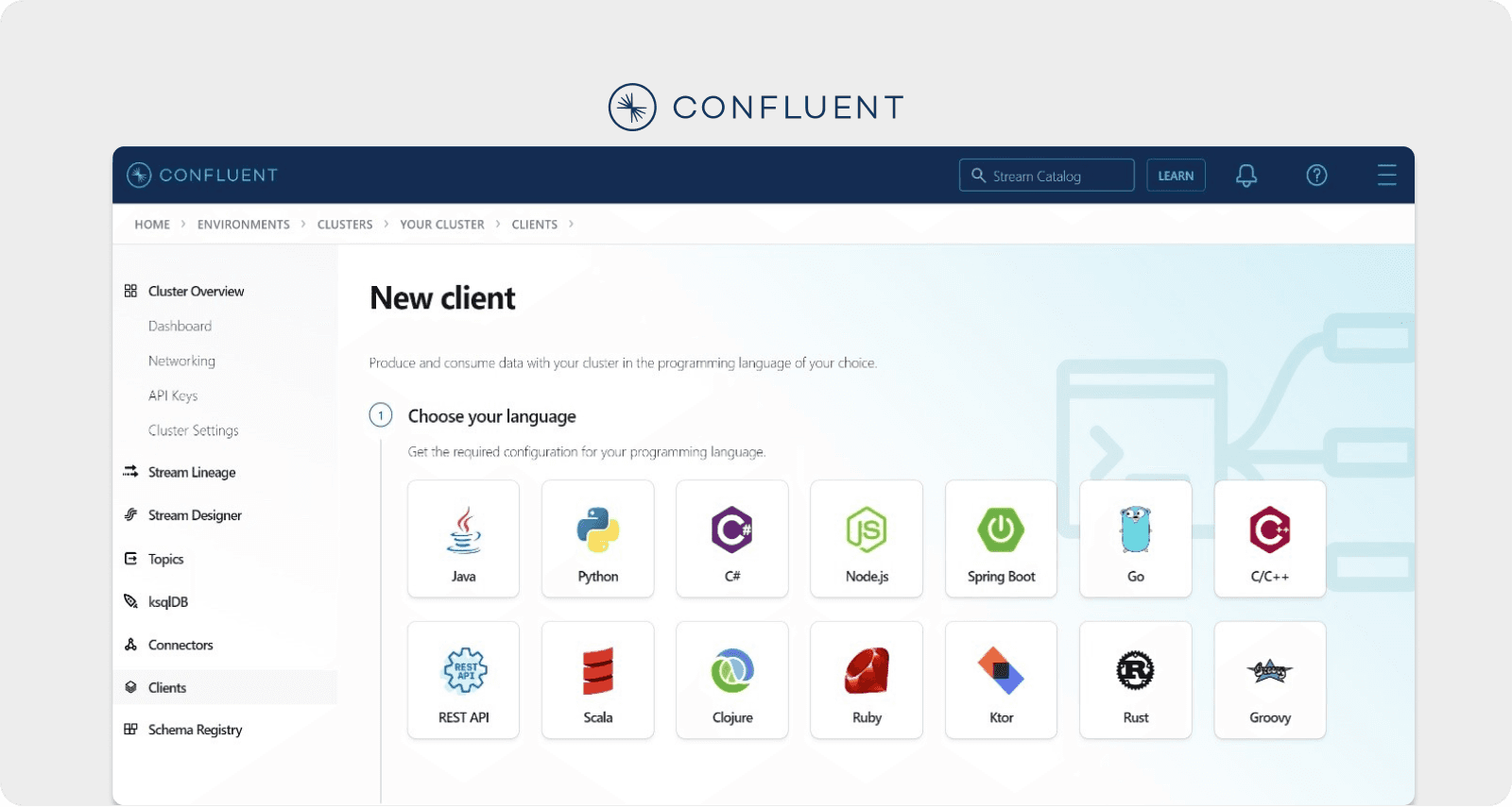
Confluent: 44% on Product vs 30% on Sales—The Pipeline So Simple It Sells Itself
Our analysis of Confluent uncovered a fascinating evolution in their product design.
According to our research, the company reduced their data pipeline configuration process from 47 steps down to just 6 steps over several years. The remarkable part? They didn't remove functionality they removed decisions. They made the interface anticipate what developers wanted before users even knew they wanted it.
This is what happens when you fix confusing SaaS screen flow with laser focus. Co-founder and CEO Jay Kreps has articulated their philosophy:
"The simplest pipeline is the most persuasive pitch. UX trumps PowerPoint every time."
The company spends 44% of revenue on R&D, and our investigation showed their obsession with connector setup screens. Why such intensity? Because our data revealed that every moment of confusion in setting up a data pipeline is a moment when competitors get a second look.
What we discovered is that their setup screen became their best growth engine. Developers who successfully configured their first pipeline in under an hour became evangelists—not because someone convinced them, but because the experience itself was convincing.
Co-founder Neha Narkhede has explained their priorities this way:
"We'd rather ship a new connector that saves a team a week of integration work than spend that week drafting battlecards for sales."
Our research showed this philosophy of shifting budget from sales enablement to plug-and-play UX accelerates enterprise adoption by letting developers self-serve.
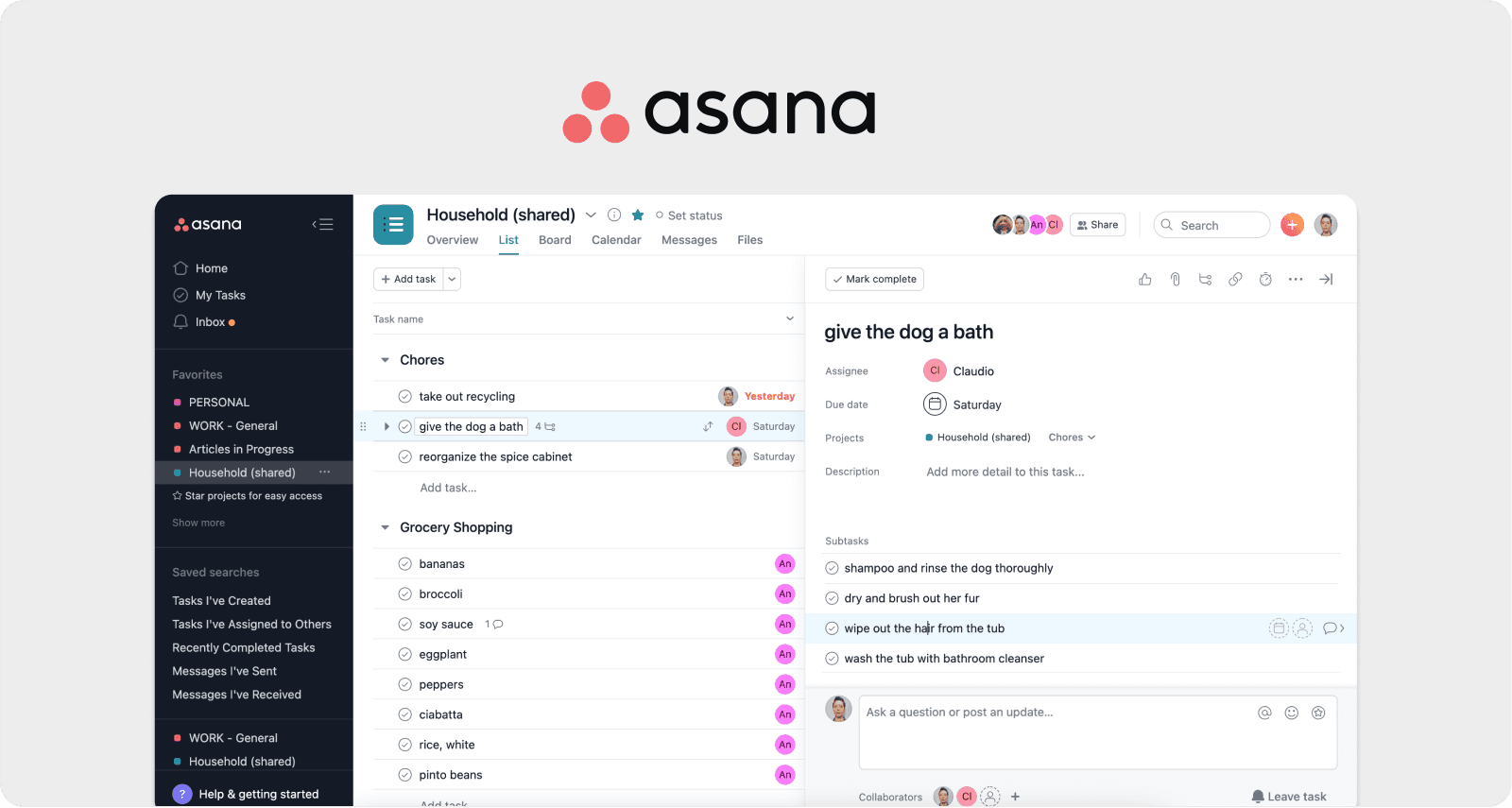
Asana: 47% on UX vs 28% on Sales—The 60-Second Rule That Changed Everything
When we examined how the best product-led companies measure success, we found they track entirely different metrics than traditional companies.
While most companies track MQLs, pipeline, and close rates, our research showed that companies like Asana obsess over micro-interactions on SaaS screen design that happen in seconds.
The data revealed that Asana invests 47% of revenue to ensure first project setup takes under 60 seconds. Co-founder Justin Rosenstein has stated:
"We invest until the first project setup takes under 60 seconds. Anything longer kills momentum."
Sixty seconds. That's their entire onboarding success metric. Not time-to-value in days. Not activation rate over weeks. Sixty seconds.
We tested this ourselves. Signing up for Asana with a stopwatch running, we found that at second 43, there was a real project with real tasks beautifully visualized on a timeline. At second 58, it was clear how a team would use this. At second 60, the value was undeniable.
This is the power of optimizing SaaS trial signup screen experiences to an almost absurd degree. Our analysis showed that every second shaved off translates to measurable conversion gains.
Co-founder Dustin Moskovitz has explained their design philosophy:
"Every animation, color choice, and microcopy is there to make you feel in control, not overwhelmed."
What particularly interested us was a case study we found in their product evolution. When Asana redesigned their workspace layout to make customization feel inevitable rather than optional, they didn't add tutorials or email campaigns. They changed the screen layout itself. The results? Customization rates tripled and churn dropped—without spending an extra dollar on retention programs.
This demonstrates how to improve SaaS screen layout to reduce churn through thoughtful design rather than intervention programs. Our research confirmed that prioritizing onboarding velocity and emotional comfort through UX drives viral sharing within organizations.
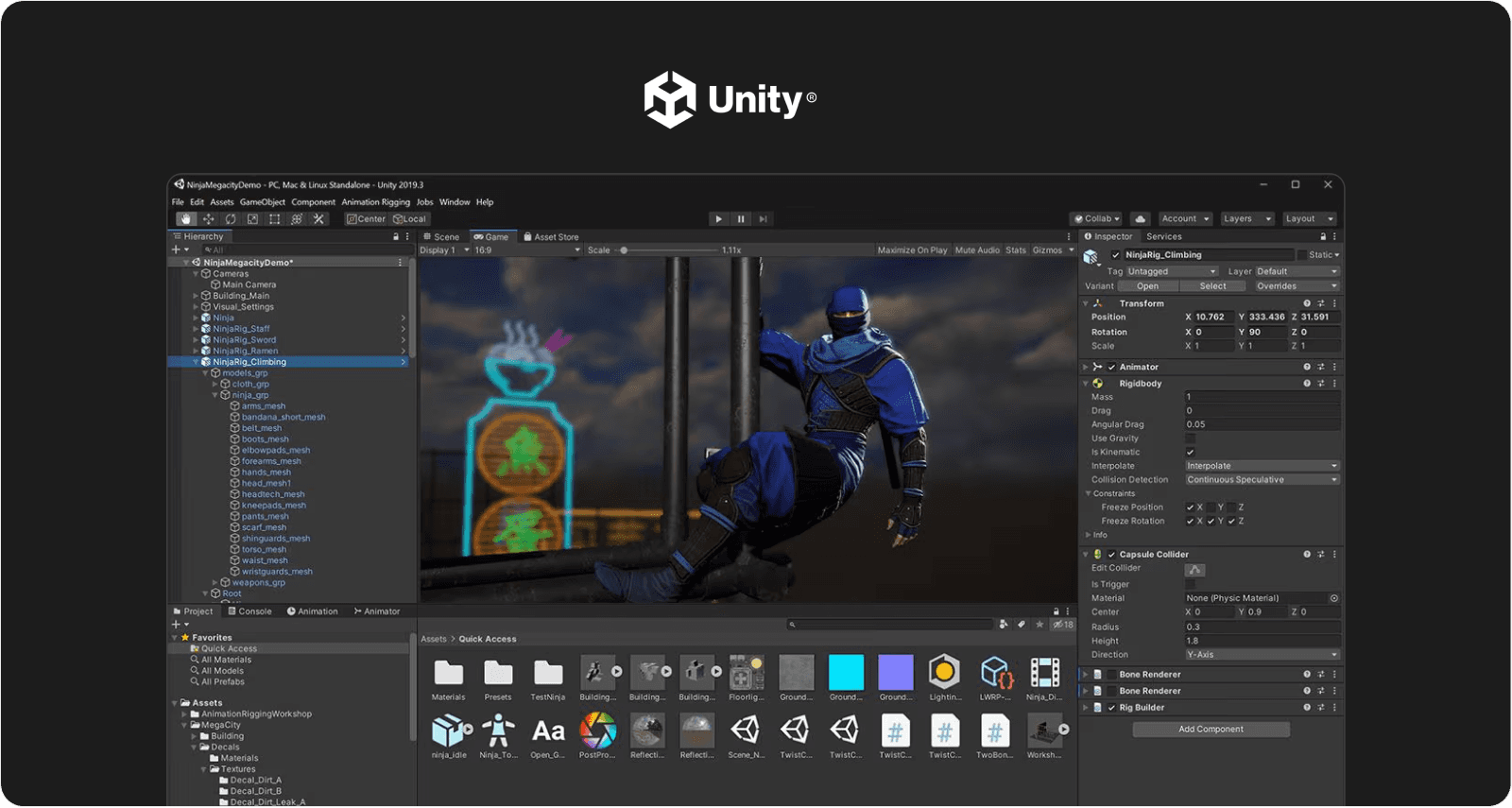
Unity: 51% on R&D vs 30% on Marketing—When Creators Become Your Marketing Team
Our investigation into Unity revealed the most aggressive product investment ratio we studied.
With 51% of revenue flowing to R&D versus roughly 30% to sales and marketing, Unity has created what our analysis shows is a self-perpetuating growth engine. Their Asset Store isn't just a marketplace our research indicated it's a growth mechanism powered entirely by creator delight.
CEO John Riccitiello has articulated their philosophy:
"If it takes longer to learn the tool than to build the idea, you've lost the creator. Our R&D dollars focus on nurturing that spark."
CTO Gregory Whitten has explained their view on marketing:
"We see developer delight as our best marketing channel happy creators become evangelists overnight."
What we found examining their product roadmap showed an obsession with editor UX enhancements: visual scripting that makes coding accessible, live GPU profiling that gives instant feedback, and asset store integration that streamlines workflows. Every improvement, according to our analysis, removes friction from the creative process.
This approach to SaaS screen UX tips for revenue growth demonstrates a fundamental truth our research confirmed: when users love the product enough, they become the marketing team for free, forever, at scale. Doubling down on ease of creation not only retains existing users but also sparks influential community advocacy.
The Compounding Effect We Discovered
As we analyzed these seven companies together, a pattern emerged that fundamentally changed how we think about growth investments.
Here's what the data revealed: product investments compound in ways that marketing spend never can.
Every improvement to an onboarding screen helps every future user forever. Every second shaved off setup time accelerates every future conversion. Every confusion point eliminated reduces every future support ticket.
Traditional sales and marketing spending, our research showed, is linear. You spend a dollar, get a result, then spend another dollar. But product investments are exponential. You spend a dollar once, and it generates returns forever.
The seven companies we profiled collectively invest over $2 billion annually in R&D, and our analysis revealed they share a common conviction: the product is the pitch, the interface is the sales team, and the user experience is the marketing budget.
Everything else, the data suggests, is just expensive amplification of something that should sell itself.
What Our Research Means for Everyone Else
After months of analyzing financial statements, product designs, user flows, and growth metrics, we arrived at a simple thesis: Every dollar invested in making a product more delightful, more intuitive, more valuable reduces the need to spend dollars convincing people it's delightful, intuitive, and valuable.
Our research suggests starting with fundamental questions:
What does the "first 10 minutes" experience look like?
Where do users get stuck in onboarding?
What micro-interactions could be polished?
How many clicks does it take to get value?
Which screens make users pause or feel uncertain?
What we discovered about the best UX fixes for SaaS trial signup screen optimization, setup flows, dashboards, and every other screen is this: improvements don't come from adding more features. They come from removing friction, automating decisions, and making magic feel inevitable.
The question our research poses isn't whether to invest in product over sales. The question is: how quickly can that shift begin?
These seven companies are betting hundreds of millions that the answer matters.
And based on everything we've found, they're winning.