Last Update:
Nov 5, 2025

Share
Minor UX fixes like button color, copy, and progress indicators can drive massive revenue shifts.
Reducing cognitive load and matching user mental models accelerates onboarding and product adoption.
Feedback loops and progressive disclosure improve satisfaction and feature usage.
Default bias, goal gradients, and feedforward UX reduce friction and increase commitment.
Consistent cross-platform design compounds value as SaaS products scale.
This article showcases how ten SaaS companies dramatically increased their revenue by making targeted user experience (UX) improvements. Real-world case studies ranging from HubSpot's $200 million button change to SEOcrawl's streamlined dashboard—demonstrate that simple, psychology-driven tweaks to onboarding flows, navigation, checkout processes, and product interfaces can significantly boost conversions, reduce churn, and improve customer satisfaction. The key takeaway: Investing in thoughtful UX guided by research, cognitive principles, and iterative testing turns everyday screens into powerful engines for SaaS growth. Strategic UX isn't just good design; it's good business.
Let us tell you a story about a button that was worth $200 million.
It wasn't a fancy button. It didn't have any special animations or cutting-edge technology. It was just orange instead of green, and it said "Start Free Trial" instead of "Get Started." But that simple change—along with a handful of other thoughtful tweaks—helped HubSpot increase their trial-to-paid conversion by 27% and contribute to a revenue boost that eventually pushed them past $2.6 billion.
That's the thing we've learned about user experience design in SaaS: sometimes the smallest changes create the biggest ripples. And when you understand the psychology behind why users click, scroll, abandon, or convert, you can turn those insights into serious revenue growth.
We've spent months digging into real-world case studies of SaaS companies that transformed their fortunes by fixing what seemed like simple screen design problems. What we found wasn't just a collection of before-and-after stories—it was a masterclass in how cognitive biases, psychological principles, and strategic UX thinking can drive measurable business outcomes.
The Hidden Cost of Bad Screens
Before we dive into the success stories, let's acknowledge an uncomfortable truth: users are abandoning these products right now, and the companies might not even know why.
Maybe it's a login screen that's asking for too much information upfront (Hick's Law: more options lead to harder decisions). Perhaps it's a dashboard that's overwhelming new users with every feature at once (violating Progressive Disclosure). Or it could be a checkout flow that's hiding the discount code field where nobody can find it.
These aren't just UX problems—they're revenue problems. Every confused user is a potential customer walking away. Every friction point in onboarding is dollars left on the table.
But here's the good news we've discovered: fixing these issues doesn't require a complete platform rebuild or a Silicon Valley-sized budget. What it requires is understanding why users behave the way they do, and then making strategic changes based on real evidence.
Let us show you how ten companies did exactly that.
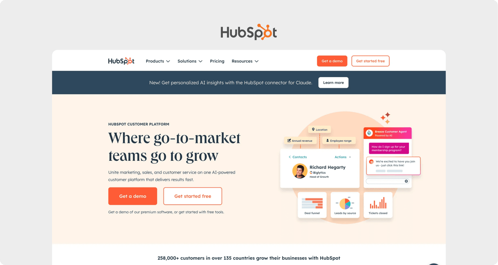
1. HubSpot: The Onboarding Revolution
The Breaking Point
HubSpot had a problem that kept their product team up at night. Despite massive traffic to their platform, they were watching potential customers evaporate during trial signup. The data was brutal: users would start the onboarding process, click around confused for a few minutes, and then simply... leave.
When the team pulled up heatmaps and user recordings, they discovered something fascinating. Users weren't actually reading anything. Their eyes glazed over the eight-step signup process. Primary call-to-action buttons were being completely ignored. The Visual Hierarchy was all wrong nothing stood out, so nothing got clicked.
The UX Move
HubSpot's redesign was a masterclass in how to optimize SaaS onboarding screen UX. They understood that Cognitive Load the total mental effort required to complete a task was crushing their conversion rates.
Their solution? They stripped everything down to four essential steps, consolidated form fields, and added auto-population wherever possible. They leveraged Fitts's Law by making their redesigned CTA buttons larger and using high-contrast colors that naturally drew the eye. The new copy was concise and action-oriented: "Start Free Trial" triggered a stronger response than the vague "Get Started."
But the real genius was in the progress indicators. By showing users a simple four-step bar, they tapped into the Goal Gradient Effect motivation increases as users get closer to their goal. Suddenly, completing the signup felt achievable rather than intimidating.
They also deployed contextual tooltips that appeared at exactly the right moment, providing Feedforward letting users know what to expect before they take action.
The Payoff
The results were staggering. Trial-to-paid conversion jumped 27%. Onboarding completion rates soared from 62% to 84%. For a company of HubSpot's scale, these percentage points translated to tens of millions in annual recurring revenue. That 15% ARR increase wasn't luck it was psychology, applied with precision.
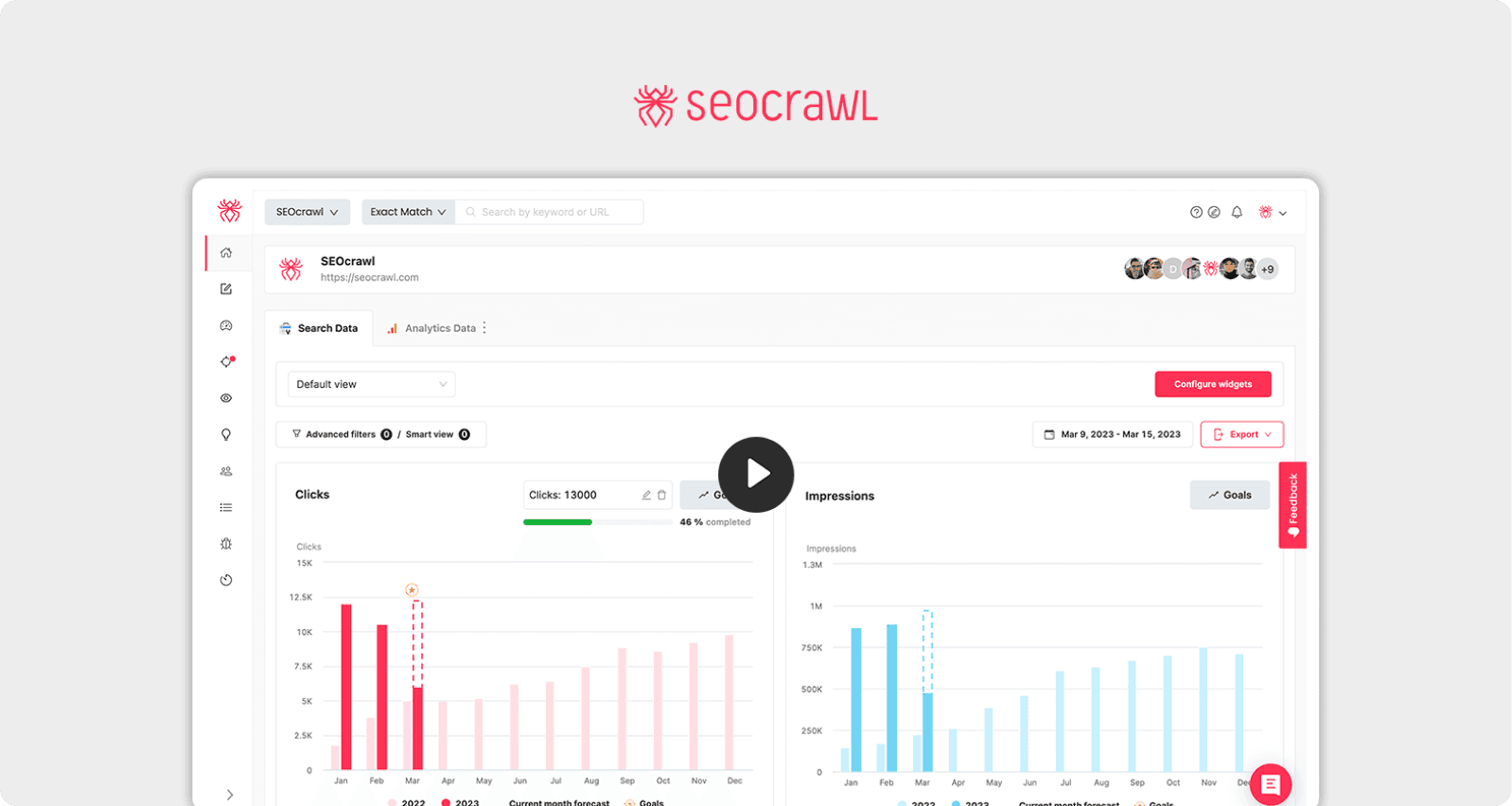
2. SEOcrawl: Finding What's Hidden in Plain Sight
The Complexity Trap
SEOcrawl faced a different beast: feature bloat. They'd spent years building an incredibly powerful SEO analytics platform, packed with sophisticated tools. The problem? Their users couldn't find them.
User surveys revealed a consistent theme: frustration. People loved what the platform could do when they finally discovered how to do it. Task-based testing showed users taking over three minutes to locate core features. In SaaS time, that's an eternity. And with a monthly churn rate of 9%, that eternity was costing them customers.
The UX Move
The SEOcrawl team's approach to fix confusing SaaS screen flow was rooted in understanding how people actually process information. They redesigned the dashboard around the Law of Proximity elements close to each other are perceived as related.
They created a left-hand fixed navigation with clear icons and labels, grouping related functions together: Primary Metrics, Audit, and Reports. High-value features like site audits and keyword trackers moved to top-level tabs, leveraging the Serial Position Effect users more easily recall items at the beginning of a list.
For new users, they implemented contextual onboarding that highlighted key modules on first login, but made it skippable for returning users (respecting Default Bias users tend not to change established behavior, so don't force them to re-watch tutorials).
The cherry on top?
A bell icon with real-time alerts for critical SEO issues. This created a Feedback Loop, immediately communicating value and keeping users engaged.
The Payoff
Monthly churn dropped from 9% to 4% more than cut in half. New paid signups doubled within three months. Their Net Promoter Score nearly doubled from 25 to 48. And here's what we found beautiful: they didn't add a single new feature. They just made their existing features discoverable.

3. Music & Arts: The Mobile-First Awakening
The Cart Abandonment Crisis
Imagine this: 68% of your traffic is coming from smartphones, but your mobile checkout experience feels like it was designed in 2010. That was Music & Arts' reality.
Mobile analytics told a painful story. Users would browse, add items to cart, start checkout, and then poof abandon at alarming rates. Usability testing revealed the culprits: form validation errors that appeared in tiny, easily-missed text. A promotional code field that was practically hidden. Touch targets so small that users kept accidentally clicking the wrong buttons.
The UX Move
Music & Arts' approach showed us critical SaaS checkout screen UX best practices built on the foundation of Aesthetic-Usability Effect people perceive designs with great aesthetics as easier to use, even when the actual usability is equivalent.
They rebuilt their mobile site with a mobile-first grid system, ensuring legible typography and touch-friendly controls that respected Fitts's Law. The checkout experience was streamlined into a single page, merging billing and shipping forms. Real-time inline validation created immediate Feedback Loops, flagging errors the instant they occurred rather than waiting until users hit submit.
They introduced a persistent cart summary a floating "View Cart" button with subtotal and item count—that leveraged Recognition Over Recall (it's easier to recognize things than remember them). The promotional code field moved to the top of the checkout form where it couldn't be missed, respecting the principle that Visual Anchors guide users' eyes to important elements.
The Payoff
Mobile cart abandonment decreased by 22%. But the real story was in the bottom line: overall e-commerce sales grew 30% year-over-year. By making it easier to pay, they made it easier to profit.
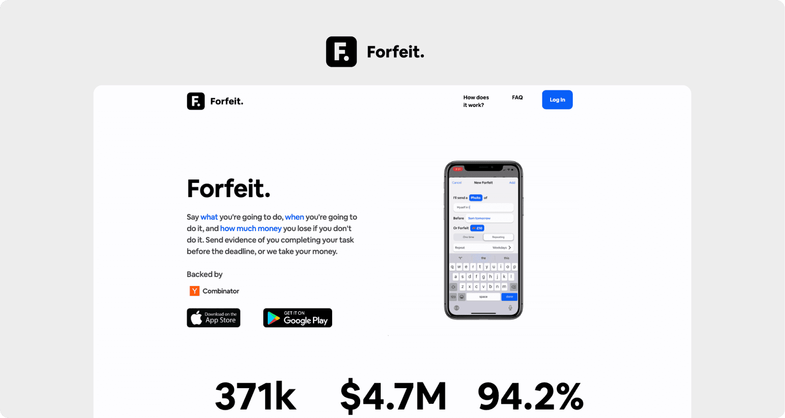
4. Forfeit: Gamifying Commitment
The Motivation Problem
Forfeit, a goal-achievement app, faced an existential challenge. Their product helped users commit to goals by putting real money on the line, but users themselves weren't committing to the app. Seventy percent churned within two weeks.
Behavioral interviews revealed the core issue: users lost motivation without timely feedback. They'd log a goal, get no response, and eventually forget the app existed. The product worked, but the experience didn't reward consistency.
The UX Move
Forfeit's redesign was pure behavioral psychology in action. They introduced progress bars, achievement badges, and streak counters textbook Variable Rewards that made engagement feel like play.
Every logged goal triggered animated confirmations: "Great job! 3-day streak unlocked!" This tapped into the Aha! Moment principle, helping users realize the app's value through positive reinforcement.
One-tap logging from the home screen minimized effort, applying the Spark Effect users are more likely to take action when the effort is small. Personalized push notifications with a friendly tone ("Time to hit today's goal!") served as Self-Initiated Triggers, prompting action based on the user's own commitments.
The stroke of genius? They understood Unit Bias one unit of something feels like the optimal amount. So they framed each day as a single, achievable unit of progress.
The Payoff
Weekly active users increased 45%. Subscription conversions rose 18% within two months. By making progress visible and celebrating small wins, they transformed a utility into a habit.
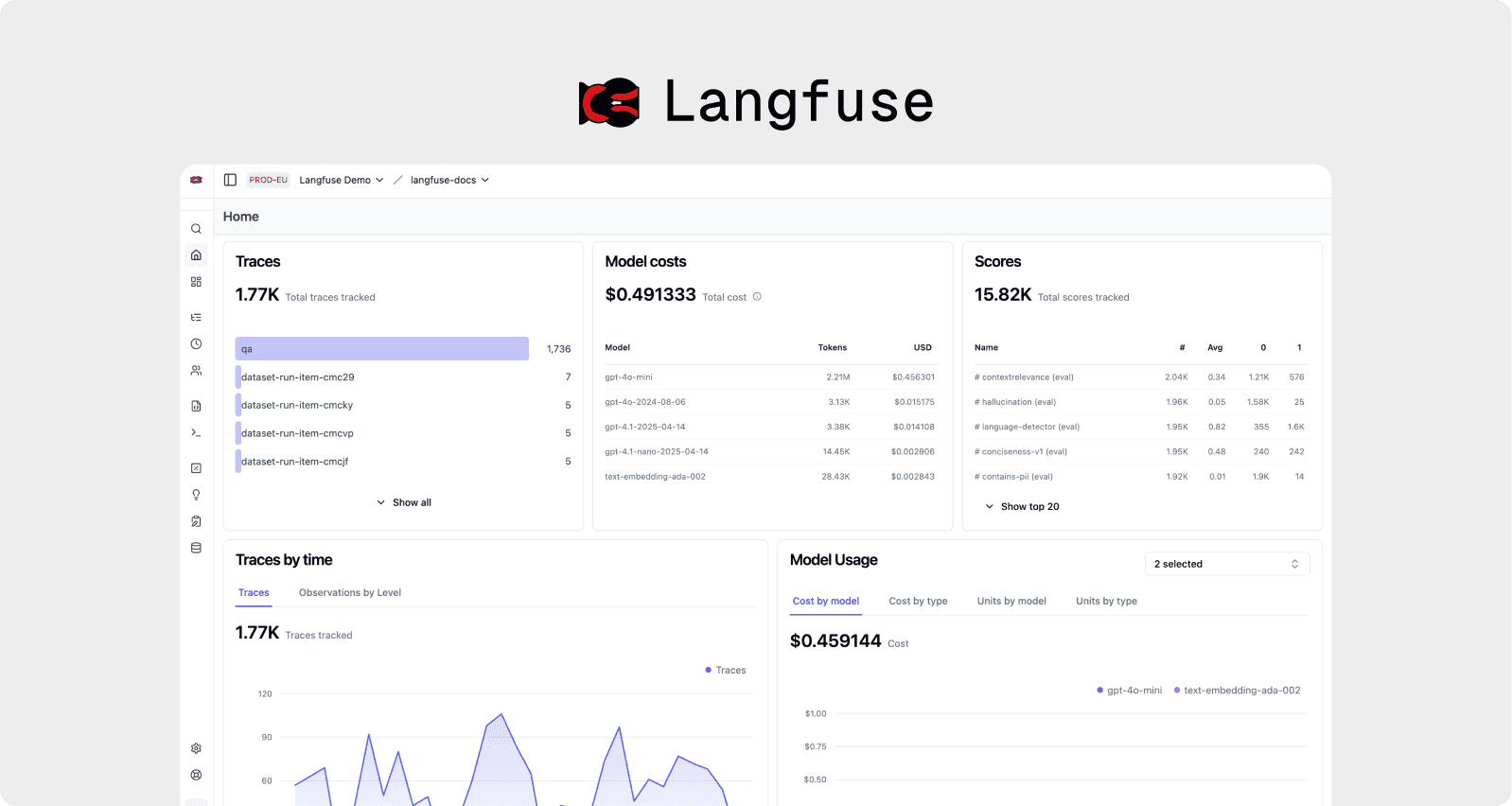
5. Langfuse: Democratizing Technical Complexity
The Technical Barrier
Langfuse built a powerful LLM analytics platform, but they'd inadvertently created a product that only developers could love or even use. Non-technical team members hit a wall at the API key setup stage. Support tickets piled up around dashboard customization questions.
The onboarding flow drop-off at the API key input stage was brutal. Users reported complete confusion about required permissions and where to even find the information they needed. For a product designed to make AI development easier, the irony wasn't lost on the team.
The UX Move
Langfuse's solution to reduce user dropoff on SaaS setup screen was a lesson in Progressive Disclosure and Feedforward. They consolidated API key instructions into a single expandable section with code snippets and "Copy to Clipboard" buttons making the technical feel manageable.
But the real innovation was in their template dashboards. By providing pre-built dashboards for common LLM metrics (latency, token usage, costs), they eliminated setup friction entirely. This respected Default Bias users could start with sensible defaults and customize later, rather than facing a blank canvas immediately.
An interactive tour overlaid key dashboard components and explained data visualizations in plain language, avoiding the Curse of Knowledge (not realizing that users don't have the same expertise). For those who wanted customization, drag-and-drop widgets enabled changes without code, proving that Tesler's Law (simplifying one aspect might transfer complexity elsewhere) could be managed thoughtfully.
The Payoff
Customer satisfaction rocketed from 62% to 88%. Paid tier adoption increased by 35%. By reducing the technical barrier, they expanded their addressable market and proved that complex tools don't require complex interfaces.
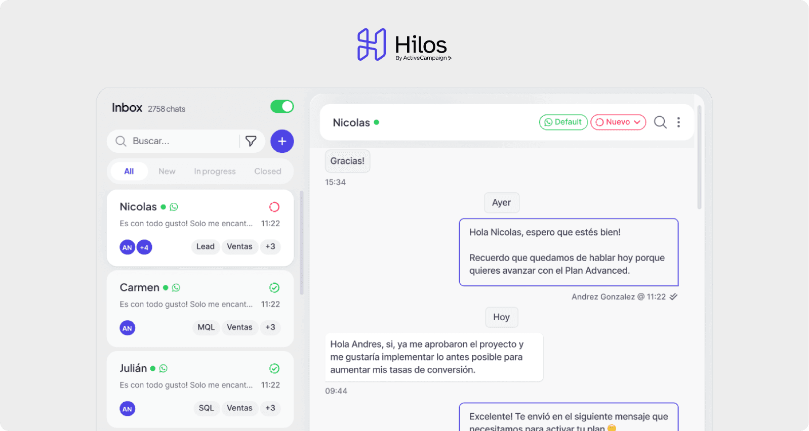
6. Hilos: Integration Without Intimidation
The Developer Friction Point
Hilos offered WhatsApp-based workflow automation, but their integration process was a developer's nightmare. Setting up webhooks, managing API keys, and testing configurations created so much friction that their onboarding NPS sat at −5. Negative. That's not a typo.
Developers reported feeling lost during setup. There was no clear path forward, no validation that steps were completed correctly, and debugging issues required leaving the platform to search documentation elsewhere. Each friction point gave users another reason to abandon the integration entirely.
The UX Move
The Hilos team built a step-by-step integration wizard that held users' hands through webhook setup, authentication, and testing. Inline validation provided immediate Feedback Loops, confirming successful completion at each stage.
They offered preconfigured templates for common use cases (e-commerce order updates, customer support queries) that could be activated with one click—leveraging Commitment & Consistency by making the first step incredibly easy. Once users committed to that first click, they were more likely to complete the full setup.
A real-time console with live logs and status indicators showed exactly what was happening under the hood, respecting the Labor Illusion—people value things more when they see the work behind them. Users could watch their integration come to life in real-time.
Searchable documentation embedded in a modal eliminated context-switching, keeping users in flow state. This addressed Cognitive Load by presenting information exactly when and where it was needed.
The Payoff
Onboarding NPS improved from −5 to +40 a 45-point swing. Trial-to-paid upgrade rates increased 28%. By making integration feel manageable, they transformed their biggest barrier into a competitive advantage.
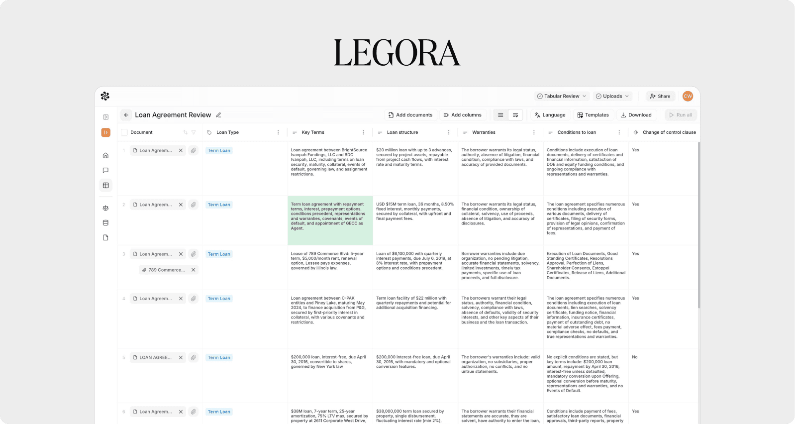
7. Legora: Legal Tech That Lawyers Love
The Professional Interface Problem
Legal professionals are demanding users. They're detail-oriented, time-pressed, and intolerant of inefficiency. Legora's legal research platform had powerful capabilities, but the interface was cluttered and difficult to navigate.
Task analysis with actual lawyers revealed they were spending excessive time hunting for case references and citations—work that should take seconds was taking minutes. Heatmaps showed that key tools were being ignored simply because users couldn't easily find them. In the legal world, time literally is money, and Leya's UX was costing their users both.
The UX Move
Leya's workspace redesign was structured around the Mental Model that lawyers already had—how legal work actually flows. They organized tools into "Research," "Draft," and "Review" tabs that mirrored the natural workflow stages of legal practice.
A collapsible quick-access sidebar provided one-click access to recently used documents and citations, leveraging the Availability Heuristic—users favor recent and available information. This respected how lawyers actually work: frequently referencing the same sources multiple times throughout a project.
Smart predictive search filtered both proprietary and public legal sources as users typed, applying Recognition Over Recall—showing options rather than making users remember exact case names or citation formats.
Citation tooltips appeared on hover, showing meta-information without leaving the page. This Progressive Disclosure kept the interface clean while making information instantly accessible when needed.
The Payoff
Task completion time for locating references dropped by 60%. License renewals among trial users increased by 22%. By speaking the language of legal workflow, they created a tool that felt intuitive rather than technical.
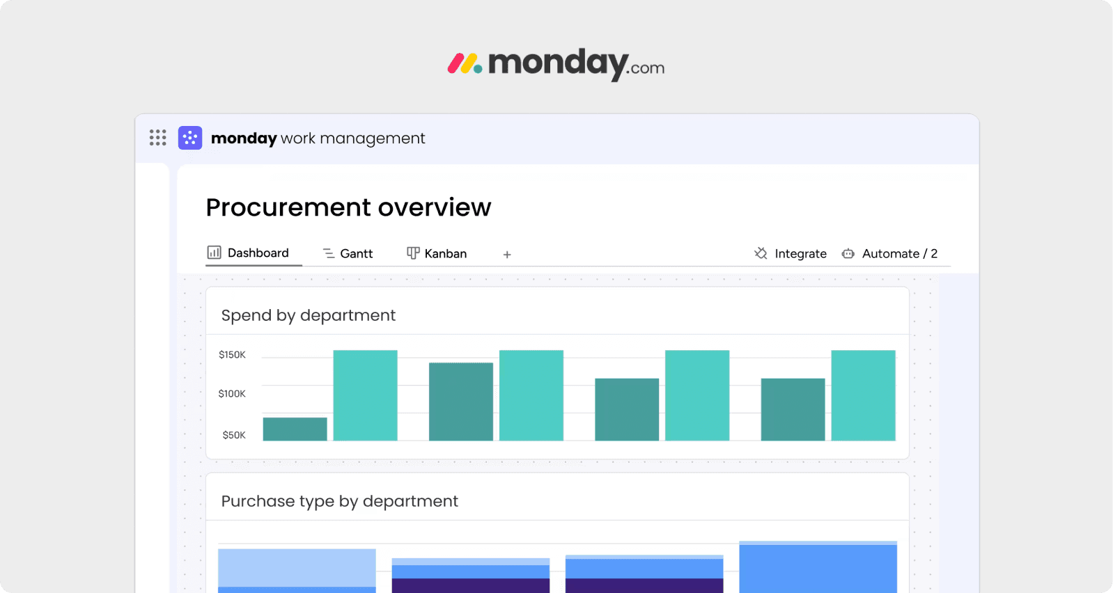
8. Monday: From Overwhelm to Ownership
The Feature Paradox
Monday, a project management platform, suffered from success. They'd built dozens of powerful features, but cognitive walkthroughs revealed a messy reality: unclear iconography, buried functions, and an overwhelming default interface that left users paralyzed rather than productive.
User interviews highlighted a desire for personalization different teams needed different views, but everyone was getting the same cluttered dashboard. The problem wasn't that features didn't exist; it's that users couldn't figure out which features mattered to them.
The UX Move
Monday approach to how to improve SaaS dashboard UX for conversions centered on giving users control. They introduced fully customizable dashboards with drag-and-drop widgets for tasks, timelines, and analytics.
This tapped into the IKEA Effect—when users partially create something, they value it way more. By letting users build their own workspace, they created emotional investment in the platform.
A standardized icon set with clear metaphors and labels fixed the Discoverability problem. A floating "+" button provided one-click task creation from any screen, applying Fitts's Law (large, accessible targets are easier to interact with) and respecting Flow State keeping users productive without breaking concentration.
For new users, an onboarding checklist displayed step-by-step guidance with progress tracking, using the Goal Gradient Effect to maintain motivation through setup.
The Payoff
Monthly recurring revenue grew by 210% within six months. Feature adoption rates increased by 75% for core modules. By letting users customize their experience, they transformed their platform from overwhelming to indispensable.
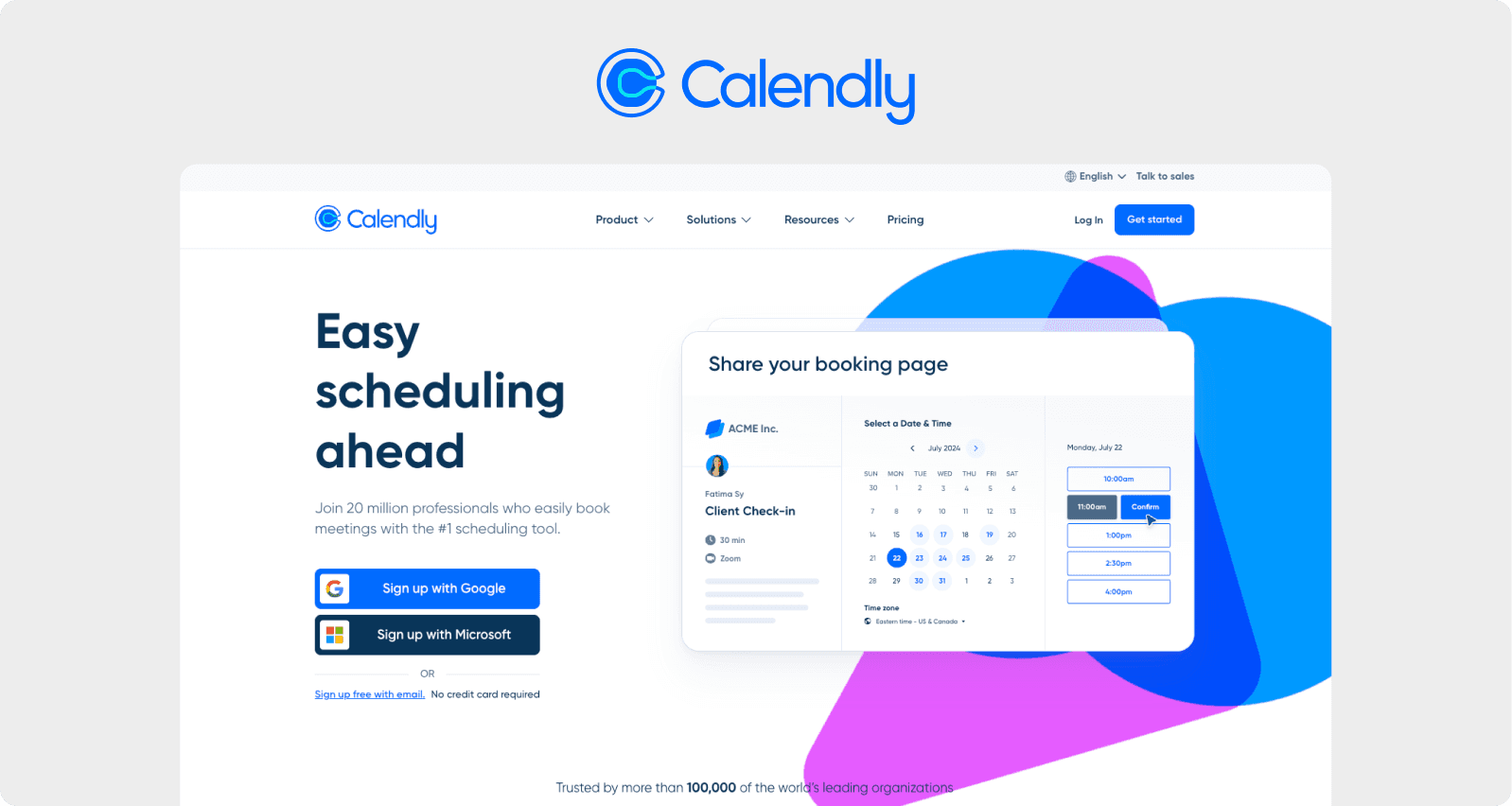
9. Calendly: Removing Registration Roadblocks
The Signup Wall
Calendly had a straightforward value proposition: simplify scheduling. But their signup process was anything but simple. Analytics showed 40% of visitors abandoning at the email verification step. Heatmaps revealed confusion over time-zone selection—a critical feature for a scheduling tool.
Every abandoned registration was a lost opportunity. For Calendly, implementing the best UX fixes for SaaS trial signup screen meant identifying and eliminating every point of friction between interest and activation.
The UX Move
Calendly enabled social login through Google and Microsoft, eliminating email verification entirely. This reduced Cognitive Load and honored Familiarity Bias—people prefer familiar experiences, and everyone already uses these services.
Smart time-zone detection auto-filled the correct time zone with a clear override option. This applied Default Bias positively—giving users a sensible default while maintaining control.
Advanced scheduling options moved behind an "Advanced Settings" toggle, implementing Progressive Disclosure. New users saw only essential features; power users could dig deeper when ready.
The mobile scheduling interface was rebuilt for thumb-friendly date and time pickers, respecting Fitts's Law on touchscreens where precision is harder than on desktop.
The Payoff
User registrations increased by 42%. Enterprise bookings rose by 18% in the first quarter post-launch. By removing friction from registration, they let their core value proposition shine through.
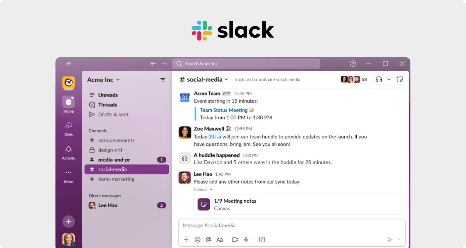
10. Slack: Scaling Without Losing Simplicity
The Growth Challenge
Success created Slack's biggest UX challenge. Rapid feature growth led to navigation clutter and inconsistent experiences across platforms. User feedback forums overflowed with complaints about difficulty locating integrated apps and managing notifications.
Cross-platform audits revealed a painful truth: the desktop and mobile experiences had diverged so much they felt like different products. For a communication tool where consistency is critical, this fragmentation was threatening adoption at scale.
The UX Move
Slack's response demonstrated SaaS screen UX tips for revenue growth at enterprise scale. They implemented a unified navigation bar moving key tabs (Channels, DMs, Apps) into a left rail consistent across all platforms, establishing clear Visual Hierarchy.
The notification center redesign centralized all alerts in a single, filterable modal with mute controls. This fixed Banner Blindness users tune out things they're repeatedly exposed to by giving users control over their alert experience.
An overhauled app directory introduced categories and search filters for easy discovery of third-party integrations, improving Discoverability dramatically.
The real investment was in a shared component library ensuring visual consistency. This design system prevented future drift and accelerated development—proving that good UX infrastructure compounds over time.
The Payoff
Daily active users grew by 25% year-over-year. Enterprise subscriptions increased by 30%. By maintaining simplicity while scaling features, they proved that growth and usability aren't mutually exclusive.
The Patterns Behind the Wins
After analyzing these ten companies, we've identified clear patterns. The most successful UX interventions share common threads:
1. Research Before Redesign Every successful company started with evidence. Heatmaps, user recordings, surveys, task-based testing—they diagnosed the actual problem before prescribing solutions. Too many teams skip this step and redesign based on hunches.
2. Respect Cognitive Load The best improvements reduced mental effort. Whether through progressive disclosure, smart defaults, or streamlined flows, these companies made tasks feel achievable rather than overwhelming.
3. Create Feedback Loops Users need to know their actions worked. Immediate validation, progress indicators, and confirmation animations all serve the same purpose: reducing uncertainty and maintaining engagement.
4. Honor Mental Models The most intuitive interfaces align with how users already think. Leya organized around legal workflow. MondaySys let users customize based on their team's needs. Fighting against users' expectations is a losing battle.
5. Test, Measure, Iterate None of these companies nailed it on the first try. They ran A/B tests, gathered feedback, monitored metrics, and refined. UX improvement is a process, not a project.
Your Screens Are Talking, Are You Listening?
Here's what these stories really tell us: SaaS screens aren't just interfaces. They're conversations with users, and right now, those conversations are either building trust or creating frustration.
Every hesitation on a login screen is a micro-moment of doubt. Every unclear button on a dashboard is a missed opportunity. Every confusing checkout flow is money walking away.
But here's the empowering truth we've discovered: companies don't need to rebuild everything from scratch. They need to understand why users struggle, apply psychological principles thoughtfully, and make strategic improvements based on evidence.
The cognitive biases and psychological principles we've explored from Hick's Law to the Goal Gradient Effect, from Progressive Disclosure to the IKEA Effect aren't academic theories. They're practical tools that, when applied correctly, can transform metrics and revenue.
We recommend starting small. Pick one screen that's causing problems maybe it's a trial signup where 40% of interested users are lost. Or a dashboard where new users get overwhelmed. Or a checkout where carts mysteriously abandon.
Study that screen like HubSpot studied their onboarding or SEOcrawl studied their navigation. Watch real users interact with it. Measure where they struggle. Ask them what confused them.
Then apply the psychological principles that make sense for the specific problem. Need to reduce overwhelm? Try Progressive Disclosure. Losing users at form completion? Lower Cognitive Load. Want users to customize? Leverage the IKEA Effect.
Test the changes. Measure the impact. Iterate.
Because that orange button that was worth $200 million for HubSpot? An equivalent is waiting to be discovered in every SaaS product. It might be in an onboarding flow, a dashboard layout, a checkout process, or somewhere nobody's thought to look yet.
The companies in this article didn't succeed because they had unlimited budgets or genius designers (though both help). They succeeded because they paid attention to psychology, respected their users' cognitive limits, and made evidence-based improvements.
Screens are already talking to users. The question is: are they having the conversation that drives revenue growth, or the one that drives users away?
The answer is in the data, waiting to be discovered. The psychological principles are proven, ready to be applied. The only question that remains is: what will be fixed first?
A Final Thought: Mistakes In UX That Make You Look Stupid
As we researched these case studies, one quote kept echoing in our minds, from the psychology cheat sheet we consulted: "People perceive designs with great aesthetics as easier to use" (the Aesthetic-Usability Effect). But here's the deeper truth these companies discovered: it's not just about making things look good. It's about making things feel good to use.
When HubSpot reduced their signup steps, they weren't just saving time, they were reducing anxiety. When SEOcrawl reorganized their navigation, they weren't just improving findability they were building confidence. When Forfeit added streak counters, they weren't just displaying data they were creating joy.
We've learned that the best UX improvements don't just optimize conversion funnels. They respect human psychology, honor cognitive limitations, and create experiences that feel effortless because they align with how our brains actually work.
That's not just good design. That's good business.
And that, ultimately, is why these ten companies didn't just fix their screens, they transformed their relationships with users, one thoughtful change at a time.
Now it's time to fix SaaS login screen UX issues. Users and revenue will thank you.