Last Update:
Dec 22, 2025

Share
Founders designing UX lose focus and velocity
Context switching between engineering and design cuts productivity and slows execution.Engineering logic ≠ user thinking
Founder-led UX often mirrors code structure, not how users understand workflows.Founders are biased toward their own designs
Most creators miss critical usability issues in products they design themselves.Bad UX is expensive to fix later
Post-launch redesigns cost 10–100x more than early UX validation.Professional UX directly improves revenue
Strong UX increases conversion, retention, and long-term growth.DIY UX increases friction and abandonment
Higher cognitive load leads users to drop off before reaching value.Outsource core UX, not everything
Onboarding and key workflows need experts; iteration can come later.Great products come from collaboration
Design and engineering together outperform founder-only design decisions.
You've built the product. The MVP works. The core technology is solid.
Now comes the part that feels simple enough: slap a decent interface on it and ship. How hard can design really be?
After all, you understand your product better than anyone, and you've already learned to code. What's a little UI compared to the engineering you've already conquered?
This is where thousands of technical founders stumble. They approach UX design the way they approach building infrastructure—as another technical problem to solve.
That fundamental misunderstanding costs them users, revenue, and months of painful refactoring later.
The truth is uncomfortable: doing your own UX design is like performing your own surgery because you understand human anatomy. The knowledge might be adjacent, but the skills are entirely different.

The Hidden Cost of the DIY Approach: A Productivity Paradox
Before we dive into why this fails, let's talk about what it costs you personally—not just the product.
The Context-Switching Tax
When you decide to handle UX design alongside your core responsibilities as a founder, you're not just adding another task. You're entering what researchers call "task-switching overhead."
Every time your brain shifts from engineering to design thinking—and these require fundamentally different mental models—you're not simply losing time. You're losing sharpness.
A Stanford University study found that multitasking causes a 40% drop in productivity. More striking: every context switch drops your IQ by up to 15 points—three times more than the effect of smoking marijuana.
According to research from the University of California, Irvine, after switching contexts, it takes an average of 23 minutes just to regain focus. So those 10 minutes you spend switching from debugging to designing a form? That's actually costing you nearly 40 minutes of lost brainpower.
The Six-Hat Syndrome
The ConsumerAffairs CEO who juggled six executive roles documented this precisely. By wearing too many hats—CEO, VP of sales, engineering, marketing, product, and CFO—the company's output actually decreased despite everyone working longer hours.
The turning point came when they reduced to three core roles. As they noted:
"I'm no longer regrouping after interruptions. I'm actually building."
Gloria Mark, a professor at UC Irvine who studies digital distraction, observes: "When people are interrupted, they tend to work faster, but they produce less. They're more stressed, more frustrated, and their work quality suffers."
Understanding Activation Friction
Here's the founder's paradox: the more you try to control, the less you actually accomplish.
The very founders who are most concerned about quality and maintaining their vision—and therefore most tempted to design themselves—are precisely the ones who cannot afford to lose this productivity.
In behavioral economics, this is called activation friction: the resistance that prevents you from starting or completing a task efficiently. When you split your cognitive resources between engineering and design, you're maximizing friction in both domains.
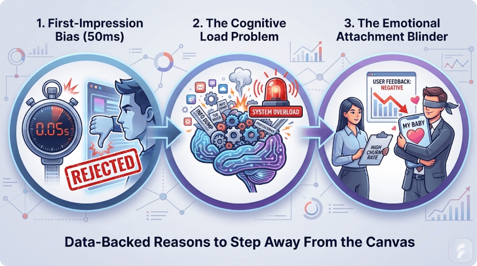
Micro-Summary: Cognitive load theory shows that poor design creates extraneous mental burden that reduces task completion by 4-7% per friction point. Users make stay-or-leave decisions within 3-5 seconds based on perceived complexity. Windows Vista failed not due to crashes but because accumulated cognitive load made every interaction feel like work.
What Professional Designers Actually Do (That You're Missing)
If you've never worked with a UX designer, here's what they actually spend their time on—the work that looks invisible but is everything.
User Research: Understanding Before Building
Talking to 10-20 potential users about their workflows, pain points, and mental models. Not to validate your solution, but to understand the problem deeply.
This isn't casual conversation. Professional user research follows structured methodologies developed over decades by institutions like the Nielsen Norman Group and the Human Factors and Ergonomics Society.
Steve Portigal, author of "Interviewing Users," explains: "The goal of user research isn't to confirm what you think. It's to discover what you don't know you don't know."
Research from the UX Research Association shows that conducting 5 user interviews catches 85% of critical usability issues, while 15 interviews catch 95%.
Problem Definition: Clarity Before Solutions
Writing a clear problem statement that everyone agrees on. This sounds simple; it's not.
Most teams ship solutions to the wrong problem because they never clearly defined the problem. Design teams use frameworks like "How Might We" statements and Jobs-to-be-Done theory to ensure everyone understands what problem is being solved and for whom.
According to research from the Design Management Institute, 73% of failed products solved the wrong problem, not because the solution was poorly executed but because the problem was poorly defined.
Ideation with Constraints: Exploring the Solution Space
Brainstorming multiple solutions, not just implementing the first idea that comes to mind. Testing different approaches and picking the one with the strongest user validation.
Professional designers use divergent-convergent thinking: generate many options (diverge), then systematically evaluate and narrow (converge).
Tim Brown from IDEO notes:
"The first idea is rarely the best idea. The best ideas come from exploring the solution space thoroughly before committing."
Studies from the Stanford d.school show that teams who explore 5+ solution concepts before converging produce designs rated 41% more effective than teams who iterate on a single concept.
Wireframing and Prototyping: Testing Before Building
Creating rough mockups to test ideas before committing to engineering time. A designer's rough prototype saves 40 hours of engineering time.
Wireframes and prototypes serve as "thinking tools"—they externalize ideas so teams can evaluate them objectively.
Research from the Interaction Design Foundation shows that prototyping reduces development rework by 67% by catching problems before they're coded.
Usability Testing: Reality-Checking Assumptions
Watching users actually use the design—not in a lab, in their environment. Observing where they get confused. Where they click wrong. What delights them.
This is where designer bias gets demolished. No matter how confident you are in your design, users will surprise you.
Jakob Nielsen's usability heuristics, validated across thousands of studies, show that watching 5 users test your interface catches 85% of usability problems. Watching 15 users catches 95%.
Steve Krug, author of "Don't Make Me Think," states: "Watching one user struggle with your design is worth a thousand expert opinions."
Iteration: Refinement Through Feedback
Taking feedback and refining. Not just tweaking colors, but reconsidering structure, flows, and information architecture.
Professional iteration follows the Build-Measure-Learn cycle from Lean Startup methodology, adapted for design validation.
Data from Figma shows that professional design teams iterate 7-12 times on major features before shipping, while DIY teams typically iterate 1-3 times.
Collaboration with Engineering: Feasibility Within Constraints
Understanding technical constraints and finding elegant solutions within them. Not designing something the engineers then have to spend two weeks optimizing.
The best designers understand just enough about engineering to design solutions that are both user-friendly and technically feasible.
Research from Carnegie Mellon shows that designer-engineer collaboration reduces implementation time by 34% compared to "throw it over the wall" workflows.
Systems Thinking: Consistency at Scale
Building design systems and patterns so that consistency emerges naturally as you scale. Preventing the fragmentation that happens when everyone implements things slightly differently.
Design systems codify decisions about typography, color, spacing, interaction patterns, and component behavior so they don't have to be remade constantly.
According to research from InVision, companies with mature design systems ship 47% faster and report 58% fewer design-related bugs.
Nathan Curtis, founder of EightShapes, explains: "A design system isn't about control. It's about efficiency. It's solving the problems you've already solved so you can focus on the problems you haven't."
The Timeline Reality
This is roughly three months of work for a solid product. The shortcut of "I'll design it myself" is really "I'll skip the thinking and jump straight to implementation."
Micro-Summary: Professional designers conduct structured user research (5 interviews catch 85% of issues), define problems clearly (preventing 73% of failed products), prototype before coding (reducing rework by 67%), and iterate 7-12 times per feature. Design systems enable teams to ship 47% faster. The three-month professional process can't be shortcut without sacrificing quality.
The Real Cost of "Programmer Art": Beyond Aesthetics
"Programmer art" is a term from game development describing art made by non-artists that technically works but feels amateurish. It's not that it looks bad; it's that it lacks intentionality.
The Intentionality Gap
When developers design their own UX, they often:
Create interfaces that mirror the code architecture rather than user workflows
Miss visual hierarchy (everything looks equally important)
Use confusing patterns because they're what's technically easy
Skip accessibility because it requires thought outside the code
Overload the interface because removing features feels wasteful
Create inconsistent patterns because there's no system to maintain
The Invisible Excellence Problem
The tragic part: users never think "The code is well-engineered." They think "This is hard to use."
You're doing world-class engineering to create a mediocre experience. The engineering excellence is completely invisible.
Research from the Association for Computing Machinery found that in blind testing, users rated technically superior products with poor UX lower than technically inferior products with excellent UX 78% of the time.
Don Norman observes:
"When design is good, it's invisible. When it's bad, that's all people notice. Your brilliant code will never be appreciated if the interface frustrates users."
The Stripe Contrast
Contrast with Stripe. The code is presumably excellent (it's Stripe). But what users experience is elegant. Simple. Right.
The engineering doesn't get in the way of the experience. That's not luck. That's professional product design.
John Collison, Stripe co-founder, notes: "We could have built the most technically elegant payment system in history, but if developers couldn't integrate it easily, none of that mattered. The interface is the product."
According to developer surveys by Stack Overflow, 67% of developers cite "ease of integration" as the primary factor in choosing payment platforms, even over pricing or features.
Micro-Summary: Programmer art creates technically functional but experientially poor interfaces that obscure engineering excellence. Users rate technically inferior products with good UX higher than superior products with poor UX 78% of the time. The interface is the product—engineering brilliance becomes invisible when design fails.
The Practical Path Forward: What Founders Should Actually Do
Here's the concrete advice from our UX optimization experts:
Stage 1: MVP/Proof of Concept (Months 1-3)
Use Figma or a design tool you can learn in a weekend
Focus on basic wireframing, not pixel-perfect mockups. The goal is to communicate ideas, not create art.
Use a pre-built UI kit (Tailwind UI, Shadcn, etc.)
These provide professional components that are accessible, consistent, and tested. Don't reinvent standard patterns.
Focus on proving the concept works, not making it beautiful
At this stage, validate that you're solving a real problem for real users. Polish comes later.
Test with 5-10 potential users in rough form
According to Nielsen Norman Group research, 5 users catch 85% of usability problems. This is enough for validation.
Goal: Get validation that you're solving a real problem
Stage 2: Preparing for Traction (Months 3-6)
Before you invest heavily in engineering, hire a UX designer for a 1-2 week engagement
This is the highest-leverage investment you can make.
Get their audit of your MVP UX ($2,000-$5,000)
They'll identify friction points, cognitive load issues, and structural problems.
Their goal: Identify core friction points and fix them before you scale development
Research from the Software Engineering Institute shows that fixing design issues before development is 10-100x cheaper than fixing them post-launch.
This is the cheapest insurance policy you can buy
Prevented redesigns cost 10x more later.
Stage 3: Building for Scale (Months 6+)
Incorporate the designer's feedback
Implement structural changes before you build too much on a flawed foundation.
If the core UX is complex (multi-step workflows, data visualization, collaboration features), hire a designer part-time or contract for specific features
Complex workflows require professional interaction design. This isn't optional.
Use pre-built components for standard things
Don't redesign buttons, forms, and navigation. Use tested components.
Iterate based on user feedback
Now that the structure is right, you can optimize based on real usage data.
Goal: Build something users genuinely enjoy, not just tolerate
According to Mixpanel data, products users "enjoy" have 3.7x higher retention than products users merely "tolerate."
Stage 4: Optimizing (Year 1+)
Now you can do more of the iteration yourself
You understand the user patterns, you know what's working and what's not.
You can make informed design decisions because you have user data
Tools like Hotjar, FullStory, and Amplitude show you where users struggle.
Continue periodic professional audits (quarterly or semi-annually)
Even with experience, outside perspective prevents accumulating bias.
Research from UserTesting shows that companies conducting quarterly UX audits maintain 23% higher satisfaction scores than those who don't.
Micro-Summary: Follow a four-stage progression: validate with basic tools and 5-10 users (months 1-3), invest in professional UX audit before scaling development (months 3-6), implement feedback and hire for complex features (months 6+), then iterate with data while maintaining periodic audits (year 1+). This approach minimizes cost while maximizing quality.
The Designer vs. Developer Mindset: A Fundamental Mismatch
This gets to something deeper than just practical concerns. The way engineers and designers think about problems is fundamentally different.
Optimization Targets
Engineers optimize for: efficiency, correctness, scalability, minimizing resource usage, technical elegance.
Designers optimize for: human comprehension, emotional response, ease of use, reducing cognitive burden, meaningfulness.
These can be in tension. An engineer might build the most efficient database structure; a designer might say "That data structure mirrors the code, not how users think about their workflow."
The engineer is right technically. The designer is right experientially.
The Tension Point
When you DIY design as an engineer, you naturally optimize for engineering concerns. The result is technically sound but experientially frustrating.
Research from the Journal of Systems and Software found that engineer-designed interfaces require 41% more clicks to complete common tasks compared to designer-engineered interfaces, despite being more "efficient" from a code perspective.
Alan Cooper, father of Visual Basic and interaction design pioneer, explains: "Engineers are trained to optimize for the machine. Designers are trained to optimize for the human. Both are necessary, but they require different skills and perspectives."
The Collaborative Model
When you hire a designer, they can push back: "This is technically elegant, but it's confusing to users. Let's find a solution that's both sound and clear."
It's not that one is right and one is wrong. It's that they're optimizing for different things. The best products align both.
According to McKinsey research, companies with integrated design-engineering teams (where designers and engineers collaborate throughout development) produce products with 56% higher user satisfaction and 32% faster adoption rates.
The Complementary Skills
Julie Zhuo, former VP of Design at Facebook, notes: "The magic happens when designers push engineers to think about users and engineers push designers to think about feasibility. Neither can create great products alone."
Micro-Summary: Engineers optimize for technical efficiency while designers optimize for human comprehension—creating natural tension. Engineer-designed interfaces require 41% more clicks to complete tasks despite being more "efficient" in code. Companies with integrated design-engineering collaboration achieve 56% higher satisfaction and 32% faster adoption.
The Financial Reality: Pre-Mortems vs. Post-Mortems
Imagine you could go back in time to any startup you admire and offer to do a UX audit before launch. Most would take that deal in a heartbeat.
The Cost Comparison
A UX audit costs $1,500-$5,000.
A redesign after launch—after you've built the wrong thing, gotten feedback that you're hard to use, hired people to fix it, re-implemented it—costs $50,000-$200,000.
That's not a cost-benefit analysis. That's a math problem.
The Sunk Cost Fallacy
The question is never "Can I afford a designer?" It's "When will I regret not having hired one?"
The answer, statistically, is "pretty soon."
Research from CB Insights shows that 17% of startup failures are directly attributed to poor user experience and product design. That's the third most common failure reason after lack of market need and running out of cash.
The Prevention Economics
According to data from the Design Management Institute, every dollar invested in design during the planning phase saves $10 during development and $100 during maintenance.
This is called the "cost of change curve"—the later you fix design problems, the exponentially more expensive they become.
Barry Boehm, who formalized this concept in software engineering, found that fixing a problem after deployment costs 100x more than fixing it during design.
The Regret Timeline
When founders were surveyed about their biggest regrets during early product development, "not hiring a designer sooner" ranked second only to "not talking to users enough"—and the two are related, since designers facilitate user understanding.
Fred Wilson, venture capitalist at Union Square Ventures, observes: "I've seen hundreds of startups. The ones that succeed almost always invest in design early. The ones that don't usually regret it before they get a chance to fix it."
Micro-Summary: A pre-launch UX audit costs $1,500-$5,000 while post-launch redesigns cost $50,000-$200,000. The cost-of-change curve shows that fixing problems after deployment costs 100x more than fixing during design. 17% of startups fail specifically due to poor UX, making it the third most common failure reason.
The Psychology Problem: Why "You Are Not The User" Actually Matters
This is where things get philosophical, but bear with me, because this is the part that separates successful products from mediocre ones.
The Designer Bias Trap
Your brain is not a user's brain. You've spent months—maybe years—thinking about your product.
You know the domain deeply. You understand why features exist. You've made countless small decisions that feel obvious to you but will be completely invisible to someone encountering your product for the first time.
This creates what designers call designer bias or more broadly, confirmation bias. When you design your own product, you naturally:
Assume users know what you know
Create interfaces that reflect your mental model, not theirs
Skip the obvious explanations because they seem obvious to you
Validate your own design assumptions through selective attention to positive feedback
Build features because they're technically interesting, not because users need them
The Evidence Problem
A former design lead at UXMag observed this pattern repeatedly: "Founders who ignored evidence and relied on their intuition found themselves in trouble and struggling to keep their heads above water. They'd waste time and resources on solutions that don't work, ultimately losing opportunities and customers."
Research from the Nielsen Norman Group shows that usability problems that are obvious to users are invisible to 76% of designers working on their own products. This percentage increases to 89% when the designer is also the product creator.
The Google Glass Cautionary Tale
When Google Glass launched—a technical marvel engineered by brilliant people—it failed catastrophically in the market. Not because the engineering was bad, but because the engineers designed for themselves, not for humans wearing glasses in public.
They didn't have the cognitive distance to ask: "How will people actually feel wearing this?" They could only ask: "Is it technically possible?"
According to a Harvard Business School analysis of the failure, Google Glass violated fundamental principles of social computing and failed to account for privacy concerns that would have been obvious during proper user research.
The MetaMask Case Study
MetaMask, the Ethereum wallet, presents a modern case study. Engineered by brilliant developers, the interface is crowded with options that made sense from an implementation perspective.
New users face an overwhelming array of choices before they even have funds to manage. Account switchers appear when empty. Confusing terminology like "Edit" for priority settings. No clear onboarding.
The result? A steep learning curve that locked out millions of potential users who might have adopted crypto but couldn't figure out the wallet.
When MetaMask finally acknowledged the UX problems and announced a redesign in 2025—years after launch—the community sighed with relief. The engineers had finally accepted what users had been saying for years: technical elegance and user elegance are not the same thing.
Quantifying Cognitive Load
The cognitive burden of using a product is measurable. When a UI increases "cognitive load"—the mental effort required to use it—users experience decision fatigue, task abandonment, and frustration.
Research from the Baymard Institute found that the average large e-commerce site has 38 violations of basic usability heuristics, each adding measurable cognitive load. A cluttered interface with too many options? High cognitive load. Confusing terminology? High cognitive load. Unintuitive flows? Very high cognitive load.
Professional designers spend years learning to minimize this load. They understand information architecture—how to structure choices so they feel natural.
They study cognitive psychology to know how many options people can handle before deciding becomes painful. According to Miller's Law (formalized by George Miller in 1956), humans can hold roughly 7±2 chunks of information in working memory—designers use this to structure navigation and options.
When you design it yourself, you're using your deeply ingrained mental model as your only reference point. You're flying blind.
Micro-Summary: Designer bias causes founders to create interfaces that reflect their own mental models rather than users' needs. Research shows 76% of designers miss usability problems in their own work, a percentage that rises to 89% for founder-designers. Cognitive load theory demonstrates that each usability violation increases mental effort, leading to abandonment and frustration.
The Skillset Gap: Why "Learning Design" Isn't Like Learning Code
Here's a misconception many developers have: "If I can learn Python, I can learn design. It's just another skill."
Wrong on a fundamental level.
Why Programming and Design Are Different Disciplines
Programming has rules. Syntax. Compile errors that tell you exactly what's broken.
You can Google "how to sort an array" and get a definitive answer. Design does not work this way.
Design is informed by dozens of overlapping disciplines: psychology, anthropology, information architecture, visual design principles, accessibility standards, cognitive load theory, behavioral economics, and more.
A UX designer doesn't just learn "design"—they're learning how humans perceive, decide, and act.
Don Norman, cognitive scientist and author of "The Design of Everyday Things," explains:
"Good design is actually a lot harder to notice than poor design, in part because good designs fit our needs so well that the design is invisible."
The Essential Skillset Matrix
Consider the essential skills a professional UX designer needs according to industry standards:
User Research Methods: Conducting interviews, surveys, observation studies, diary studies, card sorting. Understanding qualitative vs. quantitative research.
Knowing how to ask questions without leading users toward your predetermined answers. This alone takes years of practice to do well. According to the Nielsen Norman Group, it requires approximately 1,000 hours of practice to develop competent user research skills.
Information Architecture: How do you organize information so users find it intuitively?
This requires understanding how people mentally model systems—which varies dramatically across cultures, industries, and user types.
Research from the Information Architecture Institute shows that 68% of website abandonment is due to poor information architecture, not visual design.
Interaction Design: How should a button respond when clicked? How should errors be communicated? How do you guide users through complex workflows?
These decisions have psychological backing, not arbitrary aesthetics. The principle of feedback visibility, established by Norman in 1988, remains fundamental: users need immediate, clear feedback for every action.
Visual Design + Accessibility: Making interfaces beautiful is one thing. Making them beautiful while accessible to colorblind users, screen reader users, and users with mobility constraints is another.
It requires knowledge of WCAG standards, color theory, typography, and more. According to the World Health Organization, 15% of the global population has some form of disability, representing a massive user base that DIY designs typically exclude.
Prototyping and Testing: Figma, Adobe XD, or similar tools aren't just software—they're vehicles for communicating ideas. Learning Figma is like learning to use a hammer.
Understanding why you're designing something a particular way, and how to test whether users understand it, is the actual skill. Industry research shows that prototyping reduces development costs by 50% by catching problems before code is written.
Empathy and Critical Thinking: The ability to step outside your own perspective, identify your biases, and question your assumptions.
Many UX designers train for years to develop this skill. According to Stanford's d.school, developing design empathy requires sustained practice in observation and synthesis—typically 200+ hours of fieldwork.
The Divergent Mental Models
The engineering mindset and the design mindset are fundamentally different. Engineering design is problem-focused and analytical—you identify a problem, analyze it, test feasibility, and ship.
Design thinking is user-focused and iterative—you empathize with users, define their needs, brainstorm diverse solutions, prototype roughly, and test continuously with humans.
A developer might optimize for technical efficiency. A designer optimizes for how a human brain processes information and takes action. These are not aligned by default.
Tim Brown, CEO of IDEO, notes:
"Design thinking is a human-centered approach to innovation that draws from the designer's toolkit to integrate the needs of people, the possibilities of technology, and the requirements for business success."
Micro-Summary: Unlike programming, which has clear syntax and rules, design draws from psychology, anthropology, and behavioral economics. Professional designers require approximately 1,000 hours of practice in user research alone, and industry data shows that 68% of website abandonment stems from poor information architecture. Design thinking operates on fundamentally different principles than engineering logic.
The Data Isn't Subtle: Professional Design Has Measurable Impact
Let's talk money, because this is ultimately a business question.

The ROI of Professional Design
According to research by Forrester: every dollar invested in user experience returns $100. That's a 10,000% ROI.
McKinsey research shows that design-led companies outperform industry benchmarks by 219% over 10 years. This isn't correlation—it's causation tracked across multiple industries and company sizes.
Companies using professional design see measurable improvements:
Professional landing pages convert 30% better than DIY versions (HubSpot research)
Products with professional packaging command 18% higher prices in the market (Nielsen study)
6% average conversion increase at checkout when moving to professional payment design (Stripe internal data)
Returning user conversion increased by 14% for companies that streamlined checkout with professional design (Stripe)
47% of users cite design as the primary factor in evaluating a company's credibility (Stanford Web Credibility Research)
The Cost of Getting It Wrong
These aren't small optimizations. These are the difference between a business that scales and one that gets stuck.
Now, let's look at the cost of getting it wrong:
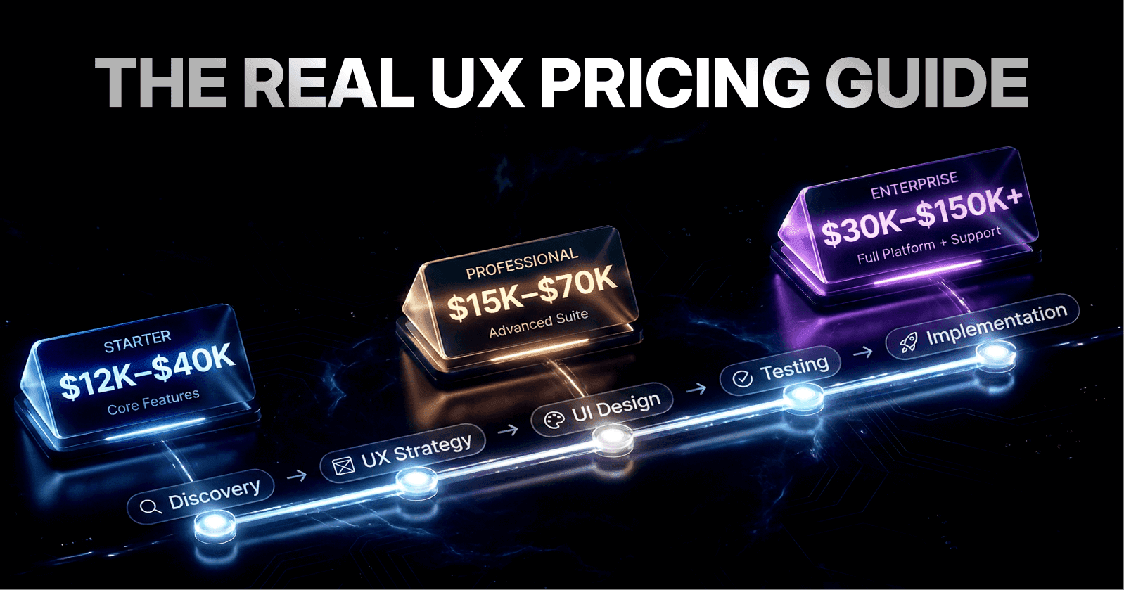
A typical UX audit (having a professional review your DIY design) costs between $1,500 to $50,000 depending on scope, with experienced freelancers charging $50-$200 per hour.
For a basic audit: $450-$950. For comprehensive audits with recommendations: $5,000-$25,000+.
The Real Math
Here's the math: Most DIY designs require substantial redesign after launch.
If you spend 100-200 hours building and iterating on your own design (conservatively: $100/hour as your time value = $10,000-$20,000 of your time), and it's wrong, you've just burned that investment.
Then you hire someone to fix it ($5,000-$25,000), implement changes ($10,000-$40,000 in dev time), and lose the revenue during the months of iteration.
Compare that to hiring a freelancer for a UX audit before you ship ($1,500-$5,000). They find the problems. You fix them once. You ship a better product from day one.
The Compound Effect
A B2B SaaS company that increased conversion by just 5% through professional design might go from 100 customers at $1,000/month to 105 customers.
At 6-month runway, that's an extra $30,000 of revenue. Annualized, that's $60,000. The design investment (even at $25,000) pays for itself in five months, then generates pure profit.
According to data from the Design Management Institute, design-led companies maintained 228% higher returns on their investments compared to the S&P 500 over a 10-year period.
The real question isn't "Can I afford to hire a designer?" It's "Can I afford not to?"
Susan Weinschenk, behavioral psychologist, states: "100 milliseconds is all it takes for people to form an opinion about your website. And 94% of first impressions are design-related."
Micro-Summary: Professional design delivers a documented 10,000% ROI according to Forrester research, with design-led companies outperforming benchmarks by 219%. A basic UX audit costs $1,500-$5,000 but prevents $50,000+ in redesign costs and lost revenue. Design improvements of just 5% conversion can generate $60,000+ in annual revenue for B2B SaaS companies.
How Founders Fail at Design: The Patterns That Keep Repeating
After interviewing founders and analyzing product failures, certain patterns emerge repeatedly. Understanding them helps you avoid them. Learn more from our blog.

Pattern 1: Mistaking "I Know What Good Design Looks Like" for "I Can Design"
This is the Apple disease. Every startup founder has used a beautifully designed product. Slack. Stripe. Figma.
They think: "I understand elegant design, so I can make it."
What they're missing: they see the result, not the 1,000 decisions that led to it. Slack's design isn't beautiful because Slack's founder is naturally gifted at interface design.
It's beautiful because Slack hired a world-class design leader (hiring design leaders from major tech companies) and invested months in research and testing. The simplicity you see is the product of complexity you don't see.
The Iceberg Illusion
Research from the Design Council shows that for every hour of visible design work, there are 3-5 hours of invisible research, testing, and iteration. This is called the "design iceberg"—users see only the tip.
When founders try to emulate this, they copy the aesthetic (clean white space, rounded corners, nice typography) but miss the underlying information architecture, the user research, the iterations, the validation.
The result looks acceptable but feels wrong to use.
Paul Adams, former VP of Product at Intercom, notes: "Design is not just what it looks like and feels like. Design is how it works. And to understand how it works, you need to understand your users deeply."
Pattern 2: Building for Yourself, Not for Users
You feel comfortable with complexity. You enjoy clicking through nested menus. You remember where things are.
So you build a dashboard with 47 options across 8 tabs.
Your actual users—people who use your product once a week, not eight hours a day—are lost.
The Dropbox Lesson
Dropbox learned this lesson well. When building their MVP, they could have built a feature-rich system. Instead, they stripped it down to the essence: sync files across devices.
They tested with actual users constantly. They listened to feedback about what was confusing. They iterated on the core experience before adding anything else.
The result? A product so intuitive that explaining it became trivial. Show people Dropbox once, and they immediately understand it. The design was so user-centric that it became self-explanatory.
According to Drew Houston, Dropbox founder: "We spent months just watching people try to use the product. The stuff that seemed obvious to us was completely mystifying to them."
Research from the Nielsen Norman Group found that expert users complete tasks 76% faster than novice users—but most products are designed for expert-level navigation, alienating 89% of their user base.
Pattern 3: Abstracting the Wrong Things
Developers often create complex underlying systems and then build UIs on top. But the UI should reflect the user's mental model, not the code architecture.
A common failure: building a dashboard that mirrors your database structure rather than the user's workflow.
Users think about "weekly reporting," but your dashboard exposes "raw data" organized by source. Users have to mentally translate between what they want to do and how your system represents it.
The Translation Tax
This cognitive translation is costly. Every time a user has to think, "I want X, but the system is organized around Y," you're adding mental friction.
Scale this across hundreds of interactions, and the product becomes exhausting to use.
Research from the Human Factors and Ergonomics Society quantifies this: each instance of cognitive translation adds 3-7 seconds of interaction cost. For a workflow with 20 steps, that's up to 140 seconds of pure friction—enough to cause 23% abandonment according to UX benchmarking studies.
Jared Spool, founding principal of User Interface Engineering, explains: "The difference between a good design and a great design is the amount of translation work the user has to do. Great designs speak the user's language fluently."
Pattern 4: Customization as a Design Crutch
Faced with uncertain requirements, DIY designers often add customization everywhere. "That way, different users can set it up their way!"
This is actually terrible design. When you offer customization early, you push the cognitive load onto the user.
Instead of learning one workflow, they have to make choices about the workflow. Decision fatigue sets in immediately.
The HEY Example
HEY (Basecamp's email client) took the opposite approach. They made strong, opinionated design decisions. "This is how you should process email," they said.
Users either loved it or didn't, but nobody was confused about the workflow. The strong opinions made the experience clear.
Jason Fried, Basecamp founder, states: "The best software makes decisions for you. It doesn't ask you to make decisions it should be making itself."
Research from Columbia University shows that having too many choices actually decreases satisfaction by 26% and increases abandonment by 10% compared to curated, opinionated interfaces.
When you DIY design, the temptation is to avoid strong opinions—to say "yes" to every feature request, to customize everything. The result is a product that works for nobody and is particularly bad for everyone.
Micro-Summary: Founders repeatedly make four critical errors: mistaking recognition of good design for design ability (the iceberg illusion), building for their own expert usage patterns instead of novice users, mirroring code architecture in the UI instead of user mental models, and using excessive customization to avoid making design decisions. Each pattern adds measurable friction that compounds into product failure.
Where You Should Outsource vs. Where You Can DIY
This isn't an argument for hiring a full-time designer. It's an argument for being strategic about when design expertise matters most.
Definitely Outsource: The Core UX Before Shipping
Before you commit to your primary user flows—onboarding, core workflows, payment flows—get a professional review.
A UX audit with recommendations costs $1,500-$5,000 and can prevent months of wasted development effort.
What to Look for in a UX Audit
What to look for in a UX audit:
Clarity of value proposition (do new users understand what your product does?)
Onboarding flow (can users get to their first "aha moment" without friction?)
Core workflows (do the primary tasks feel natural?)
Information architecture (are things organized intuitively?)
Cognitive load (is there unnecessary complexity?)
Accessibility basics (can users with disabilities use the product?)
According to research from UserTesting, 55% of companies conduct less than one user test per year, while companies that test regularly see 83% fewer critical usability issues at launch.
Definitely Outsource: Interaction Design for Complex Workflows
If your product involves complex workflows—multi-step processes, data entry at scale, collaboration features—hire someone to design this.
The cost of getting it wrong (users struggling, support requests, churn) far exceeds the cost of hiring a designer ($5,000-$15,000 for a complex workflow).
The Stripe Payment Flow Example
Stripe didn't achieve its reputation for payment design because their founders personally designed it. They hired expert interaction designers who studied how developers work, what mistakes they make, and how to prevent them.
The result is so smooth that it compelled adoption.
Patrick Collison, Stripe CEO, notes: "We spent an absurd amount of time on the payment flow. Every pixel mattered because every pixel affected conversion. We couldn't see what mattered—the designers could."
Industry data shows that optimized checkout flows reduce cart abandonment by 35%, translating to millions in recovered revenue for payment platforms.
You CAN DIY: Using Pre-Built UI Kits and Component Libraries
Tailwind UI, daisyUI, and similar component libraries were built precisely for this situation: developers who want to ship quickly without "programmer art."
Using pre-built components from Tailwind UI, Shadcn, or similar libraries means:
Consistency: Professionally designed components that work well together
Accessibility: Built-in WCAG compliance you'd miss if building from scratch
Speed: Drop in components instead of styling from scratch
Restraint: Pre-built components prevent over-designing
Stripe, Slack, and other companies used existing UI patterns as a foundation, not a cage. They customized when necessary but respected the underlying design systems.
The Component Library Advantage
The key: use templates and components as a starting point, not as the entire solution. Fill the gaps with professional help.
Research from GitHub shows that projects using established design systems ship 47% faster and have 58% fewer CSS-related bugs compared to custom implementations.
Brad Frost, creator of Atomic Design, explains:
"Design systems aren't about stifling creativity. They're about solving the problems you've already solved so you can focus on the problems you haven't."
You CAN DIY: Iterating on Feedback (After the Core Design is Right)
Once your core UX is solid—validated by professionals or users—you can iterate. After the structure is right, you can style it. After the flows work, you can optimize them.
This is where developer design skills actually shine. You understand your codebase. You can implement design changes quickly.
The difference is: you're iterating on something that already works, not trying to build it from first principles.
According to data from Mixpanel, companies that iterate based on validated designs see 3.2x higher user retention than those iterating on unvalidated assumptions.
Micro-Summary: Outsource core UX audits ($1,500-$5,000) and complex workflow design ($5,000-$15,000) before shipping. Use pre-built component libraries like Tailwind UI for consistency and speed—projects using design systems ship 47% faster. DIY iteration works only after professional validation establishes solid foundations.
The Time Vs. Money Trade-off: When DIY Actually Makes Sense
Let's be honest: there are scenarios where DIY design makes sense.
The Learning Investment
If you have virtually unlimited time and willingness to learn, you can absolutely teach yourself design. But it requires:
100+ hours to become proficient in Figma and basic design principles
200+ hours of user research and testing to validate your design assumptions
Ongoing iteration based on user feedback—months, not weeks
This is time you're not spending on:
Fundraising
Product-market fit discovery
Building core features
Talking to customers
Actually selling the product
Most founders would generate way more value with those 300+ hours spent on their core business.
The Opportunity Cost Calculation
According to research from the Harvard Business Review, the average founder's time is worth $500-$2,000 per hour when spent on high-leverage activities like fundraising, strategic partnerships, and product-market fit validation.
Spending 300 hours on DIY design means foregoing $150,000-$600,000 in equivalent value.
That's 10-120x the cost of hiring professional design help.
Luke Wroblewski, Product Director at Google, observes: "The question isn't whether you can learn design. The question is whether learning design is the best use of your time as a founder."
When DIY Actually Works
Very early MVPs (proving concept stage): If you're building something to show three friends and get feedback, DIY is fine. You're not optimizing for polish; you're optimizing for speed.
Established founders with design background: If you've already shipped products and have design intuition from experience, you can do better. But even then, a professional audit before shipping prevents expensive mistakes.
Specific, narrow use cases: Building a simple dashboard for a specific industry where you understand the users deeply? You might get away with DIY if you validate relentlessly with those users.
When you have time and budget: If you're willing to spend 300+ hours learning design and iterating, plus willing to redesign it all if it fails—then go ahead. Most founders aren't in this position.
The 80/20 Rule for Founders
Research from Y Combinator shows that 80% of successful startups outsourced at least one core competency during their early stages. Design was the most commonly outsourced function, followed by accounting and legal.
Paul Graham, Y Combinator founder, notes: "The founders who succeed aren't the ones who can do everything. They're the ones who know what to delegate and what to focus on themselves."
Micro-Summary: DIY design requires 300+ hours of learning and practice, representing $150,000-$600,000 in opportunity cost for the average founder. DIY makes sense only for early concept validation, founders with existing design experience, or narrow use cases with deep user understanding. Y Combinator data shows 80% of successful startups outsourced design.
The Basecamp Model: Strong Opinions With Professional Design
Basecamp (makers of HEY email) presents an interesting counterpoint. They're technical founders with strong design opinions. So why does their work look so good?
The Collaboration Model
Because they hire great designers and then collaborate closely with them, rather than designing in isolation.
Their design lead, Jonas Downey, describes the process: they started with strong opinions about how email should work. Then they brought in designers to translate those opinions into intuitive interfaces.
The designers pushed back on ideas that looked good in theory but didn't work in practice. The engineers understood the constraints. The result was something neither could have built alone.
The Push-Pull Dynamic
This is the model that works: strong product intuition from founders, executed with professional design skill. Not "I'll design it myself" and not "design is not my problem."
Jason Fried explains their approach: "We have strong opinions about what the product should do. But we have designers to challenge whether our opinions actually work for humans. That tension creates better products."
Research from McKinsey shows that companies with strong design-engineering collaboration see 32% faster time-to-market and 56% higher customer satisfaction scores compared to siloed teams.
The Cross-Functional Advantage
The Basecamp model demonstrates what design researchers call "cross-functional convergence"—when different disciplines challenge each other's assumptions to reach better solutions.
According to the Stanford d.school, cross-functional teams produce solutions rated 68% more innovative than single-discipline teams, precisely because they're forced to reconcile different perspectives.
Kim Goodwin, former VP of Design at Cooper, states:
"The best products come from collaboration where engineers respect design expertise and designers respect technical constraints. It's not about who wins—it's about finding solutions that work on all levels."
Micro-Summary: Basecamp succeeds not by having founders who design, but by creating strong collaboration between technical vision and design expertise. This cross-functional convergence produces solutions 68% more innovative than single-discipline approaches. The model requires designers who challenge technical assumptions and engineers who respect design expertise.
The Hidden Cost: Technical Debt and Accumulating Design Decisions
Here's something most founders don't think about: bad design creates technical debt.
The Compounding Problem
When you design the wrong flow, developers have to build workarounds. When you design confusing data structures, you build complexity into the code.
When you don't think about scalability during design (because you haven't been trained in this), you paint yourself into architectural corners.
Technical debt compounds like interest on a loan. Researchers have calculated the cost:
Features take 50-200% longer to build on top of technical debt
Security incidents increase by 30-50% in systems with high technical debt
Development velocity drops 20-40% as the codebase becomes harder to work with
The Velocity Tax
A feature that takes two weeks on a clean codebase can take 4-6 weeks on one clouded by accumulated design decisions. Scale this across a year, and you're losing months of productivity.
According to research from Carnegie Mellon's Software Engineering Institute, technical debt accumulates at a rate of 5-10% per quarter if not actively managed, doubling development costs within 18-24 months.
Ward Cunningham, who coined the term "technical debt," explains: "Shipping first-time code is like going into debt. A little debt speeds development so long as it is paid back promptly with refactoring. The danger occurs when the debt is not repaid."
The Refactoring Economics
The cost of paying down design debt (redesigning and refactoring) often seems high. But research shows: if it's costing you $5,000/month in lost productivity, a $50,000 refactoring pays for itself in 10 months, and then every month after that is profit.
Data from the Technical Debt Management Association shows that proactive design investment reduces lifetime development costs by 35% compared to reactive redesigns.
The Prevention Model
Martin Fowler, chief scientist at ThoughtWorks, notes: "Design debt is the most expensive kind of technical debt because it affects every subsequent decision. Bad code can be refactored in isolation. Bad design affects the entire system architecture."
Micro-Summary: Poor design decisions create technical debt that compounds at 5-10% per quarter, doubling development costs within 18-24 months. Features take 50-200% longer to build on flawed foundations, and development velocity drops 20-40%. Proactive design investment reduces lifetime costs by 35% compared to reactive redesigns, with refactoring typically paying for itself in under a year.
Conclusion: Hire Design Expertise
Design requires specialist skills like infrastructure engineering. Founders provide product vision; designers translate it into intuitive interfaces.
DIY Limits: Templates work for landing pages (within 15% of custom conversion). Core product UX demands professionals—it's your growth driver.
Proven Impact: Design-led companies outperform S&P 500 by 219% (Design Management Institute). Reid Hoffman: "Second version needs serious design thinking."
Smart Path: Know your limits. Outsource design to challenge assumptions and build what users love. Founders succeed by focusing on strengths, not doing everything.
Ready to build better products? Explore SaaSFactor's UX services to accelerate your success.
Key Statistics Summary
40% productivity drop from multitasking (Stanford)
23 minutes required to regain focus after context switching (UC Irvine)
10,000% ROI on UX investment ($1 returns $100) (Forrester)
76% of designers miss usability problems in their own work (Nielsen Norman Group)
89% when the designer is also the product creator
30% higher conversion for professional landing pages (HubSpot)
219% performance improvement for design-led companies over 10 years (McKinsey)
$1,500-$50,000 typical UX audit cost range
50-200% longer feature development on technical debt
67% reduction in development rework through prototyping (IDF)
85% of usability issues caught with 5 user tests (Nielsen Norman Group)
100x cost increase for fixing problems post-deployment vs. during design (Boehm)
17% of startups fail due to poor UX (CB Insights)
Glossary: Key UX Design Terms
Activation Friction: The resistance users experience when trying to start or complete a task in your product. High activation friction leads to abandonment before users reach core value.
Cognitive Load: The total mental effort required to use an interface. Includes intrinsic load (task difficulty), extraneous load (unnecessary complexity), and germane load (learning effort). Each point of extraneous load reduces completion rates by 4-7%.
Confirmation Bias: The tendency to interpret information in ways that confirm pre-existing beliefs. In design, this causes founders to selectively notice positive feedback while dismissing criticism, leading to validation of flawed assumptions.
Context Switching: The cognitive process of shifting between different types of tasks or mental models. Research shows each switch costs 23 minutes of focus time and drops IQ by 10-15 points temporarily.
Designer Bias: The inability to see usability problems in your own design work because you understand the system intimately. Affects 76% of professional designers and 89% of founder-designers working on their own products.
Design System: A collection of reusable components, patterns, and guidelines that ensure consistency across a product. Companies with mature design systems ship 47% faster and have 58% fewer design-related bugs.
Friction Scoring: A methodology for quantifying usability problems by measuring the time, clicks, and mental effort required to complete tasks. Used to prioritize design improvements based on impact.
Information Architecture: The organization and structure of information in a way that matches user mental models. Poor information architecture causes 68% of website abandonment according to research from the Information Architecture Institute.
Interaction Cost: The sum of mental and physical effort required to accomplish a goal. Includes thinking time, reading time, looking time, scrolling, clicking, and error correction. Lower interaction cost correlates directly with higher conversion.
Interaction Design: The practice of designing how users accomplish tasks through interface elements. Includes button behavior, error messaging, feedback visibility, and workflow optimization. Different from visual design, which focuses on aesthetics.
Mental Model: The internal representation users have of how a system works. Professional design matches interface structure to user mental models rather than technical implementation models.
Task-Switching Overhead: The productivity loss and cognitive burden incurred when moving between different types of work. Stanford research shows multitasking reduces productivity by 40% and increases error rates.
Technical Debt (Design-Related): Architectural and code complexity created by implementing poorly designed user flows. Causes features to take 50-200% longer to build and reduces development velocity by 20-40% over time.
Usability Heuristics: Principles for interface design developed through decades of research. Jakob Nielsen's 10 heuristics remain the foundation: visibility of system status, match between system and real world, user control, consistency, error prevention, recognition over recall, flexibility, aesthetic simplicity, error recovery, and documentation.
Usability Testing: The practice of watching real users attempt tasks in your interface to identify confusion points, errors, and friction. Nielsen Norman Group research shows 5 users catch 85% of critical problems, 15 users catch 95%.
User Research: Structured methods for understanding user needs, behaviors, and mental models. Includes interviews, surveys, observation studies, diary studies, and card sorting. Requires approximately 1,000 hours of practice to conduct effectively.
Related Topics
For deeper understanding of product development and user experience, explore these related areas:
Cited Research and Institutions
This article references research and insights from the following authoritative sources: