Last Update:
Nov 6, 2025

Share
• UX became their GTM engine – Companies like Stripe, Airbnb, and Calendly treated user experience as their primary go-to-market strategy, not just a product feature
• They out-designed, not outspent – Instead of hiring large sales teams or running expensive ad campaigns, they invested in making their product experience exceptional
• Screens did the selling – Their interfaces, flows, and interactions converted users and created word-of-mouth growth without traditional sales teams
• 70-80% lower costs – UX-led GTM strategies cost a fraction of traditional sales-driven approaches while delivering exponential growth
• Users became the sales force – Great UX turned customers into evangelists who sold other users through organic recommendations and viral loops
We've all been there. You've built something you're convinced people need. The tech stack is solid. The features are there. But somehow, users aren't sticking around. Growth is painfully slow. And everyone on the team keeps throwing around that magical phrase: "We just need to find product-market fit."
Here's the uncomfortable truth we've learned from watching dozens of successful companies: sometimes it's not your product that's broken. It's the fifteen seconds someone spends on your trial signup screen before they bounce. It's the confusing onboarding flow. It's the cluttered dashboard that makes new users feel lost.
We used to think product market fit was about features. Turns out, it's often about fixing the screens people actually see. And when you fix those screens, something magical happens they become your go-to-market engine.
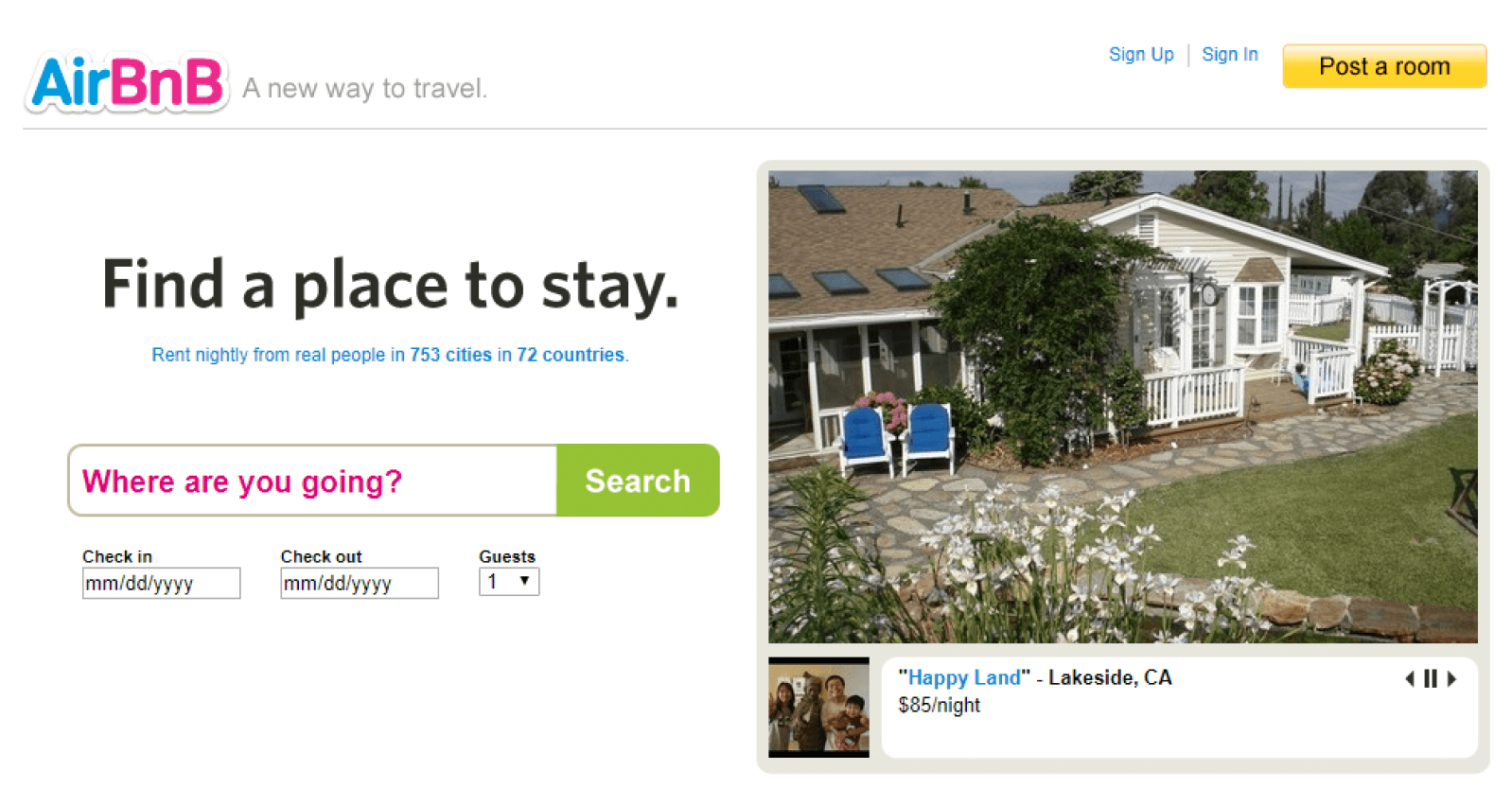
The Night Airbnb's Founders Became Photographers (And Changed GTM Forever)
Let us take you back to 2009. Airbnb was struggling. Not "we need more funding" struggling—more like "is this business even viable?" struggling. They had listings. They had a platform. But bookings were embarrassingly low.
The founders did something most tech founders wouldn't: they stopped coding and started actually visiting hosts. What they found wasn't a product problem. It was a trust problem displayed on every single listing screen.
The photos were terrible. Blurry smartphone shots. Bad lighting. Weird angles that made perfectly nice apartments look sketchy. The whole screen layout screamed "amateur hour," and potential guests were clicking away.
Joe Gebbia, co-founder of Airbnb, put it bluntly:
"We realized the photos were so bad that Airbnb felt like a risky Craigslist for strangers."
Now here's where it gets interesting from a GTM perspective. Instead of hiring a bunch of salespeople to convince people to book, or running expensive Facebook ads, they grabbed a camera and spent weeks personally photographing listings in New York.
They weren't just fixing image quality—they were fixing confusing SaaS screen flow and redesigning their entire go-to-market motion. They launched "Airbnb Photography," sending professional photographers to hosts. They redesigned listing pages with large hero images, uniform 4:3 aspect ratios, and high-resolution thumbnails. Enhanced host profiles with verified badges and richer descriptions. They updated the listing-creation flow to guide hosts on capturing better images.
💡 Result: Monthly revenue doubled in their pilot markets.
Think about that from a GTM standpoint. They didn't hire a single salesperson. They didn't increase their ad spend. They fixed what users actually saw when evaluating a property, and it unlocked everything.
Gebbia later reflected::
"When we saw bookings double in pilot markets, we knew visuals weren't cosmetic—they were central to the product's promise"
The professional photography program eventually showed that listings with quality images could earn 2-3× more bookings and command up to 40% higher rates. That's not just better UX—that's a GTM strategy that scaled without traditional sales infrastructure.
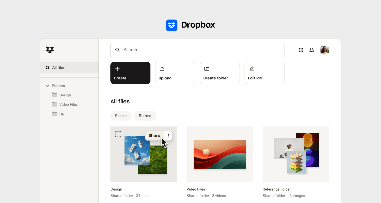
When a Video Became Dropbox's Entire GTM Launch
We love this story because it completely flips the traditional product launch playbook.
Drew Houston had a fascinating problem in 2007. He'd been building Dropbox, but he couldn't get anyone excited about it. File syncing? Everyone glazed over when he tried to explain it. With only around 5,000 signups, something had to change.
The lightbulb moment: nobody understood the UX flow from reading about it.
Houston himself explained the challenge:
"Text alone couldn't show the magic of seamless sync—so we built a video prototype."
Now, here's what makes this brilliant from a GTM perspective. Instead of finishing the full product, instead of hiring salespeople to demo it, instead of running traditional marketing campaigns, he did something genius and he made a 2-minute explainer video showing exactly how Dropbox would work.
Install the app, drag a file in, watch it appear on your other devices. Simple. Clear. Undeniable value.
This wasn't just marketing. This was using video as his entire go-to-market validation strategy. The video essentially functioned as their trial signup screen—showing people exactly what they'd get. He embedded the video prominently on the landing page as a living prototype, with a clear call-to-action to join the waiting list immediately.
Overnight, their waitlist exploded from 5,000 to 75,000 people. That's product-market fit discovered through a UX artifact that served as the entire go-to-market strategy. The video proved people wanted that specific experience the seamless, invisible file sync. It let Dropbox focus all their engineering on delivering exactly that flow, instead of guessing what features mattered.
Houston later shared:
"That demo was the fastest way to test demand and guide our roadmap. It taught us what users actually cared about,"
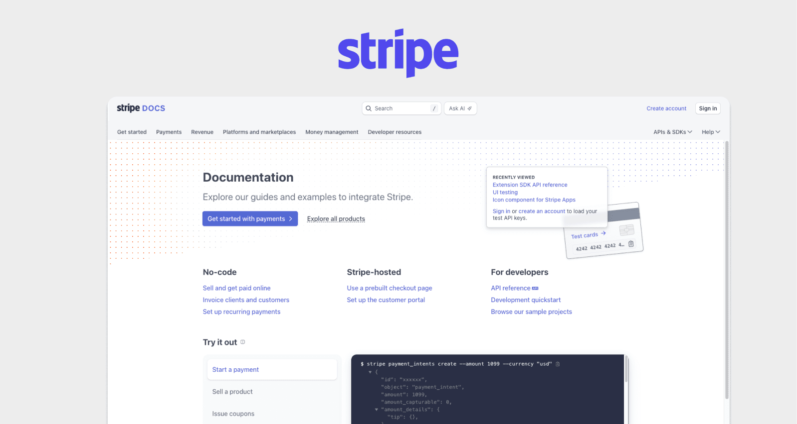
Why Stripe Won By Making Documentation Their Sales Team
Here's where things get really interesting from a GTM perspective. When Patrick and John Collison started Stripe in 2011, they could have hired enterprise salespeople. They could have gone the traditional B2B route. Instead, they had a clear thesis: payments were broken because the developer experience was torture.
Existing payment providers had APIs that made you want to throw your laptop out the window. Documentation that assumed you already knew everything. Integration processes that took weeks. High drop-off rates during sandbox testing revealed the friction was killing adoption. The entire flow was designed to make developers feel stupid.
Patrick Collison explained their approach:
"We saw engineers struggling with clunky payment APIs our goal was to make documentation part of the product."
Here's the GTM genius: they realized that if they could fix SaaS login screen UX issues and make the developer onboarding experience delightful, developers would become their sales force.
They treated developer experience as first-class UX design. Every error message was carefully written to actually help you fix the problem. The docs had copy-paste examples. They enabled test-mode API keys that required no credit card to access—solving a major pain point to reduce user dropoff on SaaS setup screen flows. You could go from signup to processing a test payment in minutes, not weeks.
They published example-driven guides with copy-paste snippets, released SDKs for popular languages, and built an interactive API reference with a live "Try It" console. Error messages came with actionable remediation tips—essentially micro-interactions on SaaS screen design that made developers feel smart instead of stupid.
As Collison emphasized:
"Docs aren't afterthoughts they're the front door to your product."
This is what we mean when we talk about how to improve SaaS dashboard UX for conversions except in Stripe's case, their "dashboard" was the API documentation itself. They understood their users' workflow and removed every single point of friction.
The result? Integration time dropped from days to minutes. Stripe became the default choice for startups. Not through aggressive sales, but because developers would finish integrating it and then tell every other developer they knew: "Just use Stripe. It actually works."
Within six months, they saw 10× growth in active API keys.
Traditional Payment API GTM vs Stripe's UX-Led GTM
That's product-led growth driven entirely by UX excellence. They didn't have better technology than competitors—they had better screens, better flows, and better micro-interactions on every touchpoint. Their UX was their GTM.
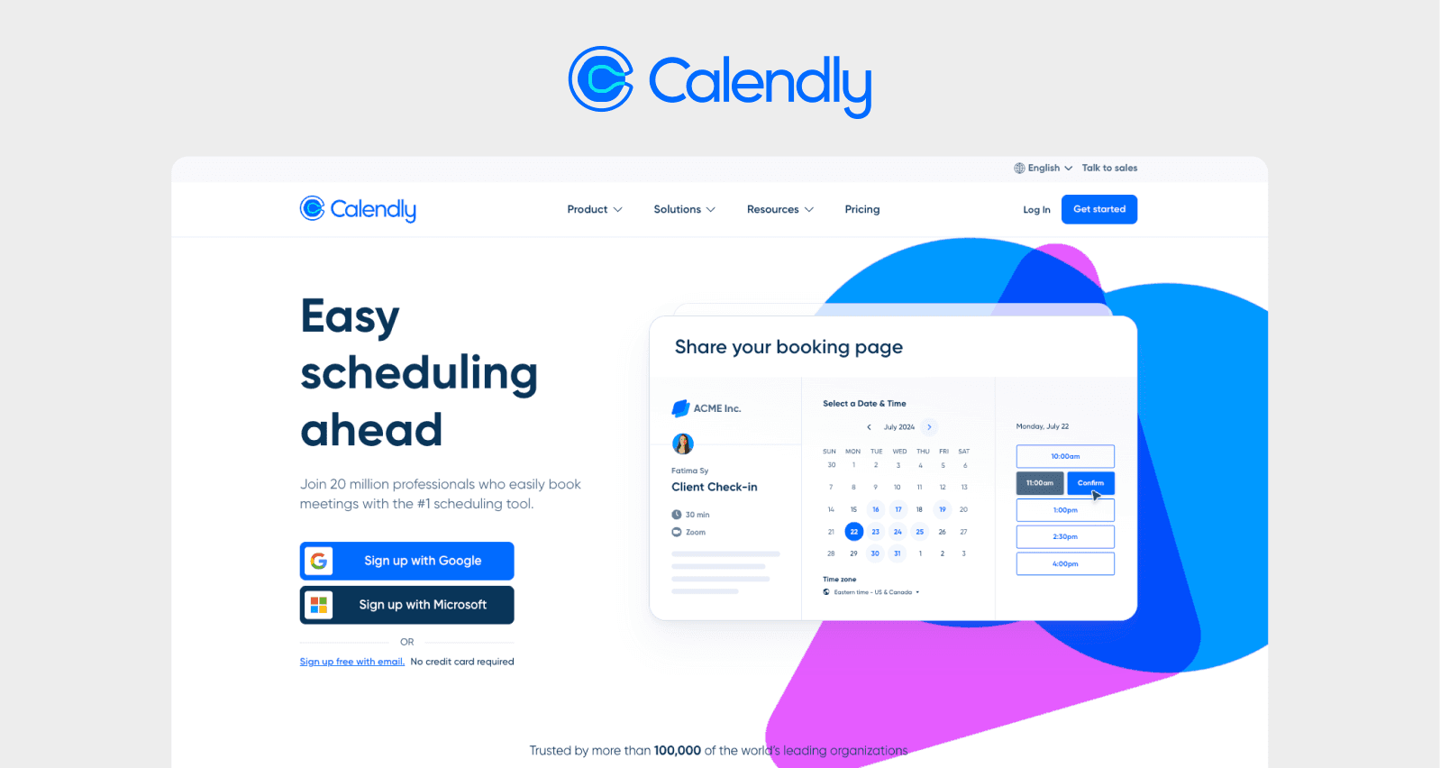
The Scheduling Link That Became Calendly's Viral GTM Engine
Tope Awotona was tired of the scheduling email dance. You know the one: "How's Tuesday?" "Tuesday's bad, what about Thursday?" "Thursday morning or afternoon?"
He had a radical idea: what if scheduling was just... a link? You send it, someone clicks it, picks a time from your availability, done.
This sounds obvious now. In 2013, it wasn't. The challenge was making the entire experience—from signup to sharing your first link to someone booking a time—completely frictionless. This is what we call implementing <u>best UX fixes for SaaS trial signup screen</u> optimization.
But user tests revealed a problem: 50% of people were abandoning the process at account creation and time-zone selection. The flow was too complicated.
Awotona was relentless in his testing:
"I built five prototypes, saw users drop out at each step, and knew simplicity was the only path to scale."
Here's where the GTM brilliance comes in. Calendly's UX genius was brutal simplicity—and that simplicity became their viral distribution mechanism.
One-click calendar integration with Google or Outlook. Automatic time-zone detection with override. Single persistent scheduling link for all invites. No accounts required for invitees. No back-and-forth. The signup flow had one job: get you to your shareable link as fast as possible. Every extra click was eliminated. Every decision point was removed.
The minimalist design emphasized one clear call-to-action: "Share your link."
Awotona later said:
"Removing every unnecessary click—from signup to meeting—made Calendly feel like magic"
This is a masterclass in applying SaaS checkout screen UX best practices to onboarding. Instead of offering fifteen scheduling options and customizations upfront, Calendly gave you the one thing that mattered: a working link. You could customize later if you wanted, but you got value immediately.
Registrations jumped 42% after the redesign. But here's the GTM magic: the viral adoption loop was built into the UX itself. People shared Calendly links, recipients had a delightful booking experience, then they signed up for their own account. The simplified UX became the distribution engine.
For anyone trying to reduce user dropoff on SaaS setup screen experiences, Calendly proves that less is exponentially more. Get people to their "aha moment" as fast as humanly possible. Then let that experience do your GTM for you.
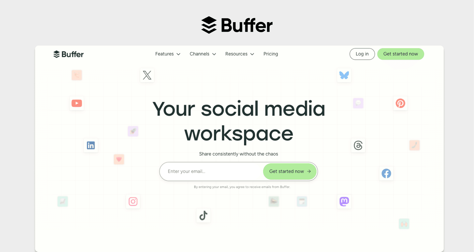
Buffer's Landing Page That Taught Us About UX-Led Conversion
Before we get to the remaining stories, there's another fascinating lesson about how landing page optimization can become your primary acquisition channel: Buffer.
Buffer provided social post scheduling, but when they analyzed their conversion rates, something was wrong. Despite traffic, they were only converting 5.23% of visitors. User feedback cited clutter and confusing signup paths. Their landing page overwhelmed visitors with features and multiple CTAs pointing in different directions.
Joel Gascoigne, Buffer's founder, became obsessed with testing: "We tested 50 page variants and realized small UX tweaks trumped big features for growth."
The fix was almost painfully simple. They stripped everything down:
Simplified headline: "Schedule your social posts in advance"
Centered signup form below the core value statement
Highlighted social-login buttons for Twitter and Facebook
Removed all secondary CTAs and extraneous imagery
Gascoigne explained:
"A clean landing page told visitors 'this is simple, put your social life on autopilot'—that clarity drove signups"
💡 Result: Conversion increased to 6.05% - 16% uplift. That might not sound massive, but it generated thousands of additional signups monthly and powered Buffer toward product-market fit.
This taught us that sometimes the difference between struggling and scaling is just removing the noise. When you apply SaaS screen UX tips for revenue growth, even small percentage gains compound dramatically at scale.
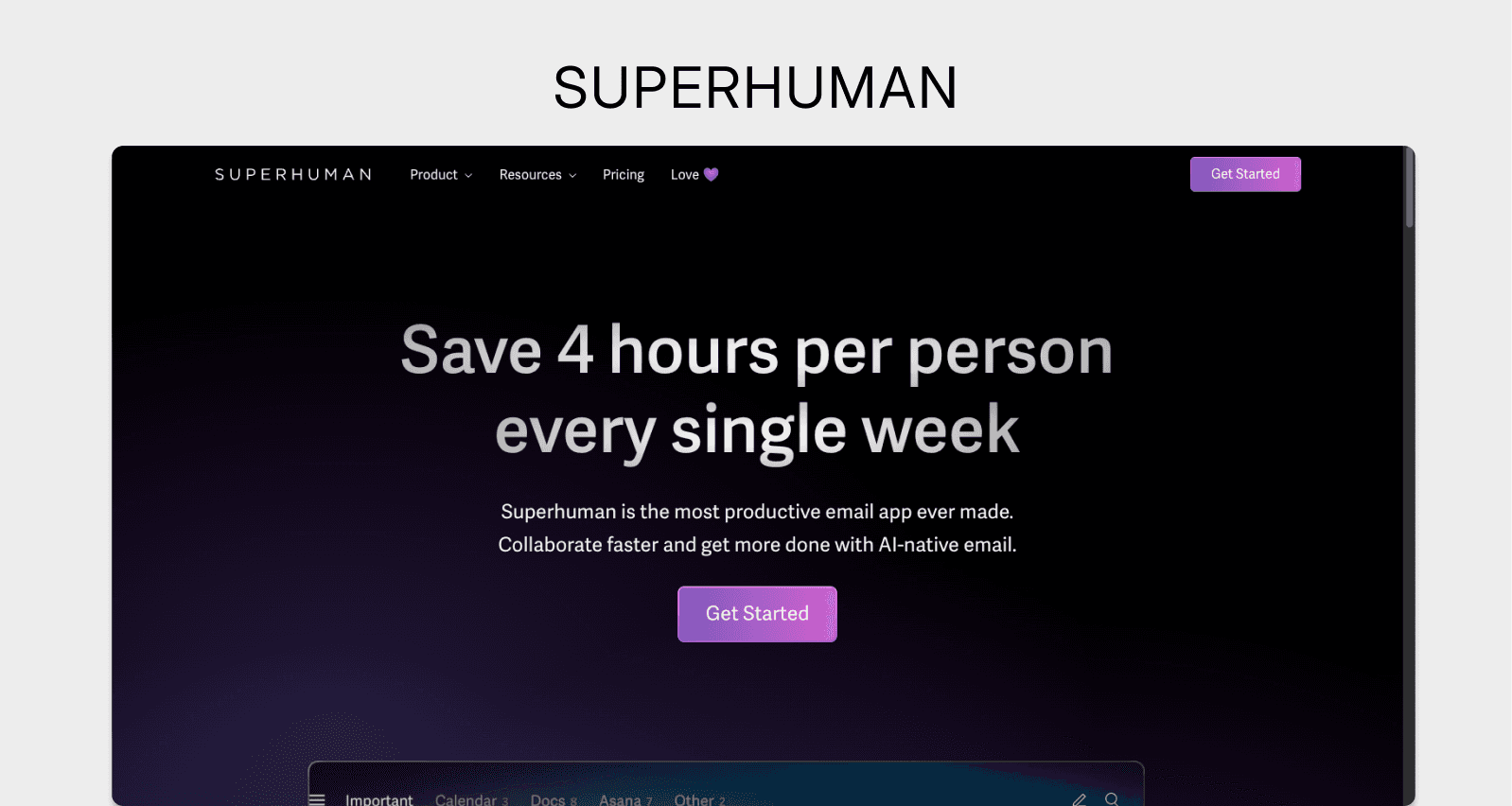
What Superhuman Learned About Building for Your Champions
Superhuman had a crisis moment that we think every founder needs to hear about. They'd built this gorgeous email client, raised money, had a waitlist but their PMF survey results were mediocre. Not enough users said they'd be "very disappointed" if Superhuman disappeared.
The initial feedback from trial users was brutal. Power users complained: "It feels no faster than Gmail."
For a product promising "the world's fastest inbox," that was devastating.
Instead of panicking and adding features, instead of pivoting, instead of hiring more salespeople, founder Rahul Vohra did customer interviews. The insight was sharp: the people who loved Superhuman really loved it, but for very specific reasons. They loved the speed. They loved the keyboard shortcuts. They loved feeling like an email ninja.
Vohra made a critical decision:
"Our first trial users said it felt no faster than Gmail—so we made every interaction sub-100ms."
The people who were lukewarm? They didn't care about those things. They wanted different features Superhuman wasn't built for.
So Superhuman doubled down. They reduced UI latency to under 100 milliseconds. They implemented intuitive keyboard shortcuts with mnemonic hints. They built instant global search across inbox and archives. They focused onboarding on power-user workflows. They removed non-essential UI elements to maintain speed—essentially perfecting the micro-interactions on SaaS screen design for their specific audience.
Vohra emphasized:
"When email feels instantaneous, users fall in love. Speed was our single biggest PMF lever,"
Here's what makes this brilliant from a GTM perspective: they weren't trying to be everything to everyone. They were trying to be perfect for email power users. And those power users became their GTM engine through word-of-mouth.
This meant working to improve SaaS screen layout to reduce churn—but only for the right users.
The PMF metric shot up. Users who would be "very disappointed" without Superhuman rose from 15% to 40%. Usage increased. Referrals increased. The power users evangelized because the product felt built specifically for them.
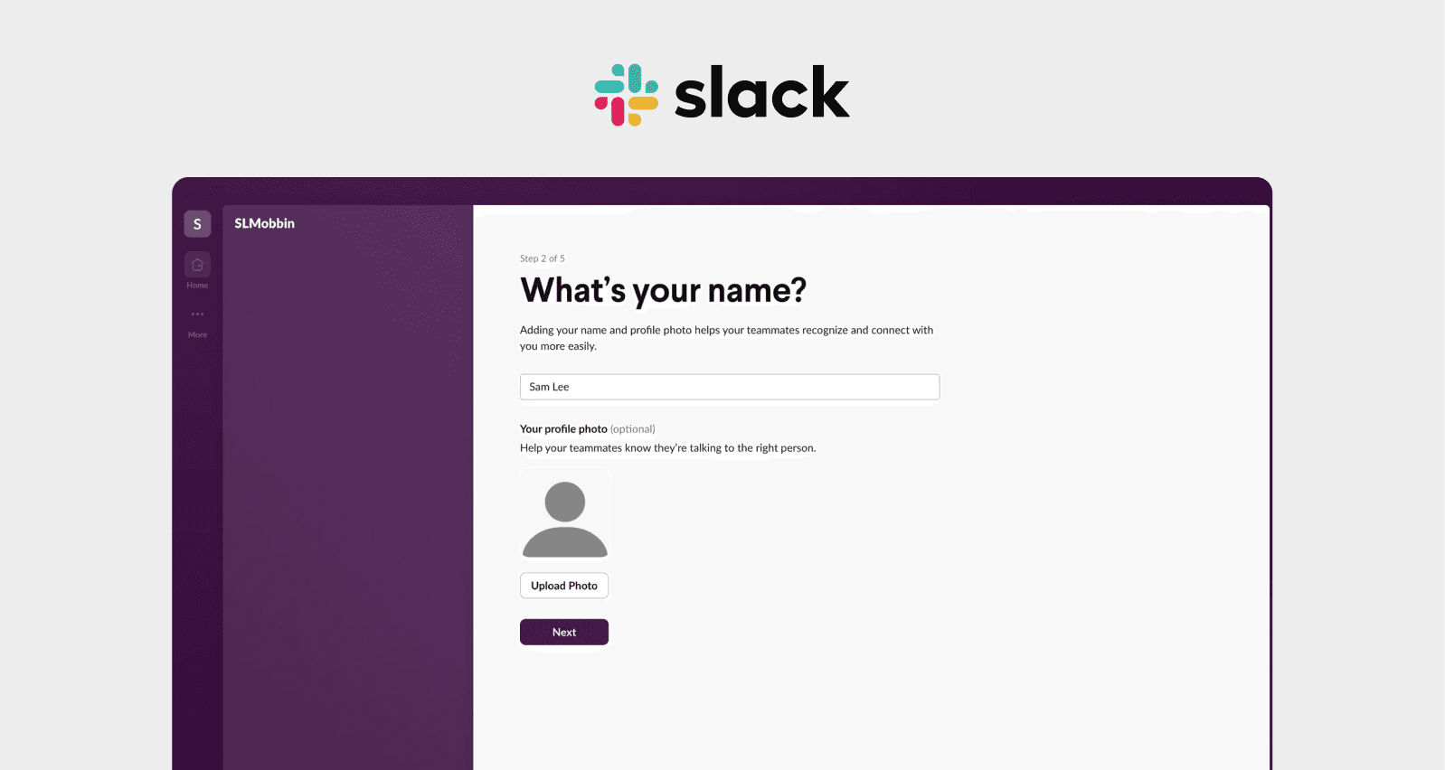
The Slack Onboarding That Made Teams Sell Each Other
Slack's origin story is famous—it started as an internal tool for a gaming company called Tiny Speck. But what made it spread like wildfire wasn't the technology. It was understanding that team messaging only makes sense when your whole team is actually using it.
That created both a UX challenge and a GTM challenge: how do you onboard a team, not just an individual?
Stewart Butterfield, Slack's co-founder, identified the problem: "Solo testing masked that teams needed to discover channels and integrations quickly to see value."
Individual users could onboard easily, but team adoption stalled. The aha moment required collaborative use, not solo exploration. This is a classic challenge when you're trying to optimize SaaS onboarding screen UX for collaborative products.
Here's where Slack's GTM genius shows up: they designed the entire onboarding flow to encourage viral team adoption.
They simplified workspace creation with guided steps (name, logo, invite). Made teammate invites dead simple. Auto-generated prebuilt channels to get you started (like "general" and "random"). Added in-product tutorials that showed you how to search message history and find information quickly. Included tooltip prompts for discovering integrations and using the search bar.
The genius was making the collaborative value obvious immediately. You didn't need three weeks to understand why Slack was useful. Within the first hour, teams could see how channels organized conversations, how search made everything findable, how it replaced email for quick questions.
When Butterfield saw real teams using it, he knew they had something: "The moment I saw a team message each other in real time, I knew Slack solved a critical need."
This is what great SaaS onboarding looks like from a GTM perspective: showing the value state fast, with real collaboration, not empty demo data. Every screen in that initial flow was designed to answer the question: "Why should my team use this?"
The results spoke volumes. Workspace size tripled in the first week after the onboarding redesign. Retention exceeded 85%. The viral bottom-up adoption inside companies proved it worked. Teams would start using Slack without IT approval, then eventually get their whole company on board.
This taught us that when you're building collaborative products, your UX doesn't just need to convert individual users it needs to turn them into evangelists who bring their teams. That's UX as a GTM multiplier.
What We've Learned: The UX-Led GTM Framework
Here's the pattern we keep seeing across all seven companies: they didn't just build products they treated their user experience as their primary go-to-market strategy. They obsessed over the actual screens and interactions users experience, knowing that every login screen, every setup flow, every dashboard was either a conversion moment or a bounce point.
The companies that figured this out didn't just get marginally better results. They unlocked entirely new growth curves. Airbnb's photos doubled revenue without hiring salespeople. Dropbox's video proved demand and generated 15x signups before they even built the full product. Stripe's developer UX became their moat and eliminated the need for traditional sales. Calendly's simplicity became their viral distribution engine. Buffer's landing page clarity drove thousands of additional signups. Superhuman's focused UX created passionate evangelists. Slack's team onboarding created a bottoms-up GTM flywheel.
So where do you start? Here's what we've seen work when building a UX-led GTM strategy:
1.Measure What's Actually Happening on Your Screens
Where do people drop off? Which flows confuse them? Don't guess watch session recordings, run user tests, ask people who bounced why they left. Use analytics to identify the exact point where users abandon your flow. Heat maps can reveal what people are clicking on (or ignoring). Exit surveys can tell you why people left.
The data will surprise you. We've seen companies discover that 60% of users never clicked their main CTA because it was below the fold. Or that their "enterprise-grade" language actually scared away SMBs. These best UX fixes for SaaS trial signup screen experiences come from real data, not assumptions.
2.Fix the Trust Signals First
Like Airbnb discovered, if your product screens don't build confidence, nothing else matters. This might mean better visuals, clearer copy, social proof, testimonials, security badges, or just removing things that look sketchy. Amateur design signals amateur product. Professional presentation signals professional reliability.
This is especially critical when you're trying to <u>fix SaaS login screen UX issues or landing page problems. Users make trust decisions in seconds. Your GTM strategy needs to win that moment.
3. Optimize for the "Aha Moment"
Every extra second between signup and value is a chance to lose someone. Map out the fastest path to someone experiencing success with your product, then remove everything else from that flow. What's the one thing that makes someone go "Oh, I get it now"? Build a highway to that moment.
Calendly got this right by getting users to their shareable link in under 60 seconds. Dropbox showed the end result before asking for setup. This is the core of implementing SaaS checkout screen UX best practices minimize friction, maximize value delivery speed.
4. Test the Micro-Interactions
Small things matter more than you think. Button states, loading indicators, confirmation messages, transitions these <u>micro-interactions on SaaS screen design</u> tell users whether your product is polished or half-baked. A smooth, responsive interface builds trust. Janky interactions create doubt.
Superhuman proved this by making every interaction sub-100ms. That attention to detail became their competitive moat and their word-of-mouth engine.
5. Know Who You're Optimizing For
Superhuman's lesson was clear: trying to please everyone makes mediocre experiences. Build for your specific user, and make their experience exceptional. It's better to be loved by 1,000 people than to be "pretty good" for 10,000. Define your ideal user, then obsess over their journey.
Your GTM strategy should reflect this focus. Don't try to sell to everyone. Make your screens perfect for your ideal customer, then let them sell for you.
6. Make Your Flows Frictionless
Every form field, every extra step, every moment of confusion is costing you users and weakening your GTM engine. Following SaaS checkout screen UX best practices isn't about following rules it's about respecting people's time and reducing friction. Ask for the minimum viable information. Save the optional fields for later. Get people to success first, data collection second.
Buffer proved that removing secondary CTAs and simplifying their value proposition increased conversions by 16%. What could you remove from your flows?
7. Show, Don't Tell
Dropbox's video taught us that demonstrating value beats explaining it. Whether it's a demo video, interactive tour, or dummy data that shows the end result, let people see what success looks like before they invest time in setup.
This is increasingly important in a world where attention spans are shorter and competition is fiercer. Your UX needs to communicate value instantly that's what makes it an effective GTM tool.
The Real Lesson: UX Is Your Unfair GTM Advantage
We used to think go-to-market strategy was about sales teams, marketing budgets, and distribution channels. Now we know better.
Sometimes the best GTM strategy is hiding behind a confusing signup flow. Sometimes it's buried under a cluttered dashboard. Sometimes it's waiting on the other side of trusting users with a simpler, clearer interface.
Think about what happened with these seven companies. Airbnb didn't hire salespeople they fixed their listing photos and let the visuals sell. Dropbox didn't build an enterprise sales team they made a video and let it do the selling. Stripe didn't hire solution engineers hey made their docs so good that developers sold each other. Calendly didn't run ads they made sharing so easy that users became their distribution channel. Buffer didn't increase ad spend they simplified their landing page. Superhuman didn't try to please everyone they made power users so happy they couldn't stop talking about it. Slack didn't pitch IT departments they made team adoption inevitable through great UX.
So before you hire that sales team, before you increase your ad budget, before you blame your product—look at your screens. Really look at them. Is every interaction clear? Does every flow build trust? Can someone get from curious to successful in minutes, not hours?
Because that's often where your GTM advantage lives. Not in your sales deck. In your UX.
The companies that figured this out didn't just improve their metrics they transformed their businesses. They went from struggling to thriving by making their user experience their primary go-to-market motion. They built what we call "UX-led GTM"—where the product experience itself becomes the primary driver of acquisition, activation, and expansion.
Your product might already be the right solution. Your UX just needs to become your sales engine.