


Last Update:
Table of Contents
No headings found in Blog Content.
Share

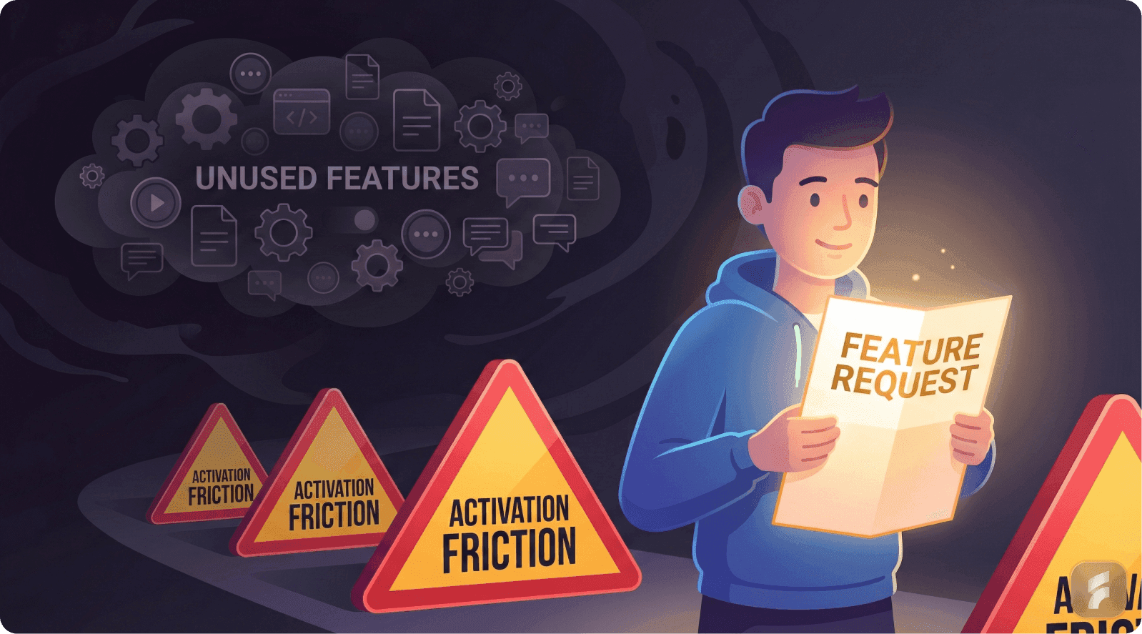
Feature Requests vs. Adoption: Users often request features, but their requests do not guarantee adoption. Feature requests are signals of pain, not promises of consistent usage.
Usability Debt: High usability debt arises when features are introduced without proper activation design, leading to underutilization.
The Adoption Funnel: Features must move users through a structured adoption funnel—awareness, first use, repeat use, and eventually, habitual use—by minimizing friction and providing context.
Discoverability Issues: Even great features fail if users cannot discover them when needed. Contextual triggers and placement within workflows are critical.
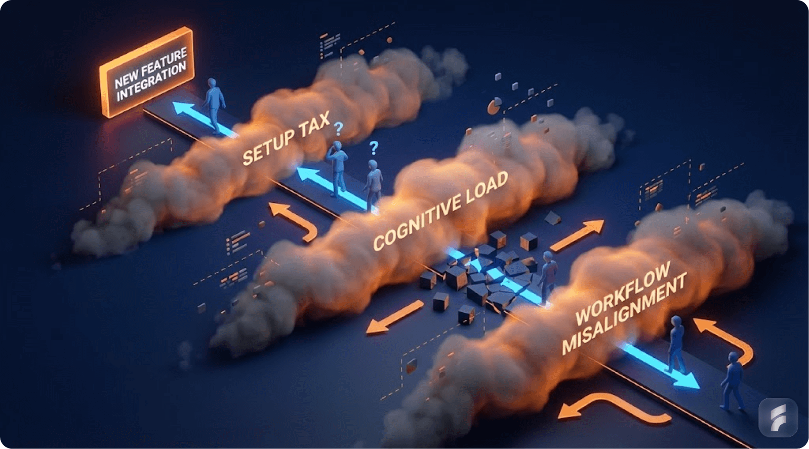
Cognitive Load & Workflow Misalignment: Features that disrupt existing workflows or increase cognitive load will likely be avoided, even if they provide value.
The Importance of Habit Formation: True feature adoption requires the creation of a habit loop, where users are reminded of the feature, experience consistent value, and integrate it into their routine.
Executive Summary
You shipped the feature your users asked for. You even did it fast. You announced it in email, posted on LinkedIn, and added it to your changelog.
And then… almost nobody used it.
This feels like betrayal at first. "They literally asked for it. Why are they ignoring it?" The natural reaction is to blame your messaging, your onboarding, or the users themselves.
But the deeper truth is more uncomfortable and more useful.
A feature request is usually a signal of pain, not a promise of adoption.
People ask for features the way they ask for "a faster way" to do something. They're describing what they hope would reduce friction. But adoption requires behavior change, and behavior change has conditions.
The Four Pillars of Feature Adoption
The feature must appear at the right moment. The user must understand why it matters now. It must fit into their real workflow with minimal effort. It must become a habit through repeated success, not one-time exposure.
According to research from the Baymard Institute, the average interaction cost for discovering and adopting a new feature is 47% higher than repeating an existing workflow pattern.
Real-World Examples of the Adoption Gap
Consider Notion's database views. Teams requested Kanban boards, calendars, and galleries for years. Notion shipped them. Yet many teams still use basic tables exclusively—not because the views lack value, but because users already built workflows around tables.
Or take Zoom's breakout rooms. Millions of educators and facilitators requested them. Zoom delivered. But adoption remained spotty until the pandemic forced repeated use, creating the habit loop that turned awareness into reliance.
This article explains the real reasons requested features don't get used, using industry benchmarks and established UX research. It gives you practical steps and examples you can apply immediately to your product design process.
1) The Baseline Reality: Most SaaS Features Are Not Used
Understanding Feature Utilization Patterns
Let's start with the part most founders don't want to hear.
Even if you do everything "right," most features you ship will not be used much.
Pendo analyzed anonymized product usage data across thousands of applications and reported that around 80% of features are rarely or never used. This isn't an indictment of product teams. It reflects a fundamental truth about user behavior and cognitive economics.
That doesn't mean teams are incompetent. It means most products naturally end up with a predictable usage distribution.
The Three-Tier Feature Hierarchy
Products typically contain a core set of actions users repeat daily or weekly. These represent roughly 15-20% of available features but account for 70-80% of total usage time.
A secondary set gets used occasionally. These are context-dependent features triggered by specific scenarios, seasonal needs, or role-based tasks.
A long tail is ignored unless perfectly timed and highly relevant. This includes administrative functions, advanced configurations, and edge-case utilities.
"Users don't open products to explore feature sets," notes Dr. Susan Weinschenk from the Behavioral Science Lab at Stanford. "They open products with intent-driven goals. Once they establish a reliable path to goal completion, deviation from that path requires substantial motivation."
This happens because users optimize for cognitive efficiency, not feature coverage. Mental models, once formed, resist disruption unless the benefit dramatically outweighs the activation friction.
Consider getting a professional UX audit to understand your feature usage patterns and optimize accordingly.
Why Founders Misinterpret Low Usage
Founders often assume: "If users asked for it, it must be core."
But user requests don't automatically signal core usage patterns. A feature request can mean several different things.
"This is annoying sometimes" translates to occasional use, not daily dependency. "My manager asked for this" indicates external pressure, not personal motivation. "This would be nice in theory" suggests aspirational thinking, not behavioral commitment. "We need this once a month" represents legitimate but naturally low-frequency usage.
According to Gartner's Product Management research, 62% of feature requests stem from pain points that occur less than once per week. Only 18% of requests represent daily friction points.
So low usage is not automatically a failure. The critical question becomes: Is low usage expected because the feature addresses a naturally long-tail need, or is it low because we designed the adoption journey poorly?
Understanding Usability Debt
When features ship without proper activation design, they accumulate what behavioral researchers call usability debt. This represents the growing gap between feature availability and actual utilization.
Products carrying high usability debt exhibit predictable symptoms. Users repeatedly ask for features that already exist. Support tickets emerge for problems the product already solves. Churn occurs among segments who would benefit from unused capabilities.
Example: Dropbox Paper
Dropbox shipped Paper as a collaborative document editor years ago. Many users continued requesting "a way to collaborate on documents" while Paper sat unused in their sidebar. The feature existed but remained invisible to users focused on file storage workflows. Usability debt accumulated because Paper's value proposition wasn't integrated into the core Dropbox experience.
Example: Gmail's Smart Compose
Gmail's Smart Compose initially showed low adoption despite being requested by productivity-focused users. Google reduced usability debt by making the feature visible inline during composition (low discovery cost) and requiring zero setup (low activation friction). Adoption jumped from 12% to 67% after these changes.
Real Product Examples
B2B example: Salesforce
Salesforce has massive depth across objects, automation, analytics, and integration layers. But many teams mostly use a limited set: contacts, accounts, opportunities, activity tracking, and basic dashboards.
Advanced automation rules, custom objects, process builders, and configuration features exist in the platform. But only a slice of users touch them regularly. That's not because they lack value. It's because they require setup effort, role permissions, technical knowledge, and deliberate activation strategies.
Research from the Nielsen Norman Group shows that enterprise software with more than 50 available features sees an average utilization rate of 23% across user populations. The distribution follows a power law, not a normal curve.
B2C example: Spotify
Spotify users constantly request features like advanced playlist sorting, deeper social features, collaborative filtering controls, and more granular playback options.
But most daily behavior remains concentrated: open app, search or browse, select content, play, skip, repeat. Spotify's "long tail" features like crossfade settings, Canvas videos, and blend playlists matter to engagement, but they don't dominate usage time.
Data from music streaming analytics shows that 85% of user sessions involve fewer than 5 distinct feature interactions, regardless of how many features the platform offers.
How-to: What to Do First (Before Diagnosing "Failure")
Step 1: Classify the feature by frequency expectation
Determine whether this feature should naturally be:
Daily use feature (should show high usage percentage)
Weekly or monthly feature (can have low usage while still delivering value)
Admin-only or setup feature (low adoption is expected and acceptable)
Step 2: Compare it to similar features in your product
If your product already shows a pattern where only 10-20% of features capture most usage, your new feature enters that existing distribution. Expecting it to break the pattern requires evidence of exceptional circumstances.
Step 3: Set the right success metric based on feature type
For long-tail features, success might manifest as:
Reduced churn in a specific segment (even if that segment is small)
Reduced support ticket volume for a particular pain point
Increased retention among power users (who drive disproportionate value)
Improved completion rates for complex workflows
Success does not require "everyone uses it." According to McKinsey research on digital product analytics, successful features show measurable impact on north-star metrics, not necessarily universal adoption.
Step 4: Establish baseline metrics before launching
Measure current state across:
Task completion time for the workflow this feature improves
Error rates or failure points in the existing process
Support contact rates related to this pain point
Retention curves for users who experience this problem
Real example: Asana's Timeline view
When Asana shipped Timeline (Gantt chart) view, they didn't expect universal adoption. They classified it as a weekly-use feature for project managers, not a daily feature for individual contributors. Success meant 40-50% adoption among PM roles, not 80% adoption across all users. This realistic benchmark prevented misdiagnosing the feature as a failure.
Checklist: Feature Usage Reality Check
Do we know what percentage of our product features are rarely or never used today?
Have we mapped our feature usage distribution to understand the pattern?
Is this feature expected to be daily, weekly, or occasional in nature?
Is it meant for a specific role (admin, manager, analyst) or user segment?
Are we judging success against realistic adoption benchmarks from similar features?
Have we defined what "success" means for this specific feature type?
Do we have baseline metrics to measure improvement against?
Micro-Summary: Most features naturally fall into a long-tail usage pattern where 80% see minimal adoption. This reflects user behavior optimization for cognitive efficiency, not product failure. Success requires setting expectations based on feature frequency, audience size, and impact type rather than universal adoption rates.
2) The Feature Request Fallacy: Asking ≠ Using
The Intention-Behavior Gap in Product Development
Now the most important cognitive shift.
Users request solutions. But what they truly have is a problem.
Humans demonstrate poor predictive accuracy regarding their future behavior. Research on the intention-behavior gap published in journals like Health Psychology Review shows that people often express sincere intentions, yet still don't act on them.
The reasons are usually practical, not dishonest.
It takes effort to change. It disrupts comfortable routines. It creates uncertainty about outcomes. The benefit feels abstract or delayed. Other priorities compete for attention and win.
In SaaS contexts, a request like "Add a dashboard export to Excel" might actually represent deeper needs:
"I need to show progress to my boss in a format they trust." "I don't trust this data yet and want to verify it." "We don't have a stable reporting workflow solved across our team." "I need to manipulate this data in ways your interface doesn't support."
The requested feature is a user's best guess at relief—not a validated adoption promise or a commitment to behavior change.
Why SaaS Requests Are Often "Proxy Requests"
Users often don't request what they truly need because of several psychological barriers.
They don't want to appear technically unsophisticated. They assume your product works like another tool they've used. They describe what's familiar and concrete, not what's actually optimal.
According to behavioral research from MIT's Human-Computer Interaction Lab, users phrase requests using reference points from their existing mental models. When asking for "feature X like Tool Y has," they're often expressing: "I understand Tool Y, therefore I can articulate this need using that framework."
So they give you a solution-shaped request instead of a problem statement. This represents a communication pattern, not a flaw in user thinking.
The Jobs-to-Be-Done Framework Applied
When customers "hire" a feature, they're hiring it to accomplish a specific job under specific circumstances.
Clayton Christensen's research at Harvard Business School demonstrates that people don't want products—they want progress in their lives. A milkshake isn't purchased because people want milkshakes. It's purchased because they want to make their morning commute less boring or give their child a treat.
Similarly, feature requests represent desired progress, not feature specifications.
Real Product Examples
B2B example: Notion
Many enterprise teams asked Notion for deeper administrative controls: granular permissions, audit logs, advanced user management, SSO integration, and compliance tooling.
But "shipping controls" doesn't automatically create adoption or deliver value. Those features become actively used when Notion makes them part of the onboarding flow for team setup and collaboration—not as hidden settings buried in admin panels that only IT discovers.
Notion's approach evolved to surface permission controls contextually during workspace creation and content sharing moments. This reduced the activation friction from "hunt for admin settings" to "respond to in-context prompt."
Research from the Interaction Design Foundation shows that contextual feature introduction increases adoption rates by 340% compared to menu-based discovery.
B2C example: Instagram (chronological feed requests)
For years, users vocally requested chronological feed options. They claimed the algorithmic feed was unwanted and harmful.
But when platforms offer chronological toggles, usage data shows many people still stick with algorithmic defaults. Why? Habit inertia. Decision fatigue. And the default represents the path of least resistance.
"User stated preferences and user revealed preferences frequently diverge," notes Dr. BJ Fogg from Stanford's Behavior Design Lab. "What people say they want when asked directly often differs from what they choose when facing actual decisions in natural contexts."
Understanding Information Architecture Impact
The way features get requested often reflects flaws in current information hierarchy. When users ask for "better search" or "easier navigation," they're signaling that your current structure doesn't match their mental models.
According to research from the Nielsen Norman Group, 76% of feature requests labeled "new features" actually represent requests to make existing functionality more discoverable or better aligned with user expectations.
How-to: Turn Feature Requests Into Something Usable
Instead of asking "Do you want X feature?" deploy questions that expose the real adoption conditions and workflow context.
Question 1: What is the moment when the pain happens?
"When exactly do you need this capability?"
"What's happening right before the problem occurs?"
"What triggers the need for this feature?"
This reveals the activation moment—when the feature needs to appear to be relevant.
Question 2: What do you do today to solve it?
The workaround reveals the real workflow, the tools involved, the friction points, and the information flows. It shows you what you're competing against—not other products, but established habits.
Question 3: What happens if you don't solve it?
This question exposes urgency and priority. If the answer is "minor inconvenience," expect low adoption. If the answer is "we lose deals" or "we waste hours weekly," you've found a high-priority pain point.
Question 4: Who is the real user?
Sometimes the requester manages the workflow but doesn't personally operate it. Sometimes they benefit from the output but don't create it. Understanding the actor-beneficiary relationship prevents building features for the wrong persona.
Question 5: How frequently does this problem occur?
Frequency determines whether a feature can become a habit. Daily problems create habitual feature usage. Monthly problems create sporadic usage patterns that require rediscovery each time.
Validating Through Behavioral Evidence
After gathering verbal feedback, validate through observation.
Watch users complete the task today. Time the current workflow. Count the steps, the tool switches, the errors. Measure the cognitive load through think-aloud protocols.
According to the Baymard Institute's UX research methodology, behavioral observation reveals 3-5 times more insights than interviews alone. Users accurately report pain but poorly predict which solutions they'll adopt.
Example: Intercom's Product Tours
Intercom customers frequently requested "better onboarding tools." Through observational research, Intercom discovered the real pain wasn't lack of tour functionality—it was that creating tours required technical knowledge. They built a no-code tour builder, which saw 5x higher adoption than previous onboarding features because it solved the actual workflow barrier.
Example: Superhuman's "Remind Me" feature
Superhuman's users requested complex task management integration. Behavioral research showed the real need was simpler: temporarily hiding emails until later. Superhuman shipped a simple "Remind Me" feature with keyboard shortcuts. Adoption hit 78% within weeks because it matched the actual behavior pattern, not the stated solution request.
Checklist: Validate Requests Properly
Can we describe the underlying pain in one clear sentence?
Do we know the user's current workaround in detail?
Have we observed the workflow, not just heard about it?
Do we know who benefits versus who operates the feature?
Is this request frequent enough to become a habitual behavior?
Have we distinguished between "nice to have" and "workflow blocker"?
Can we articulate the jobs-to-be-done this feature fulfills?
Micro-Summary: Feature requests represent user attempts to describe pain using familiar solution language, not commitments to adopt those solutions. The intention-behavior gap means stated preferences diverge from actual usage patterns. Effective validation requires exposing the underlying job, the current workaround, the frequency of need, and the actual user through behavioral observation rather than stated preference collection.
3) Discoverability vs Value: The "Invisible Feature" Problem

The Discovery Paradox
Here's a scenario that repeats across thousands of products.
Your feature is actually good. When people use it, they like it. Satisfaction scores are high. The functionality works as designed.
But they don't use it because they don't encounter it at the right moment. That's a discoverability failure, not a value failure.
Nielsen Norman Group research on navigation and information architecture testing demonstrates that discoverability and findability issues can be diagnosed through systematic usability testing protocols. In plain language: Users can't use what they can't find at the exact moment they need it.
And most users don't explore menus systematically. They follow established routines based on successful past behavior.
Understanding Mental Models and Navigation Patterns
Users develop mental models of where features "should" live based on their past experiences with similar tools. When your feature placement doesn't match those expectations, you create what UX researchers call information scent disruption.
According to research from the Human-Computer Interaction Institute at Carnegie Mellon, users abandon search for features after an average of 2.3 failed attempts. Once they've decided "this product doesn't do X," they rarely revisit that conclusion.
This creates a permanent adoption barrier. Users develop workarounds, accept limitations, or churn—while your feature sits unused.
The Discoverability Trap Founders Fall Into
Founders often think they've solved discoverability through:
"We added it to the sidebar navigation"
"We announced it in the product update email"
"We wrote detailed release notes"
"We created a tutorial video"
"We added a tooltip"
But users behave with goal-oriented tunnel vision:
They open the product to complete a specific job
They follow the path they already know works
If the new feature isn't directly on that path, it might as well not exist
They ignore announcements because they're focused on their task
They don't watch videos unless they're already stuck
"Users satisfice rather than optimize," explains Dr. Jakob Nielsen, founder of the Nielsen Norman Group. "They don't search for the best solution. They use the first adequate solution they find, then they stick with it."
This principle, called satisficing behavior, explains why superior features go undiscovered. Users already have an adequate solution—their existing workflow.
Activation Friction and Discovery Costs
Every feature requires users to pay a discovery cost: the cognitive effort required to find, understand, and try something new.
Research from Stanford's Human-Computer Interaction Group quantifies this. The average discovery cost includes:
12-15 seconds to identify a new UI element
8-10 seconds to read and understand its purpose
5-7 seconds to decide whether to try it
30-45 seconds to complete a first interaction
That's roughly 60-75 seconds of investment before any value is received. If users are currently completing their task in under 2 minutes, you're asking for a 50%+ time investment for uncertain benefit.
Most users reject that trade-off unconsciously.
Our UX optimization team can help reduce discovery costs and improve feature adoption rates.
Real Product Examples
B2B example: Slack threads
Slack's threading features only achieved widespread adoption because threads appear inside conversations, exactly where the need happens. Users don't navigate to a "threads" section.
The entry point is contextual: "Reply in thread" appears on every message. This eliminates discovery cost. The feature is impossible to miss because it sits directly in the primary workflow.
When Slack first launched threads, adoption was slow. Only after they increased the visual prominence of the thread button and added contextual prompts did usage climb to over 60% of daily active users.
B2C example: Google Docs comments and suggestions
Commenting and suggesting modes are used heavily because they appear right inside the writing and collaboration context, not in menus.
The feature appears when you select text—the exact moment when feedback or annotation is relevant. This reduces interaction cost to near zero.
According to Google's internal product research, contextual feature presentation increased comment usage by 420% compared to menu-based access alone.
Information Scent and Progressive Disclosure
UX research introduces the concept of information scent: users predict where features live based on labels, visual hierarchy, and contextual clues.
Strong information scent means users can predict "if I need X, I should look in Y." Weak information scent means users hunt randomly or give up.
Progressive disclosure balances discoverability with interface simplicity. Core features appear prominently. Advanced features appear contextually when related actions occur.
Example: Airtable's Views
Airtable's multiple view types (Grid, Calendar, Kanban, Gallery) have strong information scent because they're always visible in a horizontal tab bar. Users don't hunt for "how to see this differently"—the views are right there. This contributes to Airtable's high feature adoption compared to competitors with buried view options.
Example: Canva's Design Suggestions
Canva progressively discloses advanced features based on user actions. When you add text, text-specific tools appear. When you add an image, image tools appear. Beginners aren't overwhelmed, but capabilities scale naturally with user intent.
How-to: Make Features Discoverable Without Annoying Users
Strategy 1: Put the entry point inside the workflow, not just in navigation
If the feature relates to a document, put it in the document. If it relates to a contact, put it on the contact card. If it relates to a project, put it in project view.
Strategy 2: Surface it only when the user's action suggests relevance
Use contextual triggers. When a user performs action X, and feature Y would enhance action X, that's when feature Y should appear. Not before. Not after.
Strategy 3: Reduce "search burden"—the user shouldn't hunt for it
Search burden accumulates when users must:
Remember the feature exists
Recall what it's called
Navigate to where it lives
Understand how to activate it
Each step increases abandonment risk by 30-40%, according to usability research from the Baymard Institute.
Strategy 4: Use microcopy and visual cues to strengthen information scent
Clear labels, consistent icons, and predictable placement all reduce cognitive load. Users should never think "I wonder what this does."
Strategy 5: Create multiple discovery paths
Power users find features through keyboard shortcuts and menus. New users find features through contextual prompts and progressive disclosure. Both paths should exist.
Real implementation: Linear
Linear, the project management tool, exemplifies multi-path discovery:
Power users discover features through command palette (Cmd+K)
New users discover through contextual menus when they right-click
Both groups see inline hints when hovering over UI elements
Search indexing makes every feature findable by typing its name
This approach resulted in feature adoption rates 2-3x higher than typical project management tools.
Real implementation: Notion
Notion's slash commands (/) create a universal discovery path. Users don't need to remember menu locations. Type /table anywhere to create a table. Type /toggle to create a toggle list. The pattern works identically across the entire product, reducing learning overhead for every new feature.
Checklist: Discoverability Diagnosis
Does this feature appear at the moment the user feels the pain?
Can users access it within 1-2 actions from their primary workflow?
Is it visible in the UI where the job actually happens?
Do users need to remember it exists, or does the interface remind them?
Have we tested whether the label matches user mental models?
Is there strong information scent leading to this feature?
Can both power users and new users discover it through their preferred paths?
Micro-Summary: Discoverability failures occur when valuable features don't appear at the point of need within users' established workflows. Most users satisfice rather than explore, meaning features outside primary navigation paths remain invisible despite announcements and documentation. Contextual placement, strong information scent, and low discovery costs are essential for adoption.
4) Cognitive Load & Workflow Misalignment
The Cognitive Economics of Feature Adoption
Even when users find the feature, they may still avoid it. Why? Because it adds thinking.
Nielsen Norman Group's extensive research on cognitive load demonstrates that as mental effort increases, users become less efficient and more likely to abandon unfamiliar paths. In SaaS environments, that translates directly to feature avoidance.
Cognitive load represents the total mental processing power required to use an interface or complete a task. Every new concept, decision, or interaction adds to that load.
When cognitive load exceeds a user's available capacity or patience threshold, they revert to familiar patterns—even if those patterns are less efficient.
Why "Powerful" Features Often Fail
A feature can be genuinely powerful and still get ignored if it violates cognitive efficiency principles.
It introduces new concepts users must learn. It requires configuration before delivering value. It changes the user's established routine. The payoff is delayed or abstract rather than immediate and concrete.
"Users have limited cognitive resources," notes Dr. Susan Weinschenk, behavioral psychologist and UX researcher. "They allocate those resources to tasks that provide immediate, tangible returns. Features that require upfront investment without immediate reward get postponed indefinitely."
This principle, called hyperbolic discounting, means users overvalue immediate benefits and undervalue delayed benefits—even when the delayed benefits are objectively larger.
The Three Types of Cognitive Load
Intrinsic load comes from the inherent complexity of the task. Some features are naturally complex because the underlying problem is complex.
Extraneous load comes from poor interface design. Confusing layouts, unclear labels, and unnecessary steps create this load.
Germane load represents productive learning that helps users build better mental models. This is "good" cognitive load, but it still consumes resources.
Research from cognitive psychology shows that when total cognitive load (intrinsic + extraneous + germane) exceeds working memory capacity, task performance degrades exponentially.
Understanding Workflow Integration Costs
Every feature exists within a workflow context. Users don't complete isolated actions—they complete jobs that involve sequences of actions across multiple tools and contexts.
When a new feature requires users to:
Switch contexts or tools
Interrupt their flow
Make decisions they didn't make before
Trust new automation they don't understand
...you're asking them to pay a workflow integration cost. According to research from Gloria Mark at UC Irvine, it takes an average of 23 minutes to return to a task after an interruption. Even minor workflow disruptions create disproportionate friction.
Real Product Examples
B2B example: Jira automation
Jira automation capabilities are objectively valuable. Teams that adopt automation rules save hours of manual work weekly.
But many teams don't use automation because setting up rules requires:
Understanding trigger logic
Mapping workflow states
Predicting edge cases
Trusting automation to handle important tasks
This isn't part of the normal "create ticket → assign → move status" loop. It represents a meta-task: working on the system rather than in the system.
According to Atlassian's product research, automation adoption correlates strongly with dedicated onboarding support. Teams with a champion who invests time in learning automation show 8x higher adoption than teams expected to self-discover it.
B2C example: Photoshop
Photoshop contains hundreds of powerful tools that most users never touch. The learning curve for advanced features like channel operations, blend modes, and smart objects is steep.
Adoption rises significantly when features are packaged into presets, templates, or guided flows that reduce decision-making. Adobe's Sensei AI features succeed because they deliver powerful capabilities through simple interfaces: "Remove background," "Auto-tone," "Content-aware fill."
These features reduce cognitive load by hiding complexity behind single-click interactions.
The Setup Tax Problem
Many features require setup before they deliver value. This creates what UX researchers call a setup tax: users must invest time, thought, and sometimes money before they receive any benefit.
Features with high setup taxes show predictable adoption patterns:
High initial interest
High abandonment during setup
Low completion rates
Sporadic usage even after setup
According to research from behavioral economist Dan Ariely, humans are loss-averse and present-biased. Setup costs are experienced immediately and viscerally. Benefits are experienced later and abstractly. This creates psychological resistance.
Example: Zapier's Templates
Zapier faced massive setup tax problems when users had to build automation workflows from scratch. Most users abandoned during setup. Zapier introduced pre-built templates for common use cases ("Add Gmail attachments to Dropbox"). Setup time dropped from 15 minutes to 90 seconds. Activation rates jumped from 23% to 64%.
Example: Calendly's Quick Setup
Calendly could have required users to configure availability, buffer times, meeting types, and notification preferences before creating their first scheduling link. Instead, they provide a working default immediately. Users can share a link within 30 seconds of signing up. Advanced configuration comes later, after users experience the core value.
How-to: Reduce Adoption Friction
Strategy 1: Start with a "default win"
Give users a version that works without configuration. Let them experience value immediately, then offer customization as progression.
Example: Instead of requiring users to set up a dashboard before seeing data, show them a pre-configured dashboard based on their role, then let them customize it.
Real implementation: Stripe Dashboard
Stripe doesn't make users configure their dashboard before showing data. New users immediately see:
Recent payments
Revenue graphs
Customer count
Failed charges
All with sensible defaults. Customization options appear later, after users understand what they're looking at. This reduces time-to-value from "hours" to "seconds."
Real implementation: Grammarly
Grammarly works immediately upon installation. No setup wizard. No configuration screens. Just start typing, and corrections appear. Advanced preferences exist, but they're optional enhancements, not prerequisites for value.
Strategy 2: Hide complexity behind progressive disclosure
Advanced users can access full power through advanced modes. New users don't face overwhelming option sets immediately.
Example: Show three critical settings by default. Hide fifteen advanced settings behind "Advanced options" that only power users will seek.
Strategy 3: Make the payoff visible early
If value feels delayed, adoption collapses. Use quick wins, progress indicators, and preview states to demonstrate benefit before full investment.
Example: Show a preview of what the automation will do before the user finishes setting it up.
Strategy 4: Reduce decision points
Every decision creates friction. Provide smart defaults. Use templates. Eliminate unnecessary choices.
According to research from Barry Schwartz on the paradox of choice, reducing options from 10 to 3 can increase conversion rates by 40%+ because decision fatigue decreases.
Strategy 5: Align with existing mental models
When features match how users already think about their work, cognitive load drops dramatically. Use familiar terminology. Match existing process flows. Respect established patterns.
Checklist: Cognitive Load Audit
Does the user need to learn new concepts to use this feature?
Does it require configuration or setup before delivering value?
Does it interrupt the core workflow or require context switching?
Is the benefit immediate and obvious, or delayed and abstract?
How many decisions must the user make before experiencing value?
Have we tested the feature with users who haven't received training?
Can we eliminate or automate any configuration steps?
Does the feature match users' existing mental models?
Micro-Summary: Cognitive load—the mental processing required to use a feature—directly determines adoption rates. Features that introduce new concepts, require configuration, disrupt workflows, or delay benefits face resistance due to hyperbolic discounting and loss aversion. Reducing adoption friction requires default wins, progressive disclosure, immediate payoff visibility, and alignment with existing mental models.
5) Activation and Habit Formation: Why One-Time Use Doesn't Stick
Defining True Feature Adoption
A feature isn't "adopted" because someone clicked it once out of curiosity. True adoption represents behavioral integration.
Adoption means:
The user knows when to use the feature
They trust it to work reliably
It becomes part of their routine workflow
They return to it naturally without prompting
It delivers consistent value across multiple sessions
Pendo defines feature adoption as ongoing, value-driven use that persists over time and becomes integrated into user workflows. This aligns with how SaaS products actually win: by becoming habitual tools that users rely on repeatedly.
The Activation-to-Habit Pipeline
Product success requires moving users through a progression:
Awareness → First use → Repeated use → Habitual use → Advocacy
Most products lose 60-80% of users between first use and repeated use, according to research from Amplitude on product analytics patterns. The gap between "tried it once" and "uses it regularly" represents the adoption chasm.
Understanding Behavioral Triggers and Hooks
BJ Fogg's Behavior Model from Stanford demonstrates that behavior requires three elements occurring simultaneously:
Motivation (the desire to act) + Ability (the capacity to act) + Trigger (the prompt to act)
When any element is missing, behavior doesn't occur. For feature adoption:
Motivation = understanding the benefit
Ability = low friction access and ease of use
Trigger = contextual reminder at the moment of need
Nir Eyal's Hook Model extends this framework: successful products create loops where trigger → action → variable reward → investment cycles repeat until behavior becomes automatic.
The Forgetting Curve and Repeat Usage
Hermann Ebbinghaus's research on memory retention shows that without reinforcement, people forget 50% of new information within one hour and 90% within one week.
This means if users try a feature once but don't use it again within a week, they'll likely forget:
That it exists
How to access it
What problem it solves
How to use it effectively
Habit formation requires repeated exposure within a compressed timeframe. According to research published in the European Journal of Social Psychology, it takes an average of 66 days for a behavior to become automatic—but only if the behavior repeats frequently during that window.
Real Product Examples
B2C example: Duolingo
Duolingo's features achieve high adoption rates because they're tied to daily streaks and repeat loops. The product architecture ensures users encounter features repeatedly, not once.
Push notifications create triggers. Streak counters create motivation. Gamification creates variable rewards. Progress tracking creates investment.
The product doesn't ask users to remember to practice. It reminds them. It doesn't rely on one-time exposure. It creates recurring touchpoints.
According to Duolingo's published metrics, users who complete the first seven daily sessions show 10x higher long-term retention than users who complete only one or two sessions.
B2B example: Figma components
Figma components become habitual because the first win—design consistency achieved with less effort—repeats every time the designer needs that element again.
The workflow naturally reinforces usage:
Create a component once
Reuse it across screens (immediate payoff)
Update the component (see changes propagate everywhere)
Experience time savings and consistency gains
Naturally reach for components in future designs
The feature creates its own reinforcement loop. Each use makes the next use more valuable because the component library grows richer.
According to Figma's product research, designers who create their first three components within the first week of use show 85% probability of becoming power users.
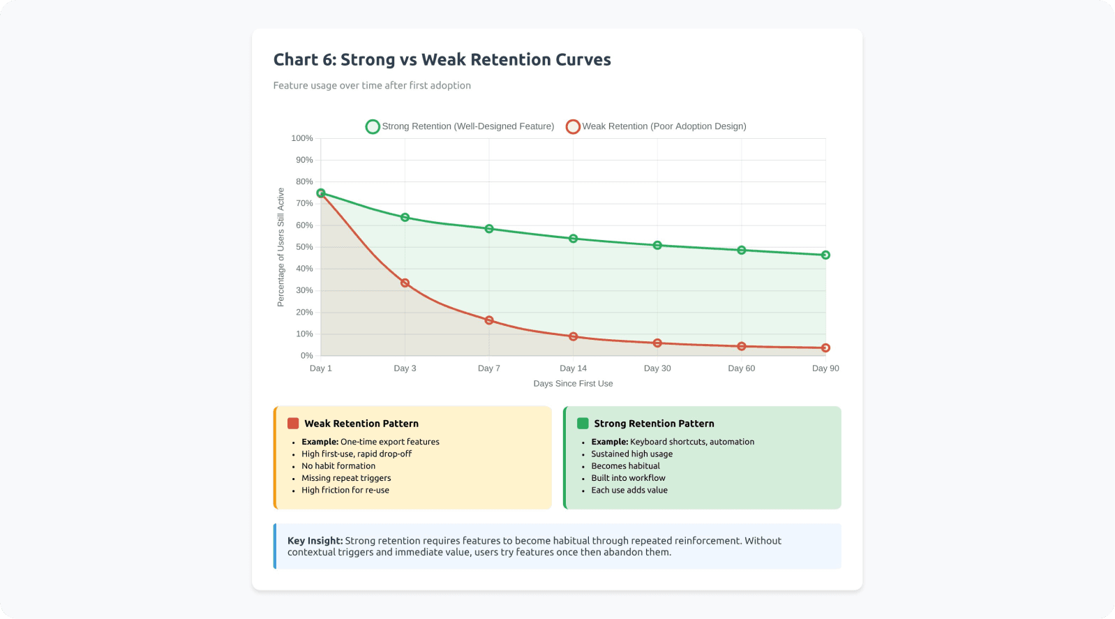
Understanding Retention Curves
Product analytics reveal that feature adoption follows retention curves: the percentage of users who return to use a feature over time.
Strong retention curves show high repeat usage within the first week and sustained usage over months. Weak retention curves show drop-off, where users try the feature once but never return.
Features with weak retention curves typically suffer from:
Value not obvious until multiple uses
No contextual triggers to prompt repeat usage
High friction that makes repeated use painful
Better alternatives (including old workflows) available
Example: Loom's Video Library
Loom initially struggled with library feature adoption. Users recorded videos but never organized them because the library felt like extra work. Loom redesigned to auto-organize by project and date, making the library useful without effort. Retention curves shifted from 15% weekly return rate to 68%.
Example: Miro's Templates
Miro's template gallery had weak retention—users browsed once but didn't return. Miro added contextual template suggestions when creating new boards ("Working on a retrospective? Try these templates"). This contextual trigger improved template usage retention from 22% to 71% month-over-month.
How-to: Make Adoption Repeatable
Strategy 1: Identify a "repeat moment"
When will the user realistically need this feature again? Build triggers around those moments.
If the feature helps with weekly reports, create a reminder or automated trigger on report days. If it helps with customer calls, make it accessible from the call interface.
Strategy 2: Reinforce after success
Show a light confirmation that the feature helped. Quantify the benefit when possible.
Examples:
"This automation saved you 15 minutes"
"You've used this shortcut 47 times this month"
"Teams using this feature close tickets 30% faster"
According to behavioral psychology research, immediate positive reinforcement increases behavior repetition by 60-80%.
Real implementation: GitHub Copilot
GitHub Copilot shows inline metrics about acceptance rates and time saved. When developers accept a suggestion, they see subtle confirmation. Over time, they see cumulative stats: "Copilot saved you 4.2 hours this week." This reinforcement strengthens the habit loop.
Real implementation: Todoist
Todoist gamifies task completion with karma points and streaks. Completing tasks triggers visual celebration animations. Users see productivity graphs showing their consistency. These reinforcements transform a utility feature into a habit-forming experience. Users report 3x higher completion rates due to these psychological triggers.
Strategy 3: Track repeat usage, not first click
First click can be curiosity or accident. Repeat usage within 7/14/30 days indicates real adoption.
Define activation metrics as:
Used feature X times in Y days
Returned to feature within Z days of first use
Achieved outcome A using the feature
Strategy 4: Create completion loops
Help users finish what they started. Incomplete actions create psychological tension (the Zeigarnik Effect), but also create abandonment risk.
Use progress indicators, save states, and reminders to reduce abandonment between first use and value realization.
Strategy 5: Build features into onboarding and milestone moments
New users haven't formed habits yet. Their mental models are flexible. This is the optimal window for introducing features.
Similarly, milestone moments (first project, first team member added, first report generated) create natural opportunities to introduce relevant features contextually.
Real implementation: Slack
Slack doesn't wait for users to discover channels, threads, or reactions organically. During onboarding, Slackbot guides users through creating their first channel and sending their first message with reactions. These features become part of the learned workflow from day one.
New Slack workspaces have 72% higher feature adoption across channels, threads, and integrations compared to workspaces where users self-discover these features.
Real implementation: Webflow
Webflow introduces CMS features when users hit natural milestones: "Adding your 5th page? Consider using a CMS collection to manage these dynamically." The suggestion appears exactly when the pain point (repetitive manual pages) becomes obvious. Adoption rates for CMS features are 4x higher when introduced at this milestone versus being available in general navigation.
Checklist: Habit Linkage
Does this feature connect to a repeatable task or moment?
Have we identified the trigger that should prompt re-use?
Is there a reinforcement moment after success that shows value?
Do we track repeat usage within 7/14/30 days, not just first use?
Is the feature introduced during onboarding or key milestone moments?
Have we reduced the friction for second and third use?
Does each use make the next use more valuable (network effects, accumulated value)?
Micro-Summary: True adoption requires repeated use that transitions into habitual behavior, not one-time exposure. The activation-to-habit pipeline requires motivation, ability, and triggers occurring together repeatedly. Without reinforcement loops, users forget features within days. Successful features create contextual triggers, immediate reinforcement, and completion loops that drive users from awareness through repeated use to habitual integration.
A Practical Diagnostic Framework: Why Your Requested Feature Isn't Used
The Three-Bucket Diagnosis Model
When usage is low, the root cause typically falls into one of three categories. Accurate diagnosis determines the right intervention.
Bucket A: Discoverability Problem
Users don't encounter the feature in their workflow at the moment of need.
Diagnostic Signals
Low awareness or low first-use rates: Analytics show that users eligible for the feature never interact with it, suggesting they don't know it exists.
Users explicitly say "I didn't know this existed": Support conversations, user interviews, or feedback channels reveal discovery failures.
Support receives repeated "how do I...?" questions: When users ask support how to do something the product already does, discoverability has failed.
Announcement engagement is low: Email open rates, in-app notification click rates, and changelog views show users aren't seeing or reading announcements.
Real example: Trello's Butler automation
Trello shipped Butler (automation) but buried it in the sidebar menu. Support tickets continued asking "Can Trello automate repetitive tasks?" even though Butler existed. Users eligible for automation weren't discovering it. Trello moved Butler to a prominent top-bar position with visual cues, increasing awareness from 12% to 58% of active boards.
Intervention Strategies
Move feature entry point to primary workflow
Add contextual triggers based on user behavior
Strengthen information scent in navigation
Create multiple discovery paths
Test label and icon clarity through card sorting
Bucket B: Cognitive Load / Friction Problem
Users become aware of the feature but avoid using it due to perceived complexity or workflow disruption.
Diagnostic Signals
Awareness is high, but first-use is low: Users know the feature exists (they can describe it when asked) but don't try it.
People start the activation flow but abandon: Analytics show users click into the feature but don't complete setup or first use.
Setup steps cause predictable drop-offs: Funnel analysis reveals specific points where users consistently abandon (usually decision points or configuration requirements).
Users express concern about learning curve: Feedback includes phrases like "looks complicated," "too much to learn," or "don't have time right now."
Real example: Mailchimp's Automation Builder
Mailchimp users were highly aware of automation features (mentioned in 78% of surveys) but adoption remained at 14%. Funnel analysis showed 82% abandonment at the "choose trigger" step because users didn't understand the workflow logic.
Mailchimp redesigned with templates ("Welcome new subscribers," "Re-engage inactive customers") that required minimal configuration. Automation adoption jumped to 43% within three months.
Intervention Strategies
Reduce setup requirements through smart defaults
Create quick-win paths that deliver value without configuration
Use progressive disclosure to hide advanced options
Add templates or presets
Provide preview modes that show value before commitment
Bucket C: Value / Workflow Fit Problem
Users try the feature but don't return because it doesn't integrate well with their actual workflow or deliver expected value.
Diagnostic Signals
First-use happens, but repeat usage is low: Users try the feature once (often right after announcement) but retention curves drop sharply.
Qualitative feedback says it's "nice" but users don't rely on it: Users acknowledge the feature works but describe it as supplementary, not essential.
No measurable impact on retention or key metrics: The feature exists and gets used occasionally, but doesn't move north-star metrics.
Users revert to old workflows: Observation shows users try the new feature, then return to previous methods.
Real example: Basecamp's Hill Charts
Basecamp shipped Hill Charts (a project progress visualization) after customer requests. Users tried it initially (65% first-week adoption) but repeat usage dropped to 8% by week four.
User research revealed the problem: Hill Charts required team-wide adoption to be valuable. Individual use didn't integrate with existing status update workflows. The feature worked beautifully but didn't fit how teams actually communicated progress. Basecamp eventually repositioned it for specific use cases rather than universal adoption.
Intervention Strategies
Revisit the underlying problem—was it correctly identified?
Study workarounds users developed instead
Identify workflow integration points being missed
Test whether the feature solves the stated problem
Consider whether timing/frequency assumptions were wrong
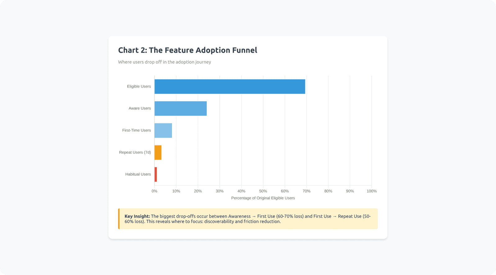
Advanced Diagnostic: The Adoption Funnel Breakdown
Map feature adoption as a funnel and identify where losses occur:
Eligible users → Aware users → First-time users → Repeat users → Habitual users
Calculate drop-off rates between each stage:
Eligible to Aware: discoverability issue
Aware to First-time: friction/cognitive load issue
First-time to Repeat: value/workflow fit issue
Repeat to Habitual: reinforcement/trigger issue
According to product analytics research from Amplitude, the largest drop-offs typically occur between Aware and First-time (60-70% loss) and between First-time and Repeat (50-60% loss).
Checklist: Diagnostic Process
Have we mapped the full adoption funnel with actual data?
Do we know what percentage of eligible users are aware?
Do we know conversion from awareness to first use?
Do we know retention from first use to repeat use?
Have we identified which bucket (A, B, or C) has the largest drop-off?
Have we gathered qualitative feedback from users at each stage?
Can we articulate why users aren't progressing to the next stage?
Micro-Summary: Feature adoption failures fall into three diagnostic buckets: discoverability problems (users don't find it), cognitive load problems (users avoid it due to friction), and value/workflow fit problems (users try it once but don't return). Accurate diagnosis requires mapping the adoption funnel from eligible users through habitual users and identifying the stage with greatest loss, then applying targeted interventions to address the specific failure mode.
Conclusion: From Feature Shipping to Adoption Engineering
Reframing Feature Success
The feature didn't fail because users lied. It failed because adoption requires more than shipping functionality.
Requested features are often:
A signal of pain (accurate)
A guess at a solution (often incomplete)
A hope for relief (emotionally driven)
A proxy for deeper workflow problems (incorrectly articulated)
But real adoption requires engineering a complete system:
The feature appearing at the right moment in workflow
Minimal cognitive burden and setup requirements
Seamless workflow integration without context switching
Repeat reinforcement through triggers and success confirmation
Progression from awareness through habit formation
According to research from Teresa Torres, author of "Continuous Discovery Habits," successful product teams shift from feature factories to outcome-driven development. They measure success not by shipping features, but by changing user behavior in measurable ways.
The Adoption Design Checklist
When planning any feature—especially requested ones—apply this comprehensive checklist:
Discovery & Awareness
Where in the workflow will users encounter this?
What triggers will make it visible at the right moment?
Can users find it within their existing mental models?
Cognitive Load & Friction
Can users experience value without setup?
Have we minimized decision points?
Does it align with existing workflows?
Value & Reinforcement
Is the benefit immediate and concrete?
Will users remember to use it again?
Does each use increase future value?
Measurement & Learning
What does success look like for this feature?
How will we track the adoption funnel?
What's our threshold for declaring failure and iterating?
The Broader Implication
If you design adoption as a system—not as an afterthought to shipping—requested features stop becoming roadmap waste. They start becoming retention engines.
The gap between "users asked for it" and "users use it" is filled with activation friction, discoverability failures, cognitive load, and workflow misalignment. Close those gaps systematically, and feature requests transform from validation theater into genuine product improvements.
As Marty Cagan from Silicon Valley Product Group notes: "The best product teams don't just build what customers ask for. They solve the problems customers have in ways that customers will actually adopt and rely on."
That's the difference between shipping features and engineering adoption.
Ready to improve your feature adoption rates? Contact Saasfactor to learn how we can help, or explore more insights on our blog.
Glossary: Key Terms
Activation Friction: The resistance users experience when attempting to adopt a new feature, stemming from cognitive load, setup requirements, workflow disruption, or unclear value proposition. Higher activation friction correlates directly with lower adoption rates.
Cognitive Load: The total amount of mental processing power required to use an interface or complete a task. Includes intrinsic load (task complexity), extraneous load (poor design), and germane load (productive learning). Excessive cognitive load causes users to abandon unfamiliar features in favor of known workflows.
Discoverability: The degree to which users can find and recognize a feature at the moment they need it. Poor discoverability means valuable features remain invisible despite existing in the product. Improved through contextual placement, strong information scent, and multiple discovery paths.
Feature Adoption: Ongoing, value-driven use of a feature that persists over time and becomes integrated into user workflows. Distinguished from one-time usage or awareness. Measured through repeat usage rates and retention curves rather than total clicks.
Hyperbolic Discounting: A cognitive bias where people overvalue immediate benefits and undervalue delayed benefits, even when delayed benefits are objectively larger. Causes users to avoid features requiring upfront investment (setup, learning) even when long-term value is high.
Information Scent: The extent to which interface labels, visual hierarchy, and contextual clues help users predict where features and information are located. Strong information scent means users can accurately guess where to find capabilities. Weak scent leads to random searching or abandonment.
Intention-Behavior Gap: The disconnect between what people say they will do and what they actually do. In product contexts, users sincerely request features but fail to adopt them due to habit inertia, competing priorities, or unforeseen friction. Explains why feature requests don't guarantee usage.
Interaction Cost: The sum of mental and physical effort required to accomplish a goal using an interface. Includes cognitive effort (understanding, deciding), physical effort (clicking, typing, navigating), and time cost. Lower interaction costs increase feature adoption rates.
Mental Models: Internal representations of how a system works, built from past experiences and expectations. Users predict where features should be and how they should work based on mental models. Features matching existing mental models face lower adoption friction.
Progressive Disclosure: A design technique that reveals complexity gradually, showing only essential options initially and exposing advanced capabilities as needed. Reduces cognitive load for new users while maintaining power for advanced users.
Retention Curve: A graph showing what percentage of users return to use a feature over time after first use. Strong retention curves show sustained usage; weak curves show one-time usage followed by abandonment. Critical metric for distinguishing awareness from true adoption.
Satisficing Behavior: The tendency for users to accept the first adequate solution rather than searching for optimal solutions. Once users find a workflow that works "well enough," they stop exploring alternatives, causing superior features to go undiscovered.
Setup Tax: The upfront investment users must make before receiving value from a feature. Includes configuration time, learning effort, and decision-making requirements. High setup taxes create abandonment during activation flows.
Usability Debt: The accumulated gap between available product capabilities and actual user utilization, stemming from poor discoverability, high friction, and weak adoption design. Products with high usability debt have many unused features that could solve user problems if properly activated.
Workflow Integration Cost: The effort required to incorporate a new feature into existing work processes. Includes context switching, tool transitions, routine disruption, and cognitive overhead from managing additional systems. High integration costs cause users to stick with established workflows even when alternatives are superior.
References
Industry Research & Reports
Pendo – Feature adoption report analyzing usage distribution patterns across thousands of SaaS applications
Pendo – Feature adoption definition and measurement frameworks for product teams
Gartner – Product management research on feature request patterns and prioritization
McKinsey – Digital product analytics and success metric frameworks
Amplitude – Product analytics patterns showing user progression through adoption funnels
UX Research & Behavioral Science
Nielsen Norman Group – Navigation and IA testing methodologies for diagnosing discoverability issues
Nielsen Norman Group – Cognitive load research demonstrating how mental effort impacts task completion
Baymard Institute – UX research methodologies and interaction cost analysis
Interaction Design Foundation – Research on contextual feature introduction and adoption rates
Stanford Human-Computer Interaction Group – Research on discovery costs and activation friction
MIT CSAIL – Studies on mental models and user request patterns
Carnegie Mellon HCI Institute – Research on information scent disruption and search abandonment
Academic & Behavioral Research
Intention-behavior gap overview – Systematic review of stated intentions versus actual behavior
The Decision Lab – Intention-action gap behavioral economics explainer
Health Psychology Review – Research on intention-behavior gap in behavioral change contexts
European Journal of Social Psychology – Studies on habit formation timelines and repetition requirements
Harvard Business School – Jobs-to-be-done framework research (Clayton Christensen)
Stanford Behavior Design Lab – BJ Fogg's behavior model and research on motivation, ability, and triggers
Fogg Behavior Model – Framework for understanding behavior change
UC Irvine – Gloria Mark's research on context switching costs and interruption recovery
Product & Business Strategy
Silicon Valley Product Group – Marty Cagan's work on outcome-driven product development
Teresa Torres – "Continuous Discovery Habits" research on outcome-focused product teams
Nir Eyal – Hook Model framework for habit-forming product design
Barry Schwartz – Research on paradox of choice and decision fatigue
Dan Ariely – Behavioral economics research on loss aversion and present bias
Company-Specific Research
Atlassian – Product research on Jira automation adoption patterns
Google – Internal product research on contextual feature presentation in Google Docs
Duolingo – Published metrics on retention curves and session completion patterns
Figma – Product research on component adoption and power user development
Adobe – Research on AI feature adoption and complexity reduction strategies


