Last Update:
Nov 7, 2025

Share
Cut signup friction to hit 80%+ completion rates with minimal fields and clear SSO options.
Segment users immediately post-signup for a personalized experience.
Deliver the "aha" moment in under 10 minutes with a real, valuable action.
Celebrate quick wins to boost second-action completion by 30%.
Introduce features one at a time to avoid overwhelming users.
Use contextual tooltips, checklists, and empty states to guide not trap users.
Email onboarding should span 4 personalized messages over 2 weeks max.
Time collaboration/integration asks after individual value is proven.
Define 3–5 activation criteria and measure them within 7 days.
Introduction
I've spent the last six years designing onboarding experiences for SaaS products, and I can tell you this with absolute certainty: most companies are losing users before they ever experience the product's value.
Not because the product is bad. Not because the pricing is wrong. But because those first nine screens between signup and activation are fundamentally broken.
Today I'm going to walk you through exactly how to build each of these screens, why they matter, and what I've learned actually works when you're trying to optimize SaaS onboarding screen UX. This isn't theory. This is what I've tested, broken, rebuilt, and watched convert users at rates that completely changed the trajectory of multiple products.
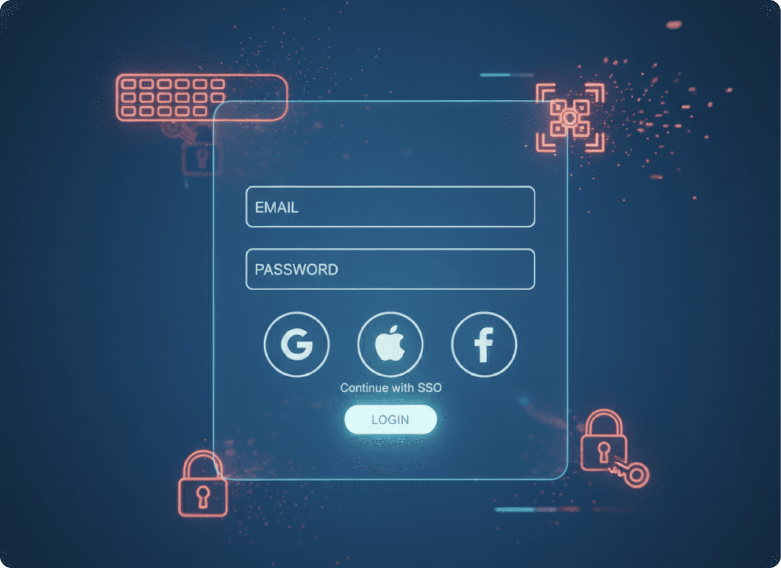
Screen 1: The Signup Screen (Or How to Stop Losing 40% of Users Before They Start)
Let me start with the screen most companies get wrong immediately.
Your signup form is not a data collection opportunity. It's a barrier. Every field you add is another chance for someone to say "maybe later" and never come back.
When you need to fix SaaS login screen UX issues, start by asking yourself one brutal question: what is the absolute minimum information you need to create an account? Not what your sales team wants. Not what would be nice to have. What is technically required?
For most SaaS products, that's email and password. That's it.
What Works
Make the form visually clean and unintimidating. Use large input fields with plenty of white space. Your signup screen should feel like an invitation, not an interrogation.
Offer Single Sign-On options prominently. Google, Microsoft, GitHub depending on your audience. I position these above the email/password option because they're faster and reduce friction. Personally, at companies I've advised, we've seen SSO options account for 60 to 70% of signups when positioned correctly.
Remove anything that distracts from the core action. No marketing copy. No feature lists. No testimonials. Those belong on your landing page. This screen has one job: get the account created.
Use inline validation. Show a green checkmark when their email format is correct. Show password strength in real time. Don't make them submit the form to discover they made a mistake.
The goal is a signup completion rate above 80%. If you're below that, you have friction somewhere. Find it and remove it.
Pro Tip: Password Requirements
Think carefully about password requirements. Yes, security matters. But requiring 12 characters, mixed case, numbers, special characters, and a hieroglyph is how you lose people. Find the balance your security team can live with that doesn't make users rage quit.
Screen 2: The Segmentation Screen (Where You Learn Who They Actually Are)
Once someone creates an account, you have about fifteen seconds of goodwill before they start evaluating whether this was worth their time.
Don't waste it with a generic welcome message.
This is where you ask the question that determines everything that comes next: "What brings you here today?" or "What's your primary goal?" or "What role best describes you?"
The exact question depends on your product, but the purpose is the same. You're segmenting users so you can personalize their entire journey.
How to Build This Screen
Present clear, distinct options. Usually four to six choices maximum. Each option should represent a genuinely different use case or user type. For a project management tool, that might be:
Freelancer managing clients
Team lead coordinating projects
Product manager planning launches
Personal productivity
Make each option visually distinct. Use icons or illustrations. Give each option two lines of text: a title and a brief description. "Freelancer managing clients" then underneath "Track multiple client projects and deliverables."
Always include a skip option. Some users won't fit your categories, and forcing them to choose something inaccurate is worse than letting them skip. But don't make the skip option prominent. Small text link at the bottom works.
Why This Matters
Here's what most people miss: this screen isn't just about customizing the next few screens. It's about fundamentally changing what value proposition you lead with.
Someone who selected "freelancer managing clients" cares about client-facing features, time tracking, invoicing maybe. Someone who selected "personal productivity" cares about speed, simplicity, and getting things out of their head. Same product. Completely different value angle.
Personally, when I'm working with early stage companies at Saasfactor, I push hard on this screen. Get it right and your activation rate jumps by 30 to 40%. Get it wrong and you're showing everyone generic features nobody specifically cares about.
Aim for 70% or higher of users selecting an option rather than skipping. If people are skipping more than that, your options aren't resonating or you're presenting too many choices.
Screen 3: The Aha Moment Screen (Where Most Designers Completely Miss the Point)
This is the screen where users should experience your product's core value. Not learn about it. Not prepare for it. Actually experience it.
And here's where I see even experienced designers make the same mistake over and over: they build a tutorial instead of an experience.
Let me be very clear about this. Users don't want to watch a video. They don't want to read instructions. They don't want to take a tour. They want to accomplish something.
The best SaaS onboarding flows guide users to complete one real, valuable action during this screen. Not a practice action. A real one.
How to Structure This
Identify your product's core value action. For Slack, it's sending a message. For Figma, it's creating something visual. For a form builder, it's creating and publishing a form. Whatever the one thing is that makes users think "oh, this is useful," that's what happens on this screen.
Make it dead simple to complete. You might have a feature rich, complex product. That's fine. But on this screen, you're showing the simplest possible version of the core action:
Remove optional fields
Pre-fill what you can
Provide smart defaults
Guide without controlling. Use visual cues like highlighting, arrows, or progressive disclosure to show what to do next. But let the user do it themselves. The sense of accomplishment matters.
Show immediate results. If they create something, show it rendered beautifully. If they complete a task, celebrate it. The cause and effect needs to be obvious and immediate.
The Importance of Micro Interactions
This is where micro interactions on SaaS screen design become critical. When someone completes this first action, something delightful should happen. An animation, a success message, a visual transformation. You're creating a micro moment of joy that says "yes, you're doing it right."
Time-to-value matters here. You want users reaching this aha moment within five to ten minutes of signup. If it takes longer, you're losing them.
I personally track what I call the "first value action completion rate." Of users who reach this screen, what percentage complete the core action? Anything below 70% means something is too complicated, too confusing, or too disconnected from what users actually want to accomplish.
Pattern That Works: Contextual Setup
One pattern that works exceptionally well is contextual setup. Instead of asking users to "set up their workspace" before doing anything useful, let them accomplish something valuable first, then naturally introduce setup as part of continuing their work.
Example: don't make users create a project structure before creating their first task. Let them create the task directly, then suggest organizing it into a project because now they have something to organize.
Screen 4: The Quick Win Celebration (The Screen Everyone Skips That Doubles Completion)
Most designers jump straight from the first valuable action to "here are more features." This is a mistake.
When someone completes that first meaningful action, pause and acknowledge it. This is a psychological inflection point. The user just proved to themselves that your product can work for them. Reinforce that proof.
What This Screen Should Do
Explicitly celebrate the accomplishment. "You just created your first project!" or "Your first automation is live!" Make it clear, direct, and positive.
Show progress visually. A simple progress indicator showing they're 30% through the initial setup creates momentum. People want to complete things. Give them something to complete.
Provide a clear next step. Don't leave them wondering what to do now:
"Next, let's invite your team"
"Want to create a second project to see how organizing work makes it easier?"
This screen can be a modal, a full page transition, or even just a prominent message area. The format matters less than the psychology: you're building confidence and momentum.
The Impact
Here's something I've tested repeatedly: products that celebrate first wins see 25 to 30% higher progression to the second valuable action. That matters because users who complete two valuable actions have retention rates 3x higher than those who complete just one.
At companies where I've implemented this properly, we keep the celebration brief but meaningful. Three to five seconds maximum. Show the success, show the progress, give the next action, let them continue.
Don't overdo it. I've seen products that trigger confetti and animations and modals and sounds all at once. It feels mocking, not celebratory. Keep it proportional to the achievement.
Screen 5: The Progressive Disclosure Screen (How to Introduce Complexity Without Overwhelming)
Now the user has experienced core value once. They're cautiously optimistic. This is not the time to dump your entire feature set on them.
This is where you introduce one adjacent capability that enhances what they just did.
If they created their first project, maybe now you show them how to add a due date or assign it to a category. If they sent their first message, show them how to create a channel. Small steps that build on existing success.
The Structure That Works
Connect to what they just accomplished. "You created a project. Want to see how setting a due date helps you stay on track?" You're not introducing a random feature. You're solving a problem they now have.
Show, don't tell. Instead of explaining the feature, demonstrate it in context. Highlight the UI element, show what clicking it does, let them try it immediately.
Make it optional. Use language like "Want to..." or "Try..." not "Now you must..." If someone feels forced through a rigid sequence, they'll rush through without learning or they'll bounce entirely.
One feature at a time. I cannot stress this enough. One new capability per screen. Not three. Not five. One.
Reducing User Dropoff
This is how you reduce user dropoff on the SaaS setup screen. Users don't leave because setup is required. They leave because you're asking them to learn too much, too fast, with no clear benefit.
Layer your onboarding across multiple sessions:
First session: Core value action plus one enhancement
Second session: Introduce collaboration or organization features
Third session: Customization and preferences
Week two: Advanced capabilities
Personally, when working with SaaS companies at Saasfactor, I map features to a progression timeline. Core features in minutes 1 through 10. Adjacent features in the first hour. Advanced features in the first week. Power user features after they're clearly engaged and coming back regularly.
Track feature adoption rates over time. You should see gradual, steady increases. If there's a cliff where suddenly adoption drops for later features, you're introducing them too late or without enough context.
Screen 6: The Contextual Guidance Screen (Actually, It's Not a Screen, It's Everything)
Here's where I need to break my own framework slightly. The sixth "screen" isn't really a screen at all. It's a system of contextual help that appears throughout the product, exactly when users need it.
But it's so critical to how to improve SaaS dashboard UX for conversions that I'm treating it as its own stage.
Elements You Need
Tooltips that appear on hover or first encounter. These explain what things are and what they do. Keep them to one sentence. "Task lists help you organize related items together." That's it. Not a paragraph. Not a story. One clear sentence.
Modals for important moments. When someone is about to invite team members for the first time, a modal can explain billing implications or permission settings. These should be rare. Save them for decisions that are hard to undo.
Empty states that guide action. When someone lands on a screen with no data yet, don't just show emptiness. Show them exactly what to create and why it matters. "Create your first dashboard to visualize project progress" with a big, obvious action button.
Checklists that show onboarding progress. A persistent checklist in the corner showing "3 of 5 setup steps complete" gives users direction and motivation. Each item should link directly to the relevant action.
The Critical Rule
The crucial thing about all of this: it must be dismissible and non-intrusive. The moment users feel trapped in your guidance system, they'll start looking for the exit.
A Hard Lesson Learned
I've learned this the hard way. Early in my career, I built onboarding flows that forced users through every step. Completion rates were high because users had no choice. But actual adoption was terrible because people rushed through to escape the prison I'd built.
Now I design guidance as helpful suggestions that users can ignore if they want. Engagement with voluntary guidance is a much better signal than forced completion of mandatory steps.
For best UX fixes for SaaS trial signup screen experiences specifically, layer guidance carefully. Trial users are evaluating. They need to see value fast, but they also need enough guidance to not feel lost. The balance is showing them how to succeed without making them feel babysat.
Screen 7: The Email Bridge Screen (Or Why Onboarding Doesn't End When They Close the Tab)
Most users won't complete your entire onboarding in one session. They'll sign up, try something, then close the tab to get back to work. This is normal. This is expected.
This is why email is a critical screen in your onboarding flow, even though it technically happens outside your product.
The Email Sequence That Works
Day 0, immediately after signup: Welcome email that celebrates their account creation and links to one clear next action. If they completed the first value action, acknowledge it. If they didn't, guide them to complete it. One link. One action.
Day 1, 24 hours later: Check-in email based on their actual behavior:
Did they complete the first action but nothing else? Send them tips for the logical next step
Did they drop off without completing anything? Remind them why they signed up and what they can accomplish
Day 3, three days after signup: Feature spotlight showing something specific they haven't tried yet. Include a short video or GIF. Make the call to action link directly into the product at the relevant screen, not just the homepage.
Week 1, seven days after signup: Progress summary. Show them what they've accomplished so far and what they haven't explored yet. This works especially well for SaaS screen UX tips for revenue growth because it reinforces progress while suggesting expansion into paid features.
Personalization is Key
Each email needs to be personalized based on the user's actual product usage and their initial segmentation choice. Someone who identified as a freelancer gets different emails than someone managing a large team.
Target Metrics
The click-through rates that matter:
30% open rates minimum
15% click-through rates leading back into the product
Below that, your emails aren't compelling or your subject lines need work.
One thing I've learned: send fewer, better emails. I used to design elaborate 10 email onboarding sequences. Now I use 4 emails max in the first two weeks. Each one is highly personalized and directly tied to specific user actions or inactions.
Also, make them actually helpful. Not salesy. Not pushy. If someone clicks an email from your product, they should feel like you're helping them succeed, not that you're trying to manipulate them into upgrading.
Screen 8: The Integration/Collaboration Screen (Where Individual Use Becomes Team Value)
Somewhere in the first week, usually after users have experienced individual value multiple times, you want to introduce the multiplayer aspect of your product.
This might mean:
Inviting team members
Connecting external tools
Setting up integrations
Whatever makes your product more valuable through connections.
This is delicate because you're asking users to do work that doesn't immediately benefit them. They need to understand why it matters.
How to Position This Screen
Tie it to a specific benefit they've already experienced. "You've created five projects. Want to invite your team so they can see progress and update tasks too?" You're not asking them to invite people randomly. You're solving a problem they now have.
Make the action as simple as possible. Paste email addresses, click send. That's it. Don't make them assign roles and permissions and set up complex structures first. You can do that later.
Explain what happens next. "They'll receive an email invitation and can join your workspace immediately." People hesitate when they don't know the consequences of their actions.
Provide value even if they skip. Some users work solo. Some aren't ready to invite others yet. That's fine. Don't gate features behind team invitations. Let individual users continue getting value.
Timing Matters
For products where collaboration is truly core to the value proposition, this screen comes earlier. Slack introduces team invitations immediately because the product is messaging. But for most SaaS, individual value needs to come first.
I've found that users who invite at least one other person have 4x higher retention than solo users. But forcing invitations before they see individual value tanks activation rates. Timing matters enormously.
When working on projects where we're trying to fix confusing SaaS screen flow, this is often the culprit. Products ask for team invitations too early, before users understand why it matters, and it creates a jarring interruption in the experience.
Screen 9: The Activation Confirmation Screen (How You Know They're Actually Onboarded)
The final screen in the onboarding sequence is actually a milestone, not a destination. It's the moment where you confirm the user has reached activation.
Activation means they've experienced enough value that they're likely to continue using the product. It's different for every product, but it usually involves completing 3 to 5 meaningful actions.
Examples of Activation Criteria
For a project management tool, activation might mean:
Created 3 projects
Invited 1 team member
Completed 5 tasks
Logged in on 2 separate days
For a design tool:
Created 2 designs
Used 3 different features
Exported or shared 1 file
What Happens on This Screen
Explicit confirmation that they're set up. "You're all set! You've created your workspace, built your first projects, and invited your team." Summarize what they've accomplished.
Transition to ongoing usage. "Here's what to explore next" with 2 to 3 suggestions for deeper engagement. These should point to features that increase stickiness and move users toward paid plans if you have them.
Remove onboarding elements. Once someone is activated, stop treating them like a new user:
Remove the checklist
Hide the persistent tips
Let them use the product without training wheels
This confirmation doesn't have to be a literal screen. It can be a modal, an email, or just a change in the product's UI behavior. What matters is that you've defined what activation means and you acknowledge when users reach it.
The Most Important Metric
I personally track activation rate as the most important onboarding metric. Of all signups, what percentage reach your activation criteria within the first week?
Industry averages: 25 to 40%
Products with excellent onboarding: Above 60%
If your activation rate is low, don't optimize your screens randomly. Map out where users are dropping off. Is it at signup? During the first value action? When you ask them to invite others? Find the leaky bucket and fix that specific screen.
The Psychology That Makes All of This Work
Before I wrap up, I want to explain why this nine screen framework actually converts users.
It's based on something called the Fogg Behavior Model, which states that behavior happens when motivation, ability, and a prompt all converge at the same moment.
Three Essential Elements
Motivation: Users must want the outcome. This is why the aha moment screen matters. It shows them the outcome they want, immediately.
Ability: The task must be easy. This is why we reduce friction at every screen:
Remove form fields
Provide defaults
Make actions obvious
Prompt: "Something must trigger the action at the right time. This is why contextual guidance and email sequencing matter. We're prompting at the moment when users are ready"
When users drop off during onboarding, one of these three elements is missing. Either they don't care enough about the outcome (wrong value proposition), the task is too hard (too much friction), or you're not prompting them at the right moment (bad timing or unclear next steps).
Every screen I've described optimizes all three elements. We build motivation by showing value immediately. We maximize ability by reducing complexity. We provide prompts through UI cues, progress indicators, and timely emails.
This is also why personalization matters so much. A generic onboarding flow can't be perfectly motivating for everyone because different users want different outcomes. By segmenting early, we can show each person the outcome they specifically care about.
How to Actually Implement This
If you're reading this thinking "great, now I need to rebuild my entire onboarding," take a breath. You don't have to do everything at once.
Step 1: Start with Measurement
Define what activation means for your product. Track how many users reach it. Track where users drop off in your current flow.
Step 2: Fix the Biggest Leak First
If 50% of users abandon during signup, start there. If signup is fine but nobody completes the first value action, focus on screen three.
Recommended Priority Order
For most SaaS products, the priority order I recommend is:
Fix signup friction (screen one)
Ensure users experience value quickly (screen three)
Add segmentation to personalize the experience (screen two)
Celebrate wins to build momentum (screen four)
Layer in progressive feature disclosure (screen five)
Add contextual guidance throughout (screen six)
Build email bridges for multi-session onboarding (screen seven)
Time collaboration/integration prompts correctly (screen eight)
Define and track activation explicitly (screen nine)
At Saasfactor, when we work with companies to improve SaaS screen layout to reduce churn, we typically focus on screens one, three, and six first. Get those right and you'll see immediate impact on activation and retention.
The other screens amplify results but aren't as critical to basic functionality.
The Metrics That Actually Matter
Finally, let me give you the specific numbers to track for each screen:
Screen 1 (Signup): Completion rate above 80%
Screen 2 (Segmentation): Selection rate above 70%
Screen 3 (Aha Moment):
First value action completion above 70%
Time-to-value under 10 minutes
Screen 4 (Celebration): Progression to second action above 60%
Screen 5 (Progressive Disclosure): Feature adoption increasing week-over-week with no cliff
Screen 6 (Contextual Guidance):
Tooltip engagement above 40%
Reduction in support tickets
Screen 7 (Email Bridge):
Open rates above 30%
Click-through above 15%
Screen 8 (Collaboration): At least 30% of users inviting others or connecting integrations within two weeks
Screen 9 (Activation): Overall activation rate above 40%, ideally above 60%
Screen | Metric | Target |
|---|---|---|
Screen 1: Signup | Completion rate | Above 80% |
Screen 2: Segmentation | Selection rate | Above 70% |
Screen 3: Aha Moment | First value action completion | Above 70% |
Screen 3: Aha Moment | Time-to-value | Under 10 minutes |
Screen 4: Celebration | Progression to second action | Above 60% |
Screen 5: Progressive Disclosure | Feature adoption | Increasing week-over-week with no cliff |
Screen 6: Contextual Guidance | Tooltip engagement | Above 40% |
Screen 6: Contextual Guidance | Support ticket reduction | Measurable decrease |
Screen 7: Email Bridge | Open rates | Above 30% |
Screen 7: Email Bridge | Click-through rates | Above 15% |
Screen 8: Collaboration | Users inviting others or connecting integrations | At least 30% within two weeks |
Screen 9: Activation | Overall activation rate | Above 40%, ideally above 60% |
If you're hitting these numbers across all nine screens, your onboarding is in the top 10% of SaaS products. Most companies struggle to hit even half of these benchmarks.
But that's also the opportunity. Every percentage point improvement in activation translates directly to revenue growth because more activated users means more retained users means more paid customers.
I've seen products 3x their activation rate by systematically improving these nine screens. The changes aren't usually dramatic. They're small optimizations that compound: removing two form fields here, adding a celebration there, timing an email better, clarifying a call to action.
This is the work of effective SaaS onboarding. Not flashy. Not revolutionary. Just relentlessly focused on removing friction and delivering value at every single screen in the journey from signup to activation.
And that's what converts users. Not features. Not marketing. Just a thoughtfully designed path that guides people from curiosity to success as quickly and smoothly as possible.