Last Update:
Nov 6, 2025

Share
73% of SaaS users abandon within 7 days, because they never hit their Aha! Moment.
Slack’s 2,000-message threshold and Dropbox’s first file share prove that value realization not signup is the true success metric.
Micro task sequencing increases momentum through the Zeigarnik Effect and visible quick wins.
Context-triggered help (e.g., hover cues, nudges) outperforms static tutorials by >30% in feature adoption.
Personalization by role, learning style, and platform context increases NPS and reduces churn.
Progress feedback using the Endowed Progress Effect and gamification elements boosts completion and satisfaction.
Continuous A/B testing and cross-device support compound activation rates and customer lifetime value.
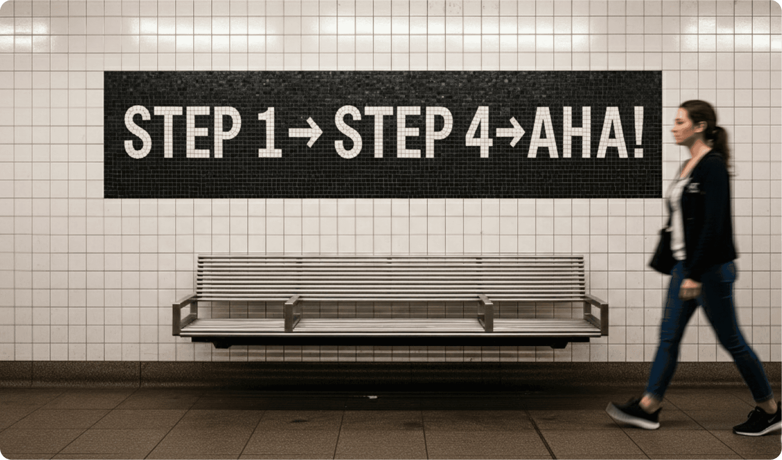
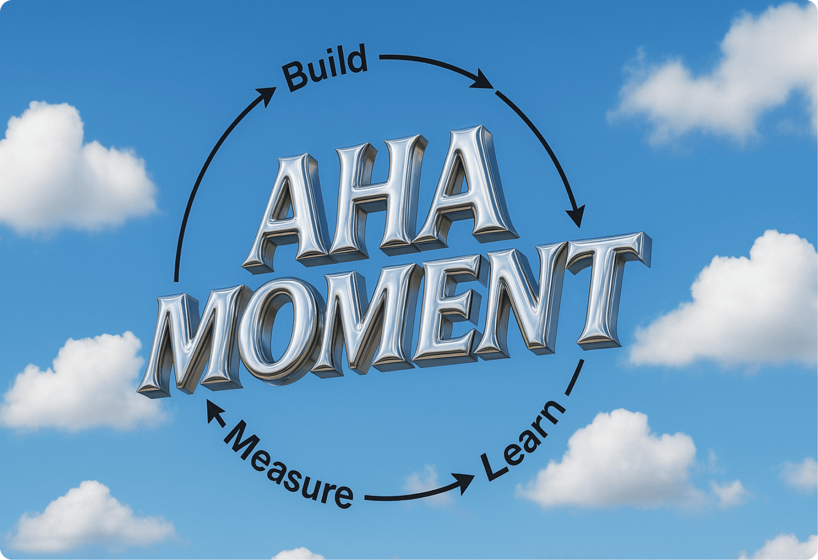
The Aha! Moment Framework
The numbers tell a brutal story — 73% of SaaS users abandon products within the first week of signup. That’s not just a statistic; it’s billions in lost revenue across the software industry. For every 100 users who create an account, only 27 are still active seven days later.
The problem isn’t your features, pricing, or even the product itself.
The real problem is onboarding.
Most companies optimize for signup completion rates, but they ignore what actually matters: getting users to their first moment of genuine value realization.
At SaaSfactor, we've spent years helping companies optimize SaaS onboarding screen UX and fix confusing SaaS screen flow to drive measurable revenue growth. We analyze data through tools like Clarity, Hotjar, Amplitude, Baremetrics, and Google Analytics to uncover where users struggle and where growth hides. What we've learned from studying the most successful SaaS companies has fundamentally changed how we approach onboarding optimization.
The Critical Question Every SaaS Company Must Answer
When does a user experience value from your product for the first time?
Most product teams can't answer this question. They offer vague responses like 'when they create an account' or 'when they explore the dashboard' or 'when they complete the setup wizard.' These answers measure completion, not value.
The fundamental mistake is optimizing for the wrong metric. Companies measure how many users finish onboarding, not how many users experience their first moment of genuine realization that the product solves their problem. This distinction is everything.
We call this the Aha Moment. Every successful SaaS company obsessively identifies and optimizes for this exact moment. It's the moment when a user stops testing and starts using. It's when potential transforms into realization.
Slack's 2,000 Message Strategy: Driving Team Communication Velocity
Slack grew from 100,000 users to over 4 million in 15 months. Everyone knows that story. What most people don't know is the precise metric that predicted which teams would become long-term customers.
It wasn't account creation. It wasn't inviting team members. It wasn't even sending the first message. The activation metric was 2,000 messages sent across the team.
Why 2,000 Messages Matter
At first, 2,000 sounds arbitrary. Why not 1,000 or 5,000? But the data revealed something fundamental. At 2,000 messages, teams weren't testing Slack anymore—they were living in it. Their communication patterns had fundamentally shifted:
They had replaced email for internal conversations
Communication velocity had increased dramatically
Team members were actively participating, not passively observing
They had experienced the core value of instant, organized team communication at scale
Teams that hit 2,000 messages had a 93% likelihood of becoming long-term customers. Teams that didn't hit that threshold within their first few weeks almost always churned.
The Strategic Implication for Onboarding
This insight completely reframed Slack's approach to improve SaaS dashboard UX for conversions. They weren't trying to get users to complete an onboarding checklist. They were trying to get teams to send 2,000 messages. Every feature, every nudge, every email was designed to push teams toward that activation milestone.
This is what successful onboarding looks like: identify the precise moment when users realize value, then remove every obstacle between signup and that moment.
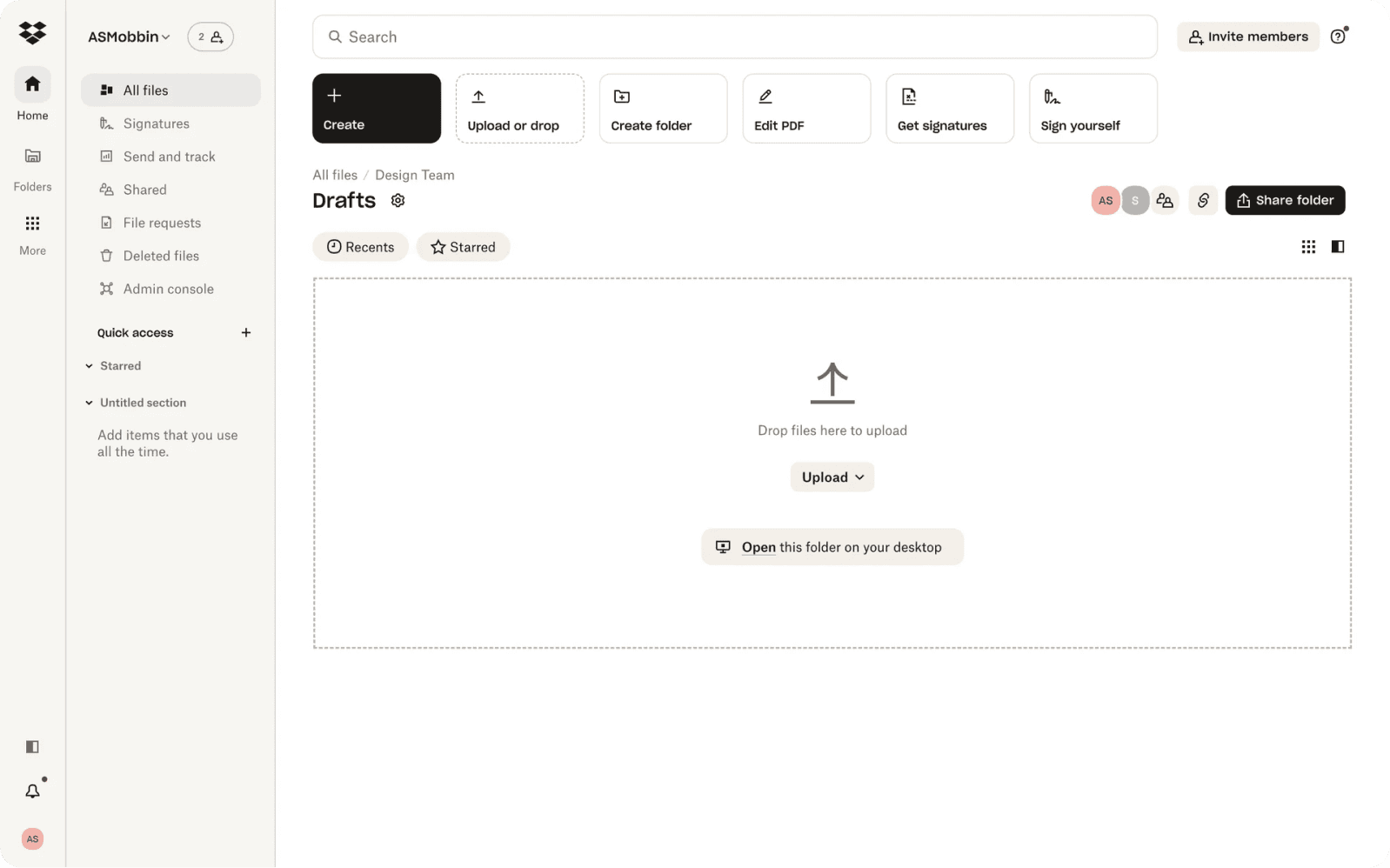
Dropbox's Collaborative Upload Strategy: Optimizing for Shared Value
Dropbox's activation moment was equally specific: upload first file and share it with another user. This wasn't just about file uploads, it was about collaborative access.
Dropbox’s Aha Moment: Upload a file → Share it with another user.
Uploading alone = backup drive.
Sharing = collaborative workflow.
Why Sharing Defines the Dropbox Value Proposition
The distinction between uploading and sharing is profound. When users uploaded files but never shared them, they were treating Dropbox like a backup drive. They could get that anywhere. But when they shared their first file and saw how effortlessly another person could access it, they experienced the unique value proposition.
Dropbox isn't about storage it's about collaborative access. This insight explained their entire growth strategy. Their famous referral program where you got extra storage for inviting friends wasn't a growth hack. It was an activation strategy. Sharing files created viral loops. Every shared file was an opportunity for someone new to experience the core value.
That's how they grew from 100,000 to 4 million users in 15 months. The lesson for optimizing SaaS onboarding screen UX is clear: identify what makes your product uniquely valuable, then optimize for the moment users first experience that unique value.
Breaking Down Activation: The Micro Task Sequencing Strategy
Once you've identified your Aha Moment, the challenge becomes obvious: how do you get users there as quickly as possible? This is where micro task sequencing becomes critical.
The Psychology Behind Micro Tasks: The Zeigarnik Effect
There's a cognitive principle called the Zeigarnik Effect: people remember incomplete tasks better than completed ones. By breaking onboarding into small, achievable micro tasks, you create open loops that drive users forward.
When implementing SaaS screen UX tips for revenue growth, this psychological principle becomes a practical framework. Each small win builds momentum for the next step.
Salesflare CRM: A Perfect Micro Task Sequence
Salesflare CRM demonstrates how to reduce user dropoff on the SaaS setup screen through perfect micro task sequencing. Their activation milestone was clear: send first email via CRM integration. But they didn't just tell users to send an email and hope for the best. They broke the path into perfectly sequenced micro tasks:
Step 1: Connect Your Email Account
Time required: 30 seconds
Completion rate: 87%
Method: OAuth (no password memorization required)
Value: Low friction, high perceived benefit
Step 2: Import Your First Contacts
Time required: 2 minutes
Completion rate: 76%
Value: Built directly on email connection, immediately showed data enrichment capability
Step 3: Send Your First Tracked Email
Time required: 3 minutes
Completion rate: 68%
Impact: Users who completed this step showed 45% higher activation
This was the activation moment—the point where users experienced real value
Step 4: View Relationship Insights Dashboard
Not required for activation, but 82% of activated users completed it
Showed automated value Salesflare generated from that one email
Reinforced the product's unique value proposition
The Micro Task Sequence Pattern
Notice the progression. Each task was easier than the previous when measuring cognitive load, but more valuable when measuring perceived benefit. Users built momentum. They experienced small wins. Each step made the next step more obvious and more valuable.
When we apply this framework to improve SaaS screen layout to reduce churn for clients at SaaSfactor, we start with the easiest possible task and ensure every completed micro task yields visible value. The results are immediate and measurable. Completion rates jump significantly, and users who complete the micro task sequence are typically 3-4 times more likely to hit their activation milestone.
Why Static Tutorials Fail: The Context-Triggered Help Strategy
94% of users skip welcome tours. Session recordings consistently show the same pattern: users land on a product, see a multi-step tutorial popup, and immediately close it without reading a single word.
The Problem with Static Tutorials
Static tutorials suffer from a fundamental mismatch: they provide information without context. Users don't want to learn everything upfront. They want to learn what they need exactly when they need it.
Amplitude Analytics: Behavioral Triggers in Action
Amplitude Analytics demonstrates the power of context-triggered onboarding through behavioral triggers:
Trigger One: Hover Detection for Feature Explanation
When a user hovers their mouse over a feature for more than 3 seconds without clicking
A tooltip appears explaining what the feature does
Result: 20% increase in feature adoption
Trigger Two: Repeated Visits Without Action
When a user visits the dashboard three times without creating a report
An in-app nudge appears: 'Create your first report in 60 seconds'
Result: 31% conversion to report creation
Trigger Three: Inactivity Pattern Detection
When a user goes 7 days inactive after signup
They receive an email with progress reminder and incentive to return
Result: 18% reactivation of inactive users
The Context-Triggered Onboarding Principle
Context-triggered onboarding works because it respects user intent. It doesn't interrupt exploration. It supports it exactly when support is needed.
When implementing best UX fixes for SaaS trial signup screen design, this principle becomes a practical guideline: don't overwhelm users with everything at once. Show them what they need when they're ready to see it. Watch their behavior. Respond to their hesitation signals. Let them drive the pace.
Multi-Modal Learning Paths: Accommodating Different Learning Styles
Not everyone learns the same way. Different people need different onboarding experiences:
65% of people are visual learners who want videos and diagrams
30% are kinesthetic learners who need hands-on interaction
5% are auditory learners who benefit from voiceovers and explanations
Notion's Multi-Modal Approach
Notion solved this brilliantly through flexible onboarding paths. Their approach demonstrates effective micro interactions on SaaS screen design:
Component One: 60-Second Video Explanation
Explains the Notion philosophy and core concepts
Users can skip if they prefer to explore directly
Serves visual and auditory learners
Component Two: Role-Based Template Gallery
Project managers get a project management template
Content creators get a content calendar
Knowledge base builders get a wiki template
Each template has an interactive tutorial embedded directly in it
Component Three: Learn-by-Doing Interactive Tutorials
Users learn by clicking and exploring, not by reading instructions
Serves kinesthetic learners who need hands-on interaction
The Impact of Multi-Modal Onboarding
The results spoke for themselves:
Template-based onboarding was 40% faster than blank slate onboarding
Feature adoption increased by 83%
Users who started with templates were 2.5 times more likely to become paid customers
When helping companies fix SaaS login screen UX issues and optimize onboarding flows, we now provide multiple learning paths. Some users want video walkthroughs. Some want text guides. Some want to just click around and figure it out themselves. The best onboarding respects all three preferences.
Role-Based Personalization: Showing Users What Matters to Them
Generic onboarding treats every user the same. It shows everyone every feature. It uses the same messaging for a solo founder as it does for an enterprise team. This approach fails for predictable reasons:
Users see irrelevant features and become overwhelmed
Generic messaging feels impersonal and doesn't address specific pain points
One-size-fits-all ignores the diverse use cases people bring to your product
Salesforce Lightning: Scaling Personalization
Salesforce Lightning demonstrates how to scale personalization effectively. At signup, they collect just 3-5 pieces of information:
Company size
Industry
Role
Primary use case
Those few data points enable completely custom onboarding paths:
Sales Rep Experience
Week one: Lead management and email tracking
Week two: Collaboration tools
Week three: Advanced automation
Manager Experience
Week one: Dashboard setup and team performance reports
Week two: Collaboration tools
Week three: Analytics and optimization
Admin Experience
Week one: Customization, integrations, and security settings
Week two: Collaboration tools
Week three: Advanced automation
The Impact of Personalization
The results validated the personalization approach:
25% faster onboarding because users spent less time searching for relevant features
8% reduction in churn because perceived relevance increased
12-point increase in NPS scores
When helping companies improve SaaS dashboard UX for conversions, personalization is now the starting point. Who is this user? What role do they play? What problem are they trying to solve? Design the first experience around their specific context, not around showing off every feature.
Visual Progress Feedback: Leveraging the Endowed Progress Effect
The Endowed Progress Effect is a powerful psychological principle: people are more likely to complete tasks when they perceive they've already made progress.
The Classic Study: Coffee Loyalty Cards
There's a famous study that demonstrates this principle perfectly:
Group One: Received a card requiring 10 stamps for a free coffee
Group Two: Received a card requiring 12 stamps, but it came with 2 stamps already filled in
Both groups needed to collect 10 stamps. But the group with the pre-filled card showed 82% higher completion rates. Why? Because they felt like they had already started. They had momentum. Quitting meant losing progress.
Salesflare's Progress Indicator Strategy
Salesflare applies this brilliantly through comprehensive progress indicators and micro interactions on SaaS screen design:
Core Progress Elements
Onboarding checklist starts at 15% (creating an account counts as progress)
Every completed task shows a checkmark and updates the progress bar
Estimated time remaining is displayed for each step
Celebratory animations appear when users hit milestones
Gamification Layers
Bronze, silver, and gold badges for completion speed
Social proof messages like '85% of users complete this step first'
Streak counters for daily engagement
The Impact of Progress Visualization
The results were dramatic:
35% reduction in onboarding abandonment
18% increase in user satisfaction scores
Users reported feeling clear about expectations and motivated to continue
Duolingo: Progress Feedback at Scale
Duolingo takes this principle to the extreme with comprehensive gamification:
XP points per lesson
Daily streak flames that trigger loss aversion
Progress bars per skill tree
Leaderboards for competitive motivation
Crown levels signaling mastery
Variable rewards with random XP bonuses
Their data showed that this system increased daily active users by 34% compared to pre-gamification. Paid conversion was 2.8 times higher for users maintaining 30-day plus streaks.
The lesson is clear: visual progress feedback isn't decoration, it's motivation architecture. When implementing strategies to reduce user dropoff on the SaaS setup screen, progress visualization is essential. Every step should show visible progress and celebrate completion.
Multi-Session Onboarding: Respecting How Users Actually Work
The assumption that users complete onboarding in one session is fundamentally flawed. Life interrupts. Meetings happen. Phones ring. Forcing completion in a single session creates anxiety, not motivation.
Why Multi-Session Support Matters
Not all users onboard in one sitting. The data shows that many successful activations happen across multiple sessions:
Work interruptions are inevitable
Users need time to process and reflect
Some steps require information users don't have immediately available
Mobile users often start setup on one device and finish on another
Pipedrive CRM: Multi-Session Implementation
Pipedrive CRM demonstrates effective multi-session onboarding support:
Technical Implementation
Cloud-synced onboarding state
Progress saved in real-time
Users can start on desktop and finish on mobile
Smart Reminder System
Day one: 'You're 60% done. Finish in 2 minutes.'
Day three: 'Complete setup to unlock reports.'
Day seven: 'Need help? Talk to our team.'
The Impact of Multi-Session Support
After implementing multi-session support:
22% more users completed onboarding
31% increase in mobile completion rates with state sync
This fundamentally changed how we approach onboarding design. When implementing best UX fixes for SaaS trial signup screen optimization, multi-session support is now standard. Don't punish users for leaving. Make it easy to return. Show them exactly where they left off. Remind them why completing setup matters.
Continuous Optimization: The Data-Driven Testing Framework
Everything discussed so far comes from obsessive data analysis. At SaaSfactor, we don't guess about what works. We measure it, test it, and iterate based on what the data reveals.
The Four-Week Optimization Cycle
We follow a rigorous optimization process that produces measurable results:
Weeks 1-2: Data Collection
Heatmaps from Hotjar and FullStory
Session recordings to identify friction points
Funnel drop-off analysis
User surveys including exit intent and NPS
Weeks 3-4: Hypothesis Formation
Identify the top three friction points
Propose UX improvements
Prioritize by potential impact
Weeks 5-6: A/B Testing
Test different copy variations
Test different CTAs
Test different flows
Measure activation rate changes
Analyze statistical significance
Weeks 7-8: Implementation and Iteration
Deploy winning variations
Monitor sustained impact
Begin the next optimization cycle
The Impact of Continuous Optimization
This process produces consistent results:
18% average increase in engagement
12% average churn reduction
Embedded continuous improvement culture
When we work with clients to fix confusing SaaS screen flow or implement SaaS checkout screen UX best practices, this is our framework. We don't redesign and walk away. We instrument everything. We watch what users actually do. We test variations. We measure impact. We iterate relentlessly.
HubSpot's Testing Strategy: Three Critical Experiments
HubSpot runs more A/B tests on onboarding than almost any company. Three tests in particular reveal important lessons about optimization.
Test One: Checklists vs Video Tutorials
Hypothesis: Interactive checklists would drive higher completion
Result: Checklist format had 15% better activation than video-only
Insight: Users wanted both checklists for structure, videos for complex features
Winning variation: Offered both with user choice
Test Two: Onboarding Length
Variant A: 5 steps
Variant B: 3 steps focused only on activation milestone
Result: 3-step version had 23% higher completion
Surprise: 5-step version had 8% better 30-day retention
Why: Users who completed advanced setup understood more features
Solution: 3-step core flow with optional advanced setup available immediately after
Test Three: Generic vs Role-Based Personalization
Personalized onboarding increased NPS by 14 points
Reduced time to value by 22%
This single test validated their entire personalization strategy
The Testing Principle
Great companies never stop testing. They question every assumption. They measure every change. They learn from every experiment. Testing isn't a project, it's a continuous practice.
Cross-Device Continuity: Meeting Users Where They Are
Users don't live on one device anymore. They start tasks on desktop, continue on mobile, and finish on tablet. If your onboarding doesn't sync across devices, you're creating friction that kills completion.
Asana's Cross-Platform Implementation
Asana's cross-platform strategy demonstrates best practices:
Design Principles
Responsive layouts maintain the same information hierarchy on mobile, tablet, and desktop
Cloud sync updates state in real-time across devices
Touch-optimized interactions use swipe gestures and tap targets larger than 44 pixels
Offline support uses local caching for mobile reliability
User Experience
Users can start onboarding on desktop and continue on mobile without losing progress
Push notifications remind users to complete setup on whichever device they're currently using
The Impact of Cross-Device Continuity
15% year-over-year growth in daily active users
28% increase in mobile daily active users after sync improvements
Cross-device users showed 2.3 times higher lifetime value
When helping companies improve SaaS screen layout to reduce churn, device consistency is non-negotiable. If your onboarding breaks on mobile, you've lost half your potential users before they even start.
Putting It All Together: A Real Transformation
After studying every successful SaaS onboarding flow, we rebuilt our approach for a client facing 73% first-week abandonment. The transformation required implementing every principle discussed:
Implementation Steps
Identified their Aha Moment through cohort analysis
Broke the path to that moment into momentum-building micro tasks
Implemented context-triggered help that appeared exactly when users hesitated
Personalized the flow based on role and use case
Added visual progress feedback that celebrated every completed step
Enabled multi-session completion with cloud sync and smart reminders
Instrumented everything and ran continuous A/B tests
The Results
Three months after implementing these changes:
First week retention jumped from 27% to 64%
Activation rate increased by 41%
Time to value dropped by 38%
Users who completed the new onboarding flow were 4.7 times more likely to become paying customers
The transformation wasn't about prettier screens or smoother animations. It was about understanding what success actually meant and removing every obstacle between signup and that first moment of realized value.
The Truth About Better UX and Revenue Growth
This entire journey revealed something fundamental: better UX isn't about making things look good. It's about removing friction that blocks growth.
Every Friction Point is a Revenue Leak
Every confused user is a revenue leak
Every moment of hesitation is a conversion opportunity lost
Every unclear screen is a churn risk waiting to happen
When we optimize SaaS onboarding screen UX or fix SaaS login screen UX issues, we're not decorating interfaces. We're building revenue engines.
What Winning Companies Do Differently
The companies that win don't have the most features or the prettiest designs. They have the clearest path from signup to value:
They understand their Aha Moment
They obsessively remove friction from the journey to that moment
They measure everything
They test relentlessly
They never stop optimizing
How SaaSfactor Drives Revenue Through UX Optimization
At SaaSfactor, we've stopped thinking about onboarding as a feature. We think about it as the single most important factor determining whether users stay or leave, whether they convert or churn, whether your product grows or stagnates.
We help SaaS companies optimize their entire user experience to drive measurable revenue growth. Our approach combines rigorous data analysis through tools like Clarity, Hotjar, Amplitude, and Google Analytics with proven UX optimization strategies. We fix confusing SaaS screen flow, implement SaaS checkout screen UX best practices, and optimize every touchpoint from trial signup to activation.
Our process is methodical: we identify where users struggle, form hypotheses about what's blocking conversion, run A/B tests to validate improvements, and iterate continuously. We don't guess, we measure. We don't redesign and walk away—we instrument everything and optimize relentlessly.
The Data Doesn't Lie
Users who experience value in their first session are exponentially more likely to become long-term customers. Everything else is just details.
Find your Aha Moment. Build the shortest possible path to it. Remove every obstacle. Measure every step.
That’s how you turn signups into revenue.
And that’s what we’re obsessed with.