Last Update:
Nov 13, 2025

Share
75% of users abandon AI SaaS platforms within the first week due to confusing onboarding experiences.
Overwhelming feature-heavy screens and technical jargon alienate users before they see product value.
Generic onboarding paths fail to personalize experiences, causing 62.5% of users to drop off before activation.
Multi-step setups and hidden features kill engagement by delaying immediate value demonstration.
The solution lies in streamlined UX, personalized flows, and micro-interactions that guide users to quick wins.
AI SaaS Onboarding Methods Destined to Fail
We've spent the last eighteen months watching something peculiar happen across the AI SaaS landscape. Companies pour millions into developing genuinely useful artificial intelligence, only to watch users sign up, click around for three minutes, and disappear forever. The technology works. The value proposition is real. Yet somewhere between the trial signup screen and the actual product experience, something fundamental breaks down.
At Saasfactor, we've diagnosed hundreds of these failures, and here's what we've learned: the problem isn't usually the AI. It's the screens. The flows. The tiny moments where users make split-second decisions about whether this tool is worth their time. When we talk about fixing SaaS login screen UX issues or how to improve SaaS dashboard UX for conversions, we're really talking about the difference between a product that generates revenue and one that generates frustration.

The Tutorial Trap: Why Feature-Heavy Explainer Screens Drive Users Away
Last year, we watched Microsoft roll out Copilot across enterprise organizations with comprehensive documentation, video tutorials, and hands-on workshops. Everything a well-resourced tech giant could throw at the adoption problem.
The result? Only about 50% of companies deployed it organization-wide, and even when they did, employees tried it once or twice and then... stopped.
The failure wasn't about lacking features. It was about overwhelming people with complexity at precisely the moment they needed simplicity. Think about what happens when someone encounters the best UX fixes for SaaS trial signup screen. They're already making a mental calculation: is this worth my attention? Every additional step, every explanatory popup adds weight to the wrong side of that equation.
The numbers tell a brutal story:
75% of users abandon a product within the first week if onboarding is confusing
40% abandon specifically because the process feels too complex
84% of employees are confused about what AI actually is, even while using AI tools
It takes 11 weeks for users to realize satisfaction gains when onboarding is structured poorly
Here's where it gets worse: 84% of employees are confused about what AI actually is, even while actively using it. Now imagine layering a feature-heavy tutorial on top of that existing confusion. You're teaching calculus to someone still uncertain about basic arithmetic.
"Technical complexity overwhelms average users without proper guidance, leading to low utilization rates even when comprehensive training is provided."
The cruel irony? Forty percent of users believe AI should require zero or minimal onboarding. They expect intelligence from the software, not homework. When you optimize SaaS onboarding screen UX by removing tutorial steps and replacing them with immediate value demonstration, activation rates climb—not by a little, but by multiples.
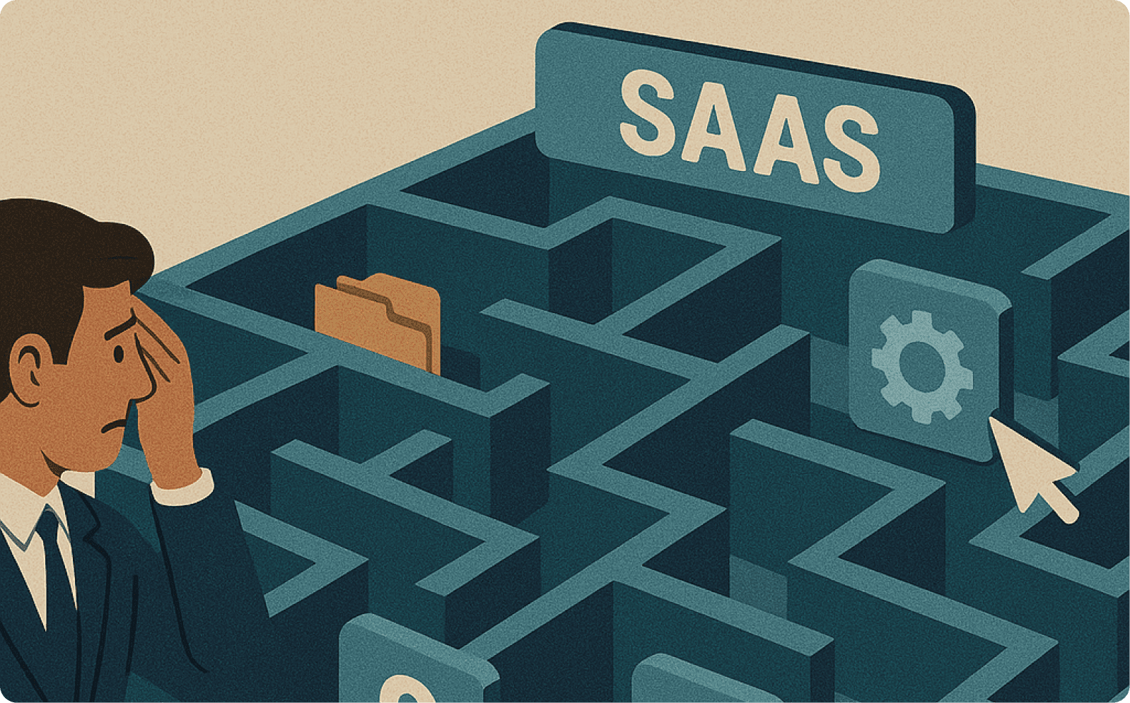
The Generic Onboarding Path: Why Identical Welcome Screens Fail Different Users
There's this assumption we keep encountering: one good onboarding sequence should work for everyone. It's efficient to build. One login flow, one setup process, one dashboard layout.
Then reality intrudes. Consider three users signing up for the same AI product:
A developer expecting code suggestions
A content marketer expecting blog outlines
A data analyst expecting to query databases
They land on the same generic welcome screen. Within minutes, two of those three people are gone.
Sixty-two and a half percent of users drop off before reaching their "aha moment." The pattern is consistent: users arrive with a specific job to be done, encounter a generic introduction to capabilities they don't care about, and decide the product isn't for them.
Look at the AI writing tools market. Dozens launched with identical value propositions. The result:
86% of articles ranking in Google are still human-written
Only 14% are AI-generated despite the proliferation of tools
71% of organizations reported AI increased workload in early implementations
The tools exist. The capability exists. The adoption doesn't.
The companies that crack this understand: micro-interactions on SaaS screen design matter more than macro features. It's about revealing the right capability at the right moment to the right person. That's how to improve SaaS dashboard UX for conversions—make it immediately personal, even if it's just smart enough to segment by role.
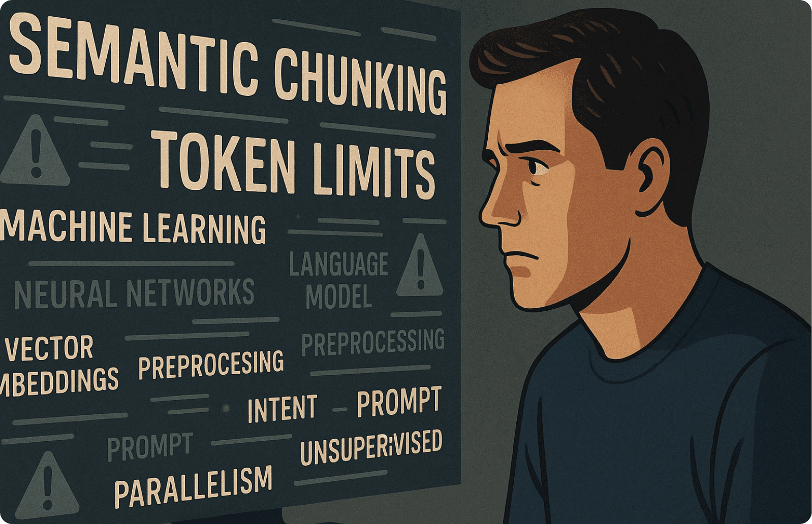
The Jargon-Heavy Onboarding Wall: Why Technical Explanation Screens Confuse Instead of Clarify
Last month, a founder showed us his AI data analysis tool. Technically sophisticated. Genuinely impressive. His onboarding explained how models worked, what "temperature settings" controlled, why users might adjust "token limits." His signup-to-activation rate was abysmal.
We asked him to walk us through it. Within two minutes, he'd used phrases like "embedding space," "semantic chunking," and "context window optimization."
We stopped him. "If I'm a marketing director trying to understand why my campaigns underperformed last quarter," we said, "how does any of that help me right now?"
He paused. "Well, they need to understand how the AI works to use it effectively."
Do they, though?
This is where fixing confusing SaaS screen flow becomes critical. The enterprise data is devastating:
95% of corporate AI pilots fail to deliver measurable returns
70% of those failures are people-related, not technology-related
Employees resort to "shadow AI" using ChatGPT instead of approved tools
"When employees face jargon without context, they resort to shadow AI—using unauthorized tools instead of company-approved solutions because the official onboarding made the product feel inaccessible."
The SaaS checkout screen UX best practices that drive conversion aren't about adding more information—they're about removing everything that isn't immediately necessary. If a user can accomplish their first meaningful task without understanding your technical architecture, then your technical architecture doesn't belong in onboarding.
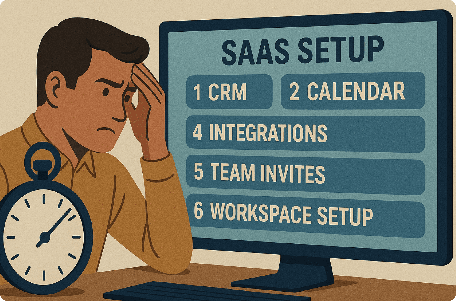
The Multi-Step Setup Screen Approach: Why Front-Loading Integrations Kills Activation
There's a moment in every failed onboarding where we can pinpoint exactly when the user gave up. It's during setup. The product promises to make their life easier, but first they need to:
Connect their calendar
Integrate their CRM
Configure their workspace
Invite their team
Authorize their accounts
Customize their dashboard
By the time they're done, they're exhausted. They've spent thirty minutes on administrative tasks and zero minutes experiencing value. Eighty percent of them never come back.
GitHub Copilot ran into this exact problem. New users had to navigate IDE configuration, understand repository structure, and set up extensions before seeing their first AI suggestion. The metrics reveal the damage:
11 weeks to realize satisfaction gains when setup blocks value
Only 26.4% adoption increase even with reminder emails
Massive underutilization despite paid licenses
When we discuss how to reduce user dropoff on the SaaS setup screen, we're rethinking what "setup" means. Can you show value first, then ask for configuration? Can you provide a working default so they experience the product immediately?
"Every integration, every connection, every customization option you front-load is another opportunity for the user to decide this is too much work."
The Saasfactor principle: time-to-value should be measured in minutes, not days. Fifty-two percent of customer churn happens in the first ninety days, and most is decided in the first session, during setup.

The Feature Tour Onboarding: Why Showing Everything Means Users Find Nothing
Last month, we reviewed a session recording that haunts us. A user spent eight minutes exploring an AI workflow tool, then churned. The exit survey said: "Doesn't integrate with tools I actually use."
The founder was baffled. "We have integrations with everything—Slack, Salesforce, HubSpot, Gmail. Why didn't they see them?"
The integrations existed in a settings submenu, behind two clicks and a scroll. The user never got there. The product they needed existed. They just never found it.
This is where improving SaaS screen layout to reduce churn becomes crucial:
80% of features you build go unused by most users
69% of customer success teams lack tools to track what's happening during onboarding
Only 20% of launched features are actually used regularly
We've seen this pattern: a founder offers a churning customer 50% off. The customer declines:
"The tool is good, but I'm the only one on my team using it. It's not integrated with our Slack or CRM, so every Monday I have to actively remind myself to log in. It feels isolating."
The integration existed. They just never saw it during onboarding. This is an onboarding failure that looks like a product failure.
The SaaS screen UX tips for revenue growth we suggest: watch what users do, then show them what they need based on their behavior. Every onboarding step should have analytics attached—completion rates, time spent, drop-off points, feature discovery patterns. You cannot fix what you cannot see.
The Path to Clarity
Successful AI SaaS onboarding isn't impossibly difficult. It's just different than what most companies assume. The tutorial approach feels thorough. The feature tour feels comprehensive. They feel like best practices because they're common practices. But common and effective are not the same thing.
If you're looking for a systematic approach to building onboarding that actually converts, we've documented the exact screen-by-screen framework in our guide: Convert More Users: The 9-Screen SaaS Onboarding Framework That Works.
What works is simpler than what fails, which is why it's so hard to build. It requires:
Restraint when you want to show everything
Personalization when you want to scale universally
Immediate value when you want comprehensive setup
Measuring behavior when assumptions feel sufficient
The disconnect happens in those first few minutes when someone tries to bridge the gap between "this might solve my problem" and "this is definitely solving my problem right now." That bridge is your onboarding. The screens matter. The flows matter. The micro-interactions matter more than your feature set, more than your pricing, more than your marketing.
Better UX isn't about making things prettier. It's about removing the friction that blocks growth. Every unnecessary step is friction. Every unclear instruction is friction. Every delayed moment of value is friction. Your job isn't to educate users about your product's capabilities. Your job is to get them to their first success so quickly and so easily that continuing feels obvious.
"Do that, and adoption follows. Miss that, and watch your carefully crafted AI capabilities power a product that nobody uses."
The data is clear. The patterns are consistent. The solution is available. What remains is execution building onboarding that prioritizes users' time-to-value over your desire to showcase features. That's the work. That's what converts trials to customers, and customers to advocates. Not smarter AI. Smarter UX.