Last Update:
Dec 18, 2025

Share
75% of users abandon products within their first week—with 38% dropping off after just the first screen
Only 26 out of 100 users complete registration—meaning 74% of marketing investment evaporates before experiencing your product
Progressive profiling increases conversions by up to 20%—asking only email and password upfront reduces cognitive load at critical moments
Companies guiding users to aha moments see 18% increases in free-to-paid conversions—time to value under 5 minutes yields 3x higher activation
Personalized onboarding increases activation by 30-50%—just 1-2 segmentation questions create 8-16 distinct optimized paths
84% of users abandon poorly designed empty states—contextual help, clear CTAs, and examples prevent confusion-driven churn
Behavior-triggered emails generate 10x more revenue—45% open rates versus 21% for scheduled campaigns through contextual relevance
Each additional form field reduces completion by 3-5%—with 81% of users abandoning forms they've started due to length and security concerns
Mobile accounts for 50%+ of traffic but lowest conversion rates—1-second faster performance increases conversions by 27%
Small improvements compound dramatically—5% signup + 10% onboarding + 15% aha moment = 32% overall activated user improvement
Introduction: Understanding the Onboarding Crisis
The moment a user clicks "Get Started" on your product, a battle begins. And you're already losing.

Research shows that 75% of users abandon products within their first week. More alarmingly, 38% drop off after encountering just the first screen. This isn't a failure of your product—it's a failure of your signup and onboarding process.
The Highest-Risk Interaction Point
The onboarding phase represents the single highest-risk interaction point in the entire user lifecycle, according to Nielsen Norman Group research. You've spent months perfecting your product and invested marketing dollars to drive traffic. Yet the moment potential customers meet your creation, they vanish.
The Financial Reality
The financial implications are staggering. For every 100 users who begin the registration process, only 26 complete it. This means 74% of your marketing investment evaporates at the registration stage alone—before anyone even experiences your product.
The Path Forward
Here's the good news: onboarding drop-off isn't inevitable. Companies that redesign their signup and onboarding processes see dramatic results.
One SaaS platform improved their registration completion rate from 23% to 67% by simplifying their flow—a 191% improvement. Another increased trial-to-paid conversions by 45% with strategic changes.
These aren't anomalies. They're the predictable results of understanding why users abandon and systematically removing friction.
This guide explores the comprehensive steps you need to include in your Comprehensive SaaS Onboarding Framework to dramatically reduce drop-off and activate users faster.
Part 1: Common Pitfalls and Reasons for Onboarding Drop-Off
Before we solve the problem, we need to understand why it exists. The reasons users abandon your onboarding aren't mysterious—they're remarkably consistent across industries and product types.
The Expectation Gap: When Promise Meets Reality
One of the most underrated reasons for early churn is the disconnect between what your marketing promised and what your product actually delivers.
Harvard Business Review research attributes 23% of early-stage churn directly to expectation misalignment. Users arrive at your signup form excited about a specific promise, and then onboarding fails to deliver or clarify that value.
The Cognitive Disconnect
Consider this scenario: a user reads your marketing copy about "simplifying project management" and signs up with enthusiasm. But then your onboarding throws them into a generic feature tour discussing 15 different capabilities. None of these directly address the promise that captured their interest.
The cognitive disconnect is jarring. Users bounce.
As Dr. Susan Weinschenk, behavioral psychologist and author of "100 Things Every Designer Needs to Know About People," notes:
"People make decisions based on what they expect to happen, not what you tell them will happen."
The "Aha Moment" Never Arrives
The most critical component of successful onboarding is delivering what's known as the "aha moment"—the exact point where perceived value exceeds interaction cost.
This is when a user thinks: "Oh, I get why this product is useful for me."
Defining the Aha Moment
For Dropbox, it's uploading the first file. For Slack, it's sending the first message. For Figma, it's creating the first design.
But most drop-offs occur before users have experienced this core benefit.
Amplitude data shows that the aha moment is the single user action linked most strongly to retention and activation metrics. According to product analytics research, companies guiding users to aha moments see 18% increases in free-to-paid conversions.
The Setup Trap
The problem? Many onboarding flows prioritize setup tasks, feature tours, and data collection before users can actually experience value.
It's like asking someone to assemble furniture before letting them sit on it. The natural motivation to continue dissipates quickly.
Cognitive Overload and Feature Sprawl
Your product probably does dozens of things. But your onboarding should not introduce all of them.
When users face more than 3-4 choices simultaneously during onboarding, decision fatigue sets in. Research from Carnegie Mellon's Human-Computer Interaction Institute shows completion rates drop by up to 60% under these conditions.
The Paradox of Choice
This creates what behavioral psychologists call the "paradox of choice." More options should theoretically be better, but in onboarding, it paralyzes users.
A new product manager opening Slack for the first time doesn't need to learn about custom workflows, bot integrations, and enterprise security features. She needs to send a message. Everything else is noise.
The Blank State Problem
Hotjar UX research reveals that 84% of users who encounter blank states without contextual help abandon within the first session. The empty dashboard—that blank slate greeting—becomes a symbol of complexity rather than potential.
The Form Length and Information Collection Problem
Here's a hard truth: 81% of people have abandoned a form after beginning to fill it out. And the primary culprits are well-documented:
Security concerns: 29% of form abandonment
Form length: 27% of abandonment
Unnecessary questions: 10% of users abandon over irrelevant fields
The Seven-Field Barrier
When your signup form asks for seven fields before showing any value—company name, industry, role, team size, use case, billing address, and phone number—you're fighting against user psychology.
Additionally, 23% of people will not complete registration if you require them to create a user account. This suggests that forcing account creation as a prerequisite friction point drives significant abandonment.
The Password Problem
The password field is particularly problematic. It has the highest abandonment rate on any form.
Why? Password creation requires cognitive effort—remembering or storing it securely. Users instinctively hesitate at this step.
Blank Dashboard Problem and Zero-State Confusion
When a new user logs in and sees a completely blank dashboard or "no data available" message, they feel lost.
There's no example of what the product could look like when populated. No clear next step. No proof that action on their part will lead somewhere meaningful.
What Users Need
This "zero-state experience" eliminates social proof, usage examples, and clear next actions—exactly what users need to feel confident proceeding.
Rather than exciting users about fresh potential, it signals confusion and complexity.
Learn more about optimizing user experiences.
Mobile-First Disconnect
Despite mobile users making up 61% of email engagement, many companies still optimize signup and onboarding for desktop first.
The result? Slow load times, poorly optimized forms for thumb interaction, and frustrating navigation that works fine on a 27-inch monitor but feels like torture on a 5-inch screen.
The Speed Penalty
Even a 1-second delay in page load time can result in a 7% reduction in conversions. And 76.2% of cart abandonment occurs on mobile compared to 68.1% on desktop, clearly showing the mobile friction problem.
Misaligned Personalization and Generic Flows
Without personalization, onboarding treats every user identically. A freelance designer goes through the same flow as a Fortune 500 design team. A startup operator sees the same prompts as an enterprise administrator.
This generic approach forces unnecessary cognitive translation. Each user must mentally adapt the onboarding to their specific context, which increases interaction cost and reduces perceived fit.
The Personalization Advantage
Personalized onboarding flows increase activation rates by 30-50% compared to generic experiences, according to growth consultancy Reforge. Yet most products still deploy one-size-fits-all onboarding flows.
Micro-Summary
Onboarding drop-off stems from seven primary friction points: expectation misalignment, delayed aha moments, cognitive overload, excessive form fields, poor empty states, mobile optimization gaps, and lack of personalization. Each represents a specific psychological barrier that compounds abandonment risk.
Part 2: The 10 Essential Steps
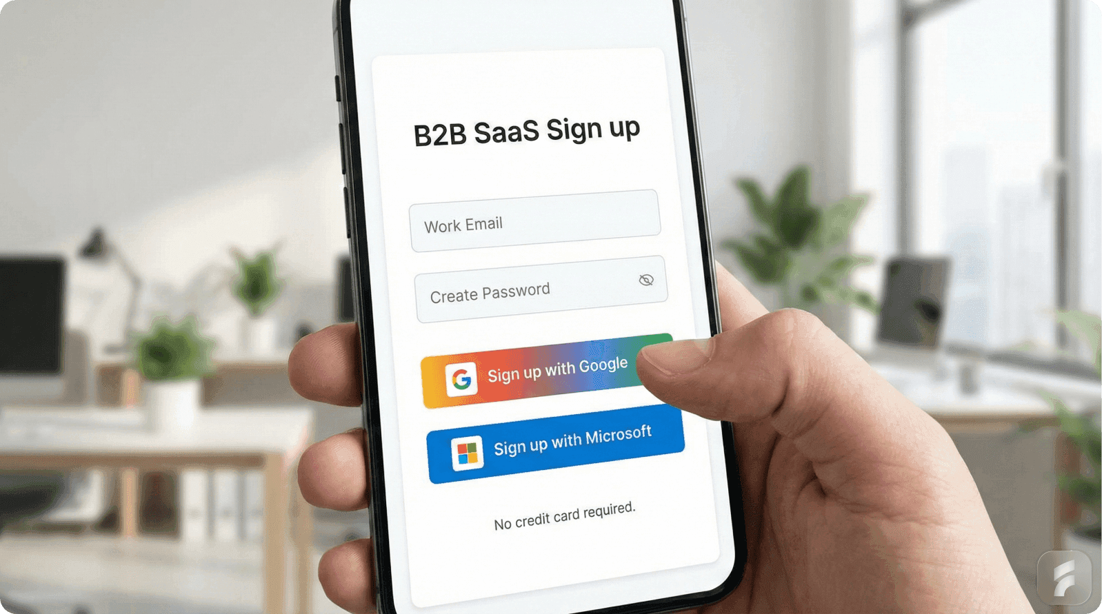
Step 1: Simplify Signup with Progressive Profiling
The Science
70% of users abandon signup forms due to cognitive load. Cognitive Load Theory reveals that the human brain has finite capacity for processing information at any given moment.
Each form field requires a decision: Should I provide this? Is it safe? Do I have this information right now? According to the Baymard Institute, every additional form field reduces completion rates by 3-5%.
Research on loss aversion by Kahneman and Tversky demonstrates that humans are more motivated by fear of losing something than by potential gains. Long signup forms trigger unconscious risk perception:
"What if I provide my information and this doesn't work?"
The Solution: Progressive Profiling
Ask for only essential information immediately (email and password), then collect additional data over time as users become invested.
This works through three mechanisms:
Reduced cognitive load at the critical conversion moment
Increased commitment bias: Once users invest time and create an account, they're more likely to continue (Cialdini's consistency principle)
Context-aware collection: Questions make more sense after users see your product
The Results
78% of marketers using progressive profiling report better lead quality
McKinsey research shows it increases conversions by up to 20%
One SaaS platform increased completion from 23% to 67%—a 191% improvement
Implementation
Essential Signup = Email + Password + (Optional: 1 segmentation question)
Progressive Collection = Role, Company, Use Case (post-signup)
Step 2: Remove Verification Friction
The Problem
Email verification creates momentum-killing context switches. Users sign up with enthusiasm, then you ask them to leave your product, open their email, find your message, and click a link. In that moment, momentum dies.
Research on attention residue by Sophie Leroy shows that when people switch contexts, part of their attention remains stuck on the previous task. This divided attention reduces performance and increases abandonment likelihood.
Over 90% of consumers have left a site rather than complete cumbersome registration.
Three Smart Strategies
1. Allow Product Exploration Before Confirmation
Let users explore core features while email verification happens asynchronously. Only gate email-dependent features behind verification.
2. Use Magic Link Authentication
Send a single-click link instead of requiring password creation. This eliminates the highest-friction field while improving security through passwordless authentication.
As security researcher Troy Hunt notes:
"Passwords are the single biggest point of failure in authentication systems. Eliminating them removes both a security vulnerability and a UX friction point."
3. Smart Timing
Ask users to confirm email only when attempting to use email-dependent features, not as a mandatory first step.
Real-time email validation reduces bounce rates by 23% by catching typos immediately.
Step 3: Identify and Accelerate to Your "Aha Moment"
The Science
The aha moment is when users emotionally realize your product solves their problem—the difference between technical understanding and believing you can't live without it.
When users experience their aha moment, their brain releases dopamine, creating a "reward prediction error" that strengthens neural pathways and increases likelihood of repeated behavior.
The Data
Companies guiding users to aha moments see 18% increases in free-to-paid conversions
Time to Aha directly predicts retention—longer delays increase churn
Must occur during first interaction ideally
The Implementation
Phase 1: Identify Through Data
Analyze retained users. Which action did they take within the first session?
Slack: sending a message
Dropbox: uploading a file
Figma: creating a design
Phase 2: Build the Fastest Path
Map only the prerequisites to reach this moment. Stanford's Behavior Design Lab found each additional step reduces completion by ~20%.
Phase 3: Remove Prerequisite Learning
Users don't need to understand 10 features before experiencing core value. Teaching everything creates cognitive overload.
Real Example: Slack
Slack doesn't teach about channels, integrations, or security before letting users send a message. It gets users to message as fast as possible.
Stewart Butterfield, Slack's CEO:
"We realized that if we could get people to send just one message, they understood the entire value proposition."
This relates to Kahneman's "peak-end rule"—people judge experiences based on the most intense moment and the ending. If onboarding ends with users experiencing core value, they judge the entire experience positively.
Step 4: Personalize Based on User Segment
The Psychology
Self-determination theory identifies three fundamental human needs:
Autonomy: Disengage when forced into rigid processes
Competence: Want to feel capable
Relatedness: Want to feel understood
Generic onboarding threatens all three. Personalized onboarding satisfies them.
The Data
Personalized onboarding increases activation by 30-50%
Increases retention by 25%
Intrinsically motivated individuals show 225% higher engagement
The Strategy
Ask 1-2 segmentation questions during signup:
What's your role? (Designer, Developer, Manager, Executive)
What's your primary use case? (Personal project, Team collaboration, Client work)
Result: 8-16 distinct onboarding paths from just 2 questions.
Real Examples
Figma: Asks about role and use case, then shows role-specific templates immediately. "We saw activation rates jump 34% when we started showing role-specific templates rather than a generic template library."
Slack: Personalizes initial channels based on team size and industry. A three-person startup sees different suggested channels than a 500-person enterprise team.
When users see tailored content, they unconsciously think: "This product understands me." That feeling accelerates commitment and reduces dropout.
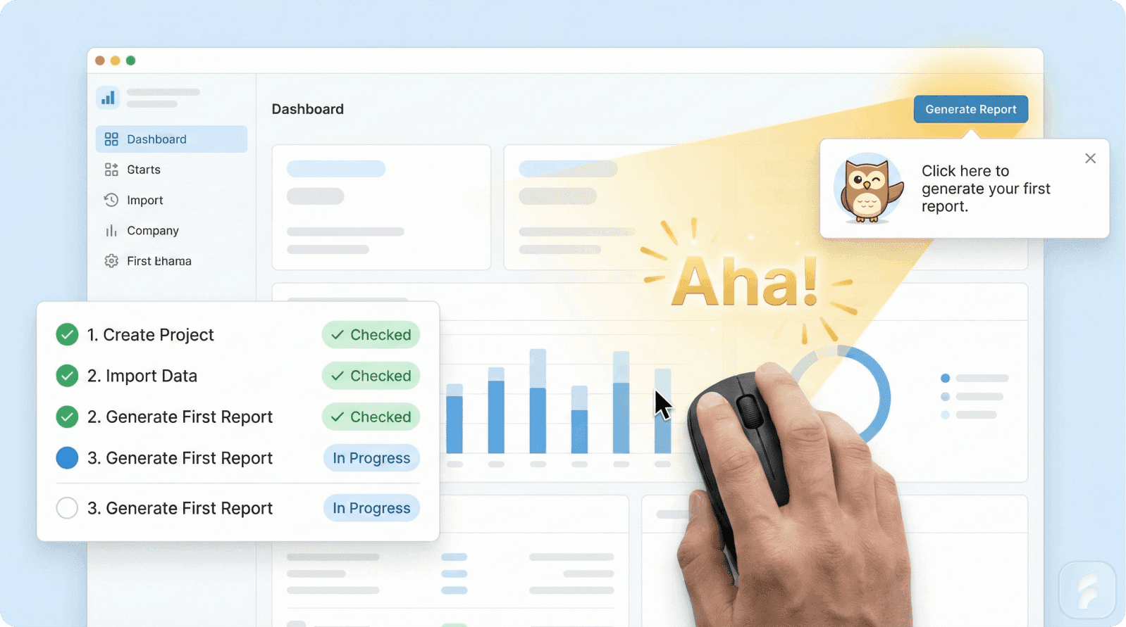
Step 5: Create Visual Progress with Checklists
The Zeigarnik Effect
Soviet psychologist Bluma Zeigarnik discovered that people remember uncompleted tasks twice as well as completed ones. More importantly, unfinished tasks create psychological tension our brains unconsciously seek to resolve.
When you start a task, it creates task-specific tension. This tension only releases when completed. Unfinished tasks create persistent tension, motivating closure.
Why Checklists Work
1. Visible Incomplete Tasks
"3 of 5 steps complete" creates psychological tension motivating completion.
2. Milestone Celebrations
Each checkbox completion provides a dopamine hit, reinforcing behavior.
3. Endowed Progress
Starting users with partially-complete checklists creates stronger completion motivation than empty ones.
Research by Nunes and Dreze: participants given a coffee card requiring 10 purchases (0 completed) were less motivated than those given cards requiring 12 purchases (2 already "completed"). Actual effort was identical, but perceived progress created momentum.
Real Example: Duolingo
Duolingo's "streak" mechanic is masterclass Zeigarnik Effect application. Users with streaks of 7+ days are 5x more likely to remain active after six months.
Design Framework
3-5 core steps maximum
First step pre-completed (endowed progress)
Clear percentage display (3 of 5)
Visual checkmarks
Celebration triggers
Persistent visibility
Step 6: Design Empty States as Onboarding Moments
The Problem
When users see a blank dashboard, their brain processes absence, not possibility. Empty states force four cognitive steps:
Recognize space is intentionally empty (not broken)
Imagine what should appear
Decide what action to take
Execute that action
Most abandon at step 1 or 2.
The Data
84% abandon when empty states lack contextual help
77% of Daily Active Users abandon within first 3 days
40-60% of SaaS users open software once and never return—often due to poor empty state design
The Solution
Each empty state should answer three questions:
What is this space? Clear title/description orienting users immediately.
What should I do here? Prominent CTA with specific, actionable language.
What does it look like when populated? Example, template, or screenshot showing potential outcome.
Real Examples
Notion: Shows templates and examples, transforming empty states into inspiration opportunities. Users who interacted with templates during first session had 3x higher retention.
Slack: Empty #general channel includes onboarding guidance and suggestions, transforming confusion into direction.
Mailchimp: Empty campaign states include quick-start templates, making blank space an activation opportunity.
The Template Strategy
Templates simultaneously:
Show what populated content looks like
Reduce effort to get started
Provide inspiration and best practices
Create immediate value
Step 7: Optimize for Mobile-First
The Reality
Mobile accounts for 50%+ of web traffic but has the lowest conversion rates (2.3% vs 2.8% desktop). Yet many companies optimize for desktop first, then shrink the experience for mobile.
The Data
1-second page delay = 7% reduction in conversions
1-second faster performance = 27% increase in conversions
53% of mobile site visits abandoned if pages take 3+ seconds to load
Mobile rage clicks increased 15.6% in 2024
Why Mobile-First Matters
Mobile-first design forces prioritization. On a 5-inch screen, you can't show 15 features or ask 10 questions. You're forced to distill onboarding to only what truly matters.
As Luke Wroblewski observes:
"Mobile forces you to focus. It forces you to prioritize. And those forces make your product better."
Implementation
Performance First:
Target under 3-second load times on 4G
Compress images, minify code
Use caching and CDNs
Touch-Optimized Design:
Minimum 44px buttons (thumb-sized per Apple guidelines)
8px+ spacing between interactive elements
Mobile-appropriate input types (email, tel, number)
Minimize typing; use toggles and dropdowns
One-Handed Usage:
Place CTAs within thumb reach (center and lower half of screen)
Avoid two-handed gestures
Test on actual devices
The Thumb Zone Principle
Research shows users primarily interact one-handed. The "thumb zone" (area easily reachable while holding device) should contain all critical interactions. Elements outside require hand repositioning, increasing interaction cost and error rates.
Pro Tip: Using input type="email" with autocomplete="email" and input type="tel" with autocomplete="tel" can reduce form completion time by 50% on mobile.
Step 8: Deliver Immediate Value with Quick Wins
The Science
Research in the Journal of Applied Psychology found intrinsically motivated individuals show 225% higher engagement than those motivated externally.
Quick wins create intrinsic motivation by giving immediate, tangible proof the product works and users are capable of achieving something meaningful.
The Dopamine Loop
When users complete meaningful actions and see immediate results, their brain releases dopamine. This creates a "reinforcement loop"—once the brain learns using your product produces this reward, it's motivated to return.
Dopamine isn't just about pleasure—it's about prediction and motivation. When actions produce better-than-expected results, dopamine neurons fire, strengthening neural pathways. Quick wins create positive prediction errors making users want to repeat the behavior.
The Data
Slack's interactive onboarding resulted in 23% increase in user satisfaction
Products delivering value within first 5 minutes see 60% higher retention
Duolingo's gamification approach (quick wins, streaks) made it one of the most engaging learning apps
Implementation
Identify 2-3 features delivering quick, visible value achievable in under 5 minutes:
Design tool:
Upload image → image appears on canvas
Create shape → shape is drawn
Export work → file downloads
Project management:
Create project → project appears in list
Add task → task appears
Assign teammate → notification sent
Each should produce visible results proving: "Yes, this tool works, and I just made something."
The Psychology
Self-Determination Theory: People feel most engaged when tasks satisfy three needs:
Autonomy: "I chose to do this"
Competence: "I'm capable of doing this"
Relatedness: "This connects to something that matters to me"
Quick wins satisfy all three.
The IKEA Effect
Research by Norton, Mochon, and Ariely shows people value things more when they've had a hand in creating them. Quick wins leverage this—when users make something (however small) in your product, they value both the output and the product more highly.
Real Examples
Canva: Immediately drops users into editable templates. Within 30 seconds, users modify colors and text. Within 2 minutes, they've created something exportable.
Grammarly: Provides instant feedback on demo text during onboarding, showing corrections in real-time without users writing anything themselves.
Step 9: Personalize Communication with Behavior-Based Triggers
The Problem
Most companies send onboarding emails on fixed schedules: "Welcome on day 0, feature deep-dive on day 3, reminder on day 7."
But users don't follow schedules—they follow their own journey. Behavior-triggered communication sends the right message at the exact moment it's most relevant.
The Psychology
Marketing researchers call this "contextual relevance"—messages matching the recipient's current situation are processed more deeply and acted upon more frequently.
Behavioral economist George Loewenstein:
"The value of information decays rapidly. Information delivered at the moment of need is exponentially more valuable than the same information delivered too early or too late."
The Data
Behavior-triggered emails generate 10x more revenue per email
45.38% open rate and 5.02% click-through (vs 21% and 2.6% for standard emails)
First week engagement decides whether clients become engaged or disappear
Experian research: behavior-triggered emails have 8x higher click-through rates
Implementation
Trigger messages from actual behavior:
1. Milestone Completed
Trigger: User uploads first file
Message: "🎉 Your first file is uploaded! Here's what to do next..."
2. Inactivity (24-72 hours)
Trigger: 48 hours since last login, onboarding 60% complete
Message: "You're almost there! Just 2 more steps to unlock [specific value]..."
3. Feature Skipped
Trigger: User created 5 projects but hasn't invited teammates
Message: "Work better together: Here's how to invite your team..."
4. Aha Moment Reached
Trigger: User sends first message
Message: "You just experienced the power of [product]. Ready to level up?"
The Three Critical Questions
Behavior-triggered communication answers questions keeping users oriented:
What do I need to do?
When should I do it?
What happens next?
Multi-Channel Coordination
Coordinate across:
Email
In-app notifications
Push notifications (mobile)
SMS (high-priority triggers)
Ensure consistency and avoid overwhelming users with the same message on every platform.
Real Example: Duolingo
Duolingo's behavior-triggered push notifications are legendary:
Hour 24: Gentle reminder
Hour 48: Streak at risk warning
Hour 72: Motivational message
Each triggered by specific inactivity duration and customized to user history. This system is responsible for significant user retention.
Step 10: Measure and Continuously Optimize
The Foundation
You can't improve what you don't measure. Many companies implement all previous steps but never track whether they're working.
The previous nine steps are hypotheses—measurement transforms them into evidence-based practices.
As Peter Drucker stated:
"What gets measured gets managed."
The Most Important Metric: Time to Value (TTV)
TTV measures duration between signup and when a user experiences core value. It's the single most predictive metric for long-term retention and conversion.
Products with TTV under 5 minutes have 3x higher activation rates than those over 15 minutes (Amplitude research).
The Measurement Framework
Signup Metrics:
Signup completion rate
Abandonment by field
Mobile vs desktop completion
Time to complete
Verification completion
Onboarding Metrics:
Time to first value (minutes)
Onboarding completion rates
Aha moment activation rates
Feature adoption rates
Checklist completion per step
Retention Metrics:
Day 1, 7, 30 retention (cohort-based)
Correlation between onboarding path and retention
Churn rate by segment
Free-to-paid conversion
Time to conversion
The Optimization Cycle
Continuous improvement follows systematic cycles:
Baseline: Measure current state across all metrics
Hypothesis: Identify one friction point to fix (e.g., "40% drop off at password field")
Test: Implement one change (e.g., add magic link option)
Measure: Track impact on completion rate over 2 weeks
Iterate: Keep what works, revert what doesn't, test next hypothesis
Repeated weekly or biweekly, this compounds improvements over time.
Cohort Analysis
The most powerful measurement technique is cohort analysis—tracking groups of users who signed up in the same period and comparing their behavior.
This reveals whether onboarding changes actually improve long-term retention, not just short-term completion rates.
Key Cohort Comparisons:
Week-over-week retention curves
Activation rates by signup date
TTV changes over time
Feature adoption by cohort
Conversion rates by onboarding variation
The North Star Metric
Every product should identify its "North Star Metric"—the single metric best capturing core value delivery.
Slack: messages sent
Dropbox: files saved
Airbnb: nights booked
Your onboarding should be explicitly designed to move this metric.
Sean Ellis, who coined "growth hacking":
"Companies that identify and optimize for a single North Star Metric grow faster than those trying to optimize everything simultaneously."
Qualitative + Quantitative
Quantitative metrics tell you what is happening. Qualitative feedback tells you why.
Combine:
Analytics data (Mixpanel, Amplitude, Google Analytics)
User interviews (monthly)
Support ticket analysis
Survey feedback (NPS, onboarding surveys)
Real Example: Slack
Slack famously tracked: teams that exchanged 2,000 messages had 93% retention rate.
This insight transformed their onboarding strategy. Instead of focusing on feature adoption or account setup, they optimized everything toward getting teams to 2,000 messages as fast as possible.
Stewart Butterfield:
"Once we identified that metric, every product decision became clearer. Does this get teams to 2,000 messages faster? If not, we don't do it."
A/B Testing Best Practices
When testing onboarding changes:
Test one variable at a time
Run tests for full weeks (account for day-of-week variations)
Ensure statistical significance (minimum 100 conversions per variation)
Track long-term metrics (not just immediate completion)
Document all tests and results
The Compound Effect
Small improvements compound dramatically. A 5% signup improvement + 10% onboarding improvement + 15% aha moment improvement = 32% overall improvement in activated users.
This is why continuous measurement and optimization is so powerful.
Conclusion: An Integrated System for Success
These ten steps form an integrated system designed around psychological principles. Each removes a specific friction point or leverages a particular behavioral mechanism:
Progressive profiling reduces cognitive load at conversion
Smart verification preserves momentum
Aha moment focus delivers emotional commitment
Personalization satisfies need for relatedness
Progress visualization leverages Zeigarnik Effect
Intentional empty states prevent confusion
Mobile-first respects context constraints
Quick wins create intrinsic motivation
Behavior-triggered communication maintains engagement
Continuous measurement enables improvement
The Results
Companies implementing this systematic approach see transformative results:
2-3x improvements in signup completion
30-50% increases in activation rates
18-45% improvements in trial-to-paid conversion
25%+ increases in long-term retention
The Fundamental Shift
The required shift is from thinking about onboarding as "teaching users how to use our product" to "removing all friction between users and experiencing value."
Getting Started
Start with measurement (Step 10)
Identify your aha moment (Step 3)
Simplify signup (Step 1)
Accelerate to value (Step 3)
Add progress visibility (Step 5)
Implement remaining steps based on data
Onboarding isn't a one-time project—it's a continuous optimization discipline where potential becomes reality, interest becomes commitment, and signups become customers.
Glossary
Activation Rate - Percentage of users who complete onboarding actions and experience core product value, typically measured as users reaching the aha moment within a specific timeframe.
Aha Moment - The specific point where a user emotionally realizes the product solves their problem, creating commitment beyond technical understanding.
Behavior-Triggered Communication - Messages sent based on specific user actions or inactions rather than fixed schedules, generating 10x more engagement than scheduled messages.
Cognitive Load - Total mental effort required to process information and complete a task. High cognitive load during signup drives abandonment.
Cohort Analysis - Tracking groups of users who signed up during the same period to compare behavior over time and assess whether onboarding changes improve long-term retention.
Empty State - Interface displayed when no data exists yet. 84% of users abandon poorly designed empty states lacking clear descriptions, CTAs, and examples.
Friction Point - Any element that increases interaction cost, cognitive load, or hesitation, such as unnecessary form fields, confusing navigation, or slow load times.
Progressive Profiling - Collecting user information gradually over multiple interactions rather than all at once, reducing cognitive load at conversion and leveraging commitment bias.
Quick Win - Easily achievable action producing immediate, visible value in under 5 minutes, creating intrinsic motivation through dopamine reinforcement loops.
Time to Value (TTV) - Duration between user signup and experiencing core product value. The most predictive metric for retention and conversion.
Zeigarnik Effect - Psychological phenomenon where people remember incomplete tasks twice as well as completed ones, creating tension that motivates task completion.
References
This article draws on research from:
Research Institutions:
Nielsen Norman Group (usability and empty state design)
Harvard Business Review (expectation misalignment)
Carnegie Mellon HCI Institute (decision fatigue)
Stanford Behavior Design Lab (flow completion)
Industry Research:
Amplitude (aha moments and activation)
Hotjar (blank state abandonment)
Baymard Institute (form usability)
McKinsey & Company (personalization)
Reforge (growth research)
Mixpanel (product analytics)
Companies & Case Studies:
Transform Your Onboarding Experience
Ready to reduce drop-off and increase activation rates dramatically?
Product Design Services - Build conversion-optimized signup flows
UX Optimization - Eliminate onboarding friction systematically
UX Audit - Identify exactly where users abandon
SaaS Growth Strategies - More conversion insights