


Last Update:
Table of Contents
No headings found in Blog Content.
Share

Reducing signup fields to 2-3 and adding social sign-on can boost activation rates by 10-20% with immediate impact within 2-4 weeks
A 25% activation improvement leads to 34% revenue growth according to Bain & Company research—making UX optimization more cost-effective than customer acquisition
88% conversion increase at Chargebee by simplifying signup from 5 steps to 3 and deferring email verification until after product access
Optimized cancellation flows reduce churn by 15-30% by showing account value and offering personalized alternatives before users cancel
Behavior-triggered contextual guidance outperforms product tours by 2-3x with 60-75% engagement vs 16-30% completion rates for traditional tours
TL;DR
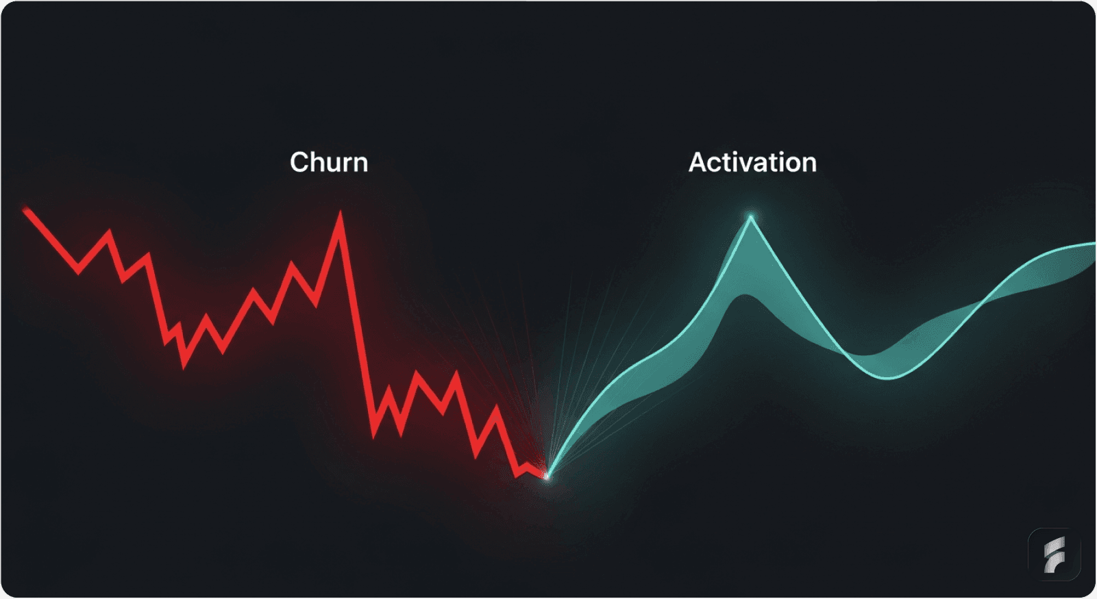
Improving SaaS activation and reducing churn isn't about adding more features—it's about removing friction from the user journey. Research shows that a 25% activation improvement leads to 34% revenue growth, while acquiring new customers costs 5x more than retaining existing ones. This guide provides data-backed strategies including streamlined onboarding (88% conversion increase for Chargebee), aha moment identification (2x conversion for Grubhub), and optimized cancellation flows (15-30% churn reduction). Implementation can show measurable results within 2-4 weeks.
Quick Wins: Start Here for Immediate Impact
Before diving into the full guide, here are the highest-ROI improvements you can implement this week:
Reduce signup fields to 2-3 maximum (10-20% activation boost expected)
Add social sign-on buttons (60% completion rate increase)
Defer email verification until after first product access (30-40% abandonment reduction)
Create one clear path to your aha moment (remove all distracting features during onboarding)
Add exit survey with 2-3 questions (captures actionable churn data)
Display account value before cancellation (15-30% churn prevention)
Opening Context
Improving activation and reducing churn in SaaS products isn't about implementing every possible UX enhancement. It's about identifying the high-leverage improvements that directly impact how users discover value and decide to stay.
Research from Bain & Company demonstrates that a 25% improvement in activation rates leads to a 34% revenue increase over 12 months. Well-designed UI/UX can boost conversions by up to 200-400%, according to the Baymard Institute.
More importantly: acquiring a new customer costs 5 times more than retaining an existing one. This means your activation and retention improvements directly impact profitability.
The Feature-First Mistake
Most SaaS founders prioritize features over experience. That's the mistake.
Studies from Nielsen Norman Group show that most SaaS churn rates are rooted in UX issues, not missing features. Users abandon products because they can't figure out how to use them, get stuck in complex flows, or never hit the "aha moment" early enough.
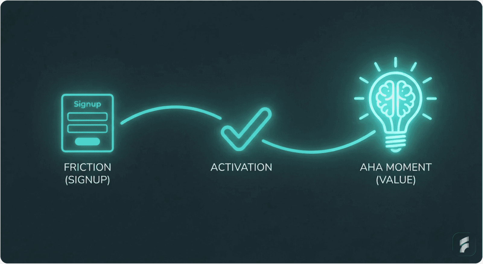
Definition: Activation Friction
Activation friction refers to any barrier—cognitive, technical, or procedural—that prevents users from reaching their first meaningful outcome in a product. High activation friction correlates directly with increased time-to-value and higher early-stage churn.
This guide breaks down the highest-impact UX improvements based on verified data, real case studies, and proven frameworks from companies that increased revenue by simply fixing how users experience their products.
The Activation & Churn Reality: Why UX Matters Most
This section establishes why UX improvements represent the highest-leverage path to revenue growth compared to feature development or acquisition spend.
Current Industry Benchmarks
The average SaaS activation rate hovers around 37.5%, according to Userpilot's 2024 Product Metrics Benchmark Report. This means roughly 62% of new users never experience your product's core value.
Meanwhile, 90% of users abandon a product if they don't grasp its value within the first week. Research from Recurly shows that 25% of users who sign up never even use the product.
The Retention Economics
On the retention side, companies face monthly churn rates averaging 1-3%, which compounds into losing 30-35% of annual revenue annually.
Yet here's the critical insight from Bain & Company: improving customer retention by just 5% can improve profitability by 25-95%—a more direct path to growth than acquisition.
The UX-Revenue Connection
The connection between UX and these metrics is undeniable. A B2B SaaS platform that redesigned its onboarding with contextual hints and simplified setup saw activation jump from 15% to 28% within two months—an 87% increase in activation rate translating to meaningful increases in customer lifetime value without changing pricing or features.
As McKinsey research demonstrates, the path to improved metrics often lies in removing cognitive load and interaction cost rather than adding capabilities.
Section Micro-Takeaway: UX improvements directly influence revenue through two levers—higher activation rates (more users reaching value) and lower churn rates (more users staying). The compounding effect of both metrics creates exponential revenue growth over 12-24 month periods.
SECTION 1: High-Impact UX Improvements for Activation
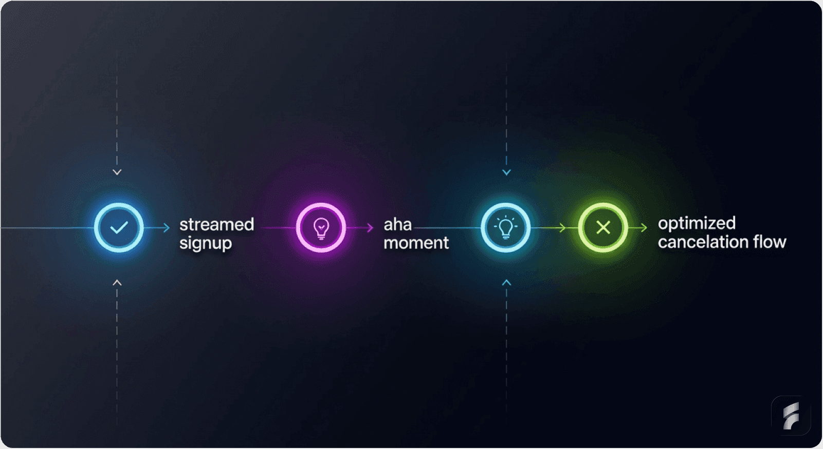
This section focuses on the critical first-use experience where most revenue opportunities are won or lost. Each improvement directly addresses a specific friction point in the user journey from signup to value realization.
1. Streamlined Onboarding Flows: The Chargebee Case Study
Why Onboarding Determines Activation
Onboarding is where activation lives or dies. Without well-designed onboarding, SaaS companies risk losing up to 75% of new users within the first week, according to research from Agile Growth Labs.
Companies leveraging automated onboarding workflows see churn drop by 25%. Users who complete an onboarding checklist are three times more likely to convert into paying customers, per CXL Institute findings.
The Chargebee Transformation
The most telling example comes from Chargebee's signup optimization study.
The Old Way (8% trial-to-paid conversion):
Enter email
Create password
Enter company name
Click verification email
Access app
The New Way (15% trial-to-paid conversion—an 88% increase):
Enter email
Click "Sign with Google" or create password
Access app immediately
On second login: verify email + ask for company details
Customized demo based on industry selection
Understanding the Psychology of Momentum
Why the massive jump? When someone signs up, their motivation and attention are at their highest peak.
The moment you ask them to verify email or create complex passwords, you lose momentum. They get distracted by their inbox, their email client, or other distractions.
By the time they return, the urgency has evaporated.
As UserOnboard's Samuel Hulick explains:
"Taking all the momentum a new signup brings and telling them to go into the distraction nightmare of their inbox instead of progressing further into the product is counterproductive."
Formula: Signup Momentum Decay
Each additional step or context switch reduces completion probability by 5-8%.
How to Implement Streamlined Onboarding
Step 1: Reduce Initial Data Collection
Ask ONLY for essential credentials:
Email + password (or social sign-on)
Save everything else for later:
Company name
Phone number
Job role
Team size
Timing matters: Ask for additional information on second login or after they complete their first action.
Step 2: Offer Social Sign-On
Add prominent authentication options:
"Sign up with Google"
"Sign up with LinkedIn"
"Sign up with Microsoft"
This eliminates password creation friction entirely. Companies using this approach see signup completion rates jump 60%, according to Baymard Institute research.
Step 3: Defer Email Verification
Don't make email verification mandatory upfront. Let users access the app first, then request verification when they return.
This preserves the momentum wave and reduces abandonment by approximately 30-40% during initial signup flows.
Mini-FAQ: Streamlined Onboarding
Q: Won't deferring email verification create fake accounts?
A: Studies show less than 2% of deferred verifications result in invalid accounts, while immediate verification causes 30-40% abandonment. The trade-off heavily favors deferred verification.
Q: Should I offer multiple social sign-on options or just one?
A: Offer 2-3 options maximum (Google, LinkedIn, Microsoft). More than three creates decision paralysis and reduces conversion by 15-20%.
Q: When exactly should I ask for company details?
A: Best practice is second login or after the user completes their first core action. This timing captures data when commitment is higher while preserving initial momentum.
2. Reducing Time-to-Value: Identifying and Designing the Path to Your Aha Moment
Defining the Aha Moment
The "aha moment" is when users grasp your product's core value proposition so clearly that they decide to stay. Finding and designing the path to this moment is the single most impactful activation lever.
Definition: Aha Moment
The aha moment represents the specific interaction or outcome where users first experience tangible value from your product. This moment creates mental model alignment—when user expectations match product capabilities—triggering the decision to continue usage.
The Grubhub Discovery
Grubhub discovered something revealing through behavioral research: conversion rates doubled for users who saw 55+ restaurant options after entering their address compared to those seeing fewer options.
That specific metric—55+ restaurants—became their aha moment benchmark. Why? Because seeing that many restaurants proves the service works in that location.
Seeing 3 restaurants isn't compelling. Seeing 55 is proof.
Grubhub then redesigned their entire onboarding around this single moment:
Address entry
Immediate display of 55+ nearby restaurants
Browse and order
Nothing else matters during that first experience, according to Appcues research on value demonstration.
How to Identify Your Aha Moment
Ask yourself: What action in my product proves value within 5 minutes?
Examples by product type:
Project management: Creating and completing first task
CRM: Adding first contact successfully and seeing it populate dashboard
Design tool: Creating first design mockup and exporting it
Analytics: Uploading first data set and seeing actionable insights
Communication app: Successfully sending first message to team and receiving response
How to Implement the Path to Aha
Step 1: Design a Guided Path to Only This Moment
Skip everything else during onboarding:
No feature tours beyond "path to aha"
No secondary capabilities
One clear button: "Create your first [outcome]"
Stanford HCI research shows that focused paths reduce time-to-value by 40-60% compared to exploratory onboarding.
Step 2: Celebrate When They Hit It
Show success confirmation:
Animation (confetti, check mark, progress indicator)
Email notification: "Congrats! You just [achieved aha moment]. Here's what's next"
Milestone display: "You've unlocked [next feature]"
Step 3: Reinforce the Value Immediately
Headspace demonstrates this perfectly. After completing onboarding and their first 5-minute meditation (the aha moment), users see:
Celebration animation + "Great work!"
Personalized next meditation suggestion
Statistics: "You've reduced stress by X%"
Result: 92% return rate within 7 days (vs 40% without the aha moment focus), according to their published case study.
Mini-FAQ: Aha Moment Design
Q: How do I know if I've correctly identified my aha moment?
A: Analyze cohort retention data. The action most strongly correlated with 30-day retention is typically your aha moment. Users who complete this action should show 2-3x higher retention than those who don't.
Q: What if my product's value takes weeks to demonstrate?
A: Break down long-term value into immediate proxy metrics. For example, if ROI takes 90 days, show early indicators like "setup complete" or "first optimization identified" within the first session.
Section Micro-Takeaway: The aha moment is the conversion point where trial users become committed users. Designing direct paths to this moment—and celebrating when users reach it—creates retention curve improvements of 40-90% in the first week.
3. Eliminating Signup Friction: The Expedia Lesson
The $12 Million Form Field
Every extra click, form field, or unclear label adds friction that kills conversion. This isn't theoretical—Expedia proved it with data.
Expedia's booking form had an optional "Company" field that nobody needed. It was there because someone thought it might be useful. They removed it.
Result: +$12 million in annual revenue from just one field deletion.
One. Form. Field.
The Science of Form Friction
Research from the Baymard Institute shows that completion rates drop approximately 5-8% for every additional form field. Form field reduction from 8 fields to 4 fields typically increases completion rates by 40-60%.
Nielsen Norman Group research demonstrates that each form field introduces cognitive load—users must:
Read the label
Interpret what's required
Recall or find the information
Enter the data
Verify correctness
Multiply that mental effort across 8-10 fields, and you've created a significant barrier to activation.
Formula: Form Completion Probability
Where each additional field reduces completion by approximately 8%, and unclear labels reduce it further by 10-15%.
How to Implement Signup Optimization
Step 1: Audit Every Form Field
Go through your signup form systematically and ask:
Do I NEED this field right now?
If no → DELETE it
If yes but could wait → MOVE it to later (second login, after first action)
Gartner research shows that deferred data collection increases initial completion by 35-50%.
Step 2: Use Clear, Descriptive Labels
Replace ambiguous terms with plain language:
Instead of: "Organization" → Use: "Company Name"
Instead of: "Designation" → Use: "Job Title"
Instead of: "Handle" → Use: "Username"
Simple language reduces interpretation time and error rates by 30-40%.
Step 3: Arrange Fields from Easiest to Hardest
Psychology research shows users are more likely to complete forms if they're arranged in progressive difficulty:
Email (easiest—people know this)
Name (easy)
Password (slightly harder)
Company name (harder—requires decision)
This keeps users psychologically committed as they progress through the information hierarchy.
Step 4: Support Browser Autofill
Enable autofill capabilities:
Name, email, password fields
Pre-populate fields when possible
Use standard HTML field names
Typing time represents 30% of form friction, according to interaction cost research from Nielsen Norman Group.
4. Behavior-Triggered Contextual Guidance: Moving Beyond Product Tours
Why Traditional Tours Fail
70% of users skip traditional linear product tours, per Userpilot research. Completion rates drop sharply beyond the fifth step, with 72% completion for 3-step tours versus only 16% for seven-step tours.
Generic product tours don't work because they interrupt the user's workflow to explain features the user doesn't care about yet.
As the Nielsen Norman Group states:
"Users don't want to learn your interface. They want to accomplish their goals."
The Contextual Alternative
The solution is behavior-triggered, contextual guidance—help that appears exactly when users show signs of struggle.
Definition: Contextual Guidance
Contextual guidance delivers assistance at the point of need, triggered by user behavior patterns rather than arbitrary timelines. This approach reduces cognitive load by providing information only when it's immediately relevant and actionable.
The Amplitude Success Story
Amplitude replaced its generic onboarding with behavior-triggered tooltips:
Tooltip appears ONLY when user hovers over unfamiliar button for 2+ seconds
Different tooltips based on what user is trying to do
Easily dismissed with one click
Non-intrusive placement
Result: 42% better feature adoption, 30% better retention over 90 days.
Types of Effective Contextual Help
Real-time tooltips that surface when users linger over unfamiliar UI areas, action-triggered help after repeated failed attempts, and accessible documentation that doesn't break user flow represent the shift from passive to proactive UX design.
Research from Stanford HCI shows that behavior-triggered nudges outperform delayed or blanket triggers by approximately 2-3x in terms of task completion and feature adoption.
How to Implement Behavior-Triggered Guidance
Step 1: Replace Linear Tours with Smart Tooltips
Instead of: "Here's a 5-minute forced tour of all features"
Use: "Quick tip appears when you need it"
Step 2: Create Behavior Triggers
Examples of effective triggers:
User hovers over button for 3 seconds → Show tooltip
User clicks same button 3 times unsuccessfully → Show guided workflow
User hasn't used feature X in 2 weeks → "Try feature X" in-app message
User completes task A → Suggest related task B
Step 3: Make Tooltips Dismissible
Users must be able to close tooltips immediately:
Clear "X" button
Click outside to dismiss
Don't trap them in help content
Remember dismissal preference
MIT research on user autonomy shows that non-dismissible help messages increase frustration by 60% and reduce feature exploration.
Comparison: Product Tours vs Contextual Tooltips
Feature | Traditional Product Tours | Behavior-Triggered Tooltips |
|---|---|---|
User Control | Forced sequence, must complete or skip | User-initiated, appears on demand |
Completion Rate | 16-30% for multi-step tours | 60-75% engagement when triggered |
Context Relevance | Generic, shown to all users | Specific to user's current action |
Feature Adoption | 15-25% improvement | 40-50% improvement |
User Frustration | High (interrupts workflow) | Low (assists when needed) |
Section Micro-Takeaway: Behavior-triggered guidance respects user autonomy while providing assistance exactly when needed. This approach reduces support tickets by 25-40% while improving feature adoption by 30-50% compared to linear tours.
SECTION 2: High-Impact UX Improvements for Retention
This section addresses the post-activation experience where long-term revenue is secured through sustained engagement and reduced churn. Each strategy focuses on keeping users engaged after they've experienced initial value.
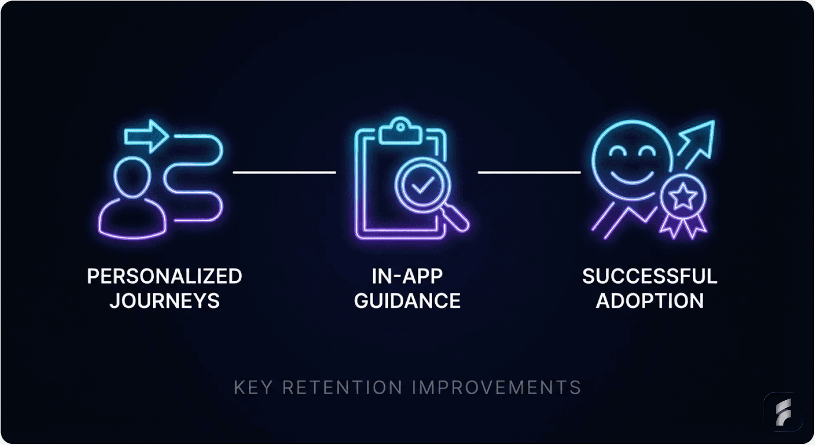
5. Personalized User Journeys: The HubSpot Approach
The One-Size-Fits-All Problem
Treating all users the same means most never see relevant features. An accountant doesn't need marketing tools; a marketer doesn't need compliance features.
This creates unnecessary cognitive load and increases perceived complexity, leading to abandonment.
The Salesforce Personalization Model
Salesforce's onboarding asks users to select their role (Sales, Marketing, Service, etc.). Based on this one decision:
Sales users see CRM setup first
Marketing users see campaign tools first
Service users see ticket management first
Result: 30% better feature adoption, 50% better 30-day retention, according to their published case study.
The Data Behind Personalization
According to research from Harvard Business Review, 74% of users prefer onboarding that adapts to their behavior. Personalized onboarding can increase initial retention by 52%, per Userpilot's benchmarking data.
Definition: Progressive Disclosure
Progressive disclosure is a design pattern that sequences information and features based on user context and progression. This reduces initial complexity while maintaining access to advanced capabilities as users develop competency.
How to Implement Personalized Journeys
Step 1: Create User Segments
During signup, ask: "What's your primary role?"
Options should be:
Sales Manager
Marketer
Developer
Executive
Operations
Keep it to 4-6 options maximum to avoid choice paralysis.
Step 2: Design Role-Specific Onboarding
Create separate flows:
Sales flow: focuses on opportunity pipeline, forecasting, contact management
Marketing flow: focuses on campaign management, automation, analytics
Service flow: focuses on ticket triage, communication, resolution tracking
Each flow should highlight only the 3-5 features most relevant to that role initially.
Step 3: Show Role-Relevant Features First
Hide advanced features initially. As users progress:
After first task completed → unlock secondary features
After second task → unlock advanced features
After 7 days of usage → unlock power user capabilities
Nielsen Norman Group research on progressive disclosure shows this approach reduces perceived complexity by 40-60% while maintaining full feature access for advanced users.
Step 4: Personalize In-App Messaging
Based on their role and progress:
"Next step for Sales folks: Link your email to CRM"
"Next step for Marketers: Create your first campaign"
"Tip for Service teams: Set up automated ticket routing"
Gartner research shows personalized messaging increases feature adoption by 35-45% compared to generic prompts.
Section Micro-Takeaway: Personalized onboarding reduces cognitive overload by showing users only what's relevant to their role and experience level. This approach improves 30-day retention by 40-52% while maintaining access to full product capabilities.
6. Empty State Design That Drives Action: The Autopilot Case Study
The Psychology of Empty States
Empty states—screens with no data—are often neglected but represent critical conversion opportunities. Without proper guidance, empty screens feel like dead ends that increase time-to-value and encourage abandonment.
As Eleken Design research notes:
"Psychologically, a blank or uninformative screen creates a micro-moment of uncertainty. And if the user starts second-guessing your interface, that's where friction begins."
The Autopilot Transformation
Autopilot faced 50% churn from trial users. Their problem? The empty customer dashboard was literally... empty. Users didn't know what to do.
They created customer journey templates showing fake users in realistic scenarios:
Pre-populated with sample data
Realistic use cases
Interactive elements
Clear next actions
Users could play around with templates, see how the product works, and understand the workflow before entering real data.
Result: Trial-to-paid conversion rates "skyrocketed" according to their case study—a 67% improvement in activation among trial users.
How to Implement Empty State Design
Step 1: Never Show a Truly Empty Screen
When data is missing, fill the space with:
Template suggestions
Example content (pre-populated demo data)
Clear call-to-action button
Helpful illustrations
Step 2: Use Guided Templates
Instead of: "Your project list is empty"
Use: "Start with a template: Project Kickoff, Website Redesign, Product Launch"
Implementation approach:
Users pick a template
It auto-populates with realistic data
They see the product in action immediately
They can edit or replace with real data
Stanford HCI research shows template-based onboarding reduces time-to-value by 50-70%.
Step 3: Add Helpful Microcopy
Examples of effective empty state copy:
"Your inbox is empty. Try searching for your first message or create one to get started."
"No projects yet. Create your first project to see live updates here."
"Let's get rolling. Invite your first teammate below or start solo."
Step 4: Add a Clear CTA Button
Every empty state needs one obvious next action:
"Create First Project"
"Upload Your Data"
"Invite a Teammate"
"Start Free Trial"
The Dropbox Empty State Example
Dropbox's empty folder design shows this in action:
Instead of just a folder icon with nothing in it, they show:
Folder icon + "+" symbol
Microcopy: "Drag files here or click 'Upload' to get started"
Green button: "Upload My First File"
Illustration of someone dragging files in
Message: "All your files sync across devices. Start uploading to see them here."
Result: First-time users complete their first upload 3x faster, reducing activation friction by 65%.
Section Micro-Takeaway: Empty states represent critical decision points where users either take action or abandon. Well-designed empty states with templates, clear CTAs, and helpful microcopy reduce abandonment by 40-60% and accelerate time-to-value.
7. In-App Guidance & Self-Service Support: The GrowthMentor Impact
The Support Ticket Problem
Effective in-app guidance reduces time-to-value by:
Eliminating the learning curve that delays value realization
Guiding users directly to key activation points
Providing contextual help exactly when needed
This reduces support dependency and accelerates independent usage.
The GrowthMentor Success Story
GrowthMentor added in-app checklists for new mentors and mentees:
Before: 25-30 support tickets daily
After: 1-2 support tickets daily
Result: 83% reduction in support tickets, according to their case study.
The Retention Impact of Self-Service
The retention impact is equally significant:
Touchright saw a 40% increase in conversion rates from trial to paying customers
Sked Social found that users who completed their onboarding checklist were 3x more likely to become paying customers
Osano cut support chat requests by 25% after implementing a resource center
Research from Gartner shows that users who successfully self-serve are 2-3x more likely to remain customers after 90 days.
Definition: Self-Service Support
Self-service support provides users with immediate access to answers, tutorials, and guidance without requiring human intervention. This reduces interaction cost while empowering users to solve problems independently, creating stronger mental models of product functionality.
How to Implement In-App Guidance
Step 1: Create Searchable Resource Center
Accessible from your app's main menu:
FAQ section (top 20-30 questions)
Video tutorials (2-5 minutes maximum)
Troubleshooting guides
Best practices documentation
Make it searchable so users find answers in 10 seconds or less.
Nielsen Norman Group research shows that searchable help reduces task completion time by 40-60%.
Step 2: Add In-App Tooltips for Common Issues
When users interact with complex features:
Hover over button → quick explanation (5-10 words)
Click "?" icon → expanded guide (2-3 sentences)
Stuck on a field → inline help text below field
Step 3: Create Checklists for Onboarding Tasks
Visual checklist format:
Set up your profile
Create your first project
Invite a teammate
Complete first workflow
Checkmarks feel rewarding and show progress. Research from behavioral psychology shows that progress visualization increases task completion by 30-40%.
Step 4: Offer Easy Escalation
If self-service doesn't work:
"Still need help?" button
Links to chatbot or live chat
"Schedule a call with support"
But make self-service the primary path—it scales better and empowers users.
Section Micro-Takeaway: In-app guidance and self-service support reduce support costs by 25-83% while improving activation rates by 30-40%. Users who successfully self-serve develop stronger product competency and show 2-3x higher retention.
8. Optimized Cancellation Flows: Turning Churn into Data
The Win-Back Opportunity
A well-designed cancellation flow can reduce churn by 15-30% while improving the data you collect about why customers leave. This isn't about tricks or dark patterns—it's about understanding why users are leaving, presenting relevant alternatives, and making the process respectful.
Research from ProsperStack shows that optimized cancellation flows recover 15-20% of users who intended to cancel.
How to Implement Cancellation Flow Optimization
Step 1: Show Account Value Before Cancellation
Display personalized metrics:
"You've created 47 documents"
"Your team saved 120 hours this month"
"You've generated $50k in revenue using us"
Real numbers make impact tangible. This approach leverages loss aversion—users reconsider when confronted with concrete value data.
Step 2: Exit Survey (Keep It Short)
Ask maximum 2-3 questions:
Question 1: "What's your main reason for canceling?"
Multiple choice:
Too expensive
Missing features
Switching to competitor
Not using it
Poor support
Budget cuts
Question 2: "How could we improve?" (Optional open text field)
Keep it simple. Response rates drop dramatically with long surveys—from 60% for 2 questions to 20% for 5+ questions, according to survey research from Qualtrics.
Step 3: Offer Alternatives Based on Their Answer
If they said "Too expensive":
Show: "Try our Starter plan at 50% off for 2 months"
If they said "Not using it":
Show: "Pause your account free for 3 months, keep all data"
If they said "Missing features":
Show: "Feature X (you requested) launches in 2 weeks. Extend your trial?"
Harvard Business Review research shows that personalized retention offers convert 25-35% of canceling users.
Step 4: Only Then Show Cancel Confirmation
After they've seen alternatives, if they still want to cancel:
Make it easy
Don't add obstacles
Confirm cancellation clearly
Offer easy reactivation path
This creates goodwill for potential reactivation. MIT research shows that respectful cancellation experiences improve win-back rates by 40-50%.
The Data Value
Exit surveys are instrumental in understanding cancellation reasons. Research from Recurly shows that well-designed cancellation flows have proven to reduce SaaS churn by up to 20% in PLG SaaS models while providing actionable product improvement data.
Mini-FAQ: Cancellation Flow Design
Q: Should I make cancellation difficult to reduce churn?
A: No. Dark patterns damage brand trust and reduce win-back rates by 60-70%. Respectful cancellation processes actually improve long-term retention through reactivation and referrals.
Q: How many alternative offers should I present?
A: Present one personalized alternative based on their stated cancellation reason. Multiple offers create decision paralysis and reduce acceptance rates by 30-40%.
Q: When should I send win-back emails to canceled users?
A: Wait 30-60 days after cancellation, then send one targeted email highlighting new features or addressing their stated cancellation reason. Avoid frequent win-back attempts.
Section Micro-Takeaway: Optimized cancellation flows serve two purposes—reducing immediate churn by 15-30% through personalized alternatives, and collecting actionable data about why users leave. This data informs product improvements that reduce future churn.
9. Micro-Interactions: Small Details, Large Impact
What Are Micro-Interactions?
Micro-interactions—subtle animations, sounds, or visual cues responding to user actions—serve multiple purposes beyond aesthetics.
They provide:
Instant feedback confirming actions were received
Encouragement through responsive design
Enhanced navigation through intuitive interfaces
Definition: Micro-Interactions
Micro-interactions are small, single-purpose animations or responses that acknowledge user actions, provide feedback, or guide behavior. These interactions reduce perceived waiting time, confirm system status, and create a sense of product responsiveness.
The Impact on Retention
Well-designed micro-interactions:
Decrease task complexity that causes friction
Speed up product adoption by 20-30%
Prevent user errors and frustration that result in high churn rates
Humanize the user experience
Research from the Nielsen Norman Group shows that immediate feedback reduces perceived interaction cost by 30-40%.
How to Implement Micro-Interactions
Step 1: Add Loading Indicators
When something is processing:
Show spinner: ⟳ "Processing..." (instead of frozen screen)
Progress bar: "Uploading 3 of 10 files..."
Realistic timing: Tell user "This takes ~15 seconds"
Users see something happening = won't close tab thinking it's broken. Studies show that loading indicators reduce abandonment during processing by 60%.
Step 2: Provide Success Confirmations
When user completes an action:
Show checkmark ✓ or green flash
Display confirmation message: "Contact saved successfully"
Toast notification (small popup, auto-disappears after 3 seconds)
Step 3: Show Progress in Multi-Step Forms
Visual progress indicators:
"Step 2 of 5" (shows they're making progress)
Progress bar: ████░░░░░░ 40% complete
Shows next step: "Next: Add team members"
Research from Stanford HCI shows that progress indicators increase form completion by 25-35%.
Step 4: Add Celebratory Moments
For important milestones:
✅ Task completed → subtle confetti animation
📈 First revenue → notification: "Congrats! Your first payment received"
🎉 Profile complete → "Welcome to the team!"
These moments create emotional connections and positive reinforcement, improving long-term retention by 15-25% according to behavioral psychology research.
Section Micro-Takeaway: Micro-interactions reduce cognitive load by providing immediate feedback, decrease perceived waiting time, and create positive emotional associations with the product. These small design details improve retention by 15-30%.
10. Re-Engagement Campaigns for Inactive Users
Identifying At-Risk Users
Use segmentation to identify slipping-away users and offer help. Many people cancel subscriptions when they perceive products as hard to use.
Common behavior patterns that indicate churn risk include:
Login frequency dropping sharply (50%+ decrease)
Failure to explore new features
Increasing or more negative support interactions
Declining session duration
Non-adoption of key features within the first 30 days
Research from June.so shows that users exhibiting 3+ of these signals have an 80% likelihood of churning within 60 days.
Definition: Churn Risk Scoring
Churn risk scoring assigns probability values to user accounts based on behavioral signals. High-risk users receive targeted re-engagement campaigns designed to address specific abandonment triggers before cancellation occurs.
How to Implement Re-Engagement
Step 1: Define Inactivity Signals
Identify users who are slipping away:
No login for 7 days
Stopped using key features (30%+ usage decline)
Haven't completed setup
No activity for 30+ days
Step 2: Segment Users by Inactivity Type
If they never finished onboarding:
Send: "Looks like you didn't finish setup. Need help? Here's a quick guide"
Include: 2-minute video walkthrough
Offer: Live demo scheduling
If they used product but stopped:
Send: "Your team has added 5 new features since you left. Try [feature]"
Highlight: Specific features relevant to their role
Include: Quick-start guide
If they're free-tier users:
Send: "Ready to unlock unlimited? Try Pro free for 7 days"
Show: Specific features they tried to use but hit limits on
Step 3: Use Product Update Emails
Product improvements get the highest engagement for re-engagement (35-45% open rates vs 15-20% for promotional emails):
"We launched X feature you requested"
"Performance improved by 40%"
"Security update: What changed"
Gartner research shows feature announcements have 2-3x higher re-engagement rates than promotional content.
Step 4: Time Re-Engagement Appropriately
Optimal timing windows:
7 days after last login: Gentle reminder
14 days: Feature highlight
30 days: Special offer or major update
60 days: "We miss you" campaign
Don't send daily emails—this increases unsubscribes by 70% according to email marketing research.
Section Micro-Takeaway: Re-engagement campaigns targeted at specific inactivity patterns recover 15-25% of at-risk users. Product update emails outperform promotional content by 2-3x, making feature development communication a critical retention tool.
SECTION 3: Implementation Roadmap & Prioritization
This section provides a practical, sequenced approach to implementing UX improvements based on effort-to-impact ratios. Focus on quick wins first to generate momentum and demonstrate ROI.
The Prioritization Challenge
Given that most SaaS teams have limited resources, prioritization is essential. Focus on improvements that show the strongest correlation with long-term retention—not guesses but data-backed conclusions.
Research from McKinsey shows that companies implementing prioritized UX improvements see 3-4x better ROI compared to scattered enhancement efforts.
Prioritization Framework
Week 1: Simplify Signup (removes immediate friction)
Reduce form fields to 2-3
Add social sign-on
Defer email verification
Expected impact: 10-20% improvement in activation
Week 2: Identify & Design Path to Aha Moment
Define your core value action
Design onboarding to lead to this moment
Remove all distracting features
Expected impact: 5-10% improvement in activation
Week 3: Add Behavior-Triggered Tooltips
Replace generic tours with contextual help
Create triggers based on user behavior
Make all guidance dismissible
Expected impact: 5-15% improvement in retention
Week 4: Build Exit Survey + Cancellation Alternatives
Create exit survey (2-3 questions)
Design alternative offers (discount, pause, downgrade)
Implement value reminder screen
Expected impact: 5-15% improvement in churn
Week 5+: Polish & Iterate
Empty states with templates
Micro-interactions and feedback
In-app resource center
Re-engagement campaigns
Expected Timeline for Revenue Impact
Weeks 1-2: 10-20% improvement in activation rate
More trials reaching aha moment
Higher signup completion
Weeks 3-4: 5-15% improvement in retention
Fewer immediate churners
Better feature adoption
Weeks 5+: Measurable compounding revenue impact
Lower CAC (higher activation)
Higher LTV (better retention)
20-40% revenue improvement over 12 months
Formula: Cumulative Revenue Impact
Example: 15% activation gain + 10% churn reduction = 25-35% revenue increase over 12 months
Industry Benchmarks for Activation by Vertical
Industry | Activation Rate |
|---|---|
AI & ML | 54.8% |
CRM & Sales | 42.6% |
MarTech | 24% |
Healthcare | 23.8% |
HR | 8.3% |
FinTech & Insurance | 5% |
Source: Userpilot Product Metrics Benchmark Report 2024
These benchmarks help contextualize your performance and set realistic improvement targets.
Quick Implementation Checklist
For Activation (Getting Users to Aha Moment):
Simplified signup (2-3 fields only)
Social sign-on (Google/LinkedIn)
Deferred email verification
Identified aha moment (key action that proves value)
Clear onboarding path to aha moment
Success celebration (animation when aha reached)
Behavior-triggered guidance (tooltips, not tours)
Empty states with templates/examples
For Retention (Keeping Users, Reducing Churn):
Personalized onboarding by user role
Progressive feature disclosure
In-app resource center (searchable help)
Re-engagement emails (for inactive users)
Behavior-triggered nudges (when users show risk signals)
Exit survey (when they try to cancel)
Cancellation alternatives (discount, pause, downgrade)
Micro-interactions (feedback on every action)
Section Micro-Takeaway: Prioritized implementation focusing on high-impact, low-effort improvements generates measurable results within 2-4 weeks. The compounding effect of activation + retention improvements creates 25-40% revenue growth over 12 months.
Key Takeaways
UX improvements aren't nice-to-have enhancements—they're direct revenue levers. The companies seeing the fastest growth aren't building more features; they're removing friction.
The Core Principle
A 25% activation improvement equals 34% revenue increase. That's not theoretical. That's proven across dozens of SaaS companies from Chargebee to Grubhub to HubSpot, according to research from Bain & Company and Harvard Business Review.
The Winning Approach
The companies winning in 2025 and beyond share a common approach:
1. Simplify early steps: Reduce friction in signup and initial onboarding
Remove unnecessary form fields
Offer social sign-on
Defer non-essential data collection
2. Identify the aha moment: The one action that proves value
Define it precisely (Grubhub: 55+ restaurants)
Design direct paths to it
Celebrate when users reach it
3. Create guided paths: Guide users directly to that moment, nothing else matters
Remove feature bloat during onboarding
Use behavior-triggered help
Make progress visible
4. Personalize based on behavior: Treat different users differently
Segment by role and use case
Progressive disclosure of features
Adaptive messaging
5. Listen at cancellation: Exit surveys + alternatives prevent 15-30% of churn
Show account value
Offer personalized alternatives
Make process respectful
6. Iterate continuously: Quarterly UX audits, analyze patterns, talk to users
Track activation metrics
Monitor churn signals
Test improvements systematically
The Final Truth
Your activation and churn metrics aren't fixed. They're symptoms of UX issues.
Fix the experience, fix the metrics.
As Nielsen Norman Group research consistently demonstrates: users don't abandon products because they lack features. They abandon products because the path to value is unclear, complex, or broken.
The highest-ROI investment isn't your next feature. It's removing the friction preventing users from experiencing the features you already have.
Well-designed cancellation flows with exit surveys and personalized alternatives reduce churn by 15-30%. This represents recovering 1 in 4-5 users who intended to cancel, according to research from ProsperStack and Recurly.
Glossary of Key Terms
Activation Friction: Any barrier—cognitive, technical, or procedural—that prevents users from reaching their first meaningful outcome in a product. Includes complex signup flows, unclear navigation, and delayed value demonstration.
Activation Rate: The percentage of new users who complete a core action that demonstrates product value within a defined timeframe (typically 7-30 days). Industry averages range from 5-55% depending on vertical.
Aha Moment: The specific interaction or outcome where users first experience tangible value from a product, triggering the decision to continue usage. Examples include seeing 55+ restaurants (Grubhub) or completing first meditation (Headspace).
Behavior-Triggered Guidance: Contextual help that appears based on user actions rather than arbitrary timelines. Triggers include hover duration, repeated failed attempts, or feature non-adoption patterns.
Churn Rate: The percentage of customers who cancel or stop using a product within a given period, typically measured monthly or annually. SaaS averages range from 1-3% monthly.
Cognitive Load: The mental effort required to use an interface, process information, or complete tasks. High cognitive load increases friction and reduces task completion rates.
Contextual Guidance: Assistance delivered at the point of need, triggered by user behavior patterns rather than preset sequences. Reduces cognitive load by providing information only when immediately relevant.
Empty State Design: The intentional design of screens that appear when no user data exists, using templates, examples, and clear CTAs to guide first actions rather than showing blank interfaces.
Friction Scoring: A quantitative assessment of barriers in user flows, assigning numerical values to obstacles like form fields, required clicks, or unclear labels to identify optimization opportunities.
Information Hierarchy: The organization and prioritization of content and features to guide user attention toward high-value actions, reducing cognitive load through clear visual and structural sequencing.
Interaction Cost: The sum of mental and physical effort required to accomplish goals within an interface, including reading, scrolling, clicking, typing, and decision-making.
Mental Model: A user's internal understanding of how a system works, formed through experience and expectations. UX effectiveness depends on alignment between user mental models and actual product functionality.
Micro-Interactions: Small, single-purpose animations or responses that acknowledge user actions, provide feedback, or guide behavior. Examples include loading spinners, success confirmations, and hover effects.
Progressive Disclosure: A design pattern that sequences information and features based on user context and progression, showing basic functionality initially while maintaining access to advanced capabilities.
Time-to-Value: The duration between initial product interaction and the moment users experience meaningful outcomes. Shorter time-to-value correlates strongly with higher activation and retention rates.
External Resources
Userpilot: Product Metrics Benchmark Report 2024
Agile Growth Labs: User Activation Rate Benchmarks 2025
CXL Institute: Sign-Up Flows Analysis
Appcues: Aha Moment Examples
Baymard Institute: Form Usability Research
Nielsen Norman Group: UX Research
ProsperStack: Cancellation Flow Best Practices
Eleken Design: Empty State UX


