


Last Update:
Table of Contents
No headings found in Blog Content.
Share

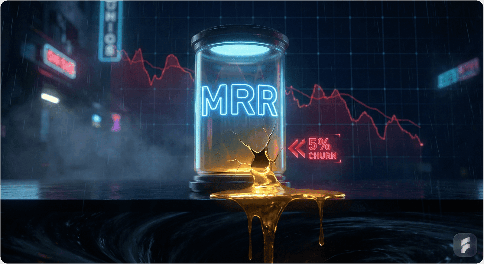
A redesign isn't about prettier screens, it's a business intervention triggered by churn, activation plateaus, and strategic shifts
Real signals include: monthly churn creeping above 3–5% (SMB) or 1–2% (enterprise), activation stuck below 30–40%, and NPS languishing under 30
Airbnb's early redesign turned trust issues into a booking engine that saved the company, proving UX directly impacts revenue
The framework: diagnose with metrics + research, define success criteria, re-architect flows, prototype with real users, then roll out gradually
Uninformed redesigns fail because they optimize for aesthetics instead of outcomes, every change needs a metric anchor
Strategic B2B SaaS product redesign services that fix confusing screen flows, optimize onboarding, and improve dashboard UX have measurably lifted activation from 25% to 40%+ and cut support costs
We've seen it happen more times than we'd like to admit.
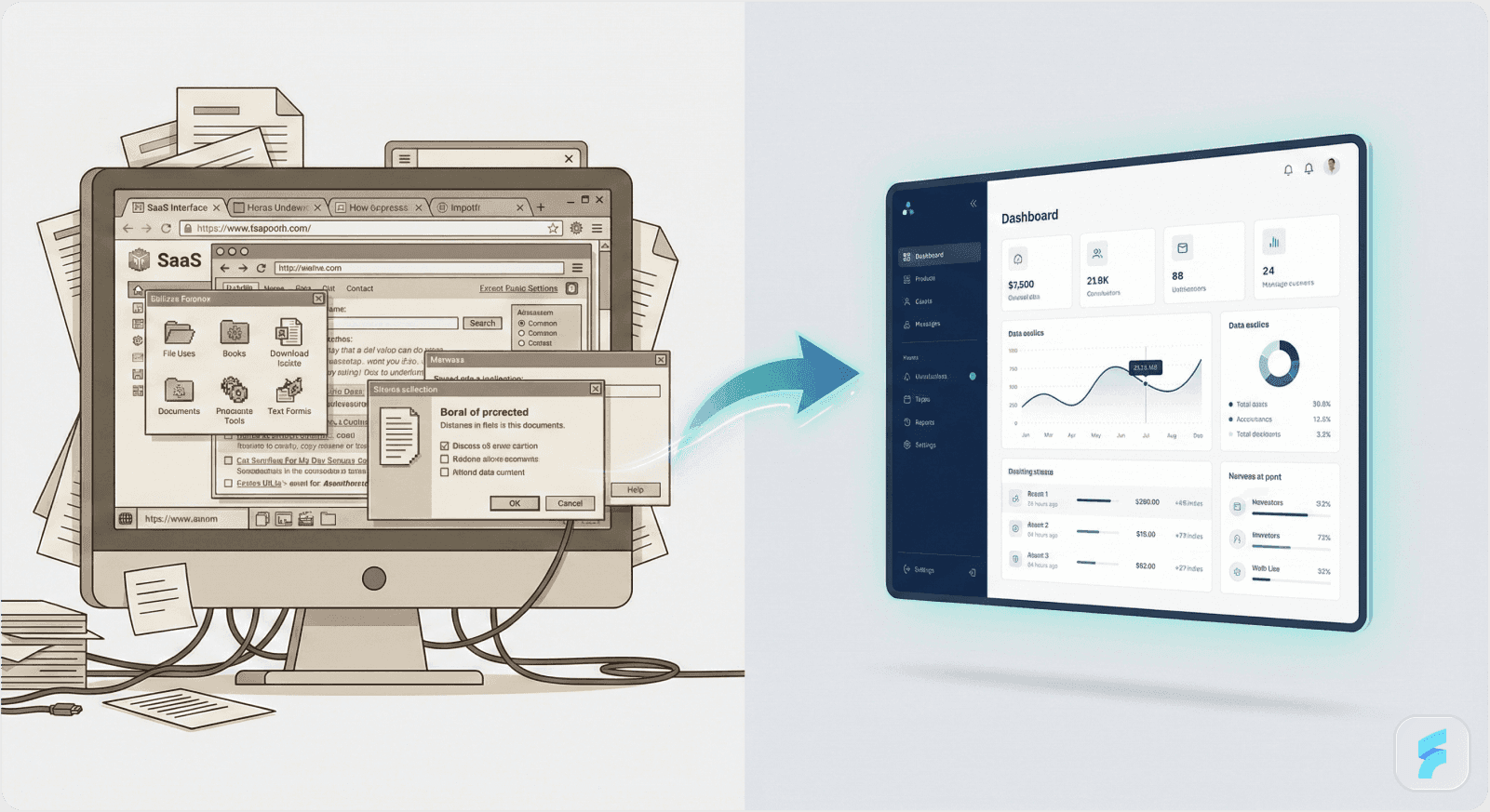
A founder notices their product looks "dated" compared to the competition. The design team gets excited about a rebrand. Someone on the board mentions that the UI feels "clunky." And before you know it, there's a Figma file with 47 artboards titled "Redesign V3" and everyone's arguing about button radius and whether the sidebar should collapse.
Here's what we've learned at Saasfactor after working with dozens of SaaS teams: Redesign is not a creative project. It's a business intervention.
And if you can't point to the metric you're trying to move, you're about to spend six months making your product look different without making it perform better.
Let's talk numbers for a second, because this is where redesign decisions either make sense or fall apart.
Say you're running a B2B SaaS product with 1,000 active accounts at $200 MRR each. That's $200K in monthly recurring revenue. Now, if your monthly churn is sitting at 5%, which sounds small but is actually above healthy ranges for SMB, you're losing 50 customers and $10K MRR every single month. That's $120K in annual revenue walking out the door, compounding every quarter.
Or maybe your activation rate is stuck at 25%. You're converting 100 trials per month, but only 25 of them become paying customers. If a strategic user interface redesign for improving activation and fixing confusing SaaS screen flow could push that to 40%, you'd be adding 15 more customers monthly. At $200 MRR, that's an extra $36K in new MRR per year, from the same marketing spend.
We've watched teams pour $50K into Facebook ads while ignoring the fact that their onboarding screen loses 60% of users before they see value. The math is brutal: if you optimize SaaS onboarding screen UX and cut that dropoff in half, you've just made every marketing dollar twice as effective.
This is why we're writing this. Because redesign, done right, isn't a cost center, it's a revenue lever. At Saasfactor, we guarantee results in 60 days, boosting onboarding and cutting churn by 35%, or we don't take a penny.
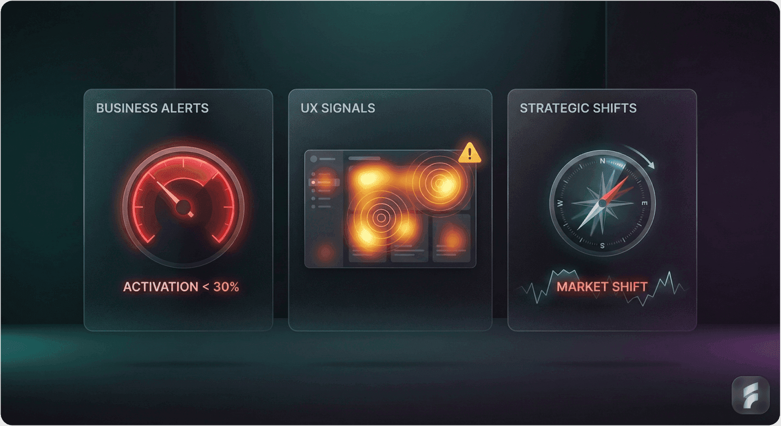
Three Signals That It's Time for UX Design & Redesign Services
We think about redesign triggers in three buckets: business metrics, user experience signals, and strategic shifts. When these start clustering together, it's no longer about whether to redesign, it's about how fast you can move.
Business and Market Signals
Your churn rate starts creeping above what's healthy for your segment. For B2B SMB products, that's typically 3–5% monthly; for enterprise, it's more like 1–2%. Your activation rate flattens or lags, stuck below 30–40% when category benchmarks hover around 37% or higher.
Other warning signs include:
Net Revenue Retention declining because existing customers aren't expanding like they used to
Support costs per active account climbing steadily
NPS dropping or stuck below 30 while top SaaS players maintain scores around 50 or above
When we see these patterns, we know there's a deeper issue that a professional UX audit service can uncover.
UX and Product Signals
These are what we hear in usability tests and support tickets. Things like "I don't know where to click," or "I didn't realize this feature existed," or workflows that require way too many steps to accomplish basic tasks.
Common UX debt includes:
Visual debt, outdated patterns compared to competitors, inconsistent design system, poor responsiveness
Accessibility issues that make adoption harder
Feature sprawl where your original information architecture no longer maps to how teams actually use the product
Navigation that's become a junk drawer with new features bolted on wherever there's space
This is exactly what our complete UX audit and redesign package addresses, identifying friction points that cost you revenue. In one project we documented, a founder told us that after our team went through their negative support tickets and repeated issues, they expected support tickets to go down by at least 30% with the new redesign.
Strategic Signals
These are the existential ones. Your ideal customer profile has evolved, maybe you started targeting freelancers and now you're selling to agencies, but the UX still reflects the old product.
Strategic misalignments we commonly see:
Moving upmarket from SMB to mid-market or enterprise and needing to support more complex workflows, permissions, and integrations
Rebrand or positioning change where the product experience no longer matches what sales and marketing promise
Shift to product-led growth requiring better onboarding optimization and trial-to-paid conversion improvement
When we see two or three of these signals showing up at once, that's when we know a team needs to shift from cosmetic refresh to strategic B2B SaaS product redesign service.
What Happens When You Get It Right: Real Examples
We love the Airbnb story because it's one of the clearest examples of design thinking as a growth lever.
Airbnb: Design as a Business Turnaround
In the early years, Airbnb's team realized the product experience wasn't communicating trust or quality well enough. Bookings were low, retention was struggling, and they were essentially a failing startup. So they did something counterintuitive, they stopped adding features and started deeply studying hosts and guests. They improved listing visuals, reduced friction across the booking flow, and rebuilt the experience around the core job-to-be-done: helping people feel confident booking a stranger's home.
The result? They turned a failing business into one with strong engagement and network effects. It's become an iconic example in design thinking discussions, and for good reason, the redesign wasn't about prettier screens, it was about removing the friction that was blocking growth.
B2B SaaS Product Redesign Success
We've seen similar patterns in our own work as a UX design service for high-growth startups. One product studio we follow described a case where a holistic app redesign, full UX audit for identifying churn issues, reworked onboarding, clarified information architecture, led to measurable lifts in activation and user satisfaction.
In our own portfolio, we've worked with over 300 SaaS companies, and the results speak for themselves. One client saw user engagement spike significantly after we redesigned their platform, more people visited their site, stayed longer, and went deeper, visiting more pages. Another told us we brought not just creativity and technical expertise, but took time to understand their company, business, and goals.
Founders consistently report:
Reduced support tickets (UX design for reducing support tickets in action)
Higher trial-to-paid conversion
Better alignment between roadmap priorities and actual user behavior
Targeted Interventions That Move Metrics
Here's a composite example from our own experience working with expert UX support for scaling SaaS: we worked with a B2B analytics tool stuck at 25% activation. Users would sign up, look at the dashboard, and bounce. Through session replays and interviews, we discovered that people didn't understand what to do first, the dashboard was cluttered, the setup screen was overwhelming, and there was no clear path to value.
We applied our UX optimization service for onboarding improvement approach:
Redesigned the onboarding with a focus on time-to-first-value
Simplified core workflows to reduce user dropoff on the SaaS setup screen
Added micro interactions on SaaS screen design to guide people through key actions
Within a quarter, activation pushed above 40%. That's 15 percentage points of lift that translated directly to more paying customers from the same traffic. This is the kind of revenue-focused UX audit outcome we aim for with every engagement.
For more on reducing dropoff during setup, check out our blog on the Aha Moment Framework, where we break down how to cut setup screen dropoff by 64%.

How We Approach Product Design for SaaS & AI
We've developed a framework over the years that treats redesign like a business project, not a Dribbble exercise. At Saasfactor, we've refined this into a three-step process that's informed by our analysis of 297 SaaS products and 106 psychology principles.
Diagnose with UX Research & Usability Audit
We start by combining product analytics, activation rates, feature adoption, churn, NPS, time-to-first-value, with qualitative inputs like user interviews, support tickets, and session replays. This UX audit service with actionable recommendations helps us map where the pain points actually are, not where we assume they are.
We conduct competitive analysis, heuristic reviews, user observation, and feedback analysis to pinpoint the top fixes for your product. Our secret weapon? A collection of 1,745+ UX design best practices we call "The BAD UX" that we've developed over six years of experience, you can't find it elsewhere.
We benchmark against SaaS norms to see if we're dealing with a design problem or a broader strategy or pricing issue:
Monthly churn: 3–5% in SMB B2B, 1–2% in enterprise
NPS targets: 30–50+ range
Activation: around 35% or higher
If you're far off those numbers, our UX discovery and audit package for founders can help figure out why.
Define Success and Constraints
We align user expectations with value through strategy sessions, using data-driven UX to turn visitors into subscribers. This is where we translate business problems into design questions. How might we cut time-to-first-value from 14 days to 5? How might we increase activation from 30% to 45% in three months? How do we improve SaaS dashboard UX for conversions without breaking workflows that power users rely on?
We also set a tight scope, identifying must-change flows:
Onboarding optimization
Core usage workflows (often requiring complex user flow optimization)
B2B dashboard design and usability improvement
Billing and checkout (applying SaaS checkout screen UX best practices)
This prevents "everything must change" paralysis and keeps us focused on improving retention metrics.
Re-architect the Experience
Here's where we fix SaaS login screen UX issues, rework information architecture to match real usage patterns, and clarify primary versus secondary navigation. As a UI/UX design agency specializing in enterprise UX design, we simplify the number of steps for core jobs-to-be-done and use modern SaaS patterns, clear hierarchy, empty states that teach, in-product guidance, while keeping the mental model familiar enough that existing users don't feel lost.
We'll identify the best user flows for the critical parts of your product and design them based on research insights. For complex products, we often need to redesign complex dashboards with better hierarchy and filtering, apply enterprise UX design principles for workflow apps, and improve SaaS screen layout to reduce churn.
Every screen is either helping users move forward or creating friction that costs you revenue.
Prototype, Test, and Iterate
We build mid- to high-fidelity prototypes of critical flows and validate them with real users before committing engineering resources. We conduct user testing with 5 users according to the persona you choose, sharing interview materials and actionable insights after our design sprint session.
We track qualitative signals like confidence and comprehension alongside test-level metrics like task success and time-on-task, then refine based on what we learn. This is where best UX fixes for SaaS trial signup screen get validated, not in a design team meeting, but with actual users clicking through the flow. Our UI/UX redesign service for mobile and web apps ensures changes work across all platforms before launch.
Design Presentation and Feedback
We present the designs for review, critique, and feedback to ensure they align with your goals. This collaborative approach ensures stakeholder buy-in before development begins.
Plan Rollout and Communication
We avoid big-bang surprises. Instead, we use feature flags, beta programs, and opt-in toggles so power users can adapt and give feedback before full rollout. We support your developers with clean, organized Figma files and detailed assets, making implementation smooth.
We communicate the "why" through release notes, in-product tours, and Loom-style walkthroughs, explicitly connecting changes to user-reported pain points and outcomes, speed, clarity, fewer clicks.
This is also where we apply SaaS screen UX tips for revenue growth: make sure the new experience actually drives the metrics we identified in step two. Our approach to optimizing product funnels ensures every change contributes to trial-to-paid conversion improvement.

Why Uninformed Redesigns Fail
Here's where we need to be blunt: redesigns not informed by metrics are optimized for aesthetics, not outcomes.
Design Without Research Is Decoration
We've seen it over and over. Experienced UX design companies emphasize that design work must be anchored in research and data; otherwise, teams risk reshuffling pixels while core problems remain untouched. When teams chase trends, dark mode, glassmorphism, fancy micro-animations, without measuring activation, retention, or usability, they create "novelty" that can actually increase cognitive load rather than reduce it.
We craft psychology-based UX strategies informed by our analysis of 297 SaaS products and 106 psychology principles. Your product will be strategized based on what has worked for other successful products, not what looks trendy on Dribbble.
Common Failure Patterns
The most common mistakes we see:
Breaking existing workflows – Power users rely on specific patterns. Without validation through UX research & usability audit, you risk alienating your most valuable customers.
Misaligning with business goals – Shipping a beautiful dashboard that hides the key actions driving expansion revenue, or reducing clarity around billing and usage in ways that negatively impact Net Revenue Retention and trust.
Ignoring accessibility and mobile – In today's world, a UI/UX redesign service for mobile and web apps must ensure experiences work seamlessly across devices.
A big redesign is inherently risky. The only rational way to de-risk it is to anchor every decision in a clear metric and a documented user insight. If you can't name the metric you're trying to move, don't touch the screen. This is why we position ourselves as the best UX design agency for SaaS products, we make decisions based on data, not opinions.
Metrics and Attitudes From the Ecosystem
We think it's important to ground all of this in concrete numbers and attitudes from the broader SaaS ecosystem, so it doesn't feel theoretical.
Core SaaS Health Metrics
Churn benchmarks – Many B2B SaaS products hover around 3–5% monthly churn in SMB, with healthy enterprise players closer to 1–2%. Even small improvements here compound dramatically, cutting churn from 5% to 4% on a $200K MRR base saves you tens of thousands in annual revenue.
Activation and adoption – Average activation rates sit in the mid-30% range, with top performers, especially in AI SaaS design, crossing 50%+ activation due to better onboarding and clearer value delivery. If you're stuck at 25% or 30%, there's real upside to be captured with conversion-focused UI/UX services for SaaS.
Companies like Cursor and Lovable have shown what's possible with frictionless onboarding, Cursor's instant setup and 2,000 free completions helped them reach a billion code completions daily with zero marketing spend. Read more about these GTM strategies in our detailed blog post.
NPS and satisfaction – Maintaining NPS above 50 is correlated with significantly lower churn, which highlights the link between improving customer experience and revenue durability.
What Founders Tell Us
We've also heard from agencies and product partners who report that founders consistently say redesigns that "resonate with the target audience" lead to visibly better satisfaction and performance across key engagement metrics. Strategy-first studios stress that early-stage SaaS founders should pair lean MVPs with design that's "good enough" but measurable, then invest in bigger redesigns only when data proves misalignment between UX and growth goals.
At Saasfactor, we use these benchmarks as reality checks. If you can't name the metric, don't touch the screen. If churn is telling you it's time, listen. And if you're redesigning without knowing whether it'll move activation, retention, or expansion, you're just redecorating.
The Clarity on the Other Side
Here's what we've come to believe: better UX is not just about visuals. It's about removing friction that blocks growth.
When we help a team redesign their product, whether it's a UX revamp service for low conversion pages or a complete UX and UI overhaul for outdated platforms, the goal is never to make something that looks good in a portfolio. The goal is to create an experience where users understand what to do, feel confident doing it, and come back because the product actually helps them get their job done.
That means:
Fixing the confusing SaaS screen flow that's costing you conversions
Applying SaaS checkout screen UX best practices so fewer people abandon at the last step
Reducing user dropoff on the SaaS setup screen by making the path to value obvious
Using UX workflow redesign to streamline complex processes
The best redesigns we've been part of, the ones that actually moved the needle, were the ones where every decision was tied to a metric and validated with real users. They weren't the flashiest. They weren't the ones that won design awards. But they were the ones that turned activation from 25% to 40%, cut churn by two percentage points, and made every marketing dollar twice as effective.
If your metrics are screaming "redesign," we suggest you listen. But make sure you're redesigning for outcomes, not just aesthetics. Whether you need to hire UX designers for a fintech app, find UI UX designers for a mobile SaaS product, or partner with an experienced UX agency for improving customer experience, choose partners who understand that growth isn't blocked by ugly screens, it's blocked by friction.
And the teams that win are the ones who relentlessly remove it.
Want to see how we've helped companies like yours? Check out our case studies including work with YC-backed startups like Sira, where we redesigned their time-off management interface to make HR scheduling more transparent and scalable.


