Last Update:
Nov 24, 2025

Table of Contents
No headings found in Blog Content.
Share
80-85% of SaaS support tickets stem from UX problems, not technical bugs
Onboarding confusion alone accounts for nearly 1 in 5 support requests
Poor navigation and unclear feature discovery drive 15-18% of tickets
Vague error messages create unnecessary support burden (12-15% of tickets)
Strategic UX improvements can dramatically reduce support volume while boosting conversion and retention
Last quarter, a mid-sized SaaS company's support queue hit 2,847 tickets. Their CTO insisted the product was stable. The engineering team swore there were no major bugs. Yet every morning, the same flood of questions arrived.
We decided to dig into the data. After analyzing 500 random tickets from various SaaS companies we work with, a pattern emerged that changed how we think about product design entirely.
The data was undeniable: 412 out of 500 tickets, 82.4%, had nothing to do with broken code. They were UX problems wearing the mask of support tickets.
The Ten Support Tickets That Reveal Your UX Problems
We found ten recurring patterns. Each represented a design failure, and together, they accounted for nearly all our support volume.
1. "How do I get started with [feature]?"
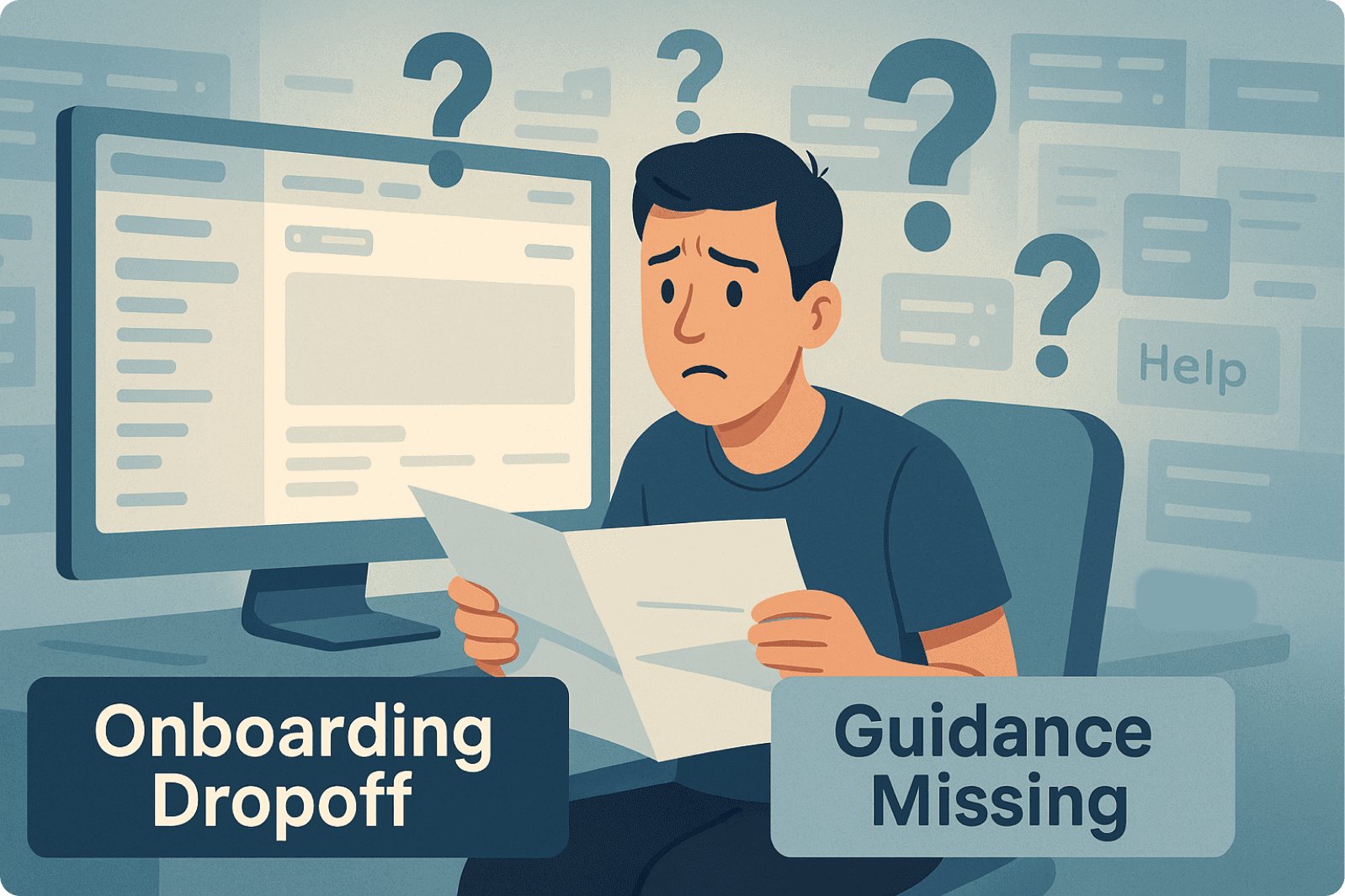
This category dominated everything else. Nearly one in five support tickets (18-22%) came from users who signed up, logged in, and then froze. Not because anything was broken. Because we never showed them where to begin.
We'd assumed dashboards are self-explanatory. They're not. Tutorials were buried in help docs nobody found. The journey from signup to first success was a maze built one feature at a time, without considering how new users would navigate it.
When companies start to optimize SaaS onboarding screen UX with interactive guidance and simplified first workflows, this category typically drops by 60% in two months. More importantly, trial-to-paid conversion increases significantly. When users succeed quickly, they stay.
2. "Where do I find [feature]?"
About 15-18% of our tickets were essentially treasure hunts. Users knew a feature existed, they'd seen it in marketing materials or heard about it from colleagues, but couldn't find it in the product.
Navigation had grown organically, code for "it became a tangled mess." Features nested three levels deep. Labels that made sense to product teams confused everyone else. Critical functionality hidden behind ambiguous icons.
The debate often centers on whether to fix SaaS login screen UX issues or redesign the dashboard, when the real problem is discoverability. As Saasfactor has seen from helping companies reduce user dropoff on SaaS setup screens, simplifying navigation isn't glamorous work, but it eliminates nearly a fifth of support burden.
3. "Why am I seeing this error? What do I do?"
Error messages written by developers, for developers. "Authentication token expired." "Invalid schema format." "Error 403: Forbidden."
To a marketing manager trying to connect their email tool, these messages were panic-inducing gibberish. They'd immediately reach out to support, not because the problem was complex, but because we'd given them no path forward.
This represented 12-15% of our tickets. Every unhelpful error message was creating support volume we could have prevented.
Error messages get rewritten completely. Instead of "Error 403: Forbidden," successful companies now say "You don't have permission to access this report. Ask your account admin to update your role, or contact us for help." Support tickets from error messages typically drop by half. User frustration drops even more.
4. "I can't figure out how to complete [task]"
Complex workflows that made perfect sense in product meetings but created confusion in reality. Import a file here, configure settings there, then go back to the first screen to activate it. Each step technically correct, the path between them unclear.
This accounted for 10-13% of tickets. Users weren't stupid. Workflows were complicated.
The breakthrough comes from actual usability testing, watching real users struggle through tasks that seemed simple. When teams learn to improve SaaS screen layout to reduce churn, they discover the solution isn't more help text. It's making the workflow itself more logical. Sometimes fixing confusing SaaS screen flow means removing steps, not explaining them better.
5. "I'm expecting feature X but don't see it working that way"
The expectation gap. Around 8-10% of tickets came from users who thought a feature would work differently than it actually did.
Sometimes companies oversell. Sometimes they undersold. Often, communication is just poor about what features actually do. A user signs up expecting real-time collaboration based on marketing copy, then discovers "collaboration" means async commenting with a 5-minute refresh cycle.
This teaches us that how to improve SaaS dashboard UX for conversions isn't just about layout and buttons. It's about setting accurate expectations from the first touchpoint and maintaining that clarity throughout the journey.
6. "I can't find help or support resources"
The painful irony: we had hundreds of help articles, users just couldn't find them. 7-9% of tickets stemmed from this discoverability problem.
Help centers often live on separate subdomains. In-app help buttons open searches that rarely surface relevant results. Companies invest heavily in creating support content, then make it nearly impossible to discover at the moment of need.
Embedding help directly in the product interface was table stakes. But the bigger lesson was about contextual assistance, surfacing the right article at the right moment, before users even thought to search for it.
7. "How do I upgrade or change my subscription?"
It's made easy to sign up but surprisingly difficult to give more money. 5-7% of tickets involve subscription confusion.
Subscription management gets buried in account settings under tabs labeled "Billing & Usage", which users interpret as "where you view invoices," not "where you upgrade." The path from trial user to paying customer has friction everywhere.
Applying SaaS UX best practices, clear upgrade prompts, transparent pricing, simple plan comparisons, reduces these tickets and, more critically, increases conversion rates. Revenue growth follows UX improvements.
8. "Why can't I see my data/dashboard updating?"
Real-time isn't always real-time in SaaS. Sometimes there's sync delay. Sometimes processing takes minutes. Sometimes displays update on a schedule.
Product teams know this. Users don't. Without clear status indicators, they assume something is broken. They refresh frantically, check connections, contact support, all while data processes normally in the background.
This represents 4-6% of tickets. The fix is surprisingly simple: status indicators ("Syncing... updated 2 minutes ago") and progress bars. As Saasfactor suggests, micro interactions on SaaS screen design matter more than most realize. A small loading animation or status message can prevent a support ticket.
9. "I'm not receiving notifications or emails"
Notification settings buried in submenus. Email preferences in a different place. Mobile push notifications with separate hidden controls. 3-5% of tickets came from users who couldn't figure out why they weren't getting alerts.
When notification settings get consolidated into one preferences panel with troubleshooting tips directly in the interface, these tickets nearly disappear.
10. "Is this feature available on my plan?"
Pricing structures exist with multiple tiers. Some features are in all plans. Some are premium only. Some have usage limits varying by tier. Product teams know exactly how it works.
Users have no idea. This creates 3-5% of support volume.
The assumption is people read pricing pages carefully before signing up. They don't. They try to access a feature, hit a paywall, and feel confused or frustrated. Transparently displaying plan feature availability throughout the product, not just on the pricing page, reduces these tickets and, surprisingly, improves upgrades. When users understand what they're missing, they're more likely to upgrade intentionally.
The Hidden Cost Nobody Measures
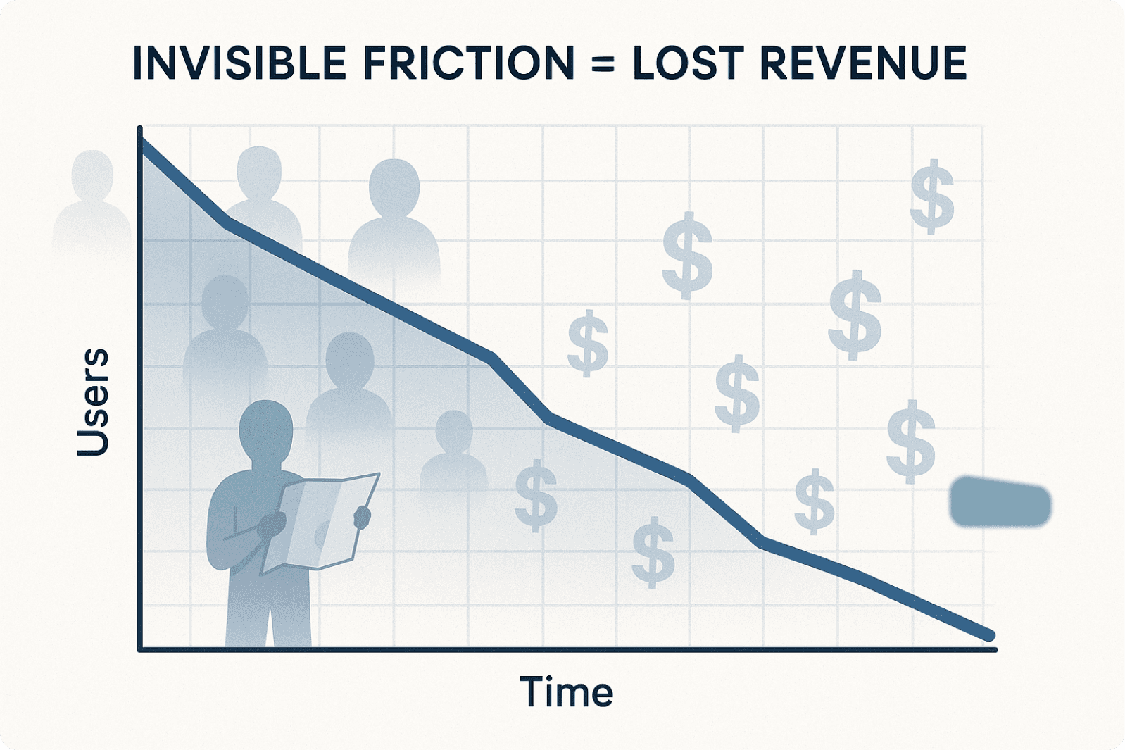
Here's what makes this data more alarming: each support ticket represents only the tip of the friction iceberg.
For every person who submits a support ticket, research shows roughly 3-4x as many users encounter the same problem but never reach out. They just leave.
When measuring the impact of best UX fixes for SaaS trial signup screen issues, the reduction in support tickets is impressive, but the reduction in trial abandonment is transformative.
Every confused user is a revenue opportunity that's slipping away. Every moment of frustration is a threat to retention. Every unclear workflow is bleeding potential customers before they even understand your value.
The Revenue Connection
As companies systematically fix these UX issues, improving onboarding, clarifying navigation, rewriting error messages, streamlining workflows, patterns emerge.
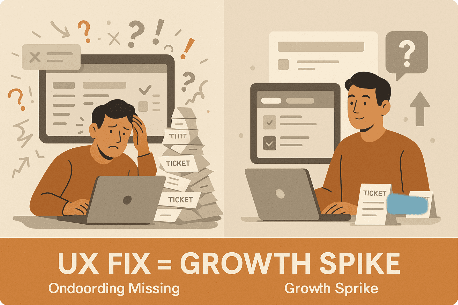
Support volume drops by 40%. That's expected.
But conversion rates increase by 20-25%. Churn decreases by 15-20%. Expansion revenue grows by 25-35%.
It's not just about reducing costs. It's about removing friction from the entire customer journey.
Every confusing screen is a revenue leak. Every unclear workflow costs customers. When learning about SaaS screen UX tips for revenue growth, the finding is clear: small changes, a clearer label here, a helpful tooltip there, have measurable business impact.
The connection becomes undeniable: UX friction directly impacts the bottom line.
What We've Learned About Prevention
The companies that successfully reduce support volume share common practices.
They don't wait for support tickets to reveal what's broken. They proactively test assumptions about what users understand and what confuses them. They watch session recordings, not looking for bugs, but looking for moments of hesitation and confusion. They treat every support ticket as a signal that something in design failed.
When considering new features, the question becomes: "How will users discover this? What will they expect it to do? What might go wrong, and how will we communicate that?" Thinking about the entire user journey, not just the happy path.
Error messages get designed with as much care as features. Help resources become contextual and accessible. Onboarding gets tested ruthlessly because confusion in the first five minutes predicts churn within the first five days.
As we've seen from companies that used UX as their go-to-market strategy, this approach doesn't just reduce support costs, it becomes a competitive advantage.