Last Update:
Nov 9, 2025

Share
Design velocity means faster learning, not just faster building.
The best teams test hypotheses with prototypes before building full features.
The Build-Measure-Learn loop is the fastest path to validated learning.
User feedback cycles uncover friction and drive rapid iteration.
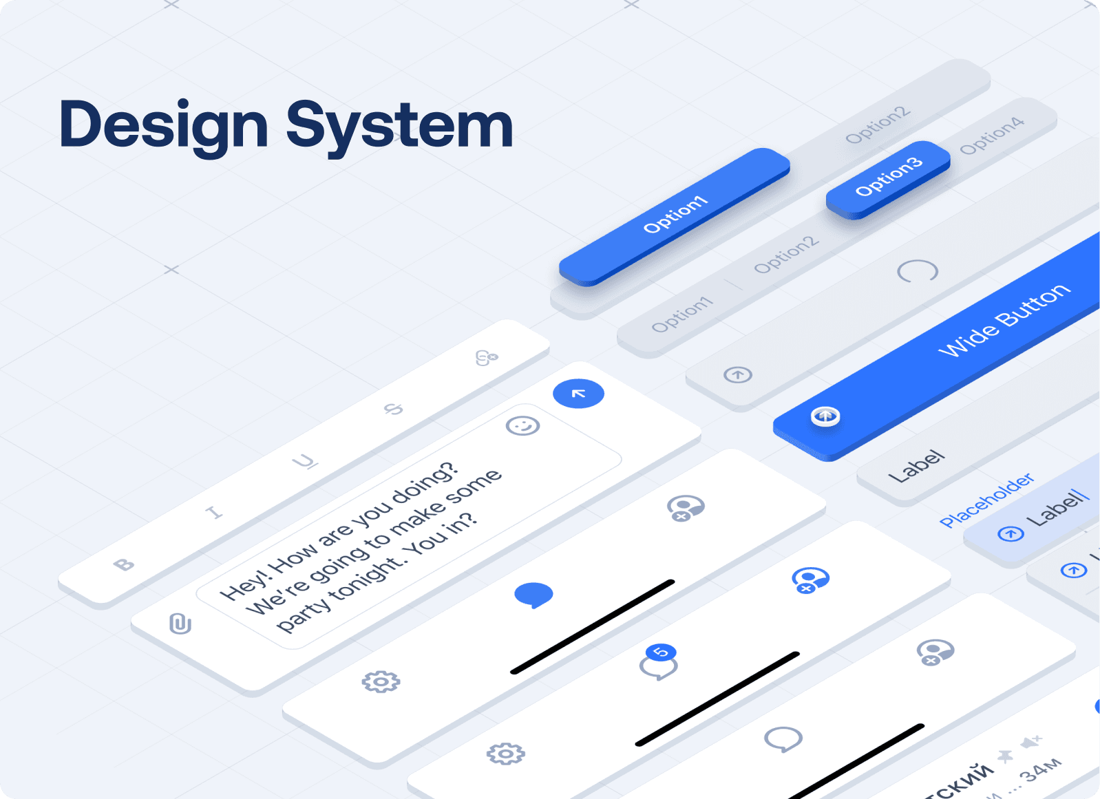
Design systems and agile structures reduce rework and enable speed.
Step velocity compounds learning over time, dramatically outpacing slower competitors.
Step Velocity in Startups
We became obsessed with a question: why do some startups ship features in days while others take months to build things nobody wants?
So we started researching. We dug into case studies, analyzed frameworks, and looked at how the fastest companies in the world actually work. What we discovered fundamentally changed how we approach every project.
What Design Velocity Actually Means And Why It Matters
Design velocity isn't about how fast you can push pixels. It's about how fast you can learn whether you're building the right thing.
The fastest teams don't move quickly because they work longer hours. They move quickly because they compress the feedback loop between building something and discovering whether it actually works.
Traditional teams measure progress by outputs. How many features did we ship? High velocity teams measure progress by learning. Did we validate our hypothesis? Did we prove this solution works before investing months building it?
The difference is profound. A team that takes three months to build a polished feature nobody wants is slower than a team that takes two weeks to test a rough prototype and discover it's the wrong direction.
Speed compounds. If you can complete a full learning cycle in two weeks while your competitor takes three months, you're not just six times faster. You're exponentially ahead because each cycle teaches you something that shapes the next cycle.
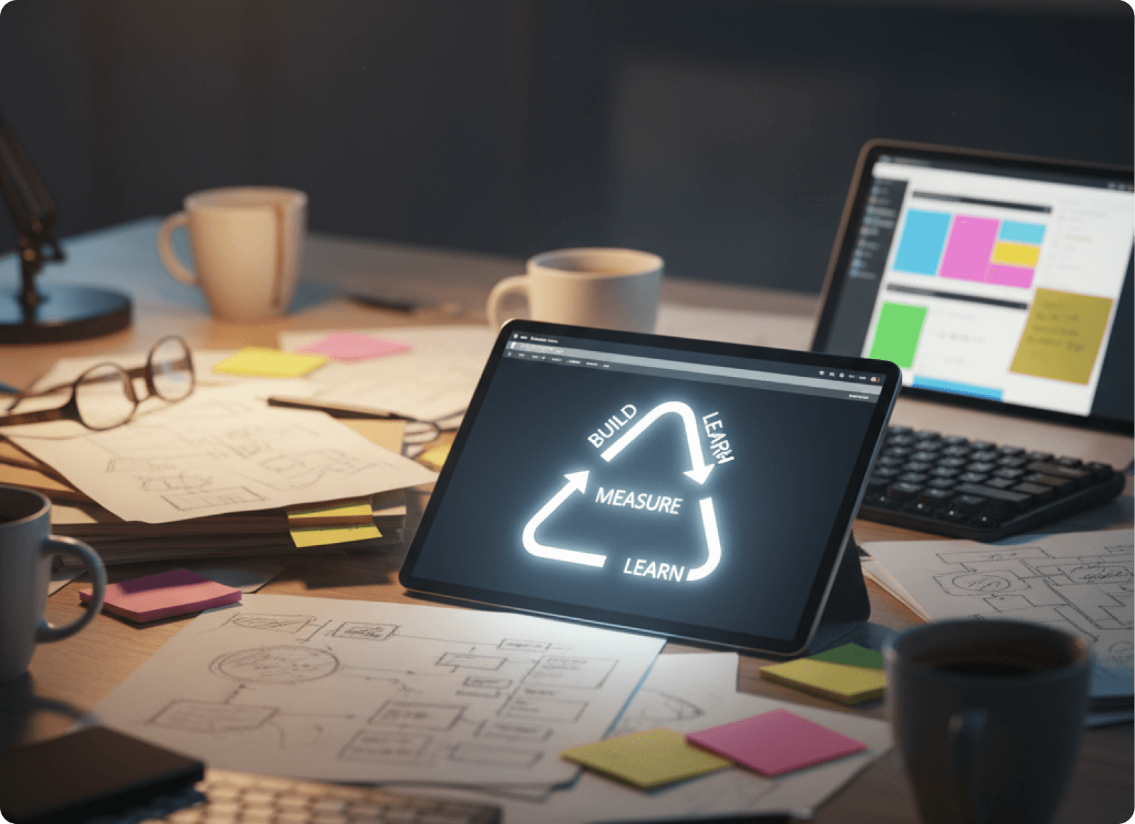
The Build-Measure-Learn Loop: The Core Framework
Every high velocity startup we studied followed the same rhythm: Build-Measure-Learn.
The loop has three phases:
Build — Create a minimum viable product or low fidelity prototype to test a hypothesis
Measure — Collect real user feedback through testing, interviews, or analytics
Learn — Analyze the data and decide whether to iterate, pivot, or advance the design
Traditional companies take months to complete one loop. The fastest startups do it in weeks. The team that completes ten cycles while competitors complete one has ten times the learning advantage.
When you're trying to fix SaaS login screen UX issues, this framework changes everything. Instead of spending weeks debating which approach might work, you test three different approaches in the same timeframe and let real user behavior decide.

How Uber Validated Their Core Idea In Weeks, Not Years
Uber needed to validate their core idea quickly. Rather than spend massive time building a complete platform, they launched with three cars in New York. Just three.
Their hypothesis was razor sharp: can people call a taxi with a few phone taps?
They got their answer in weeks. Success in one market led to expansion to San Francisco, where they continued iterating based on expanding user feedback.
Velocity Impact: Instead of spending eighteen months building before launch, Uber went live and started measuring real behavior immediately. Each city became a laboratory. Each insight shaped the next version.
The principle applies universally. You don't redesign entire systems. You test one specific friction point and measure what happens. That's how you optimize SaaS onboarding screen UX at speed.

How General Electric Adopted Startup Speed At Enterprise Scale
General Electric, a massive traditional corporation, cracked the code on startup speed through their FastWorks program.
The rules were aggressive:
MVP in three months or less
Started user testing after just one month, not six months
Shifted from five year design cycles to one year iteration cycles
Velocity Impact: They cut design and development timelines by eighty percent. Products reached market faster. Customer needs shaped direction earlier. Problems got caught before they became expensive.
If a giant enterprise can move this fast, the bottleneck isn't capability. It's process. This fundamentally changed how we think about improving SaaS dashboard UX for conversions.
How FinFuture Used Design Systems To Cut Development Time By 40%
FinFuture discovered something crucial about velocity. Without a shared design language, two week feature builds stretched into months because designers and developers spoke different languages.
Their solution: a formal design system with a UI kit and component library that gave designers pre made components to prototype in minutes and provided developers a code library matching design specs exactly.
Measurable Results:
30 to 40% faster development cycles for UI heavy features
Small features that took three weeks dropped to two weeks or less
One fintech company saved 6 to 10 days of dev time per project
Companies using design systems in Figma completed tasks thirty four percent faster. This is critical when working on SaaS checkout screen UX best practices. You're not starting from scratch every time. You're assembling proven components and testing new arrangements.
Speed doesn't come from individual talent alone. It comes from infrastructure that eliminates the tiny frictions that compound into weeks of wasted time.
The Four Stage Framework High Velocity Teams Follow
Stage 1: Prototyping (Rapid, Low Fidelity)
Fast teams create wireframes and clickable mockups. Low fidelity. Rough. Just enough to test one specific hypothesis.
The hypothesis might be: does this checkout flow reduce cart abandonment? One question. One test. They use Figma, Miro, or paper sketches. The medium doesn't matter. The focus does.
Teams that try to test everything at once move slowly. Teams that isolate one variable and test it ruthlessly move fast. When working to reduce user dropoff on the SaaS setup screen, you're testing one specific friction point, not redesigning the entire onboarding system.
Stage 2: Testing (Real Users, Not Assumptions)
Fast teams don't ask users if they like something. They watch what users actually do. They observe hesitations, track clicks, and note errors.
Usually five to eight users per iteration. That's enough to spot patterns without drowning in noise.
We found case after case where teams discovered their assumptions were completely wrong. The button they thought was obvious? Users couldn't find it. The flow they thought was intuitive? Users got lost at step two.
Real behavior trumps opinions every time. When you watch five users struggle at the same step, the data doesn't lie. That's where the friction lives when you're fixing confusing SaaS screen flow.
Stage 3: Analyzing (Data Driven Decisions)
Fast teams identify patterns in user struggles. Maybe users can't find the button because it blends with the background. Maybe they abandon because the next step isn't obvious.
Teams prioritize changes using frameworks like RICE: Reach, Impact, Confidence, Effort. This removes debates from the equation. The data decides.
Then they make a decision: does the hypothesis hold? Do we iterate or pivot? If the hypothesis succeeds, they advance to development. If it fails, they discard or rework before investing serious resources.
Stage 4: Refining (Rapid Implementation)
Fast teams implement feedback right away. They don't wait for the perfect moment. They act while the learning is fresh.
Each refined prototype feeds directly into the next cycle. Build. Measure. Learn. Build again. Two weeks. Test. Adjust. Two more weeks. Test. Adjust.
Teams typically iterate in two week to one month cycles, with a minimum of two iterations before advancing. This connects directly to SaaS screen UX tips for revenue growth. Revenue grows from continuous small improvements, shipping every two weeks.
Why High Velocity Design Iteration Actually Works
Early Validation Prevents Costly Mistakes
Without rapid iteration, startups risk building features nobody wants. By testing with real users early, teams validate problem solution fit before full development and identify ineffective features fast.
The Lean Startup methodology shows that when entrepreneurs embrace validated learning, development timelines shrink substantially. Instead of waiting months to discover a major issue, rapid iteration catches problems in weeks.
Wynter pivoted from B2C to B2B after user insights revealed a saturated market. That pivot happened in months, not years, because they had continuous feedback channels from day one.
This relates to best UX fixes for SaaS trial signup screen. Fixes work because they remove specific friction points blocking users from taking action. You can only find those by watching real people struggle.
User Feedback Loops Create Compounding Speed
High velocity startups establish continuous feedback channels: in app feedback widgets, segmented user testing, multi channel approaches combining interviews, surveys, analytics, and behavioral data.
When feedback gets collected immediately and analyzed regularly, teams make incremental decisions that compound into significant improvements.
Think mathematically. If you improve your onboarding flow by five percent every two weeks, after six iterations you're dramatically better because each improvement builds on the last.
The teams we studied could spot problems the same day users encountered them, test solutions the following week, and validate improvements within the month. This is the foundation of improving SaaS screen layout to reduce churn.
Agile Methodology Provides Structural Flexibility
Traditional waterfall projects lock scope upfront. If you discover a problem halfway through, you're stuck. Changing direction invalidates all your estimates.
Agile provides adaptive planning where teams adjust priorities based on user feedback, iterative development in small increments, and real time impact measurement.
Larvol needed both accuracy in estimates and flexibility to adjust scope anytime. They used complexity based story writing with historical performance data. Tools like Pivotal Tracker showed real time impact of scope changes.
The result? Accurate financial insights with on demand flexibility. You need the ability to change direction based on learning without destroying your timeline.
Design Systems As Infrastructure For Scaling Velocity
As startups grow, individual designer and developer coordination breaks down. Design systems solve this by creating shared infrastructure where pre made components eliminate decision paralysis and consistency happens automatically.
Figma studies show designers with design systems completed tasks thirty four percent faster. By 2020, sixty five percent of companies were using design systems to accelerate development.
FinFuture's prototype creation dropped by fifty percent and dev time savings reached six to ten days per project. When exploring micro interactions on SaaS screen design, infrastructure lets you test interaction variations in hours instead of weeks.
Before and After Comparison:
Metric | Before | After | Impact |
|---|---|---|---|
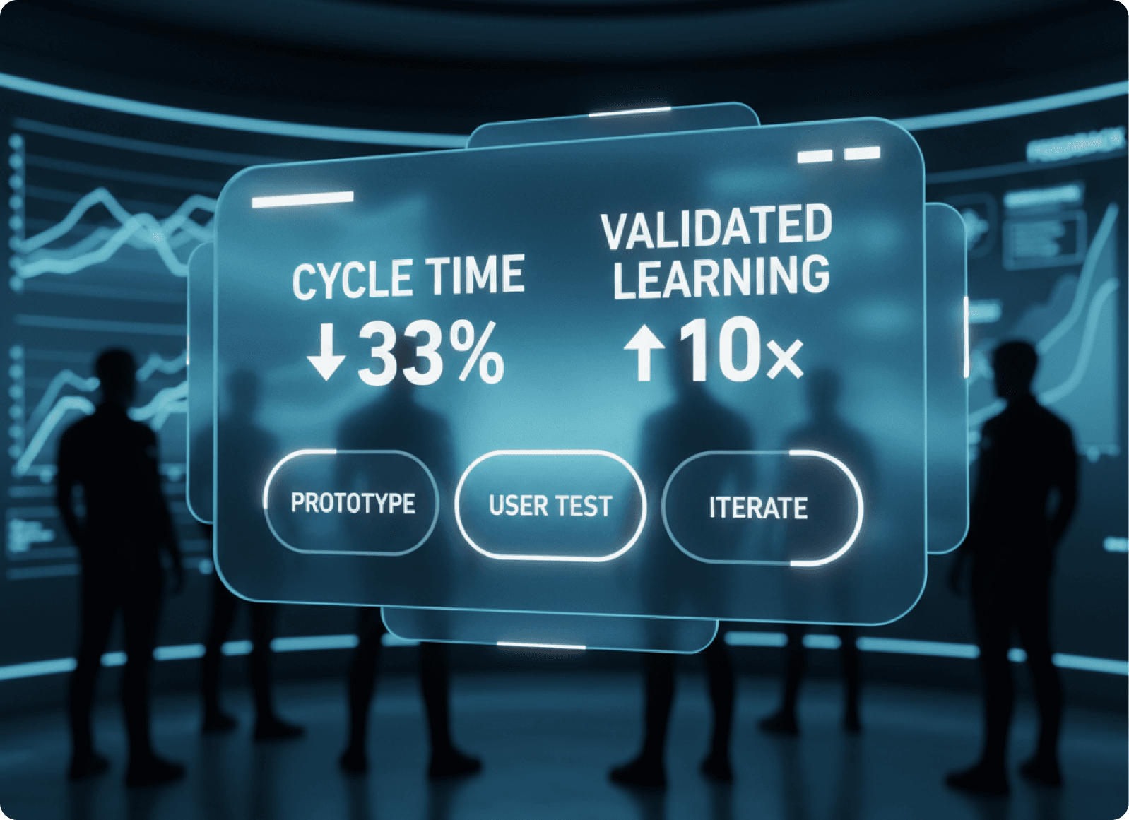
Feature Release Cycles | 3 weeks per feature | 2 weeks or less | 33% faster |
Prototype Creation Time | Full custom design | Reusable components | 50% faster |
Design Time | Undefined specs leading to rework | Design system consistency | 30–50% reduction |
Development Time | Handoff confusion, redesigns | Component-based assembly | Up to 37% reduction |
Time to Market Insights | Months of feedback loops | 2-week iteration cycles | 10× faster |
High velocity isn't about working longer hours. It's about eliminating waste, reducing rework, and learning faster.
Traditional teams spend weeks perfecting an animation before showing it to users. High velocity teams prototype in an hour, test with five users, learn whether it helps or hinders, then decide whether to invest more time.
Validated Learning Over Perfectionism: The Core Principle
High velocity design iteration succeeds because it reframes what progress means.
Traditional view: progress equals high quality finished features.
Lean Startup view: progress equals validated learning. Rigorous proof that you're building the right thing.
When teams embrace validated learning, they adapt incrementally rather than making massive directional shifts after months of work.
This is why design iteration velocity at startups can be ten to one hundred times faster than traditional enterprises. It's not about speed of execution. It's about speed of validated learning.
Every design decision becomes a hypothesis to test:
"Adding social proof to the signup screen will increase conversions by 15%"
"Reducing form fields from 8 to 4 will decrease abandonment"
"Changing the CTA color will improve click through rate"
Test. Measure. Learn. Decide. Move forward. No endless debates. No guessing. Just evidence.
What Better UX Really Means
Better UX isn't about making things look modern or following design trends. It's about removing friction that blocks growth.
Every confused user on a login screen is lost revenue. Every abandoned trial signup is a missed opportunity. Every confusing setup flow is churn waiting to happen.
High velocity design iteration gives teams the speed to find these friction points and fix them before they cost serious money. It replaces guesswork with evidence. It replaces lengthy debates with rapid tests. It replaces big risky launches with small validated steps.
The startups winning today aren't the ones with the best designers or biggest budgets. They're the ones learning fastest. The ones moving through Build-Measure-Learn cycles while competitors are still planning their first release.
Speed isn't about rushing. It's about learning. And learning is what turns good products into great ones, one insight at a time.
The fastest path to better UX is faster learning. And faster learning comes from rapid iteration, continuous testing, and ruthless focus on removing friction.
That's what drives revenue. Not beautiful screens. Frictionless ones.